http://i18.photobucket.com/albums/b140/ ... biedor.gif
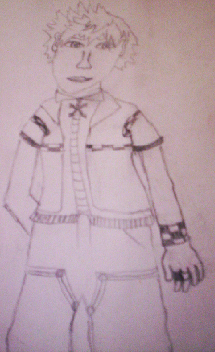
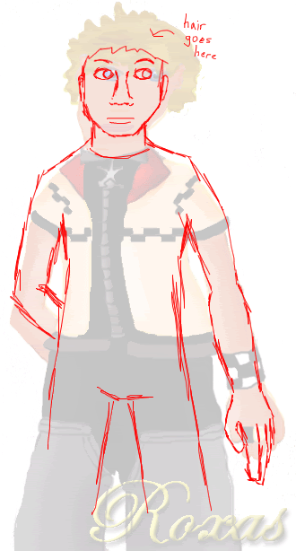
Here is a redline (basically, drawing over another drawing to show the anatomy flaws).
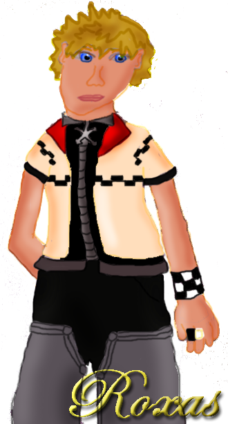
Obviously, the face is very oddly shaped, but that was mentioned already so nyeh. It was also too big for the shoulders. The shoulders themselves were too curvy - it's almost as if they weren't there. Also, arms are not just long tubes when stretched out - they curve in a bit when they reach the elbow, and the forearm curves out a bit more at the beginning of it. The fingers were also too short and stubby. His body looked lopsided as well.
As for the coloring, there are lots of colorbleeds. Do you use layers? If not, practice using them, because it is a LOT easier, trust me. Basically, do your lines on one layer, make a new layer underneath, and color there so that your lineart remains intact. As for the lineart that is visible, I would either make your hand steadier, or learn to use the pen tool (I'm sure there are tutorials somewhere, since I cannot explain it at all). They are very shaky and wobbly. The shading is also odd - there is no definate lightsource. Basically, picture light coming from somewhere and hitting Roxas, and try to shade according to that. Like, if light was coming from the left side, there would not be highlights on the right side of his right arm, and etc.
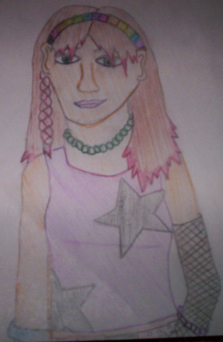
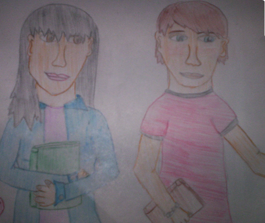
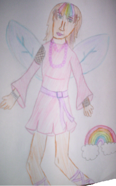
I won't critique the other pictures since the things I said here can be applied to those as well.
I know I said a lot of things, and I know that it will come off as harsh (since I don't really like to sugarcoat things), and I am sorry. Try not to take it personally. It's a LOT of things to fix, but I know that you can fix 'em and make your art look a lot better C:


