Pink Poogle Toy Forum

The official community of Pink Poogle Toy
Main Site
NeoDex
It is currently Wed Jun 05, 2024 3:57 am

All times are UTC


Post new topic This topic is locked, you cannot edit posts or make further replies.  [ 118 posts ]  Go to page Previous  1 ... 4, 5, 6, 7, 8  Next
Author Message
 Post subject:
PostPosted: Sun Oct 31, 2004 6:37 pm 
Way Beyond Godly
Way Beyond Godly

Posts: 8715
Joined: Sat Jun 05, 2004 9:10 pm
Location: Cleveland, Georgia
Gender: Female
mazil wrote:
DM was on fire! wrote:
MAZ STOLE MY PICTURE! :lol: Anyway, about the clone thing, it flopped.

EEK! Hehe, sorry DM!! :oops: Gorgeous set, though :)


Thankyuu Maz. But I was actually going to use a set with that picture, before there was the no blue rule. Your set's way better than what I made, though. :)


Image


Top
 Profile  
 
 Post subject:
PostPosted: Sun Oct 31, 2004 6:41 pm 
PPT Student
PPT Student
User avatar

Posts: 366
Joined: Mon May 31, 2004 8:35 pm
Location: Lalaland
Image
Image
Image Used: http://img.photobucket.com/albums/v199/ ... on_389.gif
Program Used: Photoshop CS

I did my best and I tried not to smush the pic too much. I hope its enough. Good Luck Everyone.


Image
"The path I've chosen had no effort, unless I took that chance, at the decision I've made, for all I've done and suffered." - Mi-Ku, © Mi-ku All Rights Reserved.


Top
 Profile  
 
 Post subject:
PostPosted: Mon Nov 01, 2004 3:29 am 
PPT God
PPT God
User avatar

Posts: 1271
Joined: Tue Jun 22, 2004 2:43 pm
Gender: Female
Judges, you know the routine. But this time just choose two people. :)

Shadowfare
Image
Image
Original Image
Program Used: PS Elements 2

Sapphire Faerie
Image
Image
Original Image
Programs Used: PSP7, Animation Shop 3

meowth1982
Image
Image
Original Image
Program Used: PSP8

Neopets Addict
Image
Image
Original Image
Program Used: Photoshop CS

Starchaser
Image
Image
Original Image
Program Used: PS 7

laq
Image
Image
Original Image
Program Used: GIMP 2.0

Zero
Image
Image
Original Image 1
Original Image 2
Program Used: PS 7

mazil
Image
Image
Original Image
Background Pattern
Program Used: Photoshop

Apricus
Image
Image
Original Image
Program Used: PSP 8

Darklegendary
Image
Image
Original Image
Program Used: PS 6

DM was on fire!
Image
Image
Original Image
Program Used: PSP 8, Paint

Knives
Image
Image
Original Image 1
Original Image 2
Original Image 3
Program Used: PS 7

Marissa
Image
Image
Original Image
Program Used: Photoshop CS

Charka
Image
Image
Original Image
Program Used: PS 7

Alex
Image
Image
Original Image
Program Used: Photoshop CS

Neko
Image
Image
Original Image
Program Used: Photoshop CS

r4che1
Image Image
Original Image
Program Used: PSP 8


Image
Gone.


Last edited by Flame on Mon Nov 01, 2004 5:47 pm, edited 1 time in total.

Top
 Profile  
 
 Post subject:
PostPosted: Mon Nov 01, 2004 6:57 am 
PPT God
PPT God

Posts: 1195
Joined: Mon May 31, 2004 6:35 am
<b>Shadowfare</b> -- Hm. You've done better. This one's very... bland. I like the color scheme, but the background is rather plain, and the text is hard to read, especially the stuff at the bottom. I can barely make it out.

<b>Sapphire Faerie</b> -- Hahahaha! Awesome! I love the sparkles in the background; they go well with the image. However, maybe you should have used purples or disco colors, because when I see a disco ball, I don't think red. Also, next time widen the bar of the subtext... maybe leave 2 pixels between the text and the lines.

<b>Meowth1982</b> -- I don't get why the fuzzy thing is beveled and faded in the sig. It's really out of place. The background is all right, but the grids are too wide. Try smaller grids next time.

<b>Neopets Addict</b> -- Switch the border colors, so that the darker one is on the outside. I like your choice of colors and main text font. I think you put a drop shadow on the subtext bar, which looks cheesy because then the perspective is messed up.

<b>Starchaser</b> -- Ooohhh! Pretty. I think it's very classy; good job. The only thing I have to criticize is the space between the subtext and the bottom border. The text is a bit too close to the bottom, so it throws off the balance, since your main text is farther away from the top border. Other than that, it's fantastic.

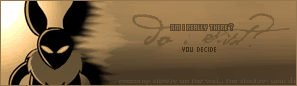
<b>Laq</b> -- Your avatar looks very good, but what happened in the sig? I don't get the bland background thing. I think you could have gotten away with the whole background instead of cropping it and leaving the rest blank.

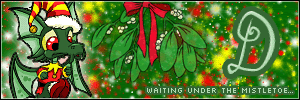
<b>Zero</b> -- Awwww! So cute. I love what you did with the mistletoe, so that it fits in with the rest of the image. Good job. I do like your color scheme, but I think the background is a bit overpowering. Perhaps you could have put a glow around the draik or faded the background so that the draik stands out more.

<b>Mazil</b> -- I love it. Good picture choice, good colors, good background. It's great! I just dislike the pixelly snowflakes in the corner, because they look out of place. The background is swirly and the overall theme is smooth, so the pixelated look doesn't work. Perhaps you should have used brushes instead?

<b>Apricus</b> -- Haha. Lovely. I like what you did with it. It's awesome! The background is great, and nice use of font to fill up space. It's very you! But um... "soggyness" should be "sogginess".

<b>Darklengendary</b> -- I like it a lot! Even though the colors are kind of muted, the overall effect is nice. I don't think you should have split the subtext though... because I keep reading it as "free from legend the world"... and then I smack my forehead. The glow on the left side of the sig is a bit distracting and out of place.

<b>DM was on fire!</b> -- You placed the text nicely!! Good job. I understand why you tinted the image this time, but don't do it too often or with just one color. It gets old. The background is also kind of bland; the swirls look out of place.

<b>Knives</b> -- Cool. I'm a fan of matching cutouts though. Also, I like the colors and the fonts you chose, but maybe you should have switched the opacities/placements of the shirt and the shoyru, because the shirt is too opaque to be behind the text. It makes the right side of the sig really uneven.

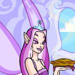
<b>Marissa</b> -- I love the background! It's so simple, but it works very well. I like what you did with the subtext as well; the waviness is a nice touch. However, I think you could have stretched the sig out a few pixels, so that the pie isn't covered. I realize that it's cut off a bit in the sig, but you're talented enough to fill in that tiny part.

<b>Charka</b> -- First off, the border needs to be a darker color, so that it frames the av/sig, not so that it blends in completely. The outer glow doesn't work at all- it doesn't match, nor does it do anything for the main text. Also, the subtext font... it's uneven. Use all caps, or choose a font that doesn't have ridiculously shaped letters.

<b>Alex</b> -- It's too plain. The colors you chose are nice, but the background needs to have more going on. Use more brushes, mess with opacities, more colors, whatever. As with Chass, you should give the subtext bar a few more pixels: at least two between the top of a letter and the top of the bar (same for the bottom). You've improved a lot since you made that set though.

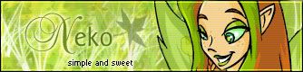
<b>Neko</b> -- Lovely! I like it a lot. Good job with the background. You made good use of the brushes. However, the main text should be larger or have something to draw more attention to it. The subtext is brighter than the main text, which I dislike. Maybe lower the opacity or choose a softer color for the subtext?

<b>Rachel</b> -- The quality is a bit shoddy. I like the fire effect you used on the main text. Use a pixel font for the subtext though, because fonts at that size tend to get fuzzy and unattractive.

Hmm... I think I'm going to have to vote out Shadowfare and Rachel this round. Sorry, guys.


Last edited by vkceankraz on Wed Nov 03, 2004 8:51 am, edited 2 times in total.

Top
 Profile  
 
 Post subject:
PostPosted: Mon Nov 01, 2004 9:06 am 
PPT God
PPT God
User avatar

Posts: 1851
Joined: Tue Sep 21, 2004 5:58 pm
Location: In Ohio. Catch me if you can :P
vkceankraz wrote:
<b>Meowth1982</b> -- I don't get why the fuzzy thing is beveled and faded in the sig. It's really out of place. The background is all right, but the grids are too wide. Try smaller grids next time.


For no other reason than to try something different...it's something I've never done before so I wanted to try it. The grids are a brush I have...and I guess I faded it into the sig to get rid of the empty space in the background...


Image

<STOWA|Sleep> my sister questioned the title. "Half Blooded Prince? Does that mean he's a Moogle"


Top
 Profile  
 
 Post subject:
PostPosted: Mon Nov 01, 2004 5:33 pm 
Honorary Member
Honorary Member

Posts: 4363
Joined: Tue Jul 13, 2004 2:40 am
Location: Down Under
Gender: Female
:o Oh no!!! i didnt realise the submission date/time had gone, is it too late for me to post my set now? i completely forgot to do it before i went to bed last nite.....


Top
 Profile  
 
 Post subject:
PostPosted: Tue Nov 02, 2004 3:26 am 
Honorary Member
Honorary Member
User avatar

Posts: 2918
Joined: Mon May 31, 2004 3:20 pm
Location: Paducah, KY
vkceankraz wrote:
Sapphire Faerie -- Hahahaha! Awesome! I love the sparkles in the background; they go well with the image. However, maybe you should have used purples or disco colors, because when I see a disco ball, I don't think red. Also, next time widen the bar of the subtext... maybe leave 2 pixels between the text and the lines.


Ideally I would have used blue, and I started to use purple (I was thinking about the wallpapers in The Sims House Party expansion) but it didn't look right, and plus my first set was purple, I wanted to go with something less girly. I tried red, and I liked the way it looked with the white. It's sort of a New Years Eve-Wintery-Christmas look. Also, using red made me think of Jim, (the red stars and all) so I decided to slap his name on it.


Image
Love is blindness. -- Set by my Secret Santa =D


Top
 Profile  
 
 Post subject:
PostPosted: Wed Nov 03, 2004 6:36 pm 
Way Beyond Godly
Way Beyond Godly

Posts: 8715
Joined: Sat Jun 05, 2004 9:10 pm
Location: Cleveland, Georgia
Gender: Female
vkceanraz wrote:
DM was on fire! -- You placed the text nicely!! Good job. I understand why you tinted the image this time, but don't do it too often or with just one color. It gets old. The background is also kind of bland; the swirls look out of place.


I'm not big on colourizing and gradients mixed together. But I couldn't decide on what to do, the BG was blander without the swirls, there were going to be stars, but I didn't like them, so I took them out.


Image


Top
 Profile  
 
 Post subject:
PostPosted: Fri Nov 05, 2004 3:34 pm 
Honorary Member
Honorary Member

Posts: 4363
Joined: Tue Jul 13, 2004 2:40 am
Location: Down Under
Gender: Female
vkceankraz wrote:
<b>Rachel</b> -- The quality is a bit shoddy. I like the fire effect you used on the main text. Use a pixel font for the subtext though, because fonts at that size tend to get fuzzy and unattractive.


I dont know why the image came out with such a bad quality, the psp image i was working with is fine :S

About the pixel font, i dont have any, and i dont know where to get any, i have asked in various places on the different PPT boards, and nobody has pointed me in the right direction of any decent ones, the only ones i have are really terrible.


Top
 Profile  
 
 Post subject:
PostPosted: Fri Nov 05, 2004 5:51 pm 
Way Beyond Godly
Way Beyond Godly

Posts: 8715
Joined: Sat Jun 05, 2004 9:10 pm
Location: Cleveland, Georgia
Gender: Female
r4che1 wrote:
vkceankraz wrote:
<b>Rachel</b> -- The quality is a bit shoddy. I like the fire effect you used on the main text. Use a pixel font for the subtext though, because fonts at that size tend to get fuzzy and unattractive.


I dont know why the image came out with such a bad quality, the psp image i was working with is fine :S

About the pixel font, i dont have any, and i dont know where to get any, i have asked in various places on the different PPT boards, and nobody has pointed me in the right direction of any decent ones, the only ones i have are really terrible.


dafont.com has some. ^_^ I use Kovensky, but you might want different. :) Or you can use Small Fonts, which you can use on Paint. Technically, doesn't it count as a pixel font since no matter how big you make it, it's still made of pixels?


Image


Top
 Profile  
 
 Post subject:
PostPosted: Fri Nov 05, 2004 6:11 pm 
PPT God
PPT God

Posts: 1195
Joined: Mon May 31, 2004 6:35 am
It's been mentioned in The Workshop many times.
Popular fonts include Silkscreen, Supermarket, and BitdustTwo. There are many more that can be downloaded at dafont.com or highfonts.com.


Top
 Profile  
 
 Post subject:
PostPosted: Sat Nov 06, 2004 11:46 pm 
PPT Student
PPT Student
User avatar

Posts: 375
Joined: Mon May 31, 2004 4:19 am
Location: The Soul Society
And here I was worrying I was late.

Shadowfare-I really like the effect on the right side, but the whole right side of the av and sig is so dark compared to the left, try using lighter colors. The bottom sig text is a bit hard to read, sort of making it useless. Also, I suggest using the same color and outline on the pixel text on the sig, the top part is a bit hard to read.

Sapphire Faerie-The background is very cool, and I like the image except for the remains of the silver shine around it. It might have been better to recreate it or just get rid of it. The text is cool, and I love the effect on the pixel text as it goes over the disco ball.

meowth1982-The av looks good even though I suggest making the image smaller, the sig isn't very good. The image is very pixelly, and the edges of it are choppy. Even though I like the background behind the text, it looks like you were just trying to take up room with the size of it.

Neopets Addict-I like the background, and a good use of font color and outline and texture on the set. The edges of the picture just seem a bit pixelly. Did you use the magic wand to get rid of the white?

Starchaser-This set is BEAUTIFUL. The colors and text are beautiful, and it just looks stunning.

laq-Very nice image and background, but I'd maybe suggest using a lighter shade of pink for the text rather than white.

Zero-Very cute set! The background looks like Christmas lights, and that gives it a christmasy feel. I'd just make the mistaletoe smaller, it looks huge compared to the draik.

Mazil-I like the background and the cutouts very much, and how the pattern fades into the lighter pink. Though it just doesn't look right not continuing the border around the av, so I'd suggest doing that.

Apricus-I like how you lightened up the image. The background is a bit plain. Also, the font on the sig just doesn't look good.

Darklegendary-This is probably one of the most interesting sets I've seen. The grungish effect goes well with the orange. Though I'd suggest maybe using colors that compliment the image more, since that huge orange chunk in the sig doesn't seem to go well with the image.

Dm was on fire!-Talk about hot pink. The set looks nice, though I'd add more to the background.

Knives-A great set. The av border is original, and I really like the font and the background in the sig, though the singer seems a lot lighter than the rest of (the sig).

Marissa-Plain and simple, yet very pretty. Only problem I have with this is that the "..." on the sig is a bit hard to read because of the pie in the background under it.

Charka-I'd suggest using a darker outline of purple on the text, it's too bright on the Skeith. And I'd suggest moving down the av text a little bit more to the right. The glow seems too bright against the sig text, and instead of choosing a black, choose another shade of purple for the sig text to go along with the set.

Alex-The image doesn't match either background. The main sig text is too small, and you have this huge blank space to need to fill.

Neko-A very cute set, nice background, but I'd suggest making the pixel text on the sig green.

r4che1-Move the small sig text up to the flaming text more. Try making the av image a bit smaller to contain the whole flame.

Sorry, but meowth1982 and Alex.


Image
Time stops for no one.


Last edited by Koku on Sun Nov 07, 2004 1:07 pm, edited 1 time in total.

Top
 Profile  
 
 Post subject:
PostPosted: Sun Nov 07, 2004 1:35 am 
PPT God
PPT God
User avatar

Posts: 1851
Joined: Tue Sep 21, 2004 5:58 pm
Location: In Ohio. Catch me if you can :P
Koku wrote:
meowth1982-The av looks good even though I suggest making the image smaller, the sig isn't very good. The image is very pixelly, and the edges of it are choppy. Even though I like the background behind the text, it looks like you were just trying to take up room with the size of it.


I have no clue why it did that. x_x It's probably due to the amount of colors and the fact my monitor's dark so it looked ok when I brought down the colors to transparent it. Looking at it on this flat screen in the computer lab I realize you are right it really pixeled it. Oiy. :(


Image

<STOWA|Sleep> my sister questioned the title. "Half Blooded Prince? Does that mean he's a Moogle"


Top
 Profile  
 
 Post subject:
PostPosted: Sun Nov 07, 2004 3:23 am 
PPT God
PPT God
User avatar

Posts: 1271
Joined: Tue Jun 22, 2004 2:43 pm
Gender: Female
Apologies. I've been sick, am still sick, and am busy and currently going insane with schoolwork.

These ratings are going to be extremely short...

Shadowfare
Too plain, too empty. You should've kept some color in it.

Sapphire Faerie
Nice animation on the av. I like the background. I don't like the main text in the sig.

meowth1982
The 3-D jub jub in the sig looks a little odd. Might've looked better if you'd kept its original colors.

Neopets Addict
Very nice from what I can see. My monitor is making everything a tad blurry, so I can't give much advice.

Starchaser
I don't like how the faerie is a more yellowish grey shade than the rest of the set. That's all.

laq
Too plain in the sig. The cutout job wasn't the greatest.

Zero
You went overboard with the background. Way too busy.

mazil
It needs a solid pink border in the av, and maybe a border around the av text.

apricus
A little hard to read the subtext, but that's it.

Darklegendary
One of the best I've seen from you. I love the background. The only thing I don't like the color of the av text.

DM
Another good set from you. The colorizing actually looks good.

Knives
You can't really tell what the other images are, though it's an awesome set. I love the av.

Marissa
You've done better. And you have the same problem Optimus did. All your sets look the same.

Charka
I don't like the border colors around the subtext. And the border around the av and sig need to be darker.

Alex
Av is too empty, and doesn't match the sig. The sig is also too empty, and doesn't really match the little dragon.

Neko
Use a pixel font/green color for the sig subtext.

Rachel
Where you cut out her head in the av looks sorta weird. And it's a little too plain looking.


Shadowfare and Alex.


Image
Gone.


Top
 Profile  
 
 Post subject:
PostPosted: Sun Nov 07, 2004 5:47 pm 
Honorary Member
Honorary Member

Posts: 4363
Joined: Tue Jul 13, 2004 2:40 am
Location: Down Under
Gender: Female
i hope you feel better soon Flame!!! :hug:


Top
 Profile  
 
Display posts from previous:  Sort by  
Post new topic This topic is locked, you cannot edit posts or make further replies.  [ 118 posts ]  Go to page Previous  1 ... 4, 5, 6, 7, 8  Next

All times are UTC


Who is online

Users browsing this forum: No registered users and 78 guests


You cannot post new topics in this forum
You cannot reply to topics in this forum
You cannot edit your posts in this forum
You cannot delete your posts in this forum
You cannot post attachments in this forum

Search for:
Jump to:  
Powered by phpBB® Forum Software © phpBB Group