Fri Dec 16, 2005 6:25 am
Norrel wrote:Eh? Nobody ever rated mines :-/
Im serious, yall did'nt forget me or something....did you?

It's a bit busy... the border around the word "and" blends into the background a bit much. it's also not v personalised, are you not going to put a name on it anywhere?
good job with the blending except that the change in colour of the background behind her isnt level and looks a bit odd.
Norrel wrote:ZORG
The set is very plain, not alot done. The text on sig is bad, the quality looks weird, and the border makes it even look MORE PLAIN.
Only thing I really like is the av... :-/
4.5/10
zorg was asking for feedback on the actual words in the text, not the complexity of the sig. i asked him if he wanted anything more on it and he said he liked the simpleness - just wasnt happy with the wording of the last line.
Fri Dec 16, 2005 2:09 pm
zorg ~> If you're only asking about the text, I think it's fine... I'm not really noticing the number of syllables. I like how everything starts with 'You are not'... and then it relates to the PPT forum? :3
Norrel ~> Your set isn't bad. I like the emoticon/action expressed in the set... It isn't plain in that sort of way.
I like how the color changes in the background and the blending.
I'm not sure how much you really editted the set though and created something of your very own. :3
I like the subtext, very fitting to the subject. The border and the subtext in white is a good detail.
Sun Dec 18, 2005 12:29 am
Zorg--I noticed this before, and I love it. It's simple, but it makes the text stand out all the more, and since that's the important part, I think it's a good thing. The text itself is excellent, and very true, even if it pops a few egos...;D
Rate my current set?


*For informational purposes, the woman is one of my favorite musicians and the signature text is from one of her songs, Isle of Inisfree.
Made with Paint and Transparency, as always.
Took me EONS...-_-
Rate my current set?
*For informational purposes, the woman is one of my favorite musicians and the signature text is from one of her songs, Isle of Inisfree.
Made with Paint and Transparency, as always.
Took me EONS...-_-
Mon Dec 19, 2005 10:46 pm
I never put my name on sigs or avatars, I feel it really ruins the set, so up until 6 months ago, I have stopped putting my name on sets...
RequiemIt's an OK set, I think it'd look better without the scanlines though, and for paint this is pretty good


And Rachel when I go back, it seems like Zorg wants a rating on the set, not the words, she mentions that the words are weird though :-/
RequiemIt's an OK set, I think it'd look better without the scanlines though, and for paint this is pretty good
And Rachel when I go back, it seems like Zorg wants a rating on the set, not the words, she mentions that the words are weird though :-/
Last edited by Norrel on Fri Dec 23, 2005 3:45 pm, edited 3 times in total.
Tue Dec 20, 2005 10:58 pm
requiem: i like the avatar, it looks nice, but i dont like the emptiness in the blue area of the signature. the outline would also use some work
norrel: nice, although i dont like the avatar much, the signature is good.
(also remember to rate at least one graphic whenever you ask for something to be rated)
rate this set:


norrel: nice, although i dont like the avatar much, the signature is good.
(also remember to rate at least one graphic whenever you ask for something to be rated)
rate this set:
Wed Dec 21, 2005 8:15 pm
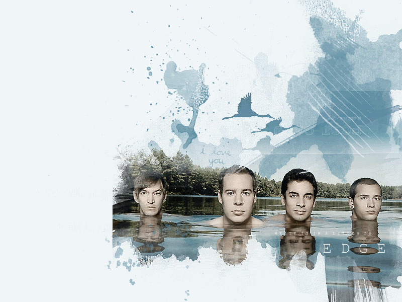
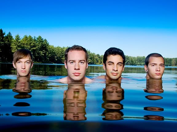
Norrel ~> You did that on Paint? I like your set. I like the bright colors. ^^
moogie ~> Mm, I like your set. The colors seem muted and soft...and a little gray looking. So it fits with the title. I like your font and I like how you arranged it on your avatar. ^^
You got a lot of people in that sig, but some people are cut off.
I like the simplicity of your set especially since you had so many people in it.
Fri Dec 23, 2005 4:02 am
Moogie-HOMG LOVE IT! Greys...-drools- Liek the lines on it, you've done a good job with a mean pic, too. (I've tried to work with that image...nasty bugger) The only think that bugs me is the text on the av....it just looks weird.
(can I use that set..pretty please? ^-^)
(can I use that set..pretty please? ^-^)
Fri Dec 23, 2005 3:48 pm
Moogie I DID rate a set, I rated Requiem's :-/
Sweet Pea No, I was saying to Requiem the set is good for paint, I was'nt saying MY set was made in Paint [/b]
Requiem Er, basically what ever I said before, nice use of mixing two programs.
Rate this Please


Sweet Pea No, I was saying to Requiem the set is good for paint, I was'nt saying MY set was made in Paint [/b]
Requiem Er, basically what ever I said before, nice use of mixing two programs.
Rate this Please
Wed Dec 28, 2005 1:53 pm
Norrel I like the colours and the text with the image. But it seams a bit simple because the noise is easly seen in the image.
I still like it. 9.5/10
----
I know. My image cuts off, but it is a part of my lj layout that I am working on.
Please rate.
Original Image: Click
I still like it. 9.5/10
----
I know. My image cuts off, but it is a part of my lj layout that I am working on.
Please rate.
Original Image: Click
Fri Jan 06, 2006 6:04 am
Wow Noelle, I love how your image just blends into everything. Also, the effect you did on the people was really cool. I love the color scheme, and it looks like you smoothed the image, then sharpened it to get that really cool looking effect. Lovely brushing, it just flows really well!
--


Rate? =D
Original Image:
http://www.kobayan.jp/location_test/ima ... 13-03l.jpg
--
Rate? =D
Original Image:
http://www.kobayan.jp/location_test/ima ... 13-03l.jpg
Sat Jan 14, 2006 12:34 am
WIS
I took me quite a while to figure out what you posted. I think I got it right: a motorcycle? Making it reveal itself more somehow, maybe by defining itself better from it's backround might help. However, I liked the effect of the words/letters that doesn't quite show what's written.
Noelle
I love it, I mean it was simply put before, it blends into everything. It be off the hook if you can take out the cuts from the side and just fade them into whatever.
--
Rate this work please?
Any improvements appreciated.
Tue Jan 17, 2006 2:13 am
Someone rate this?
Yoshi edit: Please make sure to rate someone else's work before asking for ratings, thanks.
More Orlagh love...title of one of her songs is the text.
Paint & Transparency, as always.
Yoshi edit: Please make sure to rate someone else's work before asking for ratings, thanks.
More Orlagh love...title of one of her songs is the text.
Paint & Transparency, as always.
Tue Jan 17, 2006 3:10 am
Is this thread dead or usually slow 
Sat Jan 21, 2006 3:50 am
It's always slow.
Tue Jan 24, 2006 2:42 pm
Random Havoc wrote:WIS
I took me quite a while to figure out what you posted. I think I got it right: a motorcycle? Making it reveal itself more somehow, maybe by defining itself better from it's backround might help. However, I liked the effect of the words/letters that doesn't quite show what's written.
Noelle
I love it, I mean it was simply put before, it blends into everything. It be off the hook if you can take out the cuts from the side and just fade them into whatever.
--
Rate this work please?
Any improvements appreciated.
I really don't mean to nag but this is ridiculous. PPT is the only place I know where experts can help me out, but 11 days for a rating?