Fri Sep 24, 2004 2:24 pm
Requesting: A set
Av Size: 80 by 80
Av Text: fairytales..
Sig Size:
Sig Main Text: fungi
Sig Sub-Text: fairytales are lies; believe me
Picture URL: http://img.photobucket.com/albums/v298/ ... _tales.jpg
Interests: nature, fairytale-related pictures
Colour Scheme:
Other: things that make it better with my theme "fairytales are lies; believe me"
thanks!
Sat Sep 25, 2004 10:10 am
Mistress Morbid and Fungi, I've picked up both your requests. I'll attempt to have them done ASAP.
Sun Sep 26, 2004 2:31 am
Hey, Elurial.
I need a set for the season and as soon as I saw the picture I wanted.. I thought,"Now Elurial could make this happen!". So I desided to go with my guts and request from you.
I do not know when I will start to use this..probably once I used the first three winners from my set contest.. I'll probably use it in the middle of October if thats okay.
Requesting: Set
Av Size: N/A
Av Text: Medli
Sig Size: N/A
Sig Main Text: Medli
Sig Sub-Text: I'm not sure.. something to fit the season, but nothing way Halloween related since I don't celebrate it. (I celebrate Fall harvesting instead. )
)
Picture URL: http://www.laprensa-sandiego.org/archie ... 17/pie.jpg
Interests: Pumpkins.
Colour Scheme: Orange, yellow, red.. you know the works!
Other: Could there maybe be something like a pumpkin patch in the background?
Thank you very much if you can do this!
PS: If the piece of pie isn't working with you or you like this better, I adore this: http://images.neopets.com/items/food_ha ... potpie.gif.
I need a set for the season and as soon as I saw the picture I wanted.. I thought,"Now Elurial could make this happen!". So I desided to go with my guts and request from you.
I do not know when I will start to use this..probably once I used the first three winners from my set contest.. I'll probably use it in the middle of October if thats okay.
Requesting: Set
Av Size: N/A
Av Text: Medli
Sig Size: N/A
Sig Main Text: Medli
Sig Sub-Text: I'm not sure.. something to fit the season, but nothing way Halloween related since I don't celebrate it. (I celebrate Fall harvesting instead.
Picture URL: http://www.laprensa-sandiego.org/archie ... 17/pie.jpg
Interests: Pumpkins.
Colour Scheme: Orange, yellow, red.. you know the works!
Other: Could there maybe be something like a pumpkin patch in the background?
Thank you very much if you can do this!
PS: If the piece of pie isn't working with you or you like this better, I adore this: http://images.neopets.com/items/food_ha ... potpie.gif.
Mon Sep 27, 2004 4:31 am
i loev your stuff!! so pretty hears what i would like if posable, thanks allot  ....
....
sig...
pic: http://www.thefairestlady.com/audrey/ga ... awing1.jpg
color theme: not shure realy, i guess just work around the pic coulors.
border: might be neat to have some cutouts, but i'm not shure it needs aney, use youre discresion i guess...
animations: http://www.thefairestlady.com/audrey/ga ... imated.gif
text: i want the animation as the main text, and then my name as sub text
font: something close to the animation, or something realy plain to contrast it.
...not shure if thats what you need for the animation or not...
also, would like it rufley the same size/shape as my current sig, mabey a little bigger, but if thats compleatly undoable thats fine
av...
pic: either the pic, or the animitation, but i dont know that it needs both
coulor theam: same, pic coulors, or just the animation. just realy simple, thats all,
bordes: same
animations:none unless you use the animation
so you get it right? if their are aney probloms pm me,
Mon Sep 27, 2004 11:49 pm
For Mistress Morbid:


Well, here's my attempt at your set. It's nothing spectacular, but I like it. And it's the first time I've used cutouts in a while.
Anywho... 2 things. You'll notice I didn't use a spiky border. I liked the barbed wire border you used in the original sig, but I nothing I tried came out the way I wanted it. So, I resorted to a normal straight line border.
Second, I know you said you wanted a black and white set (with a little grey if needed), but I couldn't resist dotting the is in your name with red. I didn't think it would hurt too much since her eyes are red anyway.
For Fungi:


I have to be honest... I wasn't 100% certain of what you meant when you said that you wanted the set to fit with your subtext. So, I just picked an idea and ran with it. Although, I'm not entirely sure what the idea was...
Still, I think this turned out really well. I would never have thought of using yellow on grey under normal circumstances, but strangely, they work really well together. Oh, and I absolutely adore the way your name turned out in the signature!
For Lady Fair:


This was officially the biggest, hardest set I've ever made, I think... and at one point, I almost regretted accepting the challenge. Still, I pushed through and I'm fairly happy with how it turned out.
I have a feeling there's a small jerk in the animation, but I couldn't find what frame it was in... but if it's there, it is only small and I don't think it hurts too much. Also, I added a fade at the end of the signature so that the animation didn't just snap back to the start... it flows instead.
Anyway, I hope these are what you were all looking for. Like it says in my main post, layered sets are kept for 1 week so if there are any changes you'd like made, please let me know before then.
Also, Medli, I have picked up your set and I am working on it... I just thought I'd take a little bit of time with it since it's not super-duper urgent. Hope that's okay.
Well, here's my attempt at your set. It's nothing spectacular, but I like it. And it's the first time I've used cutouts in a while.
Anywho... 2 things. You'll notice I didn't use a spiky border. I liked the barbed wire border you used in the original sig, but I nothing I tried came out the way I wanted it. So, I resorted to a normal straight line border.
Second, I know you said you wanted a black and white set (with a little grey if needed), but I couldn't resist dotting the is in your name with red. I didn't think it would hurt too much since her eyes are red anyway.
For Fungi:
I have to be honest... I wasn't 100% certain of what you meant when you said that you wanted the set to fit with your subtext. So, I just picked an idea and ran with it. Although, I'm not entirely sure what the idea was...
Still, I think this turned out really well. I would never have thought of using yellow on grey under normal circumstances, but strangely, they work really well together. Oh, and I absolutely adore the way your name turned out in the signature!
For Lady Fair:
This was officially the biggest, hardest set I've ever made, I think... and at one point, I almost regretted accepting the challenge. Still, I pushed through and I'm fairly happy with how it turned out.
I have a feeling there's a small jerk in the animation, but I couldn't find what frame it was in... but if it's there, it is only small and I don't think it hurts too much. Also, I added a fade at the end of the signature so that the animation didn't just snap back to the start... it flows instead.
Anyway, I hope these are what you were all looking for. Like it says in my main post, layered sets are kept for 1 week so if there are any changes you'd like made, please let me know before then.
Also, Medli, I have picked up your set and I am working on it... I just thought I'd take a little bit of time with it since it's not super-duper urgent. Hope that's okay.
Mon Sep 27, 2004 11:58 pm
Thank you so much Elurial! I really like how it turned out, great job!
I just thought of something that might look cool for the border, if you wanted to try it. What about just a bar that's black and white striped, with some shading so it's not just flat? I hope that made sense. If not I can try to describe it better for you, or make a quick diagram.
Edit: Here's an extremely quick sketch thing just to show you the basic idea. If you think it would look cool, go ahead and try, but if not don't worry about it, it looks fine the way it is.
http://img.photobucket.com/albums/v51/mistressmorbid/Random/border.bmp
Tue Sep 28, 2004 7:45 am
i am so increadibly happy with it, you have no idea, i think it's so beautiful. it's even better than i had hoped for, i'm so happy with it  !!!! thank you so much for doing it even though it was tricky. and you got it done so quickly, i realy didn't expect to have it before next week. but i love it, and it's beautiful. thank you so much, and i'm sorry it was so difficult
Tue Sep 28, 2004 1:18 pm
thanks a bunch, Elurial! i like the way my name turns out in the sig too!
About the subtext, well, i am also not very sure about it when i read it now.. haha.. i think i was trying to have the effect that i'm telling something halfway, and the full text can be found in my sig =)
well, i guess it'll be same in both ways. and i think it'll also look strange if i put part of my sig in my av instead of my name.
ok thanks a lot really!
Tue Sep 28, 2004 4:00 pm
I've been dying to request from you for a while, I just had no idea what I wanted!
Requesting:
Av Size: Your choice
Av Text: Twinkle
Sig Size: Your choice again
Sig Main Text: Twinkle
Sig Sub-Text: Walk with me down the pathway of life and into the light.
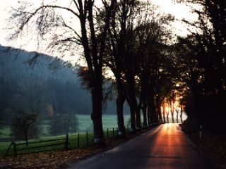
Picture URL: http://img.photobucket.com/albums/v253/ ... e/walk.bmp
Interests: Autumn
Colour Scheme: Autumny colours and kind of misty if you can manage it
Thanks loads in advance!
Requesting:
Av Size: Your choice
Av Text: Twinkle
Sig Size: Your choice again
Sig Main Text: Twinkle
Sig Sub-Text: Walk with me down the pathway of life and into the light.
Picture URL: http://img.photobucket.com/albums/v253/ ... e/walk.bmp
Interests: Autumn
Colour Scheme: Autumny colours and kind of misty if you can manage it
Thanks loads in advance!
Tue Sep 28, 2004 5:23 pm
Elurial wrote:Also, Medli, I have picked up your set and I am working on it... I just thought I'd take a little bit of time with it since it's not super-duper urgent. Hope that's okay.
Thats just fine.
Fri Oct 01, 2004 6:19 am
Your sets are so impressive!
Requesting: Set
Av Size: 80x80
Av Text: Medusa
Sig Size: 250x80
Sig Main Text: Medusa
Sig Sub-Text: Remember what peace there may be in silence...
Picture URL: http://img.photobucket.com/albums/v257/ ... e/1348.jpg
Interests: Neverwinter Nights, fantasy creatures (faeries, etc).
Colour Scheme: Blacks, blues, whatever goes with the image.
Other: Not in any hurry, take your time and feel free to use plenty of creative license
Thankyou very much!
Sat Oct 02, 2004 10:21 am
For Medli:


This set is definitely very... orange. HeHe.
Just so you know, I tried so hard to make something that worked using the slice of pie you gave me, but I just kept coming up blank. In the end, I went with the Pumpkin Pot Pie, found a nice-looking pumpkin patch and put the two together.
And I think it came out looking rather... tasty. I don't even like pumpkin. HeHe.
For Twinkle:


Hmm... 2 sets using the same font? Outrageous! HeHe.
Anywho, this was a simple set. I didn't do much, just changed the colours - but only because you said you wanted it to be autumnal. I think it would've looked good either way.
Sorry I didn't make it misty, like you wanted. I just could not fathom how to do it. Although the original image was sort of misty to begin with, so it sorta works.
Anyway, much golden-orange autumnal cheer all round!
And remember, layered sets are kept for 1 week, so if there are any changes you'd like made, please let me know as soon as possible.
This set is definitely very... orange. HeHe.
Just so you know, I tried so hard to make something that worked using the slice of pie you gave me, but I just kept coming up blank. In the end, I went with the Pumpkin Pot Pie, found a nice-looking pumpkin patch and put the two together.
And I think it came out looking rather... tasty. I don't even like pumpkin. HeHe.
For Twinkle:
Hmm... 2 sets using the same font? Outrageous! HeHe.
Anywho, this was a simple set. I didn't do much, just changed the colours - but only because you said you wanted it to be autumnal. I think it would've looked good either way.
Sorry I didn't make it misty, like you wanted. I just could not fathom how to do it. Although the original image was sort of misty to begin with, so it sorta works.
Anyway, much golden-orange autumnal cheer all round!
And remember, layered sets are kept for 1 week, so if there are any changes you'd like made, please let me know as soon as possible.
Sat Oct 02, 2004 2:59 pm
Oh my gosh! That's beautiful! Thank you sooooo much! *tootles off to upload it*
Sat Oct 02, 2004 6:12 pm
Dude, you rock.
*huggles set* Its great. Thanks so much!
Time for a secret.. I don't like pumpkins either and I want to eat it too.
*huggles set* Its great.
Time for a secret.. I don't like pumpkins either and I want to eat it too.
Mon Oct 04, 2004 2:55 am
Just cheaking out some of the work of those that I don't know, very good job your doing Elurial keep it up!