Sat Jul 23, 2005 6:07 am

Sat Jul 23, 2005 8:09 am
Sat Jul 23, 2005 1:16 pm
I might edit this but I don't know if I'll have time before the deadline:
Wallpaper: http://www.melisande.nl/ppt/girl3.png
Origninal: http://www.melisande.nl/ppt/original.png
Programs used: Photoshop 7
Wallpaper: http://www.melisande.nl/ppt/girl3.png
Origninal: http://www.melisande.nl/ppt/original.png
Programs used: Photoshop 7
Sat Jul 23, 2005 8:09 pm
This is really bad, but whatever. 
Wallpaper: http://www.freepgs.com/spunky/bgs/ppttg_wallpaper2.png
Original Images: Main, Sparkles
Program usesd: GIMP 2.2
Wallpaper: http://www.freepgs.com/spunky/bgs/ppttg_wallpaper2.png
Original Images: Main, Sparkles
Program usesd: GIMP 2.2
Sun Jul 24, 2005 2:01 am
Just a little note I'm leaving to go on vacation on the 1st of august (i'll be gone until the 8th) I MIGHT have internet acces, but since I'm not sure I would like to have the next assignment before i leave in case I get through this round. Do I need to pm this or is this okay aswell?
Nevermind I found the answer. *runs off to pm*
Nevermind I found the answer. *runs off to pm*
Sun Jul 24, 2005 3:29 am
Okay, I've used a bunch of pictures, so please bear with me. lol

(Click image for full size)
Program: PS 7.0
Pictures: Kermit, K+P1, Miss Piggy1, Miss Piggy2, K+P2, K+P3, Miss Piggy3

(Click image for full size)
Program: PS 7.0
Pictures: Kermit, K+P1, Miss Piggy1, Miss Piggy2, K+P2, K+P3, Miss Piggy3
Last edited by Jasujo on Sun Jul 24, 2005 9:37 am, edited 1 time in total.

Sun Jul 24, 2005 7:03 pm
Judges, choose 4.
Scholastic
Wallpaper
Image: http://www.calamusic.de/___DOWNLOADS___ ... _white.jpg
Program Used: Adobe Photoshop 7.0
LAQ
Wallpaper
Images: http://www.freepgs.com/spunky/bgs/030.jpg
http://www.freepgs.com/spunky/bgs/023.jpg
Program Used: GIMP 2.2
InsanePlushie
Wallpaper
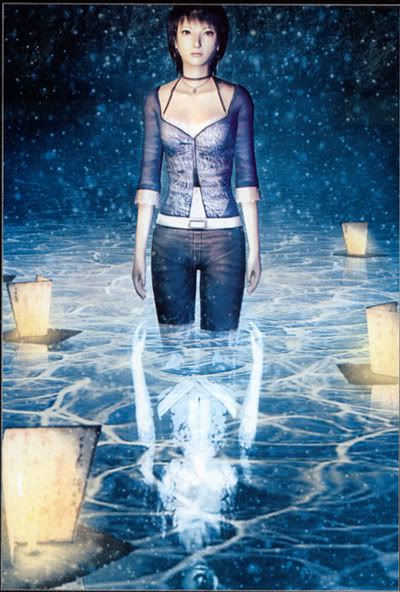
Image: http://www.melisande.nl/ppt/original.png
Program Used: PS 7
Neko
Wallpaper
Image: http://img.photobucket.com/albums/v199/ ... izu_01.jpg
Program Used: PS CS 2
mazil
Wallpaper
Images: http://www.ninjaturtles.com/wall/1024meditate.jpg
http://www.sxc.hu/browse.phtml?f=view&id=296236
http://www.sxc.hu/browse.phtml?f=view&id=7345
Apricus
Wallpaper
Image: http://venus.walagata.com/w/apricus/sandiegopic10.jpg
Program Used: PSP 8
jaye
Wallpaper
Program Used: PS 7
Jasujo
Wallpaper
Program Used: PS 7
Images: http://tim.arlott.com/wallpaper/kermit-banjo.jpg
http://tim.arlott.com/wallpaper/mp03.gif
http://tim.arlott.com/wallpaper/miss-piggy-sticker.jpg
http://tim.arlott.com/wallpaper/kissy_1mspiggy.jpg
http://tim.arlott.com/wallpaper/207-emmy7.jpg
http://tim.arlott.com/wallpaper/images2Fcutecoupb.jpg
http://tim.arlott.com/wallpaper/piggy.jpg
timkhj
Wallpaper
Program Used: PS 7
Images: http://tim.arlott.com/wallpaper/src1.jpg
http://tim.arlott.com/wallpaper/src2.jpg
http://tim.arlott.com/wallpaper/src3.jpg
http://tim.arlott.com/wallpaper/src4.gif
Scholastic
Wallpaper
Image: http://www.calamusic.de/___DOWNLOADS___ ... _white.jpg
Program Used: Adobe Photoshop 7.0
LAQ
Wallpaper
Images: http://www.freepgs.com/spunky/bgs/030.jpg
http://www.freepgs.com/spunky/bgs/023.jpg
Program Used: GIMP 2.2
InsanePlushie
Wallpaper
Image: http://www.melisande.nl/ppt/original.png
Program Used: PS 7
Neko
Wallpaper
Image: http://img.photobucket.com/albums/v199/ ... izu_01.jpg
Program Used: PS CS 2
mazil
Wallpaper
Images: http://www.ninjaturtles.com/wall/1024meditate.jpg
http://www.sxc.hu/browse.phtml?f=view&id=296236
http://www.sxc.hu/browse.phtml?f=view&id=7345
Apricus
Wallpaper
Image: http://venus.walagata.com/w/apricus/sandiegopic10.jpg
Program Used: PSP 8
jaye
Wallpaper
Program Used: PS 7
Jasujo
Wallpaper
Program Used: PS 7
Images: http://tim.arlott.com/wallpaper/kermit-banjo.jpg
http://tim.arlott.com/wallpaper/mp03.gif
http://tim.arlott.com/wallpaper/miss-piggy-sticker.jpg
http://tim.arlott.com/wallpaper/kissy_1mspiggy.jpg
http://tim.arlott.com/wallpaper/207-emmy7.jpg
http://tim.arlott.com/wallpaper/images2Fcutecoupb.jpg
http://tim.arlott.com/wallpaper/piggy.jpg
timkhj
Wallpaper
Program Used: PS 7
Images: http://tim.arlott.com/wallpaper/src1.jpg
http://tim.arlott.com/wallpaper/src2.jpg
http://tim.arlott.com/wallpaper/src3.jpg
http://tim.arlott.com/wallpaper/src4.gif
Mon Jul 25, 2005 4:36 am
Flame, where's my submission? It's on page 8, and I'm the first person who submit it if I remember correctly. 
Mon Jul 25, 2005 5:55 am
Fixed it.Scholastic wrote:Flame, where's my submission? It's on page 8, and I'm the first person who submit it if I remember correctly.
Mon Jul 25, 2005 10:56 am
Just to let you all know I'll be away until Friday (possibly Saturday). Therefore you might want to skip my judgings this round, or then wait for me. I'm fine with both options 
Mon Jul 25, 2005 11:30 pm
Apricus: This one is very simple, I can see you boosted the contrast and colors and did a few filter effects, but the majority of this wallpaper is really empty. The background is interesting enough not to be plain, but not distracting, but it's more toward the plain side, try dressing it up a little with more prominent brushwork. 8/10
InsanePlushie: I like the grungy wild look of this wallpaper, it sort of reminds me of dramatic studio illustrations. Overall, a nice artistic look, but it's really just a bunch of filters and a color overlay, try some more effects to add interest. 7/10
Jasujo: This one is actually quite cute, even if it's rather plain. The heart shapes are a little messy, it might be better to use a preset heart shape instead of drawing it yourself, as I'm guessing you did. As for the pictures, the one on the bottom left side irks me a bit because of the dark pink lines running across the edges, it would look much cleaner if you airbrushed them out. The background is very plain, the canvas texture is hardly noticeable at all, and it's so uniform that it hardly fills space. 6/10
_jaye_: I recognized this wallpaper on sight, and I am not very pleased. ( Zephyr © Shinta/Imanimetions ) Even though I presume you redid all the work yourself, it is still a very close copy, which is widely considered stealing. 0/10
LAQ: This is very pretty and bright, but you really depended too heavily on the original images. From what I can see, you adjusted the levels of the first picture, then extended the background to the canvas size, and then added the sparkles from the other picture over it. It's a pretty overall effect, but overall, mostly someone else's work. 5/10
mazil: I like this one quite a bit, despite it's simplicity, it really has a nice serene look. It's nice to see that you did some of your own work and accented it with the stock photos. Still, the stock photos are much more prominent than what you did. 6/10
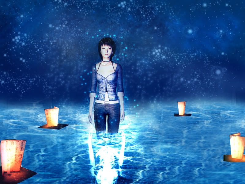
Neko: This wallpaper is very very similar to the original picture, a nice job imitating it. The reflections in the water are a little unnatural looking, probably because you had so very little to copy. You did a pretty nice job filling up the space, but the floating lanterns are sort of off looking because the extraction is a bit sloppy. 7/10
Scholastic: I like the dark gothic look of this wallpaper, but it's all rather plain looking, despite all the effects you added to it. I think it has to do with all the brushwork, it's not very eyecatching at all. The background is a little plain too. Overall, this looks a bit boring, perhaps you should have tried some color. 6/10
timkhj: I've said in previous rounds, and I will repeat again, it is unprofessional and impolite to use fanmade wallpapers as source images, particularly in this case because one of them employs fanart. Screenshots don't make great source images for wallpapers either, since they're usually very low resolution, and it can be seen in this wallpaper. Overall, I think you had an interesting idea here, but it all looks a bit sloppy because of the blurry screenshot in the background. 6/10
I vote out _jaye_, LAQ, Scholastic, and timkhj.
InsanePlushie: I like the grungy wild look of this wallpaper, it sort of reminds me of dramatic studio illustrations. Overall, a nice artistic look, but it's really just a bunch of filters and a color overlay, try some more effects to add interest. 7/10
Jasujo: This one is actually quite cute, even if it's rather plain. The heart shapes are a little messy, it might be better to use a preset heart shape instead of drawing it yourself, as I'm guessing you did. As for the pictures, the one on the bottom left side irks me a bit because of the dark pink lines running across the edges, it would look much cleaner if you airbrushed them out. The background is very plain, the canvas texture is hardly noticeable at all, and it's so uniform that it hardly fills space. 6/10
_jaye_: I recognized this wallpaper on sight, and I am not very pleased. ( Zephyr © Shinta/Imanimetions ) Even though I presume you redid all the work yourself, it is still a very close copy, which is widely considered stealing. 0/10
LAQ: This is very pretty and bright, but you really depended too heavily on the original images. From what I can see, you adjusted the levels of the first picture, then extended the background to the canvas size, and then added the sparkles from the other picture over it. It's a pretty overall effect, but overall, mostly someone else's work. 5/10
mazil: I like this one quite a bit, despite it's simplicity, it really has a nice serene look. It's nice to see that you did some of your own work and accented it with the stock photos. Still, the stock photos are much more prominent than what you did. 6/10
Neko: This wallpaper is very very similar to the original picture, a nice job imitating it. The reflections in the water are a little unnatural looking, probably because you had so very little to copy. You did a pretty nice job filling up the space, but the floating lanterns are sort of off looking because the extraction is a bit sloppy. 7/10
Scholastic: I like the dark gothic look of this wallpaper, but it's all rather plain looking, despite all the effects you added to it. I think it has to do with all the brushwork, it's not very eyecatching at all. The background is a little plain too. Overall, this looks a bit boring, perhaps you should have tried some color. 6/10
timkhj: I've said in previous rounds, and I will repeat again, it is unprofessional and impolite to use fanmade wallpapers as source images, particularly in this case because one of them employs fanart. Screenshots don't make great source images for wallpapers either, since they're usually very low resolution, and it can be seen in this wallpaper. Overall, I think you had an interesting idea here, but it all looks a bit sloppy because of the blurry screenshot in the background. 6/10
I vote out _jaye_, LAQ, Scholastic, and timkhj.
Thu Jul 28, 2005 8:51 pm
Ahem... came back earlier than expected, I honestly thought more of the judges would be finished already by now but hey, I'm not complaining.
Scholastic - Well, in a way I like this, it's simple and you've combined dark colors with light ones in a good way. Still I must say nothing "excites" me about this wallpaper, then again maybe it's just me.
LAQ - Well done, however I think you could have put more strength into the image on the right, for now the wallpaper is too bright everywhere and my eyes don't like it.
InsanePlushie - Not a style I personally like, but I do give you credit for the good job you've done. Maybe leaving some part with more detail would have been good, having the grungy style over the whole wallpaper makes it a bit too monotonous.
Neko - I'm thinking there's just a bit too much contrast in there. And al though I understand computer animation is always computer animation I still don't like the very square-ish small boats. Good job on extending the picture though.
mazil - Very well done, yet again. One problem though, according to me; I think that the image in the middle is too strong put on such a weak background. The colors mix well and I like that you used images for the background texture, but still maybe some more visible swirls with stronger colors wouldn't do any harm.
Apricus - All in all I think this is pretty good. However, there's this rule that says that you should ever place a horizon in the middle of any picture (including photos), and I suppose I have to agree with it even considering this wallpaper. I think you should have placed it a bit lower down on th pic, not entirely on the bottom of course.
_jaye_ - Considering what Marissa wrote, I don't think there is much I can add. As for the wallpaper just as a wallpaper I really don't see the function or esthetic-ness of the orange and blue blobs in the upper left corner. The glowing effect is very grainy in some places, but other than that I like it.
Jasujo - Cute idea, but other than that I'm not particularly fond of this as a piece of art. The texture you placed over the whole image would be better if you had not placed it over the images themselves (the hearts and Kermit). The shape of the hearts is awfully scruffy, regarding their edges I mean. A bit more work with the original images, such as contrast, light and color balance wouldn't hurt.
timkhj - I don't like the fact that you used wallpapers for your wallpaper. Other than that screenshots are never the best options for large graphics since they have a bad image quality which is still visible in the wallpaper you made. The way you have pasted two of your used images onto the silhouette is not the best.
My votes go to Scholastic, _jaye_, Jasujo and timkhj.
Fri Jul 29, 2005 12:26 am
<b>Scholastic</b> -- While I think the effects and overlays you added look great, I think the thing in the center is too flat for the rest of the background. It would've worked better had you tucked the logo thing underneath something that blocks out the blinding white, which also would've added some depth to the image.
<b>Laq</b> -- I love the colors and the dreamy thing you've got going on here, but overall, it's just really bright. I set it as my wallpaper for awhile, and it kind of hurts my eyes.
<b>InsanePlushie</b> -- I'm not a huge fan of the color scheme, but I actually really like what you did with this image. The artistic filters are pretty cool and it seems like the contrast is enough to bring out certain parts of the wallpaper.
<b>Neko</b> -- The image you chose to work with is of rather poor quality and I can see it in the wallpaper. It's grainy and looks washed out. I'm glad you made everything brighter, but it still doesn't improve the quality of the image.
<b>mazil</b> -- Awesome! I never would've figured that you used such odd images for texture. It looks fantastic. The only complaint I have is that Splinter looks a little out of place because the background seems more grungy (for lack of a better word) than he is.
<b>Apricus</b> -- Gorgeous. The only thing that bothered me was that the bit right under the tallest building doesn't fade into itself as well as the parts above the skyline.
<b>Jaye</b> -- I don't like the blue and orange lens flare things at the top left; they don't really go with the rest of the colors. I can see that you used the star brush to make some of the sparkles along the wispy things; those brushes are too messy to use with something so elegant. [edit] I was just alerted to check Marissa's ratings. Now, while I understand that taking ideas from other places and copying things is how we learn to do graphics (that is indeed how tutorials work), I personally wouldn't have submitted a replica to PPTTG though. In the future, do the replications as practice, but make graphics that are truly yours for everything else.
<b>Jasujo</b> -- This is really cute. However, I think you should've used the canvas effect underneath the pictures instead of on top of everything. Also, your hearts look a little uneven in some parts. Try using the custom shape tool next time. Lastly, there isn't any space for icons. I set this as my wallpaper, and though I suppose I could a couple icons in the corners, it just doesn't work out too well.
<b>timkhj</b> -- I really like the idea behind this wallpaper; it's very creative. However, the background is way too blurry, and it's very obvious when the silhouette has such crisp edges. It looks rather plain as well. You should've added some brushes or an overlay or something to give it a little texture. Also, I think you should've scooted the guy doing the flippy thing over to the right more so that he wouldn't be cut off; his current placement feels a little unbalanced. Side note: the eyes in the silhouette's head freak me out.
My votes go to Neko, Jaye, Jasujo, and timkhj.
Fri Jul 29, 2005 7:22 am
Scholastic: It looks okay, but the center element and the flower patterns you used on the corners don't really match. The center ends up being flat but also sticking out- it seems like it could just be the floral wallpaper with that stuck right on top with a glow, you know what I mean? Intertwine it with everything else a little bit. Maybe a few sporadic pricks of colour would work too, just to make something pop out.
LAQ: Veeeery bright. Not too good of a choice for something that you could potentially be staring at for long periods of time. The colours are nice though, I have to say. I also see a tad of repetition- you used those sparkles from the second picture twice. Some variation would be nice- flipping, rotating, etc.- something that'll change it up and make it look as though it was really part of the wallpaper.
InsanePlushie: Hm, unlike the others...I kinda like the colours here, haha. Kinda reminds me of a horror flick ad or something like that. I really like the fact that the mood looks completely different than that of the original, at least in my opinion it does.
Neko: You did a pretty good job of extending the picture, it works. It is a bit too contrasted though... Anyway, I notice that the lanterns' reflections are gone. That really brings down the realistic look of it, which is a shame, but I guess it'd be very hard, while possible, to replicate reflections while extending the picture, ne? Thus, the lanterns really stick out (also because they've got white edges left from cutting it out), and it's rather distracting from everything else. So the wallpaper's got great potential...it's just not really there.
mazil: Oooh. Never would've known those were stock photos. Anyway, just a couple things- I think the dude sticks out a tad, either that or the white "light" behind him isn't strong enough. It could also be a tad more green and bright to make more of a zen look, as some places make it look kinda stark.
Apricus: Very nice. I'll have to agree with Silja there on the placement issue- my sister being a photography lover, I've been told many times never to center things. Other than that, the colours are awesome, not too bright, and everything works pretty well for a desktop wallpaper.
_jaye_: Hmm, I also recognised the influence of your entry from first sight. All that aside, it's decent, but not great, aesthetically. The yellow circle lens flare at the top left corner is awfully out of place. The colours are nice, and some of the wispy things accentuate it well, but it seems a little overkill on the topmost "tentacle" or whatever you call it. I think the save format killed a bit of the quality- the sparkles are pixelly as is the lens flare at the bottom, which I think would've worked out. As neat as this could've been, it would have been much better if you had submitted something original, or something more stylised and developed from this idea.
Jasujo: I really like the idea of this one. Reminds me of a photo album. However, it could be better executed though if you were to remove the canvas texture from each of the heart photos. I think the jaggedness of the heart shapes are fine, kinda gives it a cut-out photo touch. A preset shape still would've been better, but what you have does work. I do agree on the bottom left one, as well as the top left, having its borders airbrushed.
timkhj: Oooh...a good idea downplayed by bad image quality. Eep. The background is pixellated- something much better is definitely needed. I really like your idea of putting stuff in a silhouette, I've never really seen it before and it looks awesome. Just move the handstanding dude to the right a bit (you can compromise cutting off a bit of the sword). It did take me awhile to figure out the weird eyes at the head though. But nonetheless, this wallpaper really suffers from the quality issues.
My votes go to Scholastic, Neko, _jaye_, and timkhj.