Wed Aug 18, 2004 9:02 pm
Koku wrote:hellyer wrote:Urgh, I hate making anime sets. Does anyone have any good websites with anime resources? I would search on google but i got all this porn last time...so yeah any help would be apreciated.
Search with phrases like "anime" "anime image archives", and series names on google.
And if I'm looking for a certain character, like I did for one picture for today...I did:
Cowboy Bebop Faye Valentine
It works with just about any anime. Or you can use the Yahoo image search.
Wed Aug 18, 2004 9:33 pm
Done with set! 
 >_>
>_>
Image from: http://www.melissadollies.net/pitaten/gallery/pita3.jpg <-- Not fancy link.. XP
Program used: Photoshop 7.0 + MS paint
Edit.. another edit again like last time. o_o;;
I always use MS paint for cutouts. Forgot to say I used paint for the cutouts last time too... o_o()
>_>
Image from: http://www.melissadollies.net/pitaten/gallery/pita3.jpg <-- Not fancy link.. XP
Program used: Photoshop 7.0 + MS paint
Edit.. another edit again like last time. o_o;;
I always use MS paint for cutouts. Forgot to say I used paint for the cutouts last time too... o_o()
Thu Aug 19, 2004 4:02 pm
Didn't take as long as my first set.


Picture: http://thoiathoing.250free.com/FayePPTTGmainpic.jpg
Program: Paint Shop Pro 8
Picture: http://thoiathoing.250free.com/FayePPTTGmainpic.jpg
Program: Paint Shop Pro 8
Last edited by DM was on fire! on Thu Aug 19, 2004 8:02 pm, edited 1 time in total.
Thu Aug 19, 2004 4:35 pm


Image Used: http://www.boyis.com/html/show.php?code ... 9mMDYuanBn
Program Used: Adobe Photoshop CS
EDIT: I just went through and saw that I used the same picture as Destiny did. Should I make a new set with a new picture, or keep this one? (BTW, Destiny's is soooooooooooo much better than mine (good job).
Fri Aug 20, 2004 1:50 am
bluehawaii19 wrote:EDIT: I just went through and saw that I used the same picture as Destiny did. Should I make a new set with a new picture, or keep this one? (BTW, Destiny's is soooooooooooo much better than mine (good job).
You using the same image as Destiny isn't a problem.
Sat Aug 21, 2004 3:19 am
Sat Aug 21, 2004 9:48 pm
Judges, once again rate and choose two people who you think don't qualify for the next round.
Amethyst


Image: http://img.photobucket.com/albums/v31/l ... 59/119.jpg
Program Used: Photoshop Elements
Shifty

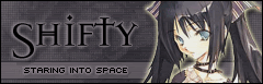
Image: http://img.photobucket.com/albums/v46/a ... 4a353c.jpg
Program Used: Adobe Photoshop
Koku


Image: http://img.photobucket.com/albums/v35/e ... itsuki.jpg
Program Used: Adobe Photoshop 7
paola

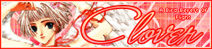
Image: http://img.photobucket.com/albums/v33/p ... clover.jpg
Program Used: Adobe Photoshop 7.0
Neko

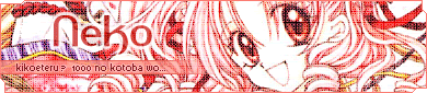
Image: http://img.photobucket.com/albums/v199/ ... 546456.jpg
Program Used: Adobe Photoshop CS
Neopets Addict


Image: http://img.photobucket.com/albums/v36/T ... Purple.jpg
Programs Used: Photoshop CS & Paint Shop Pro 7
quicksilvery1pore


Image: http://www.csusm.edu/anime/galleries/F- ... g/sexy.jpg
Program Used: Adobe Photoshop 7
polarbearpop


Image: http://www.webster.edu/~cschmitz/welcom ... p/inu2.jpg
Program Used: Adobe Photoshop 6.0
Dobbitron

Image: http://img.photobucket.com/albums/v292/ ... narok6.gif
Program Used: Adobe Photoshop 6
Optimus


Image: http://img.photobucket.com/albums/v55/Burinpu/luffy.jpg
Program Used: Paint Shop Pro 5
Kyra

Image: http://img.photobucket.com/albums/v31/k ... ane/08.jpg
Program Used: Adobe Photoshop 7
Destiny


Image: http://www.boyis.com/html/download.php?id=2423&sort=1#
Programs Used: Paint Shop Pro 7, MS Paint
Rikio
Image: http://www.melissadollies.net/pitaten/gallery/pita3.jpg
Program Used: Photoshop 7.0 + MS paint
Apricus


Image: http://img.photobucket.com/albums/v385/ ... shapic.jpg
Program Used: Paint Shop Pro 8
DM was on fire!
Image: http://thoiathoing.250free.com/FayePPTTGmainpic.jpg
Program Used: Paint Shop Pro 8
bluehawaii
Image: http://www.boyis.com/html/show.php?code ... 9mMDYuanBn
Program Used: Adobe Photoshop CS
Squibble (Feather)


Image: http://img52.exs.cx/img52/2435/wallapaper_s.gif
Program Used: Adobe Photoshop 7
Hellyer


Image: http://aomichi.net/gallery/2001/2001_08.jpg
Program Used: Photoshop 7
Amethyst
Image: http://img.photobucket.com/albums/v31/l ... 59/119.jpg
Program Used: Photoshop Elements
Shifty
Image: http://img.photobucket.com/albums/v46/a ... 4a353c.jpg
Program Used: Adobe Photoshop
Koku
Image: http://img.photobucket.com/albums/v35/e ... itsuki.jpg
Program Used: Adobe Photoshop 7
paola
Image: http://img.photobucket.com/albums/v33/p ... clover.jpg
Program Used: Adobe Photoshop 7.0
Neko
Image: http://img.photobucket.com/albums/v199/ ... 546456.jpg
Program Used: Adobe Photoshop CS
Neopets Addict
Image: http://img.photobucket.com/albums/v36/T ... Purple.jpg
Programs Used: Photoshop CS & Paint Shop Pro 7
quicksilvery1pore
Image: http://www.csusm.edu/anime/galleries/F- ... g/sexy.jpg
Program Used: Adobe Photoshop 7
polarbearpop
Image: http://www.webster.edu/~cschmitz/welcom ... p/inu2.jpg
Program Used: Adobe Photoshop 6.0
Dobbitron
Image: http://img.photobucket.com/albums/v292/ ... narok6.gif
Program Used: Adobe Photoshop 6
Optimus
Image: http://img.photobucket.com/albums/v55/Burinpu/luffy.jpg
Program Used: Paint Shop Pro 5
Kyra
Image: http://img.photobucket.com/albums/v31/k ... ane/08.jpg
Program Used: Adobe Photoshop 7
Destiny
Image: http://www.boyis.com/html/download.php?id=2423&sort=1#
Programs Used: Paint Shop Pro 7, MS Paint
Rikio
Image: http://www.melissadollies.net/pitaten/gallery/pita3.jpg
Program Used: Photoshop 7.0 + MS paint
Apricus
Image: http://img.photobucket.com/albums/v385/ ... shapic.jpg
Program Used: Paint Shop Pro 8
DM was on fire!
Image: http://thoiathoing.250free.com/FayePPTTGmainpic.jpg
Program Used: Paint Shop Pro 8
bluehawaii
Image: http://www.boyis.com/html/show.php?code ... 9mMDYuanBn
Program Used: Adobe Photoshop CS
Squibble (Feather)
Image: http://img52.exs.cx/img52/2435/wallapaper_s.gif
Program Used: Adobe Photoshop 7
Hellyer
Image: http://aomichi.net/gallery/2001/2001_08.jpg
Program Used: Photoshop 7
Last edited by Flame on Sun Aug 22, 2004 6:05 pm, edited 1 time in total.
Sat Aug 21, 2004 10:30 pm
Here it is, sorry:

Sat Aug 21, 2004 10:57 pm
I like what you've done with the place.  Keep it up everyone, especially Flame.
Sun Aug 22, 2004 5:22 am
Ladeeda...Alphabetical again...
Amethyst: I'm slightly inclined to go "Ugh." You use Yoh quite a lot, almost to excess, and you started off with a rather unflattering cap of him. I think all the effects went a bit too far. The blue is VERY strong, and the grunge and diagonal screen are rather distracting. Another problem with the blue is that it's totally uniform across the picture, almost no variation of tones. You could have taken advantage of the uniformity to highlight the text, but I see you chose only to draw attention to your pixel text. There's something else that bothers me about this set, but I can't quite put my finger on it... 7/10
Apricus: Oooh, Full Moon wo Sagasyite, I want to read that. I really like the avatar, the colors are excellent, and the selective dot overlay adds interest to the undetailed areas and highlights the focal point, the daisy. Now, the sig. I'm not sure what happened here, it rather looks like you got lazy. You didn't extract the picture and make a new background, and you didn't extend the existing background. The colors really make that stand out, the original had shades of green (which are still there), and the background you made is purely yellow and white. I'm also not very fond of what you've done to the picture, the median/dust and scratches filter (?) really destroyed all the detail in her hair and the flowers, so now the selective dot overlay looks just odd. The text is also WAY too big, it's really kind of overpowering. I know I always say empty space is bad, but you could have made the text a smaller size and still been okay because of the flowered background. 7/10
bluehawaii: Hm, this is why I don't really approve of working with wallpapers. Without seeing the source picture, it would look like you'd made the colorful background yourself. Since your source started off that way, I don't really think you did anything much with this set, just added a grid overlay and text and a border. 5/10
Destiny: Very nice, everything looks fabulous. The brown and purple look suprisingly good together, and the background text catches your attention without being distracting. However, I sort of don't like the border, the dashes look odd. 9/10
DM was on fire!: Hm, very purple. What really bothers me is the cut off picture on the sig, the cut off part is quite small, and it's part of a symmetrical mask, you could have reconstructed that little bit quite easily. Also, I don't like the fonts. The picture and the purple tinting give this air of elegance, and the scribbly font really clashes with that. 7/10
Dobbitron: I saw your sig tutorial, I guess that's how you do everything. Having a uniform style is alright, but it gets monotonous. Other than that, it looks quite nice, the gold tones are very pretty. My only complaint is the fonts. The one on the sig is really...GIRLY. And the pixel fonts are blurry, this time I think it's because you forgot to uncheck anti-aliasing. 8/10
Hellyer: Uh...I don't know which word you meant, internally or eternally, but either way it's spelled wrong. At first I thought this was another cropped set, but you actually did quite a bit with the picture, it's actually pretty impressive how natural it looks. The font, though, bothers me. I can tell it's supposed to be a rather shaky mixed font, but there's only so much you can do with a preset font. The reason it looks balanced on the Evanescence CD's is because the letters are hand drawn (or at least hand-tweaked), and to get the same look with just a font, you have to hand-tweak it yourself too. The LL is particularly noticeable as odd looking. 9/10
Koku: Oooh, more Full Moon wo Sagasyite! I really like what you did with the picture, it's very...intense. The text is a little hard to read because of the background though, maybe if you clone out the daisies or blur it some. 9/10
Kyra: I know the picture started off rather horizontal, but keeping it that way looks kinda funny. The gradient on the border is a nice touch, but I think it was a little unneccesary. I really like the bubbly background, it matches very well. The display font, though, I don't like. I can see the whole bubbly random thing going on, but it's not really random looking enough. I know it's a problem with the font, but you could have tweaked it yourself to fix that. 7/10
Neko: Hur...the novelty is kinda wearing off... I never really thought the series was THAT popular. I feel like this set is WAY too cluttered with stuff, the picture really stands out, and everything else just kinda recedes into it. Nothing much else to say about it. 7/10
Neopets Addict: This set is really cute. I like the colors, they go very nicely together. Good job extracting the picture and keeping the white stroke, it still looks very smooth. The only thing I don't like about this set is the placement of the subtext, it's pretty low on the sig, and it looks odd. Other than that, this is a really nice set. 9/10
Optimus: Hnn, the image started off pretty good, I don't know why it looks so blurry on the set. I like how you displayed the subtext on the sig, it's very unusual. I actually don't particularly like the border, it's quite distracting. Also, I think the display text on the sig doesn't really match the whole theme of the set. 8/10
paola: Oooh Clamp! I love Clover, the art is especially fabulous. This set is very...girly. All the pink and gold, and the ribbons really add to it. I like the gradient overlay on the text, it catches your attention nicely. I rather don't like your choice of fonts, the pixel text is pretty hard to read, and Monika has HORRIBLY big capitals, I actually think they're quite ugly. So you could always tweak that. 8/10
polarbearpop: I think this set is rather boring. I don't think the color tinting was a good idea, it really contributes to the drabness. Unlike the others, I'm not really impressed by your extracting work, anime pictures are simple to extract, and even given that, it looks you got lazy with the edges by blurring them. I think you tried to put a mosaic tile effect on the picture, it looks more like compression artifacts. Also, there's really a lot of wasted space on this set. 6/10
quicksilvery1pore: Hnn. The picture you started off with is extremely grainy, and I don't think you did anything about it other than downscale it, and you can still see all the grain. Other than that, it looks like all you did was make a sketchy background and put text and a premade border on it. 6/10
Rikio: I agree with the others, the borders on this set are WAY too busy, particularly the top of the av and the bottom of the sig. They really don't match with the rest of the border, and it looks like you added those parts just for the sake of having cutouts all around. I really like the picture and the color scheme, they're excellent, but again with the font. Monika has horrible capital letters, you should find some way to tweak them so they look better. 8/10
Shifty: I really quite dislike the color scheme you have here. The yellow you used on the outer glow around the picture is totally out of place, it would have looked much better if it matched the outer glow on the text. 7/10
Squibble: Firstly, I think the fading display text is unneccesary. I don't really like the avatar, since it's half wasted space, you could have made the composition better. 7/10
I vote out polarbearpop and quicksilvery1pore
Last edited by Marissa on Thu Aug 26, 2004 4:13 am, edited 6 times in total.
Sun Aug 22, 2004 6:27 am
Sorry everyone, I apologise. I've been very busy and under a lot of stress at the moment. I misread the instructions. I fixed my entry and I hope it can still be accepted with everyone elses despite the lateness.
Sun Aug 22, 2004 7:55 am
Wow... beatiful work everyone.
I'm still sad I didn't apply to re-enter or become a judge in time. I love seeing all your entries, however. Good luck to all of you!
And sorry, but my font addiction is kicking in:
Hellyer, if you don't mind me asking, what's the font you used in the set you just made?
I'm still sad I didn't apply to re-enter or become a judge in time.
And sorry, but my font addiction is kicking in:
Hellyer, if you don't mind me asking, what's the font you used in the set you just made?
Sun Aug 22, 2004 8:25 am
Its called Evanescence and can be found on http://www.dafont.com/en/top.php along with a whole lot of other awesome fonts to fuel your addiction .
Sun Aug 22, 2004 11:55 am
I apologize for shorter ratings and such- school has started again, and I have lots of things to do. But I will continue to do this the best I can with the time I have- I guarentee I will not quit on this.
Amythest- Very nice- I only have one problem with it. And that's the color you used for the text animation. It's just too... bright. I personally think it would look just fine without any animation. I love the rest of the set, though- the blue looks very nice and matches completely. The fonts are just fine- and other than that animation problem, I see nothing wrong with it whatsoever.
Shifty- Definitely not your best. First off, I REALLY dislike the image work you did- only use a glow if you really need something to show up well. And in this set, you don't really need something to show up that much- the image would show up just fine without it. As for the text on the avatar- I don't think you needed to border it- it's just too large and chunky, and distracts the eye away from the image. As for everything else, I can deal with it.
Koku- Only one problem with this one- the text is a bit hard to read. As for everything else, I love it and there's no use commenting on everything, because I love it all.
Paola- Nice job! I love all the colors- they match perfectly. The main text font looks very good in the signature- no problems with any of the other pieces of text, either, except for the subtext. The only problem I have with the text parts is the subtext- it's just a bit hard to read. Other than that, I like it- good job.
Neko- Love it. There isn't anything more to say.
Neopets Addict- Just a few problems. First off, though, I really love the colors. The match really, really well. I love the background, too- again, it matches really, really well and it looks as if you spent more than two seconds on it. I have just a few problems with it- all of them about the text. First off, the avatar text. Too chunky. Second off, I don't like how you made the signature main text cut in to the subtext displayer. It just doesn't look quite right. I would move it up a bit more. And my last problem is the subtext displayer itself (the band you have the subtext on). I would suggest that you make it purple- or you could even add a bit more of a spark to it, and make the band all shades of purple, faded together. You know, the left end of it starts off with a really dark purple, and it fades to be a pale purple at the end.
Quicksilvery1pore- Not your best. At all. This set has the "thrown together in three seconds" look. First off, the colors do not match at all. Second off, the image quality is blurry. Yes, you said you could get better quality by pasting it into your own graphics programs, but the point of this competition is to have good sets without having to paste them into your graphics program or whatever. I think the texture on it is okay, but quite frankly, you could of done much more with this.
PolarBearPop- Very well done, but I think it needs something... more. There's lots of empty space in the signature- I would suggest moving the subtext down and making the main text a bit bigger. Other than empty space, nice job.
Dobbitron- The pixel-i-ness of the image definitely kills the set. It doesn't look like you did a good job at resizing it. As for the colors, they're alright- except for the signature main text. That doesn't match at all- never make the text the color of something not seen in the image. Otherwise, I can pretty much guarantee it's not going to look good.
Optimus- Love. The. Border. AWESOME job with that. No major problems with any of it, except for the subtext. It's too hard to read vertically. A suggestions: Don't use vertical subtext UNLESS the text you want to use is short. Take DM was on fire!'s username for instance. She usually goes by 'DM'. That kind of think would look very nice vertical, but anything over three or four letters usually doesn't. To me, anyway.
Kyra- Your work in this competition has really surprised me. I thought you were going to make sets with lots of grunge or something- but actually, not doing what people expect only improves your chances in this competition- it proves you can do more than one style. I really like this set- the main font is awesome, as is the background. The best piece of advice I can give to you is keep up the good work.
Destiny- The only thing I don't like about this set is the color scheme- I'm not really a fan of brown and purple together. Otherwise, no problems- it looks like you worked hard on it, and it paid off for the most part.
Rikio- Too many cutouts. The eye should be directed towards the image, and instead it's directed towards the extravagent cutouts. The background blends in too much with the image- at first, I had to look closely to see where the image ended and the background began. My best advice: Use. Color. Other than that, I love the main text on the signature, and the colors it uses (it matches with the rest of the set. As for the subtext and avatar text, they're both a bit hard to read.
Apricus- Awesome and a half. I love how you incorperated a bit of the daisy background on the original image into the set. I LOVE the grids you used on the image. Same with the fonts. No problem with this one at all- it's a bit on the plain side, but that doesn't make it any less beautiful.
DM was on fire!- I personally liked your last one better, but there are only a few problems I see with this one. First off- you use purple too much. Try using a new color- any color will do. As for the fonts- I see no problems with them except I think you should of kept the signature main font a solid color- the white just looks... out of place. No other problems that I see- keep up the good work.
Bluehawaii19- Nice. The colors look very nice together, and the background is superb. Two problems- first off, the subtext and avatar text are hard to read. Second off, I don't think you should of used black for the signature main text colors. Other than that, no problems.
Squibble- Fantastic set. No problems at all, except that the animation on the signature is a bit jerky. Otherwise, everything is absolutely perfect. My favorite set this round because of creativity and the niceness of it all.
Hellyer- Not your best. It has the "thrown together in three seconds" look. All of the text on the signature (avatar text is fine) is way too hard to read, the background is way too plain, and I think you could of done so much more with this.
My votes go to Hellyer and Quicksilvery1pore.
Amythest- Very nice- I only have one problem with it. And that's the color you used for the text animation. It's just too... bright. I personally think it would look just fine without any animation. I love the rest of the set, though- the blue looks very nice and matches completely. The fonts are just fine- and other than that animation problem, I see nothing wrong with it whatsoever.
Shifty- Definitely not your best. First off, I REALLY dislike the image work you did- only use a glow if you really need something to show up well. And in this set, you don't really need something to show up that much- the image would show up just fine without it. As for the text on the avatar- I don't think you needed to border it- it's just too large and chunky, and distracts the eye away from the image. As for everything else, I can deal with it.
Koku- Only one problem with this one- the text is a bit hard to read. As for everything else, I love it and there's no use commenting on everything, because I love it all.
Paola- Nice job! I love all the colors- they match perfectly. The main text font looks very good in the signature- no problems with any of the other pieces of text, either, except for the subtext. The only problem I have with the text parts is the subtext- it's just a bit hard to read. Other than that, I like it- good job.
Neko- Love it. There isn't anything more to say.
Neopets Addict- Just a few problems. First off, though, I really love the colors. The match really, really well. I love the background, too- again, it matches really, really well and it looks as if you spent more than two seconds on it. I have just a few problems with it- all of them about the text. First off, the avatar text. Too chunky. Second off, I don't like how you made the signature main text cut in to the subtext displayer. It just doesn't look quite right. I would move it up a bit more. And my last problem is the subtext displayer itself (the band you have the subtext on). I would suggest that you make it purple- or you could even add a bit more of a spark to it, and make the band all shades of purple, faded together. You know, the left end of it starts off with a really dark purple, and it fades to be a pale purple at the end.
Quicksilvery1pore- Not your best. At all. This set has the "thrown together in three seconds" look. First off, the colors do not match at all. Second off, the image quality is blurry. Yes, you said you could get better quality by pasting it into your own graphics programs, but the point of this competition is to have good sets without having to paste them into your graphics program or whatever. I think the texture on it is okay, but quite frankly, you could of done much more with this.
PolarBearPop- Very well done, but I think it needs something... more. There's lots of empty space in the signature- I would suggest moving the subtext down and making the main text a bit bigger. Other than empty space, nice job.
Dobbitron- The pixel-i-ness of the image definitely kills the set. It doesn't look like you did a good job at resizing it. As for the colors, they're alright- except for the signature main text. That doesn't match at all- never make the text the color of something not seen in the image. Otherwise, I can pretty much guarantee it's not going to look good.
Optimus- Love. The. Border. AWESOME job with that. No major problems with any of it, except for the subtext. It's too hard to read vertically. A suggestions: Don't use vertical subtext UNLESS the text you want to use is short. Take DM was on fire!'s username for instance. She usually goes by 'DM'. That kind of think would look very nice vertical, but anything over three or four letters usually doesn't. To me, anyway.
Kyra- Your work in this competition has really surprised me. I thought you were going to make sets with lots of grunge or something- but actually, not doing what people expect only improves your chances in this competition- it proves you can do more than one style. I really like this set- the main font is awesome, as is the background. The best piece of advice I can give to you is keep up the good work.
Destiny- The only thing I don't like about this set is the color scheme- I'm not really a fan of brown and purple together. Otherwise, no problems- it looks like you worked hard on it, and it paid off for the most part.
Rikio- Too many cutouts. The eye should be directed towards the image, and instead it's directed towards the extravagent cutouts. The background blends in too much with the image- at first, I had to look closely to see where the image ended and the background began. My best advice: Use. Color. Other than that, I love the main text on the signature, and the colors it uses (it matches with the rest of the set. As for the subtext and avatar text, they're both a bit hard to read.
Apricus- Awesome and a half. I love how you incorperated a bit of the daisy background on the original image into the set. I LOVE the grids you used on the image. Same with the fonts. No problem with this one at all- it's a bit on the plain side, but that doesn't make it any less beautiful.
DM was on fire!- I personally liked your last one better, but there are only a few problems I see with this one. First off- you use purple too much.
Bluehawaii19- Nice.
Squibble- Fantastic set. No problems at all, except that the animation on the signature is a bit jerky. Otherwise, everything is absolutely perfect. My favorite set this round because of creativity and the niceness of it all.
Hellyer- Not your best. It has the "thrown together in three seconds" look. All of the text on the signature (avatar text is fine) is way too hard to read, the background is way too plain, and I think you could of done so much more with this.
My votes go to Hellyer and Quicksilvery1pore.
Last edited by Bangel on Tue Aug 24, 2004 11:05 pm, edited 13 times in total.