Sat Dec 18, 2004 7:39 am
Sun Dec 19, 2004 2:18 am
Sun Dec 19, 2004 3:24 am
Judges...choose one person.
laq
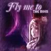
Original Image
Program Used: GIMP 2.0
Neko
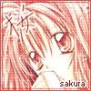
Original Image
Program Used: Photoshop CS
Marissa

Original Image 1
Original Image 2
Programs Used: Photoshop CS, Image Ready CS
Apricus

Original Image
Program Used: PSP 8
Knives
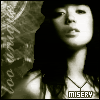
Original Image
Program Used: Photoshop 7
laq
Original Image
Program Used: GIMP 2.0
Neko
Original Image
Program Used: Photoshop CS
Marissa
Original Image 1
Original Image 2
Programs Used: Photoshop CS, Image Ready CS
Apricus
Original Image
Program Used: PSP 8
Knives
Original Image
Program Used: Photoshop 7
Sun Dec 19, 2004 5:48 am
Now, heres a problem. The site I have linked my original image to has revamped itself and the image is not under their galleries link. I did not save it to my computer or image uploader. I tried googling it but no results came up that resembled the original picture.
Well, if you can believe it, the image I used was like the one shown of Michelle Branch, but her face was oily and/or sweaty, and the other qualities of the picture are irrelevant as I don't showcase them. Also, the necklace around her neck was there originally, but whne resizing the picture it became pixelated and shoddy, so I redrew it in using the pencil tool. If you can trust me on this description of the original image, then I would appreciate it.
Well, if you can believe it, the image I used was like the one shown of Michelle Branch, but her face was oily and/or sweaty, and the other qualities of the picture are irrelevant as I don't showcase them. Also, the necklace around her neck was there originally, but whne resizing the picture it became pixelated and shoddy, so I redrew it in using the pencil tool. If you can trust me on this description of the original image, then I would appreciate it.
Sun Dec 19, 2004 9:20 am
Knives wrote:Now, heres a problem. The site I have linked my original image to has revamped itself and the image is not under their galleries link. I did not save it to my computer or image uploader. I tried googling it but no results came up that resembled the original picture.
Well, if you can believe it, the image I used was like the one shown of Michelle Branch, but her face was oily and/or sweaty, and the other qualities of the picture are irrelevant as I don't showcase them. Also, the necklace around her neck was there originally, but whne resizing the picture it became pixelated and shoddy, so I redrew it in using the pencil tool. If you can trust me on this description of the original image, then I would appreciate it.
i saw the image, i can vouche that his diescription is valid on all points.
Sun Dec 19, 2004 10:29 pm
<b>Laq</b> -- For your first icon, that's pretty good! And Hellyer used that same exact image in an earlier competition. Anyhow, I like it. The color scheme you chose is great. The grungy border is also a nice touch, but slight enough that it doesn't ruin the romantic mood of the icon. I would suggest switching the emphasis on the words though, so that it's either "Fly me to the moon" or "Fly me to the moon". Better effect that way.
<b>Neko</b> -- Beautiful image you chose, but that's about it. Your icon doesn't really have an <i>impact</i>. There's no feature that really makes a statement. The character in the upper-lefthand corner should stand out more or something, just to add a bit of spice to the simple colors.
<b>Marissa</b> -- It's very you: simple, but effective. I never would have known that you used two different images if you hadn't listed them. The combination of the two look fantastic. Good job. Love the blade flashing. The only thing is that the text should be a deeper red or something so that it stands apart from the girl's dress a bit more.
<b>Apricus</b> -- Well, what can I say, really? You mutilated the original picture, but it looks amazing. The placement is a little weird, because the focus is off. I suppose you wanted the concentration on the words rather than the actual door. Bit odd, but eh. Personally, I would have made the image the focus. You're awesome at making icons, but I bet you knew that.
<b>Knives</b> -- I saw the original image, but I don't remember much detail. Now I can see that you penciled in her necklace; it's a bit strong, because you don't want the necklace to be the focus. The lighting is a neat effect, but I still don't get the sense of misery. Doesn't take away from the work though. Overall, it's pretty cool.
Neko's icon gets my vote this round.
Sun Dec 19, 2004 10:36 pm
Knives wrote:Now, heres a problem. The site I have linked my original image to has revamped itself and the image is not under their galleries link. I did not save it to my computer or image uploader. I tried googling it but no results came up that resembled the original picture.
Well, if you can believe it, the image I used was like the one shown of Michelle Branch, but her face was oily and/or sweaty, and the other qualities of the picture are irrelevant as I don't showcase them. Also, the necklace around her neck was there originally, but whne resizing the picture it became pixelated and shoddy, so I redrew it in using the pencil tool. If you can trust me on this description of the original image, then I would appreciate it.
*appears*
It's still on the site, under scans>musicians>michelle branch. I went and looked around for it
http://raspberry-swirl.net/scans/0music ... ch-002.jpg
*disappears*
Sun Dec 19, 2004 11:40 pm
Thank you laq and moogs!
Mon Dec 20, 2004 9:40 pm
laq
For how many firsts you've had, you've done very well. I like the colors you've used. The image you've used, because of it's size and the girl's expression, looks like some possessed doll. The moon in the icon doesn't really look like a moon though. Also for the text, I understand the balance you were going for, however the word 'to' ruins it. The sentence isn't, how to put it...balanced.
Neko
Okay. The grid you've put over it gives it an old and somewhat unfinished look. The double border needs solid white between it to give it a more finished look. And I know you're fond of that font for subtext, but it isn't appealing on this icon. You also didn't place it real well.
Marissa
You've combined the images beautifully. I would have never known that the originally didn't go together. I love the sword's animation. It's a nice little touch. The only problem with this I have is the test. It blends just a little too much with the girl's kimono.
Apricus
This image...confused me until I saw the original image. When I think of a cellar door, I think of looking down a door, not up it...so, yeah. But that's just me. You've colorized it nicely. I think this would've looked better with a solid border though.
Knives
The colorizing looks really nice on this. So does the background and text, however the scripty text on the left is illegible (though maybe it's supposed to be?) For the necklace, I thought it looked just a little odd at first(though you did a very nice job). Then I read that you penciled it in. However, it's too straight lined almost...If you had given it just a slightly more rounded look, it would have looked even more authentic.
Neko.
Tue Dec 21, 2004 1:43 pm
laq-The small image looks pixellated, probably from the grid lines. I like the border-esque thing you did, and it's pretty good for your first time doing an lj icon.
Neko-I don't really like the white dots everywhere. Maybe lower the opacity a bit on them? Though I like the kanji, I'm agreeing with Flame here, and saying that the font you used on "sakura" doesn't really work well with the icon.
Marissa-I love the fact you used a real background behind her rather than brushes. The shining sword effect looks awesome.
Apricus-I like the placement of the door and the use of green. The font and swirls in the background look quite nice.
Knives-The soft glow on the image is really nice, but I don't really like the placement of the word "misery". Maybe put it somewhere in the upper-left corner?
My vote goes to Neko. Sorry.
Wed Dec 22, 2004 4:48 am
laq: Nice job! I suggest either changing the text, or moving it/using a different font, as it looks a bit off, especially with the 'to'. Also, the scanlines over the girl look a bit awkward; slightly pixellish, as well.
Neko: The icon doesn't stand out. The font you used for 'sakura' doesn't really match the graphic, the characters in the upper left hand corner blend in too much (I didn't even notice them when first looking over the graphic- but then, I was skimming, so eh)... The border would look better with white in-between the red border-lines.
Marissa: Wonderful blending work and animation. My only suggestions/crits are that you either expand or strengthen the outlines for the text, as the current outlines make the text hard to distinguish.
Apricus: Amazing work. ^_^ My only crits are that the down-pointing arrow is a bit awkward, though only very slightly, and that the pic is out of focus (though that might have been on purpose?).
Knives: Terrific job on the icon. I like your use of glow (though I may be a bit biased, as I favour using that exact kind of glow in my own work, when I can... ^^; ). =) Only suggestion is to blend/blur the 'necklace' you made slightly, as it doesn't really match the graphic.
Neko. =(
Wed Dec 22, 2004 5:27 am
Looks like Neko is out! Neko is sad, but happy that others can get the chance to be the next PPTTG! Good Luck, remaining contestants! Yay! ^^
Wed Dec 22, 2004 9:05 pm
Well, Knives, Apricus, laq, Marissa...You've made it to the final round.
The requirement is simple. Make a set. And make it a very good one...as this round obviously decides who shall win.
The requirement is simple. Make a set. And make it a very good one...as this round obviously decides who shall win.
Sat Dec 25, 2004 2:30 am
Good luck everyone! I'll be working! (And remember, the quicker you enter, the faster PPTTG 5 will start up!  )
)
Sun Dec 26, 2004 1:18 am

