Week 4 Gradings
Ethics
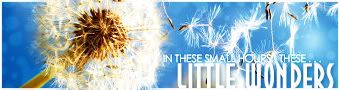
Le wallpaper (1024x768)
Ooo! I really do like this style. It's nice and simple but complex enough to be appealing to the eye. I really like the various textures and patterns you used. I personally like the text as well, but one thing that really sticks as out of place is that logo on the top left-hand corner. It is un-antialiased in some places and it just doesn't seem to fit. Perhaps one of those squiggly hearts would have served this wallpaper better. Also, on the greyscaled image to the very left, the overlayed texture/image is cut off there. You probably didn't notice, but it's rather distracting once you do.

Other than that, though, good job.

-
9/10
JellyFish72
http://img.photobucket.com/albums/v469/ ... sterbg.png
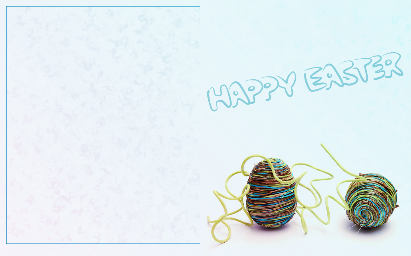
I, for one, really dislike boxed areas on wallpapers. I'm fine if they are creative, or tie in with the wallpaper in some way, but this wallpaper really seems empty to me. I see you used the marble brush to make some sort of a background, and tinted it blue, and that's nice and all, but I was hoping the wallpaper would be a little more fun to tie in with the brightly colored wicker easter eggs. The image you chose is nice and high quality, though. Other than that, there really isn't anything too special about this wallpaper, sorry.

-
6.5/10
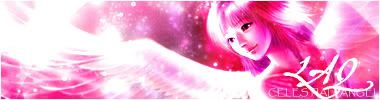
LAQ
Click hurr for the wallpaper
I think, perhaps a little better executed, and this would have been a fabulous wallpaper. However, it falls short in some places.
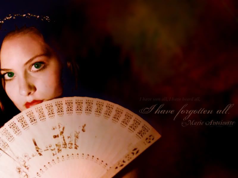
For one, the biggest problem I think, was the quality of the image. It isn't the best of quality, and image quality is one of my main irks. I'm not sure, since you are using GIMP, but if there is a filter named "Smart Blur", it is very helpful in clearing up noise and re-shaping the image. The colors of this main image isn't manipulated very attractively, either. But that is also attributed to the image's fault. I think you were trying to draw attention to the eyes by making them greener, but it looks really, really odd and out of place. In various parts of the wallpaper, there are bits of the image (most notably the hair) that, instead of black, is an odd blue, which seems like you put the blend mode "Difference" on one of the layers. However, despite that, I do like the blurry background and the text. -
7.5/10
moogie
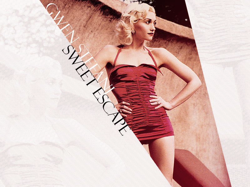
Here's
I really like this old, nostalgic newspaper-ish effect on this wallpaper. The creative shape for the main image is very attractive, and I'm glad you added the faded images of glen in the background. I like how the scanlines alternate between the three "areas", as well. The text looks nice aligned on the edge of that image, but as a suggestion, perhaps the "Sweet Escape" text could have been a dark red (like from one of the shadows on her dress) instead of black? (Perhaps a really, really dark red
) The image is nicely manipulated and sharpened as well. As a further suggestion, however, perhaps there could be one or two thin "beams" of image beside the main one? So that they look like rays from the bottom right, if you catch my drift.
-
9/10
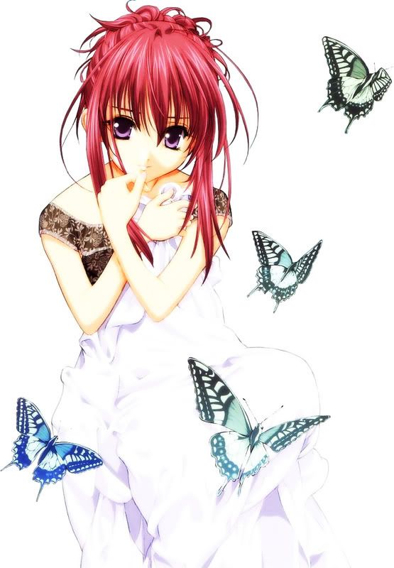
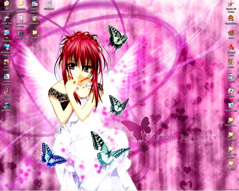
Neko

This wallpaper is pretty, it really is.
The main image has been extracted a little bit sloppily, which you tried to hide with a white glow, which is fine in this case because it doesn't look out of place in this wallpaper.
I like the wings, (did you follow a bunch of Shinta's tutorials at inanimetions?) I like the text and the butterfly next to it, in fact, I quite like the main focus point of this wallpaper. The whole wallpaper is very nice, but the biggest biggest problem I have with this is that the complex background, in this particular occasion, distracts from the main focus. I would rather that the background was simpler, and all the fancy hearts and brushes and pixels were used less. Also, the magenta "glow dots" that I assume are "falling" from the butterflies look a little awkward on white. -
9/10
Pixa
http://img.photobucket.com/albums/v167/ ... paper2.png
Good improvement from last round.
However, this is really... plain. The color scheme is nice and the text is nice and the images are laid out nicely, but it just seems very boring overall. I'm going to compare this to Moogie's for example, as these two graphics are somewhat in the same ballpark. For example, there is contrast and non-rectangular shapes that make her wallpaper a little more interesting. This one falls a little short and feels dull to me. -
8/10
YesItIsh
http://i10.photobucket.com/albums/a103/ ... yscape.png
This is very... unique. There are some very, very nice aspects about this wallpaper, and some that... aren't so great. For example, a good thing about it is the vectored city on the bottom right corner, the text is cut-off but strangely appealing. The road feels very grungy the way you have laid it out and set it on that particular blend mode. However, I really, really dislike the white scanlines. It really disrupts the whole wallpaper and feels rather out of place - as if to take out empty space. My second concern, the background seems very odd. There are certain spots, like you took several abstract brushes and stamped in a few spots around the wallpaper. In my opinion, this could have been a good wallpaper if you had some kind of direction. For example, if everything in the wallpaper lined up with that road. -
7.25/10
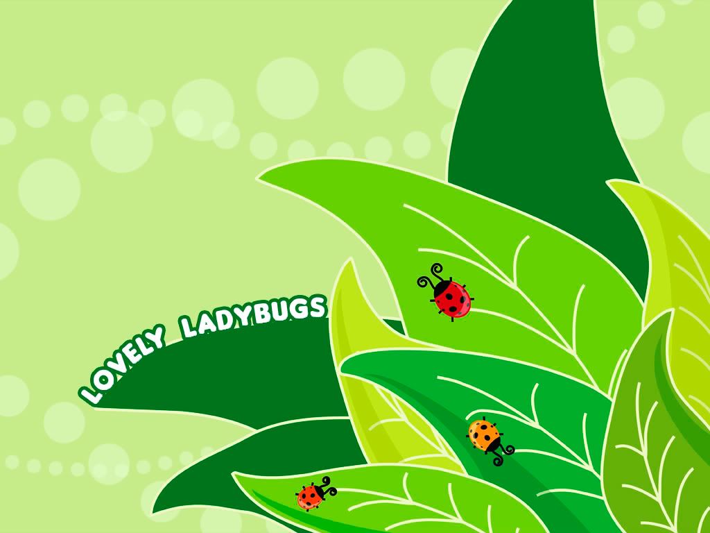
Zilary
Wallpaper Submission
Ooo! I really like this wallpaper! It's absolutely adorable! I love the whole cartoony feel, and the text works nicely as well! The bugs are very nicely vectored, and some of the leaves are too. As a suggestion, perhaps a little bit more detail on the leaves would have been nice (i.e. some of the leaves do not have shadows), but other than that, it's a positively adorable wallpaper! ^_^ Excellent job! -
9.5/10
----
I'm also sorry to inform you that Marissa will no longer judge PPTGA.


