Tue Apr 10, 2007 4:59 am
WIS: thanks for the rating, you're probably right about the red, but oculd elaborate on your second suggestion? As I'm totally lost as yo what you mean. 
Tue Apr 10, 2007 5:05 am
moogie wrote:WIS: thanks for the rating, you're probably right about the red, but oculd elaborate on your second suggestion? As I'm totally lost as yo what you mean.
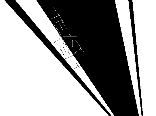
As my awesome paint illustration indicates.
Tue Apr 10, 2007 5:14 am
oh, that makes alot more sence than whatever my brain was churning XD. I'll give that a try.
Tue Apr 10, 2007 6:09 am
Also, on the greyscaled image to the very left, the overlayed texture/image is cut off there. You probably didn't notice, but it's rather distracting once you do.
>>
<<
*totally did that on purpose*
Now everyone's going to point that out. :p
Tue Apr 10, 2007 3:29 pm
Psst, you never fancied up the ratings for the last round.
Tue Apr 10, 2007 4:08 pm
Pixa wrote::P Well, I didn't want to overdo it, I did fiddle around with some of the setting and images, but I didn't want to make them overly blinding. I admit, it wasn't really the most exciting thing, but I felt my blog was a little messy last round, so wanted something cleaner.
Psst, you never fancied up the ratings for the last round.
I will at the end of this round.
Thu Apr 12, 2007 3:09 am
Ethics
this wallpaper is pretty, but plain, theres nothing that excites me.
although i do like the edit of the 2 fragmented images on the center right there. but the color choice was a big concern for me, because you chose pink as the main color, but it doesnt fit with the images that well. i would suggest making the images more pink or choosing a different font color.
also i think the butterfly is not necessary, it looks abit amateurish
7.5/10
JellyFish72
oooh, how cute
its very fresh and simple and clean and well designed, the colors are great as well.
one thing that bothers me a lot is the border on the left, i think it would look a lot better if it was gone. it takes away the focus from the eggs, which is not good.
8/10
LAQ
its very pretty, what i really like about this is that you have used the correct font and colors to bring out the atmosphere, which is very nice.
but what bothers me is the high right section of the wallpaper, if doesnt seem to match the left side, i know its suppose to empty for icons. but the overall style of the left and the right just doesnt match i dont think.
8.5/10
moogie
very nice color scheme. good text arrangement as well.
but i think it'd look better if the 2 edges of the picture was parallel, because your fonts were parallel.
i however do like very much what you did with the white, you put a really nice shading of the main image, but i think the resemblance is a bit too strong. i suggest edit the background gwen, like poster edges effect, blurring, watercolor effect or something, so it looks different from the foreground gwen.
8.5/10
Neko
very pretty and very well decorated.
but...the color choice is a big concern for me, because the main color doesnt fit with the main image, it brings out her eyes, but not her hair or her skirt. i suggest toning the pink redder, or edit the colors of the girl into a more similar pink to create a stronger resemblance between the colors.
8.5/10
Pixa
I LOVE the dot of the "i" in the "a".
anyways, it is attractive, but it seems a bit too effortless. it seems as if you just chop and pasted 5 images, put it on overlay with some scan lines.
but over all, the composition and text placement and color choice is well done.
8/10
YesItIsh
oooohhhh!!!! pretty!!
i really like how you did the thick scan lines to make it looks interesting and bold. its very attractive to the eye, and very well arranged.
the only thing that bugs me is, i think there is just a little too much of the spray effect at the background, sometimes less is more.
9/10
Zilary
WOW! cool!
its so pleasing to the eye, from the colors to the text.
i am using it right now, its very pretty.
good job.
10/10
BY the way
does any one else notice that WIS has given the lowest scores to the wallpapers with 800x600 resolution?...
Thu Apr 12, 2007 4:11 am
BY the way
does any one else notice that WIS has given the lowest scores to the wallpapers with 800x600 resolution?...
Not really. o.o
Thu Apr 12, 2007 5:42 am
blueZ wrote:i would suggest making the images more pink or choosing a different font color.
Nah.
That would be ugly.
Thu Apr 12, 2007 6:06 pm
I did more than just overlay them, I'm not that lazy.  Lol, I must say I am quite the fan of the dot as well, haha.
Thu Apr 12, 2007 11:48 pm
Ethics wrote:blueZ wrote:i would suggest making the images more pink or choosing a different font color.
Nah.
That would be ugly.
No.
it wouldnt.
i can show you an example if you want
Fri Apr 13, 2007 8:21 am
Note to Flame and Neopet_Online:
I'm sorry, but if you guys don't post your ratings within the next 24 hours, I will go on ahead and end the round with only me and blueZ's ratings.
I'm sorry, but if you guys don't post your ratings within the next 24 hours, I will go on ahead and end the round with only me and blueZ's ratings.
Sat Apr 14, 2007 6:55 am
Ethics
The wallpaper is very pretty, but plain, it lacks luster, it looks one of those 'official' wallpapers from her website, not that she has any like those, just a reference , anywho, a bit more color here and there would've made it better.
5.5/10
JellyFish72
I love the eggs, but the whole box to the side really distracts from the main focus, which, IMHO, should be the eggs, maybe a lighter area would've looked much better. The font bothers me a bit as well, a much simpler text would've worked wonders.
6.5/10
LAQ
Even though it isn't really my style, it's very pretty, eerie even, the top right side does bother me a bit however, it seems a bit out of place, but I understand you tried to make an area for icons, it just wasn't executed as well as it could've been. I love the font though, it works well with the image
7/10
moogie
I love the colors in the background, very well chosen, however, the edges could've been more parallel, it seems a bit off. Other than that great job.
9/10
Neko
It's so mesmerizing! I like it a great deal! However, it seems the color and the image conflict. A lighter color, or perhaps a bit of editing on the images part would've worked wonders.
8.75/10
Pixa
Somehow, you managed to make something that seems like it took all of 10 minutes, but you made it work. It looks good, the overlapping 'a' and 'i' and the scanlines all work well together
8.5/10
YesItIsh
Wowza, very well done, it looks very shabby, chic! It looks very edgy, and rough, I love it! The thick scan lines work well Good job.
9/10
Zilary
It's so preeeeeeeeeeetty! You did very well, I love the vector-esque look to it. It's eye candy
9.5/10
Sorry! ACT's tomorrow, I've been studying religiously Wish me luck! For those of you waiting for my PPT Idol judging's I have 2 to go!
The wallpaper is very pretty, but plain, it lacks luster, it looks one of those 'official' wallpapers from her website, not that she has any like those, just a reference
5.5/10
JellyFish72
I love the eggs, but the whole box to the side really distracts from the main focus, which, IMHO, should be the eggs, maybe a lighter area would've looked much better. The font bothers me a bit as well, a much simpler text would've worked wonders.
6.5/10
LAQ
Even though it isn't really my style, it's very pretty, eerie even, the top right side does bother me a bit however, it seems a bit out of place, but I understand you tried to make an area for icons, it just wasn't executed as well as it could've been. I love the font though, it works well with the image
7/10
moogie
I love the colors in the background
9/10
Neko
It's so mesmerizing! I like it a great deal! However, it seems the color and the image conflict. A lighter color, or perhaps a bit of editing on the images part would've worked wonders.
8.75/10
Pixa
Somehow, you managed to make something that seems like it took all of 10 minutes, but you made it work. It looks good, the overlapping 'a' and 'i' and the scanlines all work well together
8.5/10
YesItIsh
Wowza, very well done, it looks very shabby, chic! It looks very edgy, and rough, I love it! The thick scan lines work well
9/10
Zilary
It's so preeeeeeeeeeetty! You did very well, I love the vector-esque look to it. It's eye candy
9.5/10
Sorry! ACT's tomorrow, I've been studying religiously
Sun Apr 15, 2007 1:02 am
Round 4 Results:
Click Here!
Zilary has received the highest scores this round!
Unfortunately, JellyFish74 and spiral_star are eliminated this round.
------------
Round 5 Assignment:
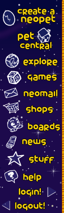
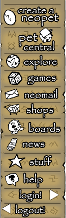
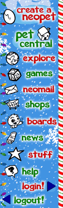
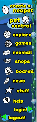
Create a Neopets Navigation Bar:
- Size must be at least 120 x 400, or 400 x 120 (Depending)
- You DO NOT have to code your sidebar!
- The side bar DOES NOT have to match up with the Neopets Template!
- You may not use Neopet images.
- The navigation may not be monotone. (All of the sidebar is variations of one color, or gray-scale)
- If you are unsure about your sidebar, please ask before you submit!
- Your navigation bar does not need the Neopets logo.
- For this assignment's purposes, lets assume that the background color of the page the sidebar is on is white.
- You must have text for every option on the default Neopets sidebar on your navigation bar. The list of them are:
-----> Create a Neopet
-----> Pet Central
-----> Explore
-----> Games
-----> Neomail
-----> Shops
-----> Boards
-----> News
-----> Stuff
-----> Help
-----> Login
-----> Logout
Hints:
* Because you can use CSS to practically manipulate a navigation bar anywhere on your profile, let's assume that as long as it isn't completely out-outrageous, be creative with it! You can have vertical or horizontal sidebars, etc
*Please be reasonable. If you are using a vertical navigation bar, don't make it so tall that most people can't view it on "One Screen" and they would have to scroll to see all the buttons. Same if you are making a horizontal navigation bar, don't make it so wide that it stretches the page.
If you are unfamiliar with Navigation Bars, here are a few examples:
http://images.neopets.com/t/bday/m5on.gif
http://images.neopets.com/t/sfp/m5on.gif
http://images.neopets.com/t/qas/m5on.gif
http://images.neopets.com/t/hol/m5on.gif
http://images.neopets.com/t/mqa/m5on.gif
* Please note that all of these are connected to another image on the bottom and another one on the top. That is why they are cut off at the top and the bottom.
I know this might be a confusing round, so if you have any questions PLEASE don't hesitate to ask!
Maximum of 2 people may be eliminated this round.
All navigation-bars are due by April 20th.
Click Here!
Zilary has received the highest scores this round!
Unfortunately, JellyFish74 and spiral_star are eliminated this round.
------------
Round 5 Assignment:
Create a Neopets Navigation Bar:
- Size must be at least 120 x 400, or 400 x 120 (Depending)
- You DO NOT have to code your sidebar!
- The side bar DOES NOT have to match up with the Neopets Template!
- You may not use Neopet images.
- The navigation may not be monotone. (All of the sidebar is variations of one color, or gray-scale)
- If you are unsure about your sidebar, please ask before you submit!
- Your navigation bar does not need the Neopets logo.
- For this assignment's purposes, lets assume that the background color of the page the sidebar is on is white.
- You must have text for every option on the default Neopets sidebar on your navigation bar. The list of them are:
-----> Create a Neopet
-----> Pet Central
-----> Explore
-----> Games
-----> Neomail
-----> Shops
-----> Boards
-----> News
-----> Stuff
-----> Help
-----> Login
-----> Logout
Hints:
* Because you can use CSS to practically manipulate a navigation bar anywhere on your profile, let's assume that as long as it isn't completely out-outrageous, be creative with it! You can have vertical or horizontal sidebars, etc
*Please be reasonable. If you are using a vertical navigation bar, don't make it so tall that most people can't view it on "One Screen" and they would have to scroll to see all the buttons. Same if you are making a horizontal navigation bar, don't make it so wide that it stretches the page.
If you are unfamiliar with Navigation Bars, here are a few examples:
http://images.neopets.com/t/bday/m5on.gif
http://images.neopets.com/t/sfp/m5on.gif
http://images.neopets.com/t/qas/m5on.gif
http://images.neopets.com/t/hol/m5on.gif
http://images.neopets.com/t/mqa/m5on.gif
* Please note that all of these are connected to another image on the bottom and another one on the top. That is why they are cut off at the top and the bottom.
I know this might be a confusing round, so if you have any questions PLEASE don't hesitate to ask!
Maximum of 2 people may be eliminated this round.
All navigation-bars are due by April 20th.
Sun Apr 15, 2007 3:09 pm
so, I'm not quite sure if this fits the round's requirements, could you please give me your ok WIS?
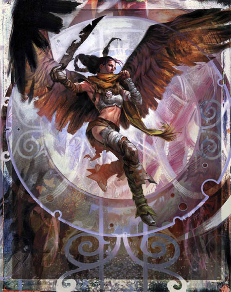
IMAGE SNIPPED, LOOK TO MY NEXT POST FOR ENTRY.
source
Photoshop 7
(note: this may change, if I have time and can realize another idea I have)
IMAGE SNIPPED, LOOK TO MY NEXT POST FOR ENTRY.
source
Photoshop 7
(note: this may change, if I have time and can realize another idea I have)
Last edited by moogie on Fri Apr 20, 2007 1:39 am, edited 1 time in total.