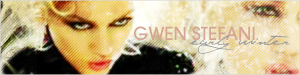
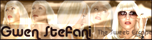
Pink Poogle Toy Forum

The official community of Pink Poogle Toy
Main Site
NeoDex
It is currently Sun Jun 30, 2024 6:44 am

All times are UTC


Post new topic This topic is locked, you cannot edit posts or make further replies.  [ 305 posts ]  Go to page Previous  1, 2, 3, 4, 5, 6, 7, 8 ... 21  Next
Author Message
 Post subject:
PostPosted: Mon Feb 26, 2007 3:11 am 
PPT God
PPT God
User avatar

Posts: 1271
Joined: Tue Jun 22, 2004 2:43 pm
Gender: Female
The spelling in this is probably atrocious. Will edit later when I'm more awake. Things more than likely don't make sense. Feel free to ask for clarification.


DM was on fire!
It's cute. I like how the background is rainbow like the girls are but not too overpowering...I don't like how the e! goes behind her fist. doesn't stand out quite enough. I can barely see your name in the av, and I don't like that there are portions of the other girls hair in the av...probably wouldn't looked better if you edited it out. 8.5/10

Dyl
The flower is redder, and you've added a border and text, but I can't really tell what else you've done. The border and text aren't bad, except in the sig the name is a bit small considering the size of the sig. Maybe you could add an effect of some sort over the image to make it more interesting? Overall it's very plain. 5/10

Ethics
Love the increase in contrast in the the image to brighten everything. Colors are nice, background is simple but effective, text
choice is good. The only thing that might've been better is a darker border. I'm also not really fond of her eye repeating the sig...it's the same all three times, so I just don't really see the point. 9/10

JellyFish72
Okay, it's a bit plain, but I see some effort here. In the sig, I'm thinking you wanted to it seem like they were maybe getting hit by the fire burst attack thing? It would've worked if you'd edited it so the boy's arm wasn't just cut off. I can see where one image ends and the other begins. It needs a more interesting border, and I think it would've been better with 2 or three stacked lines of the illegible test. The av is just sort of plain. Needs a name or text or something in there to fill space. Also, the grid isn't too great...maybe scanlines? 7/10

kentiness
I love the brightness of this in comparison to the original image. I do have one problem with it though. Because of the editing and increase in brightness, it sorta looks like the fairy is smoking a cigarette or something instead of playing a flute. *laughs*
The av found is good...I think a more cursivey or smoother fount would've looked better in the sig. 8/10

Kidwaiy
It's a good effort, but it's all just too confusing and smashed together to really be a good effect. Starting with the av, the y in your name is cute off. The border is uninteresting. I think it would've maybe been cool to zoom in on her head more? For the sig, it's just too many images smashed together...but it could work, perhaps. The three background images of her facing forward work, but the side shot looks out of place. Maybe making that picture bigger and moving it to the side of the sig (making it sort of the main picture of Gwen), and then having the others faded into the background would've made it look less messy. Also don't like the font or font placement in the sig. 7.5/10

Medli
It's not bad. I like the background and the text. It's very different looking from things I've seen before. I can't figure out the red streak in the outline of the subtext? Also, the background sort of doesn''t fit the image of link....he's smoother and 3-D-ish, but the background is flat and rougher. 8/10

LAQ
Love the colors. No qualms with the av. In the sig, however, the subtext is just a little blurry. Also, the parrot's head is just too far out and looks out of place. Love the body zoomed in behind the text though...maybe you should've just had the body in the sig and the parrot's head in the av? 9/10

moogie
I see some colorization, scanlines, and text added and some sparkles (I haven't seen those in ages!) It's simple but effective enough. Can't figure out the white on the bottom. maybe it should've been transparent? or maybe this looks better on a black background....some of the text is also cut off. Doesn't quite look right. 8/10

Neko
Love how you've changed the colors, love the font choice in ths sig. This seems to be a different style than what I've seen from you before, and I like it. But then there's the av text that I recognize from your previous sets I've seen, and I don't think it fits. It's sort of harsh against the smoothness of the image. 9.5/10

Penguin
Can't really even see the original image in this? I don't think you should've altered it this much. You need a more defined border, a more defined image, and more interesting text. I can see you played with effects to make this, but they take away entirely from the original image and the set. 4/10

Pixa
I like the image placement in this. It's interesting to see a head and a back. I think a softer pink would've looked better in this, amybe something to match her lips? As for the av, no real problems. In the sig, I don't like the subtext...it maybe needs to be a little smaller so that the second line of text could be further to the right. it would've been more balanced that way. 8.5/10

PK
The background color change isn't bad, but I think a red would've gone better with the girl. The av is too plain and needs a border. The sig is raised or bevelled around the edges (can't recall what the effect's called) but it's not defined enough. The text is a bit harsh, and there's a lot of empty space. Maybe lessening the height of the sig could fix that. 5/10

sigh_driven
There needs to be more to the background. It's not interesting enough, though the colors work. The subtext is interesting...I don't like how it looks right now, but I think it probably could work. Oh, and the set would look better with a border. 7.5/10

spiral_star
THAT'S MY DESKTOP TOO! Okay, now that that's been said. I like the effect in the background with the dot slash things and the swirl. The text needs to be smoother for both the main text and subtext. , and though that diagonal thing surrounding the subext is cool, I think it actually needs to be sharper and more defined. It looks unfinished the way it is now. You needs a brighter yellow in the border, and overall everything is a little too spread out. 6/10

whhattisthiss
Okay, it's a really cute concept with the circle and heart eyes. However, everything is waaaay too blurry. Using the original image quality would've been better. It needs a more defined border, and the test is sort of hard to read. I also don't like how the W is partially cut off in the av. 5/10

YesItIsh
I. Want. To. Eat. It. The chocolate looks like a much better quality image in your sig, and it looks edible. I love the text choice, placement, everything. Biggest probably is maybe that there is a swirl in the av and not the sig (would've stuck with just stripes) and that odd white stripe on the left side...I think there needs to be another one, or maybe a swirl of some sort instead to tie the sig in the the av? also, maybe lessen the height of the sig a bit to get rid of the empty space. 9/10

Zilary
Interesting image choice. In the av, it's hard to tell what is it an image of, but I like the text. In the sig, it might've been better to do the main text like that in the av. I see what you were trying for, but parts of the sushi just aren't dark enough to contrast the white text enough. 7/10


Image
Gone.


Top
 Profile  
 
 Post subject:
PostPosted: Mon Feb 26, 2007 5:07 am 
PPT God
PPT God
User avatar

Posts: 1109
Joined: Fri Apr 14, 2006 4:23 pm
Location: I live in a cake.
uh....
my set doesn't have a border 0.o


-If you are flammable and have legs, you are never BLOCKING a fire exit.
Mitch Hedburg
Image
-WIS<3


Top
 Profile  
 
 Post subject:
PostPosted: Mon Feb 26, 2007 6:00 am 
Way Beyond Godly
Way Beyond Godly
User avatar

Posts: 6691
Joined: Tue Jun 01, 2004 5:55 am
Gender: Female
Rotfl, for the subtext I think I did a "color dodge".


Image


Top
 Profile  
 
 Post subject:
PostPosted: Mon Feb 26, 2007 8:51 pm 
PPT God
PPT God
User avatar

Posts: 1271
Joined: Tue Jun 22, 2004 2:43 pm
Gender: Female
sigh_driven wrote:
uh....
my set doesn't have a border 0.o


Yes, and I said it didn't, and I think it needs one.

*confused* ...Or are you referencing to someone else's rating?


Image
Gone.


Top
 Profile  
 
 Post subject:
PostPosted: Mon Feb 26, 2007 9:20 pm 
PPT God
PPT God
User avatar

Posts: 1109
Joined: Fri Apr 14, 2006 4:23 pm
Location: I live in a cake.
OH i'm sorry i read it wrong, i thought you said it would look better WITHOUT a border :oops:
sorry, it was late when i read that LOL


-If you are flammable and have legs, you are never BLOCKING a fire exit.
Mitch Hedburg
Image
-WIS<3


Top
 Profile  
 
 Post subject:
PostPosted: Mon Feb 26, 2007 10:21 pm 
PPT God
PPT God
User avatar

Posts: 1462
Joined: Mon Aug 09, 2004 12:44 pm
Location: Canada
I just want so let the judges know that I only used the font I choose because thats the font she uses for her new album so I just thought I should use the same font to because my set is based on her album. I just felt like I should let you guys know that. :)


Image
Set made by YesItIsh


Top
 Profile  
 
 Post subject:
PostPosted: Tue Feb 27, 2007 12:06 am 
PPT God
PPT God
User avatar

Posts: 1023
Joined: Wed Dec 13, 2006 9:50 pm
Location: swivel chair, queens.
While we're confessing things, I made the set when the assignment was first handed out, and noticed how badly saved it was (honestly, I have no idea why it did that, usually everything else I save comes out just fine) and it was supposed to be blurred :( And as far as the coloring on the font, again, it looked great before it was saved. I actually took the set down for awhile, and it never occurred to me to post one I made before that was nowhere near as blurry or anything, and then the grading was due soon, so I put it back up cause nothing else I was making seemed good enough. /end long winded excuse.

But I do know that my set is rather shoddy, and I promise that next round, whatever assignment we have will be amazing :battar:


Image


Top
 Profile  
 
 Post subject:
PostPosted: Tue Feb 27, 2007 5:40 am 
PPT God
PPT God

Posts: 1117
Joined: Wed Jun 09, 2004 1:11 pm
Location: Bigheadboy89 is I!
Posted it twice by some weird reason, read below for the grading :D


President of the Sugarinii/Tasha fan club.
Sugarinii's soulmate... since 1991!


Last edited by NeoPet_online on Wed Feb 28, 2007 11:03 pm, edited 1 time in total.

Top
 Profile  
 
 Post subject:
PostPosted: Wed Feb 28, 2007 1:44 am 
Honorary Member
Honorary Member
User avatar

Posts: 401
Joined: Mon May 31, 2004 6:29 am
DM was on fire!:
I feel the background colors are very muddy compared to the bright crisp colors of the picture, a more pastel-toned background might look better and have the same effect. The composition of the sig is very very unbalanced toward the right side, you might want to put something more substantial on the left side. 7/10
Dyl:
I think this set could have turned out very nicely, but it falls short technically, so I can only advise that you learn your program better, or get another one (I'm guessing ArcSoft Photo Studio is primarily for retouching photos, which makes for much less flexibility than a full-fledged graphics program like PaintShop Pro or Photoshop). I'm not too fond of the drastic difference in composition between the av and sig, the sig actually has quite nice color balance, but I feel the av has too much contrast, which makes the already small flower look even smaller. 7/10
Ethics:
I like the enhanced contrast, it really draws your attention to the details, but the color is seems overly bold and unnatural. On the av, I'd have tried for a little variation of the pictures, because the way it is now, a lot of attention is drawn to the lower right corner (the brightest spot), and it's actually quite hard to tell that those are eyes on first glance. 8/10
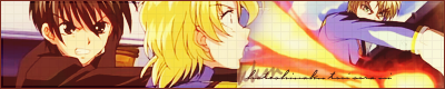
JellyFish72 :
A word of advice: screenshots are generally not good enough quality to make good graphics with, unless they're heavily retouched. This set looks overly busy, especially since there's no particular element that stands out over all the rest. I'm also very distracted by the hard line underneath the blond guy's chin, where you joined the two images. 7/10
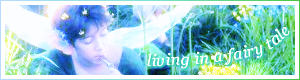
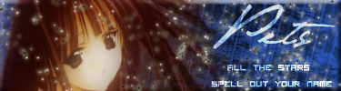
kentieness :
It's very bright and dreamy, it suits the image you used perfectly. I imagine that you meant for the text to follow the curve of the fairy wings, but it actually looks quite random, a few stray lines to guide the eye might look nice and help pull it together more. 9/10
Kidwaiy :
Interesting idea, but overall this set looks quite sloppy. I can't quite get over the two ghosted images on the left side of the sig that look so much alike, it's unsettling, but I can't quite put my finger on exactly why. The edges of her hair are pretty jagged in the av, and I can't see any reason why it would be that way, since the source image is so much larger than the av itself. 6/10
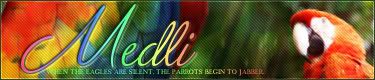
Kitten Medli :
I can't imagine how orange managed to seep into the edges of a picture that was on a white background, but it looks quite messy that way. The color composition of this set could be better; you might have chosen a lighter shade of green, the character almost disappears among the dark green background. The red text doesn't manage to stand out very much, since it's so dark and transparent, and the edges of the text are very rough. 6.5/10
LAQ :
This was one of my favorites from the Secret Santa, the bright colors are just so happy. The only thing I really dislike is the large green empty space on the sig, you might have filled it out a bit more by widening the text. Another little problem I have is with the text again, the d and the l look too similar, I would have substituted a d without a loop from another similar font. 8.5/10
moogie :
I really like the monochromatic look of this set, it gives a nice focus. I'm not too fond of the little stars, they really get lost among the highlights of the girl's hair. I don't think your choice of font was the best it could have been, it looks rather too elaborate (especially the capital D). 8/10
Neko :
I like the gold-ish rays of light, they give the set a nice feeling of warmth and movement. Unfortunately, I feel you broke the warm color scheme with the pure white text, it would have been much nicer if they were also in another shade of gold. 8.5/10
Penguin :
Interesting, it looks quite abstract, I didn't even know what it was until I saw the source image. I do like your color choice, though, the golden edge of the moon looks beautiful among all the black and blue. Your choice of font could be better as well, I would have chosen a lighter handed font rather than a calligraphy type font, to match with the delicate tapered lines in the image. 7.5/10
Pixa :
A refreshingly different way of composing such a picture, but I somehow feel that this composition looks less seductive/sultry and more...bored/annoyed. I don't know how flipping the picture upside down might look, but it may help. Other than that, though, I really have no problems with this set, excellent job. 9/10
PK :
Your source image is a fan wallpaper, which is always a big no-no with me, since that's riding off someone else's work. However, a look at the original image shows that you actually didn't, so I guess all's ok, but be careful in the future. The two halves of the sig really clash with each other in a quite unattractive way; on the one side we have the reddish-toned, soft-lined left half, and on the other side is this intense blue with lots of fine detail. One of these sides should definitely change to better match with the other, it would look much much nicer. 6.5/10
sigh_driven :
I see you kind of cheated by leaving a halo around the image, but it looks fine and the halo actually serves quite well as a highlighting element. I'm quite fond of the composition of this one, it really looks like an advertisement, which is interesting to see. 9/10
spiral_star :
It seems like all you did was crop a section from the original image and put some texture brushing on top of it. The yellow sketchy part might have served as an interesting focal point, but there's really no clue as to what it is (I imagine it's the trunk of a palm tree or an overhead view of a pier). I actually don't find the yellow to be too bad, though, it contrasts nicely with the blue. 7/10
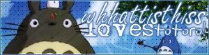
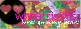
whhattisthiss :
Very cute, but the black definitely does not belong on this set, especially after you enhanced the colors of the gummy bears. The name really gets lost among the background, a lighter shade of pink might have worked better, maybe. 6/10
YesItIsh:
The way your text is composed looks very similar to a dessert shop I know, it's very cute and appropriate. I'm not very fond of your backgrounds, I think they're supposed to look like chocolate, but they look more like abstract combinations of filters. 8/10
Zilary:
Again, it seems like all you did was crop a section from the original image and put some texture brushing on top of it.The little bamboo shoot in the sig is a very cute touch, though. 6/10


Image


Top
 Profile  
 
 Post subject:
PostPosted: Wed Feb 28, 2007 2:38 am 
PPT God
PPT God
User avatar

Posts: 1307
Joined: Tue Jun 01, 2004 6:09 pm
Location: In my own little world... but at least they know me here! (DFW)
Gender: Female
Marissa wrote:
I'm also very distracted by the hard line underneath the blond guy's chin, where you joined the two images.


I started freaking out when I read that, I'll have you know! :P I went back and looked, already kicking myself for not noticing something like that, but I checked, and it's just the shading on the brunette's sleeve...

I really appreciate the comments from y'all! They're very helpful!


Top
 Profile  
 
 Post subject:
PostPosted: Wed Feb 28, 2007 3:16 am 
PPT Student
PPT Student
User avatar

Posts: 332
Joined: Mon Jul 10, 2006 6:57 pm
Location: Geelong, Australia
Flame wrote:
...Because of the editing and increase in brightness, it sorta looks like the fairy is smoking a cigarette or something instead of playing a flute. *laughs*...


Hahaha, I didn't pick up on that. Oopsie!


Image
Thanks to my SS :)
Sparkle, Sparkle :>


Top
 Profile  
 
 Post subject:
PostPosted: Wed Feb 28, 2007 3:41 am 
Honorary Member
Honorary Member
User avatar

Posts: 401
Joined: Mon May 31, 2004 6:29 am
JellyFish72 wrote:
Marissa wrote:
I'm also very distracted by the hard line underneath the blond guy's chin, where you joined the two images.


I started freaking out when I read that, I'll have you know! :P I went back and looked, already kicking myself for not noticing something like that, but I checked, and it's just the shading on the brunette's sleeve...

I really appreciate the comments from y'all! They're very helpful!
No, I'm positive it's where you joined the images. It's a vertical line, not horizontal, and perfectly straight.


Image


Top
 Profile  
 
 Post subject:
PostPosted: Wed Feb 28, 2007 6:06 am 
PPT God
PPT God

Posts: 1117
Joined: Wed Jun 09, 2004 1:11 pm
Location: Bigheadboy89 is I!
Week 1 Grading:


DM was on fire!
Image Image
So for starters, the no fill text looks very weird on this image, and it not only takes up a massive amount of space, but it also distracts from the image as a whole. Other than that I'd say next time just go with DM. - 8/10


Dyl
Image Image
Like Wis said, ArcSoft is about as good as MS Paint, only he didn't say that much, he just said it wasn't a very good program xD, anyway, I've worked with it before and found it to be very limited. The sharpness and border attempts and the JPEG compression, it just makes it a disaster. I'm sure you're quite the capable graphician if you were given the proper tools. - 2/10


Ethics
Image Image
Pink. XD. I like it, I love Sailormoon, btw. This set has a very nice color to it. It stands out a bit. The font works well with the image as a whole, the only problem I have is with the avatar. The repeat effect is, IMHO, a little overdone. It's annoying if not right, and you barely crossed the line to nice looking. Sorry :(. I have high hopes though!!! - 8.25/10


JellyFish72
Image Image
The blending of the images is almost unnoticeable, at first, but soon after it becomes evident that the images could've been blended in another way... I dunno, I haven't done too many of them. :P, but other than that the only other problem is the grid effect went out after WIS stopped using paint. And that was years ago. XD. Not too sound too mean, but as I've said before about other things, it's overdone. - 6.25/10


kentieness
Image Image
I like how you tried to make the image a bit more 'fairy' like, as to relate to the 'Fairy Tale' theme, but as Dr. Wis said, I wish you would have kept the original browns and greens, because it would've looked a bit more 'nymph-y' you know? The other problem I have is the text, sorry, but I hate curves... On text/images that is, I feel they're somewhat unnecessary and it looks like you're trying too hard, a more 'jumpy' effect would've worked better, IMO.- 5.75/10


Kidwaiy
Image Image
Three flaws. The squares, the font, and the subtext. I would've chosen a different text. The subtext was unnecessary, and the squares are unnecessary as well. - 5.5/10


Kitten Medli
Image Image
As with an image there are flaws, but I feel it was executed well. You did good, however it bothers me that the the M and part of the E are covered. - 8/10


LAQ
Image Image
The only flaw is the empty space. You know what to do, and how to do it. No advice needed on my part. - 9.75/10


moogie
Image Image
Two simple flaws. You centered too much on the source image and your text got cut off. Other than that you need no advice. - 8/10


Neko
Image Image
First of all. You should have added the sparkles on the base image, because otherwise it looks liek a last minute splatter. Other than that the image is beautifully manipulated and nicely done. I bet Rune was pleased. XD - 8.50/10


Penguin
Image Image
The graphic is bad. Try harder next time, don't invert the colors, and try to challenge yourself. - 1/10


Pixa
Image Image
Aww Pixa, you had a great thing going before you changed it. Like they tell the girls in America's Next Top Model, don't second guess yourself. Next time use a smaller text. What is it with people and borders this time around? - 6.25/10


PK
Image Image
This set is like a bad weave, pretty at first but then you start to notice all the flaws. It's messy. You could of tried to make it a bit cleaner, because the image was very nice to being with. The border isn't working for me at all. - 5/10


sigh_driven
Image Image
I usually don't like this type of set but I feel you truly did try to bring a different take to it, the image was very easy to work with, so the background and the image blend nicely. It isn't great, but it isn't horrible either. Passable. - 7/10


spiral_star
Image Image
Oh lawd. This was so beginner, I'm sorry. I mean I know where you're coming from because I used to do this a lot too, but the yellow, and the subtext, it's just all very.... Not as well as you could of executed it. - 1.5/10


whhattisthiss
Image Image
I personally feel as though the font fades into the image and you can't see it well unless you really look at it. The lack of a focal point really takes away from the image as a whole, next time choose an image that is easier to work with. - 2.50/10


YesItIsh
Image Image
Eeeeeeeeee! Touchdown. I love this set! It's delicious, warm, inviting and it's something I'd like to rest my eyes on every once in a while. However, the white line, as WIS mentioned, is a bit out of place, I think you might have wanted to match the frosting/icing/whatever the truffle(?) has, but it could've been done better. The font is lovely, almost as delicious as the truffle! XD - 9.75/10


Zilary
Image Image
You know how in American Idol, the judges always moan and groan about song choice, song choice, song choice? Well same goes here, it's all about image choice and the work-ability of the image. In this case 'not so hot'. The only thing that saves the set are the scan lines. Sorry. Better luck next time. - 4/10


FINE


President of the Sugarinii/Tasha fan club.
Sugarinii's soulmate... since 1991!


Last edited by NeoPet_online on Thu Mar 01, 2007 5:22 am, edited 3 times in total.

Top
 Profile  
 
 Post subject:
PostPosted: Wed Feb 28, 2007 6:53 am 
PPT God
PPT God
User avatar

Posts: 1109
Joined: Fri Apr 14, 2006 4:23 pm
Location: I live in a cake.
lol i swear, it looked good WITHOUT a glow... I just WANTED a glow XD
*will never use the glow effect again* :P


-If you are flammable and have legs, you are never BLOCKING a fire exit.
Mitch Hedburg
Image
-WIS<3


Top
 Profile  
 
 Post subject:
PostPosted: Wed Feb 28, 2007 7:19 am 
PPT Student
PPT Student
User avatar

Posts: 481
Joined: Wed Aug 11, 2004 3:51 pm
NeoPet_online wrote:
Almost done, grrrrrrrrr! Firefox crashed when I was about 3/4's done >.<


just a suggestion: use word when writing the judgings, so you can save what you've started ;)


Image
v: Lifebreather ----- c: Neko


Top
 Profile  
 
Display posts from previous:  Sort by  
Post new topic This topic is locked, you cannot edit posts or make further replies.  [ 305 posts ]  Go to page Previous  1, 2, 3, 4, 5, 6, 7, 8 ... 21  Next

All times are UTC


Who is online

Users browsing this forum: No registered users and 72 guests


You cannot post new topics in this forum
You cannot reply to topics in this forum
You cannot edit your posts in this forum
You cannot delete your posts in this forum
You cannot post attachments in this forum

Search for:
Jump to:  
cron
Powered by phpBB® Forum Software © phpBB Group