Pink Poogle Toy Forum

The official community of Pink Poogle Toy
Main Site
NeoDex
It is currently Thu Jun 20, 2024 12:19 pm

All times are UTC


Post new topic This topic is locked, you cannot edit posts or make further replies.  [ 115 posts ]  Go to page Previous  1, 2, 3, 4, 5, 6, 7, 8  Next
Author Message
 Post subject: Re: The PPT Graphics Academy III - Round Two
PostPosted: Fri Jul 27, 2007 4:45 pm 
PPT Student
PPT Student
User avatar

Posts: 481
Joined: Wed Aug 11, 2004 3:51 pm
Laryxle: The image is nice, and fits the text relatively well, which is good. I don't, however, like the dripping little things on each side at all, they detract from the "withery" feel of the piece and seem out of place. 6/10

Kitten Medli: This just seems too busy. You've imposed the image three times in varying sizes and focus through out a small space. This confuses the eye and makes the image less pleasing. That being said, I like the color and greyscale mixed together, it was a good choice, and the text works well. The image is simply too busy to be used in this way, another less exciting image probably would have worked better. 7/10

Apex: I like this blog a lot. The colors work remarkably well together; the green was a good choice. The main negative I see here is the text area, it could have been slightly more diluted with a white overlay, making possible text more readable. Overall, though, this is a good piece. 8.5/10

Zilary: This is interesting to say the least. Not my favorite this round, but good. You blended the images pretty well, though I can see the line where they meet, but considering the difficultly of blending an art piece and a photograph, You did a pretty good job. I like the juxtaposition of the tree and the two kissing, its almost like they're under the tree (which I'm sure you were going for. My one real problem with this blog is the text though, I simply don't like it, the font doesn't really fit the theme and the black is too obtrusive. 6.5/10

Bluez: Gorgeous. Normally I'm totally turned off by such high level contrast as evident here, but it works. The illegible text gives me this weird feeling of high-techiness, which really works to make the somewhat plain clouds really interesting. For some reason, I'm really drawn to the title, it seems oddly wise, and the placement and color really work. You've perfectly blended the black into the image. A stellar effort all around 10/10

DM was on Fire: I'm kind of bored by this blog. Its well made, the text is nice, and the colors as well here as they did in the original image, but I'm just not seeing much that was done here. I can sort of understand a justification for simplicity here, seeing as converses are pretty simple as shoes and all, but I'm still left wanting a lot more out of this blog. The text area is also MUCH too small. This is a nice, but very plain, piece. 6/10

WIS: I quite simply can't get over how beautiful the text is on this blog. Its so dynamic with all the different colors and overlays, its stunning. The manipulation is also top notch here, I can really see the work you put into this blog. The text area is manageable, but could definitely stand to be larger. Overall, great work. 9/10

Neko: I like this blog. It has great splashes of color, and an interesting background, one which I would not have thought of. My only real issue with it is that the text is slightly hard to read when you get to the bottom of the text area. Its a tiny bit plain, but the little additions you brought in really add interest here. 8/10

---

sorry for the delay, lost internet for a couple days.


Image
v: Lifebreather ----- c: Neko


Top
 Profile  
 
 Post subject: Re: The PPT Graphics Academy III - Round Two
PostPosted: Wed Aug 01, 2007 10:21 pm 
PPT Student
PPT Student
User avatar

Posts: 366
Joined: Mon May 31, 2004 8:35 pm
Location: Lalaland
I didn't want to, but, I unfortunately have to withdrawn for this competition. I will be leaving the country, and I won't have any access to Photoshop. Good luck to the rest of you.


Image
"The path I've chosen had no effort, unless I took that chance, at the decision I've made, for all I've done and suffered." - Mi-Ku, © Mi-ku All Rights Reserved.


Top
 Profile  
 
 Post subject: Re: The PPT Graphics Academy III - Round Two
PostPosted: Sat Aug 04, 2007 6:16 am 
PPT Student
PPT Student
User avatar

Posts: 481
Joined: Wed Aug 11, 2004 3:51 pm
bangel said she would be busy until saturday, I'll give her until then to judge. Thank you for your patience.


Image
v: Lifebreather ----- c: Neko


Top
 Profile  
 
 Post subject: Re: The PPT Graphics Academy III - Round Two
PostPosted: Mon Aug 06, 2007 9:13 am 
PPT Student
PPT Student
User avatar

Posts: 481
Joined: Wed Aug 11, 2004 3:51 pm
Sadly, the two participants who will be eliminated this round are Neko and Zilary.

I've decided to not keep track of the scores as WIS has done previously, its too much work for me right now.

anyway, round three awaits us.

Quote:
Round 3 Assignment:

Icon:
- Create an LJ Icon.
- Must be exactly 100px by 100px.
- You cannot use Reds, Blues, or Yellows.
- No grey scale.
- No legible English text.

Maximum of 2 people may be eliminated this round.

Icons will be due on Monday, August 13th


as always, please ask any questions to clarify


Image
v: Lifebreather ----- c: Neko


Last edited by moogie on Thu Aug 09, 2007 9:31 am, edited 1 time in total.

Top
 Profile  
 
 Post subject: Re: The PPT Graphics Academy III - Round Three
PostPosted: Mon Aug 06, 2007 2:16 pm 
PPT Baby
PPT Baby
User avatar

Posts: 85
Joined: Tue Mar 27, 2007 12:17 pm
Location: In Kreludor, hangin with the Space Faeire. Or in Shenkuu, rushing some rivers. Set by me.
Aww, did I miss this?


Image


Top
 Profile  
 
 Post subject: Re: The PPT Graphics Academy III - Round Three
PostPosted: Wed Aug 08, 2007 6:45 am 
Way Beyond Godly
Way Beyond Godly
User avatar

Posts: 6691
Joined: Tue Jun 01, 2004 5:55 am
Gender: Female
Dylan - Unfortunately, yes :[

Okie, heres my entry.

Image
Image Used: http://img.photobucket.com/albums/v37/M ... on0035.jpg
Program: PS Elements

I thought this round was very challenging, and now that I'm done, it's all the more gratifying. Definatly keep up the more specific requirements, I dig it xD


Image


Last edited by Kitten Medli on Sun Aug 12, 2007 6:29 am, edited 1 time in total.

Top
 Profile  
 
 Post subject: Re: The PPT Graphics Academy III - Round Three
PostPosted: Sat Aug 11, 2007 5:19 am 
PPT Student
PPT Student
User avatar

Posts: 335
Joined: Wed Aug 09, 2006 6:02 pm
Location: Home
Image
ARG...does the color count as yellow or light green, kind of confused

image: http://i97.photobucket.com/albums/l233/ ... 29140Q.jpg
program used: photoshop7


Image
- w i s


Last edited by blueZ on Sat Aug 11, 2007 7:00 pm, edited 4 times in total.

Top
 Profile  
 
 Post subject: Re: The PPT Graphics Academy III - Round Three
PostPosted: Sat Aug 11, 2007 6:29 am 
Newbie
Newbie
User avatar

Posts: 47
Joined: Sun Apr 01, 2007 2:42 am
Wow those requirements made this round really hard xD The flower is a light green btw, not yellow.

here is my entry, I made a few but could never decide on just one, but I thought this was the best -

Image

Image - http://photos.jpgmag.com/83832_43364_2a5673f4ea_p.jpg
Program Used - Gimp 2.2

I hope you like it :)


Image
set by me


Top
 Profile  
 
 Post subject: Re: The PPT Graphics Academy III - Round Three
PostPosted: Sat Aug 11, 2007 8:52 pm 
Way Beyond Godly
Way Beyond Godly

Posts: 8715
Joined: Sat Jun 05, 2004 9:10 pm
Location: Cleveland, Georgia
Gender: Female
Image
Image Used: HURR PLZ
Program Used: PSP 8

OH. IT AIN'T RED. IT'S PINK.


Image


Top
 Profile  
 
 Post subject: Re: The PPT Graphics Academy III - Round Three
PostPosted: Tue Aug 14, 2007 2:54 am 
Beyond Godly
Beyond Godly
User avatar

Posts: 4874
Joined: Thu Jul 22, 2004 3:20 pm
Location: Vancouver!
Image
Image Used: None
Program: Photoshop CS3

I was going to leave the white part on the top transparent... but I think it looks nicer like this. And it'll probably look better on LJ pages with non-white backgrounds.

I would hope that this is mostly orange and green, but if it isn't eligible, please tell me! I have a backup icon. :P


Top
 Profile  
 
 Post subject: Re: The PPT Graphics Academy III - Round Three
PostPosted: Thu Aug 16, 2007 11:00 pm 
PPT Student
PPT Student
User avatar

Posts: 481
Joined: Wed Aug 11, 2004 3:51 pm
Apex has been given more tha enough time to complete his entry, and he has not, thusly he will be eliminated.

All the entries are on this page, so judges, please use this page to find each player's entry.


Image
v: Lifebreather ----- c: Neko


Top
 Profile  
 
 Post subject: Re: The PPT Graphics Academy III - Round Three
PostPosted: Mon Aug 20, 2007 10:18 pm 
PPT God
PPT God
User avatar

Posts: 1271
Joined: Tue Jun 22, 2004 2:43 pm
Gender: Female
*pokes all the lovely entries and then wanders off* ;)


Image
Gone.


Top
 Profile  
 
 Post subject: Re: The PPT Graphics Academy III - Round Three
PostPosted: Tue Aug 21, 2007 11:39 am 
PPT Student
PPT Student
User avatar

Posts: 481
Joined: Wed Aug 11, 2004 3:51 pm
Kitten_Medli: I like this icon a lot, The stoic expression on the character's face matches perfectly with the muted tones you used. The background is well done, and I like the brightness contrasting with the main figure. I'm a little perplexed by the leaf icon in the bottom right though, it seems sort of arbitrary. 8.5

blueZ: Interesting, I can't say its my favorite this round, though it is nice. You very nicely edited an image that wasn't of amazing quality and gave it a totally different vibe, one of an almost digital feel, which is a success for sure. The proportions of the face are odd to me, but that wasn't your fault. 8.5

Laryxle: Nice, I like the sort of depressing mood of the picture. The splash of color is very nice. My one qualm with this icon is in the flower. I like the yellow, but the two non-yellow petals stand out quite a bit, making it look almost as though you missed them when you were desaturating the rest of the image. My one suggestion would be to desaturate those petals, and then the yellow would be even more pronounce. 7

DM was on fire!: Hmm, I don't like this graphic all that much, there are a few things that stick out for me. Fist, you chose a source image which wasn't the best (although you did quite a good job with it, smoothing it and retouching the color), its very small and pretty static in terms of substance, its not much past a girl smiling. And secondly, the color scheme is too spread out. You have bright pink fighting for attention with the skin and hair tones of the figure, and I don't really know where to look. 5

WIS: Nice, you created some nice images here. The vectoring looks very professional as usual, and the colors go very well together. The graphic flows nicely from left to right and right to left, and the white space at the top feels intentional instead of empty, overall, this was a good showing for you. 9


Image
v: Lifebreather ----- c: Neko


Top
 Profile  
 
 Post subject: Re: The PPT Graphics Academy III - Round Three
PostPosted: Tue Aug 21, 2007 3:32 pm 
Honorary Member
Honorary Member
User avatar

Posts: 1529
Joined: Mon May 31, 2004 4:18 am
Gender: Female
Hey, sorry for the delay everyone, I wasn't aware until today that it was judging time :( :oops: And as far as the color rules go, well I'm probably as confused as you are, so I'm just judging on what I see, because they've obviously all been approved for use by now :)
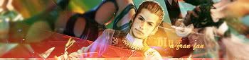
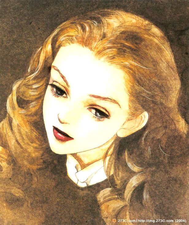
Kitten Medli - 9/10 - I really like how the character is so big and bold over a background that is chaotic, but on a small scale. I'm not sure how necessary the little text over the leaf was, and it think it bothers me more than it enhances the image, but overall I love the icon and it reminds me of fall.

blueZ - 8/10 - It looks like her soul is escaping :O It's really interesting to look at, and while at first all of the overlapping and everything going on put me off, the more I look at it the more I like it. I still feel there is too much going on for such a small space, yet I think it makes for a good feeling.
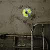
Laryxle - 6/10 - I'm not sure what's going on here. Even after I looked at the base picture, it's still very... eh. It's not a bad image, but it's just chronically unexciting to look at. Until I kept staring at it long enough where I decided that it sort of looks like a frog monster camouflaging itself against a wall to hide from heavily armed pursuers, i was completely uninvolved with it. It looks nice, but that's it. I'm all for simple, but this is just sort of blah.

DM was on fire- 5/10 - Her face is very distorted. I'm all for messing with pictures, but when working with an image of a real person it looks very obvious and unattractive, in my opinion, when they look wonky. The background is unnecessarily noisy on top of that and because the person takes up the entire left 2/3rds of the image all of the pink sort of seem like it came out of no where. It's not especially bad looking as an idea, I guess, but it's a little boring and all the extra noise does is bother me more than add interest.
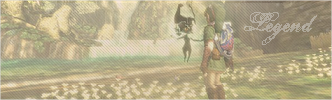
WIS - 8/10 - It's very pretty and a great idea. I'm not sure that I like the placement of the smaller orange flower placed over the larger flower though. But of course I'm getting into a lot of 'what if' territory in judging these as it is. Still, I feel it gets a bit too crowded. It's such a bold beautiful design I think you could have (should have?) pulled a little off of it and still ended up with the impact it has now, maybe more. I think that keeping the white is a good idea, it really prevents a lot of awkward color combinations that would have came with transparent (though admittedly those are always fun to see)


Image


Top
 Profile  
 
 Post subject: Re: The PPT Graphics Academy III - Round Three
PostPosted: Wed Aug 22, 2007 5:55 pm 
Way Beyond Godly
Way Beyond Godly

Posts: 8715
Joined: Sat Jun 05, 2004 9:10 pm
Location: Cleveland, Georgia
Gender: Female
Eww. Bad ratings.
It definitely looks like I'm out. Good luck, everyone! ^^


Image


Top
 Profile  
 
Display posts from previous:  Sort by  
Post new topic This topic is locked, you cannot edit posts or make further replies.  [ 115 posts ]  Go to page Previous  1, 2, 3, 4, 5, 6, 7, 8  Next

All times are UTC


Who is online

Users browsing this forum: No registered users and 73 guests


You cannot post new topics in this forum
You cannot reply to topics in this forum
You cannot edit your posts in this forum
You cannot delete your posts in this forum
You cannot post attachments in this forum

Search for:
Jump to:  
Powered by phpBB® Forum Software © phpBB Group