Fri Jun 10, 2005 2:53 am
Revisiting my Spirited Away fan-ness 

Original Image: http://www.cinecon.com/albums/album34/aav.jpg
Program: PS7
Original Image: http://www.cinecon.com/albums/album34/aav.jpg
Program: PS7
Fri Jun 10, 2005 5:21 am
Fri Jun 10, 2005 2:56 pm
erm i dunno if i can still enter, but i made these in photoshop:
Revelation Coded Version: Coded
Exodus (Name really doesnt fit)
Soul Flare Coded Version: Coded
FrostBite
I hope im still able to enter, and if so i hope you like them. I would eneter somehting a bit newer but im at my dads house currently and he doesnt have any artprogram... except paint erg. Also if imonly allowed one entry i would either revelation or exodus
UPDATE
XD scratch that
ol i didnt notice it tuntil just now
Revelation Coded Version: Coded
Exodus (Name really doesnt fit)
Soul Flare Coded Version: Coded
FrostBite
I hope im still able to enter, and if so i hope you like them. I would eneter somehting a bit newer but im at my dads house currently and he doesnt have any artprogram... except paint erg. Also if imonly allowed one entry i would either revelation or exodus
UPDATE
XD scratch that
Flame wrote:lothwe wrote:Just a heads up, I've been put down twice on the list
Really? Whoops...I'll fix that in a bit.
Now that that's settled...
Round 1
-Make a blog
-You can't use the color green
- You have 4 days
- Size should be between 250x250 and 400x400
And some friendly advice, it should actually be possible to code it.
ol i didnt notice it tuntil just now
Fri Jun 10, 2005 3:39 pm
Original image: here
Program Used: PSP 9
Thanks to A.A Milne for the poem
I've also tested it with both black and white text and it's all fine
Fri Jun 10, 2005 7:13 pm

Original Image: http://img.photobucket.com/albums/v35/e ... denpic.gif
Program: PS7
Good luck to all!
Sat Jun 11, 2005 12:43 am
Got this done early.
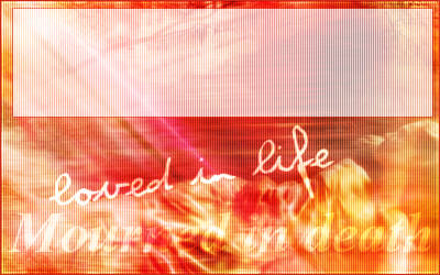
Image Used: Here, from Aethereality.net.
Program Used: Gimp 2.2
Here's what the blog looks like coded.
Image Used: Here, from Aethereality.net.
Program Used: Gimp 2.2
Here's what the blog looks like coded.
Sat Jun 11, 2005 2:06 am

Image Used: http://img.photobucket.com/albums/v37/M ... arlene.jpg
Programs: Paint, Adobe Photoshop Elements
I don't know how to code blogs so I'm not sure if this is codeable or not. Sorry. :/
Sat Jun 11, 2005 2:11 am
stoodder wrote:erm i dunno if i can still enter, but i made these in
Sorry, but you can't enter.

Sat Jun 11, 2005 4:48 pm
Sat Jun 11, 2005 8:47 pm
Changing my entry slightly
Meh, I don't like mine >.> Everybody else is soooo good!
Here's my original, but I changed it because of the minty green.
Blog in use
Original pictures: Here
Program: GIMP 2.0
EDIT: Changed it slightly
Sun Jun 12, 2005 3:39 am
Adam loves Hilary Duff

Image: http://www.hilaryduff.com/html_2003/pic ... AY-006.jpg
Program Used: PS 7
watericesage
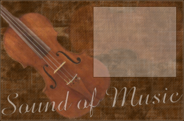
Image:http://www.kuhmann.com/yangliu/Amati%20violin%20(large).jpg
Program Used: PSP 9
Dawn 2
Program Used: PSP 9
Sunnie
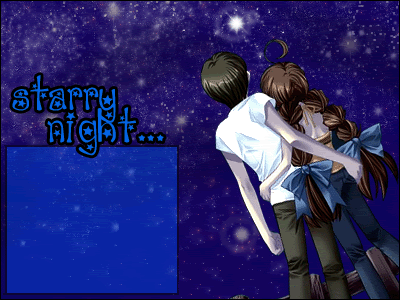
Image: http://img.photobucket.com/albums/v37/M ... onight.jpg
Program: PS 7
Scholastic
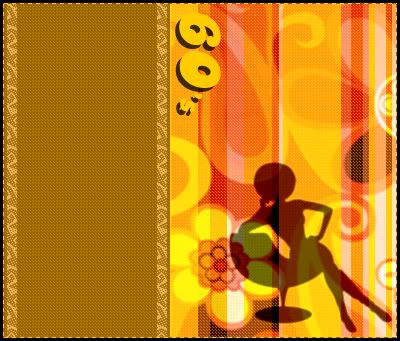
Image: http://www.phrizbie-design.com/logo_des ... esign3.gif
Program Used: PS 7
jaye

Program Used: PS 7
Note to Judges: If you see grey surrounding the sphere, it is supposed to be transparent,
but is not transparent if you use IE.
jellyoflight
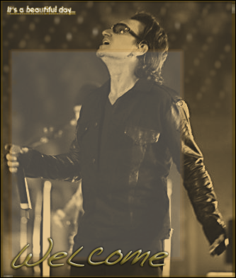
Image:http://img.photobucket.com/albums/v385/SqueezyCheezyMushNess/originalimage.jpg
Programs Used: PSP 9, Serif PhotoPlus, Paint
Amethyst

Image: http://img.photobucket.com/albums/v31/l ... 9/zeal.jpg
Program Used: PS Elements
Jasujo

Image: http://e.1asphost.com/jasujo/candy_sachet_gold350.gif
Program Used: PS 7
Goldfish Lover

Image: http://images.neopets.com/games/new_tra ... wbunny.gif
Program Used: PSP
Kandice

Images: http://img.photobucket.com/albums/v209/ ... prom10.png
http://img.photobucket.com/albums/v209/ ... res/m9.png
http://img.photobucket.com/albums/v209/ ... /prom5.png
http://img.photobucket.com/albums/v209/ ... /prom7.png
Program: PSP 7
JellyFish72
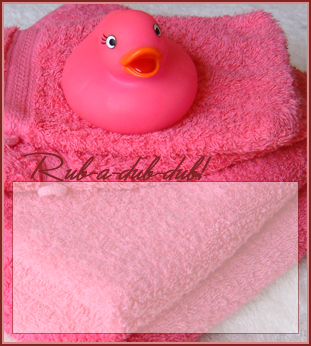
Image: http://www.sxc.hu/browse.phtml?f=view&id=297227 (Originally used a larger version but lost image)
Programs Used: PSP 9, PS CS, Animation Shop 3
Twisted Sanity

Images: http://www.pbs.org/newshour/updates/ima ... symbol.jpg
http://www.radgraphics.net/images/main/ ... 0-%201.jpg
Program Used: Macromedia Fireworks
jasminech
Images:http://img.photobucket.com/albums/v504/StarryeyedJas/Sketches/sopi.jpg (picture friend drew)
http://img.photobucket.com/albums/v504/ ... /leaf2.jpg (drawn by jasminech)
Programs: PSP 8 and PS CS
Apricus

Image: http://img.photobucket.com/albums/v385/ ... sepic1.jpg
Program: PSP 8
Adoration

Image: http://img.photobucket.com/albums/v112/ ... f/ah02.jpg
Programs: PSP 8, PS 7
Lauren.
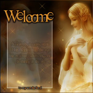
Image:http://xs32.xs.to/pics/05234/034.jpg
Program: PSP 8
DM was on fire!
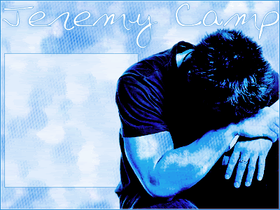
Image:http://img.photobucket.com/albums/v112/pieceofmyselfsadi/ppttgstuff/jeremycarriedorigpic.jpg
Program: PSP 8
Fizzy

Image: http://img.photobucket.com/albums/v27/a ... ngzhou.jpg
Program: GIMP 2.0
Izzi

Image: http://www.furiae.com/gallery/nawheera.jpg
Program Used: PSP 8
Neopets Addict

Image: http://images.neopets.com/pets/happy/pt ... e_baby.gif
Program Used: PS CS
mazil
Image: http://www.cinecon.com/albums/album34/aav.jpg
Program Used: PS 7
Neko
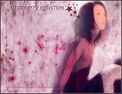
Image: http://img.photobucket.com/albums/v199/ ... 52_jpg.jpg
Program Used: PS CS2
rachel
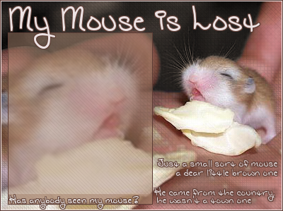
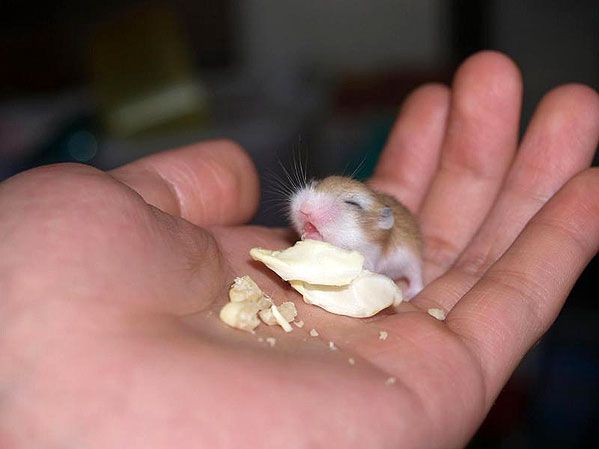
Image: http://img.photobucket.com/albums/v390/ ... /mouse.jpg
Program Used: PSP 9
Koku
Image: http://img.photobucket.com/albums/v35/e ... denpic.gif
Program Used: PS 7
LAQ
Image: http://www.freepgs.com/spunky/setpics/009.jpg
Program Used: Gimp 2.2
Kitten Medli
Image: http://img.photobucket.com/albums/v37/M ... arlene.jpg
Program Used: Paint, PS Elements
timkhj

Images: http://tim.arlott.com/blog/pic1.jpg
http://tim.arlott.com/blog/pic2.jpg
InsanePlushie

Image: http://home.kabelfoon.nl/~paternot/ppttg/original.png
Program Used: PS 7
Judges are to choose 4.
Image: http://www.hilaryduff.com/html_2003/pic ... AY-006.jpg
Program Used: PS 7
watericesage
Image:http://www.kuhmann.com/yangliu/Amati%20violin%20(large).jpg
Program Used: PSP 9
Dawn 2
Program Used: PSP 9
Sunnie
Image: http://img.photobucket.com/albums/v37/M ... onight.jpg
Program: PS 7
Scholastic
Image: http://www.phrizbie-design.com/logo_des ... esign3.gif
Program Used: PS 7
jaye
Program Used: PS 7
Note to Judges: If you see grey surrounding the sphere, it is supposed to be transparent,
but is not transparent if you use IE.
jellyoflight
Image:http://img.photobucket.com/albums/v385/SqueezyCheezyMushNess/originalimage.jpg
Programs Used: PSP 9, Serif PhotoPlus, Paint
Amethyst
Image: http://img.photobucket.com/albums/v31/l ... 9/zeal.jpg
Program Used: PS Elements
Jasujo
Image: http://e.1asphost.com/jasujo/candy_sachet_gold350.gif
Program Used: PS 7
Goldfish Lover
Image: http://images.neopets.com/games/new_tra ... wbunny.gif
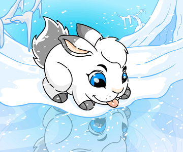
Program Used: PSP
Kandice
Images: http://img.photobucket.com/albums/v209/ ... prom10.png
http://img.photobucket.com/albums/v209/ ... res/m9.png
http://img.photobucket.com/albums/v209/ ... /prom5.png
http://img.photobucket.com/albums/v209/ ... /prom7.png
Program: PSP 7
JellyFish72
Image: http://www.sxc.hu/browse.phtml?f=view&id=297227 (Originally used a larger version but lost image)
Programs Used: PSP 9, PS CS, Animation Shop 3
Twisted Sanity
Images: http://www.pbs.org/newshour/updates/ima ... symbol.jpg
http://www.radgraphics.net/images/main/ ... 0-%201.jpg
Program Used: Macromedia Fireworks
jasminech
Images:http://img.photobucket.com/albums/v504/StarryeyedJas/Sketches/sopi.jpg (picture friend drew)
http://img.photobucket.com/albums/v504/ ... /leaf2.jpg (drawn by jasminech)
Programs: PSP 8 and PS CS
Apricus
Image: http://img.photobucket.com/albums/v385/ ... sepic1.jpg
Program: PSP 8
Adoration
Image: http://img.photobucket.com/albums/v112/ ... f/ah02.jpg
Programs: PSP 8, PS 7
Lauren.
Image:http://xs32.xs.to/pics/05234/034.jpg
Program: PSP 8
DM was on fire!
Image:http://img.photobucket.com/albums/v112/pieceofmyselfsadi/ppttgstuff/jeremycarriedorigpic.jpg
Program: PSP 8
Fizzy
Image: http://img.photobucket.com/albums/v27/a ... ngzhou.jpg
Program: GIMP 2.0
Izzi
Image: http://www.furiae.com/gallery/nawheera.jpg
Program Used: PSP 8
Neopets Addict
Image: http://images.neopets.com/pets/happy/pt ... e_baby.gif
Program Used: PS CS
mazil
Image: http://www.cinecon.com/albums/album34/aav.jpg
Program Used: PS 7
Neko
Image: http://img.photobucket.com/albums/v199/ ... 52_jpg.jpg
Program Used: PS CS2
rachel
Image: http://img.photobucket.com/albums/v390/ ... /mouse.jpg
Program Used: PSP 9
Koku
Image: http://img.photobucket.com/albums/v35/e ... denpic.gif
Program Used: PS 7
LAQ
Image: http://www.freepgs.com/spunky/setpics/009.jpg
Program Used: Gimp 2.2
Kitten Medli
Image: http://img.photobucket.com/albums/v37/M ... arlene.jpg
Program Used: Paint, PS Elements
timkhj
Images: http://tim.arlott.com/blog/pic1.jpg
http://tim.arlott.com/blog/pic2.jpg
InsanePlushie
Image: http://home.kabelfoon.nl/~paternot/ppttg/original.png
Program Used: PS 7
Judges are to choose 4.
Sun Jun 12, 2005 4:19 am
General note: the text area for blogs needs to be relatively big. Probably a good 600 pixels combined width and height and room for 8-10 words going across. Some of the text areas on the blogs here are quite small, not giving enough room to get very many words without the scrollbar(which should also be taken into account when sizing the text area). I didn’t talk about this individually though, but the people who’s text areas are too small should know who they are.
Adam loves Hillary Duff: I’m not entirely sold on the monotone color scheme you chose, it’s nice, but I think you could have chosen a better color scheme. The cut off top right-hand corner seems a bit out of place. All and all, it’s a good blog though, and I like your font choice.
Watericesage: A very good piece. I love the way the base stands out just a little bit from the background. The background seems to have a grunge sort of theme, at least to me. And I feel that it’s a wonderful juxtaposition of elegance of classical music compared to the crass of the background. I don’t like the white text or text area you chose, but I don’t know what would have looked better. I aould have also tried enlarging the text area. Very good work altogether though. See general note.
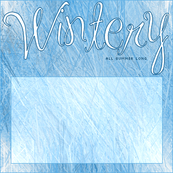
Dawn2: I do like the way you did the text area. But other than that, I don’t really like this blog. I don’t see a lot of effort put into it. All I can see is som random brush strokes for the background. I don’t really like the text choice for “Wintery,” but it works. You could have done better.
Sunnie: Very nice job with this one. I like the fact that you didn’t just use the image as the background, but you added stars to it. I really think that helped this piece come alive. I didn’t actually know you altered the image until I saw the original, which is a good thing. It means that you can blend extra elements into an image to enhance, which you did a remarkable job doing here. My only qualm is the size and color of both textbox and the text. I personally would never use a text so busy. I think it detracts from the actual art. The elements of the image are what really make this blog stand out for me. Good job. See general note.
Scholastic: Wow, that’s all I can really say about this piece. I really like it. the background is flashy and stylish without being too busy. The brown seems like it would look better as a different color, like say, black? I don’t know for sure. Another thing is, the background doesn’t really bring up the feeling of the 60’s, which isn’t a problem per-se, just something that makes the blog feel weird to me, that’s all.
_Jaye_: I like what you did with this. I’m using IE, but that’s not realy a problem, I know what it would look like transparent. The star pattern you put in is very nice looking. I think you could have done a better job making the ball look 3-D, and I also think you could have made the pixel text look better, but that’s about it.
Jellyoflight: I like the monotone here, for some reason. I’m not usually a fan of monotone, but it works here. I don’t like the way you boxed the text area in or the font you chose for “Welcome,” but I like everything else.
Amethyst: Wonderful job with this piece. The only problem I have with it is the small size of the text area, which isn’t that major. I can’t think of anything I would change. Fantastic.
Jasujo: Good work. This piece really reminds me of the saying “less is more.” The picture has a certain elegance about it, and you capture that elegance wonderfully. I don’t like the border you chose for text area and I think the text area could stand to be larger, especially with the inside detailing.
Goldfish Lover: This piece is alright. I don’t like the way you went with the border, the choppiness doesn’t really match the clean-cut lines of the rest of the piece. And I think you could have chosen better fonts. I like the subtle pixel overlay you added, though.
Kandice: The image manipulation is good, but as a blog, it seems like your piece would be very hard use, considering the colors. It’s also hard to see the images or read the text.
Jellyfish72: I’m not particularly a fan of the image you chose, I think you could have used a better one. The outline on the whole blog is too thick for my taste. What I do like is the text area, it works very well with the blog.
Twisted Sanity: You’ve put together a wonderful blog here. The image looks really good with the slight mosaic you put on. The font, although I don’t really like that type of font, works here. And the radioactive symbol in the text area pulls the whole things together. A stellar piece of work.
Jasminech: This piece is nice. I don’t like the purple background you put on it, the only logical explanation I can think of why it’s there is because it the background color of the webpage where this blog is meant for use. The girl’s placement is right on, I think, in both places. I think the leaves would look a little better if you had them be slightly transparent, maybe 60%. I think the text “cherry blossom” needs to be a different color, one that matches the rest of the blog more.
Apricus: VERY good job. The colors you chose are absolutely marvelous. The font choice is great. And I really like the text area, albeit it being a little small.
Adoration: Good work on this one. The only problem I have is that the picture looks sloppy, you missed a few white spots and some of the cuts are a little jagged. The blog layout is very good though.
Lauren.: this is another very good piece. Other than the fact that you didn’t do much with the image, I like the artistic aspects of the blog. I think the piece would look better if there wasn’t the text in the text area, it’s somewhat distracting.
DM was on fire!: this is good. You cut the image out of the original very well. The layout is well done as well. The only thing I don’t like is your font choice.
Fizzy: I like this one a lot. You made the right choice by taking the second image out of the blog. What I think you should have done is make the text area larger, because right now, it’s very small. See general note.
Izzi: Like marissa said, please don’t direct link if the site doesn’t allow it. I like your blog a lot though. The only thing I would change is the font choice on “to my sanctuary”
Neopets Addict: Good work here. The colors mesh very well together, and I like the text placement. The only thing I don’t like is how the text area goes almost al the way to the sides of the enter blog. This creates a very common visual effect; one that I feel looks bad. Shrink the text box one to two pixels on each side to remove this effect.
Mazil: fan-tas-tic. I really like this. I like juxtaposition of the anime image and the rest of the blog, the non-matching works. I also like your non-conventional approach to the text area.
Neko: I don’t really know what to say other than that this piece is simply really cool. It’s also very artistically sound. Everything matches, and the brushes and effects you used are all very good. I didn’t quite understand what the wing was at first, but when it clicked in my mind, the blog just got that much cooler. Once again, this piece is really cool.
Rachel: I don’t know what I don’t like about this blog, but the thing just doesn’t hit it for me. I think it’s the picture combined with font choice. Both of which don’t really work for me, the image is just weird looking for me, and the font is hard to descipher(it took me a good five minutes to realize the last word in the title was “lost”, at first, I think it was “nosy”). I also don’t think the mouse face inside the text area is necessary. The blog is quite functional though, which is a good thing.
Koku: Good all around. You did a good job softening the image and I like that you used grayscale to set the text area apart. Good job all around, no changes.
LAQ: I like the colors, and the way the image is overlayed gives me a feeling of mystery. The text box stands out a little too much for me, maybe try a different color instead of white?
Kitten Medli: I like that you extended the image, and it looks pretty seamless. Good job there, the font you chose works perfectly. You also picked a very soft and pleasing color-pallet. See general note.
Timkhj: This blog is technically and functionally very sound, one of the best of the bunch in those respects. But the aesthetics are a little lacking, mainly because of the image you chose. Don’t get me wrong, the blog is by no means bad. I like how you did the text, it just leaves a little to be desired artistically and could have been better.
InsanePlusihe: I like this blog, the image is especially good. The text inside the area is very creative and really fitting, to me. The only thing I don’t like is how light you made the text area, I think it would have looked better if it were darker, say black, and the text was white or another light color.
Out: Dawn2, Jellyfish72, Rachel, Timkhj
Adam loves Hillary Duff: I’m not entirely sold on the monotone color scheme you chose, it’s nice, but I think you could have chosen a better color scheme. The cut off top right-hand corner seems a bit out of place. All and all, it’s a good blog though, and I like your font choice.
Watericesage: A very good piece. I love the way the base stands out just a little bit from the background. The background seems to have a grunge sort of theme, at least to me. And I feel that it’s a wonderful juxtaposition of elegance of classical music compared to the crass of the background. I don’t like the white text or text area you chose, but I don’t know what would have looked better. I aould have also tried enlarging the text area. Very good work altogether though. See general note.
Dawn2: I do like the way you did the text area. But other than that, I don’t really like this blog. I don’t see a lot of effort put into it. All I can see is som random brush strokes for the background. I don’t really like the text choice for “Wintery,” but it works. You could have done better.
Sunnie: Very nice job with this one. I like the fact that you didn’t just use the image as the background, but you added stars to it. I really think that helped this piece come alive. I didn’t actually know you altered the image until I saw the original, which is a good thing. It means that you can blend extra elements into an image to enhance, which you did a remarkable job doing here. My only qualm is the size and color of both textbox and the text. I personally would never use a text so busy. I think it detracts from the actual art. The elements of the image are what really make this blog stand out for me. Good job. See general note.
Scholastic: Wow, that’s all I can really say about this piece. I really like it. the background is flashy and stylish without being too busy. The brown seems like it would look better as a different color, like say, black? I don’t know for sure. Another thing is, the background doesn’t really bring up the feeling of the 60’s, which isn’t a problem per-se, just something that makes the blog feel weird to me, that’s all.
_Jaye_: I like what you did with this. I’m using IE, but that’s not realy a problem, I know what it would look like transparent. The star pattern you put in is very nice looking. I think you could have done a better job making the ball look 3-D, and I also think you could have made the pixel text look better, but that’s about it.
Jellyoflight: I like the monotone here, for some reason. I’m not usually a fan of monotone, but it works here. I don’t like the way you boxed the text area in or the font you chose for “Welcome,” but I like everything else.
Amethyst: Wonderful job with this piece. The only problem I have with it is the small size of the text area, which isn’t that major. I can’t think of anything I would change. Fantastic.
Jasujo: Good work. This piece really reminds me of the saying “less is more.” The picture has a certain elegance about it, and you capture that elegance wonderfully. I don’t like the border you chose for text area and I think the text area could stand to be larger, especially with the inside detailing.
Goldfish Lover: This piece is alright. I don’t like the way you went with the border, the choppiness doesn’t really match the clean-cut lines of the rest of the piece. And I think you could have chosen better fonts. I like the subtle pixel overlay you added, though.
Kandice: The image manipulation is good, but as a blog, it seems like your piece would be very hard use, considering the colors. It’s also hard to see the images or read the text.
Jellyfish72: I’m not particularly a fan of the image you chose, I think you could have used a better one. The outline on the whole blog is too thick for my taste. What I do like is the text area, it works very well with the blog.
Twisted Sanity: You’ve put together a wonderful blog here. The image looks really good with the slight mosaic you put on. The font, although I don’t really like that type of font, works here. And the radioactive symbol in the text area pulls the whole things together. A stellar piece of work.
Jasminech: This piece is nice. I don’t like the purple background you put on it, the only logical explanation I can think of why it’s there is because it the background color of the webpage where this blog is meant for use. The girl’s placement is right on, I think, in both places. I think the leaves would look a little better if you had them be slightly transparent, maybe 60%. I think the text “cherry blossom” needs to be a different color, one that matches the rest of the blog more.
Apricus: VERY good job. The colors you chose are absolutely marvelous. The font choice is great. And I really like the text area, albeit it being a little small.
Adoration: Good work on this one. The only problem I have is that the picture looks sloppy, you missed a few white spots and some of the cuts are a little jagged. The blog layout is very good though.
Lauren.: this is another very good piece. Other than the fact that you didn’t do much with the image, I like the artistic aspects of the blog. I think the piece would look better if there wasn’t the text in the text area, it’s somewhat distracting.
DM was on fire!: this is good. You cut the image out of the original very well. The layout is well done as well. The only thing I don’t like is your font choice.
Fizzy: I like this one a lot. You made the right choice by taking the second image out of the blog. What I think you should have done is make the text area larger, because right now, it’s very small. See general note.
Izzi: Like marissa said, please don’t direct link if the site doesn’t allow it. I like your blog a lot though. The only thing I would change is the font choice on “to my sanctuary”
Neopets Addict: Good work here. The colors mesh very well together, and I like the text placement. The only thing I don’t like is how the text area goes almost al the way to the sides of the enter blog. This creates a very common visual effect; one that I feel looks bad. Shrink the text box one to two pixels on each side to remove this effect.
Mazil: fan-tas-tic. I really like this. I like juxtaposition of the anime image and the rest of the blog, the non-matching works. I also like your non-conventional approach to the text area.
Neko: I don’t really know what to say other than that this piece is simply really cool. It’s also very artistically sound. Everything matches, and the brushes and effects you used are all very good. I didn’t quite understand what the wing was at first, but when it clicked in my mind, the blog just got that much cooler. Once again, this piece is really cool.
Rachel: I don’t know what I don’t like about this blog, but the thing just doesn’t hit it for me. I think it’s the picture combined with font choice. Both of which don’t really work for me, the image is just weird looking for me, and the font is hard to descipher(it took me a good five minutes to realize the last word in the title was “lost”, at first, I think it was “nosy”). I also don’t think the mouse face inside the text area is necessary. The blog is quite functional though, which is a good thing.
Koku: Good all around. You did a good job softening the image and I like that you used grayscale to set the text area apart. Good job all around, no changes.
LAQ: I like the colors, and the way the image is overlayed gives me a feeling of mystery. The text box stands out a little too much for me, maybe try a different color instead of white?
Kitten Medli: I like that you extended the image, and it looks pretty seamless. Good job there, the font you chose works perfectly. You also picked a very soft and pleasing color-pallet. See general note.
Timkhj: This blog is technically and functionally very sound, one of the best of the bunch in those respects. But the aesthetics are a little lacking, mainly because of the image you chose. Don’t get me wrong, the blog is by no means bad. I like how you did the text, it just leaves a little to be desired artistically and could have been better.
InsanePlusihe: I like this blog, the image is especially good. The text inside the area is very creative and really fitting, to me. The only thing I don’t like is how light you made the text area, I think it would have looked better if it were darker, say black, and the text was white or another light color.
Out: Dawn2, Jellyfish72, Rachel, Timkhj
Sun Jun 12, 2005 3:36 pm
moogie wrote:Dawn2: I do like the way you did the text area. But other than that, I don’t really like this blog. I don’t see a lot of effort put into it. All I can see is som random brush strokes for the background. I don’t really like the text choice for “Wintery,” but it works. You could have done better.
Actually, I didn't use any brushes at all. The background was made with a mixture of effects, and it took a long time to get it to look exactly that way. Even if you don't see the effort, I assure you it was there.
Sun Jun 12, 2005 11:20 pm
Wow, I haven't done this in awhile. And this is gonna take quite some time, considering how many contestants there are now compared to PPTTG1, which didn't even end. o___o
Anyway, here goes. I'm gonna try not to be too nice. :P
Adam loves Hilary Duff: It looks decent as a whole as a graphic (contrary to moogie's opinion, I like the blue tone), but there are quite a few bits which I find could use a little fixing. First off, the corner on the top right is really annoying me. I understand that it's part of the original picture, but since you're using PS7, surely you could use at least the Clone Stamp to get rid of it. Also, the dots you placed on the picture seem more detrimental than beneficial- it makes the image look of a lower quality, to be honest. Also, the blog area needs to be more opaque- I can't think of a specific colour that would show up well in there. Good size choice though.
watericesage: As nice as the background is, and how you fixed up the violin, there's really one large thing I notice about the blog that detracts me from it. The blog area. The colour seems too light- I suspect you used an offwhite and made it translucent? Sure, text would definitely show on it, but perhaps a brown would have done the job better. Also, the text area is small and makes the blog looks disproportional as a whole.
Dawn2: Your created background is simple (to the point where I don't see much effort, contrary to what you say yourself about not using brushes), but unique. Colours suit each other, and the blog area is a good colour and size to be usable. The font for "wintery," however, doesn't really seem to fit- it's also the dominant element, which really makes this blog a lot less than it could have been. Perhaps you could have added more wintery elements and summery elements to create a "clash"- I'm sure you could do that from scratch on PSP. Forgive me if I'm being vague, but that's all I can put into words.
Sunnie: Very nice. Your colour adjustments and addition of stars onto the picture are very very fitting. My only real criticisms are that the colour of the text area is a little too bright, and the text area is also a tad on the small side.
Scholastic: Excellent work there- I'm a little curious though, are those flowers and the motif bordering the text area brushes, backgrounds, or something you made yourself? Regardless, the colours are vibrant and all elements fit your sixties theme. One thing I might have done myself though would be to carry the colours you have on the right to a small portion of the left, or just "tone up" the tan of the text area to something brighter.
_jaye_: As off-the-wall as this idea is, I'm not too fond of what you've got there... I like your crystal ball theme idea, but it's not looking like one to me. The glitter and stars work out nicely, but the ball isn't three-dimensional enough. Other than that, the text area's pretty nice, although the rectangle looks a tad awkward in there- perhaps some rounded fading would work. After all, text may only code to arrange in rectangles, but that doesn't mean your text area can't be larger and have an irregular shape.
jellyoflight: Hmm. First of all, the image looks fine- even though you only really just put a sepia tone over it. I like your 3D-ish text effect, and the colours pretty much fit altogether, but it's really the text area that seems problematic. I like your colour offsetting and the light border you added to it- but really, that kinda working belongs in anything but a blog (it'd look excellent on a set if you utilised it well). With Bono looking so dark and the rest of the background so much lighter, there's really no text colour that would show up completely, and defeats the purpose of a blog.
Amethyst: Eep, a little too bright. The "glow" (in other words, slight more contrast) you added is a good touch, but too much. The bottom's also rather busy- you could fade the grid there and perhaps the brightness of the image to allow for the text to show better (maybe a translucent rectangle with a gradient mask?). I like your text area design, it allows for customisable headers, I guess. The swirls seem to show up a bit too much though.
Jasujo: Nice and elegant! A few issues I see though- the pattern you have in your text area, especially on the top left of it, kinda runs into the image and jumbles it. If you made the edges of the text area more opaque/white (use a layer mask), it'd make things cleaner. You could also have made your name a little more clear and the border of the text area more gold- use the Dodge and Burn tools slightly to adjust that.
Goldfish Lover: Mm...as neat as those many patterns you added in the background are, there hasn't been much done. The borders could have been in shades of blue rather than just plain black, for starters- and in turn, the image should have been adjusted accordingly. This image also isn't the best to make a blog with- there aren't very many places to put a proper text area. Yours is running into the Snowbunny- text would be hard to read and the image wouldn't look so nice. The text choice for "welcome" also doesn't seem to fit very well.
Kandice: Very nice- I like how you stuck to black and white, but mostly black- I hate to go against moogie again, but I find that this works out for the better, as it'd be easier to decide on a text colour. Nice blending of images. Text area is a good size, but I think in order for the text to work better, the text area should be more contrasted than the rest of the blog.
JellyFish72: It really doesn't seem like you've done anything other than add a border, text, and a text area. I'm frankly at a loss at why you had to use three programs to achieve this. Nevertheless, it's usable as the text area can definitely make things readable. "Rub-a-dub-dub!" could be brought out more, it's getting lost in that towel, heh.
Twisted Sanity: Very nice. The scanlines and mosiac effect work very well together to portray the theme you've got, as well as all that text (illegible too, which is good for things like this) you have over the radioactive symbol. Your blog area is a good size- I like the erratic effect that came out, with the border and the scanlines, but most of all, I'm glad you went against the flow and used something that isn't just a plain rectangular shape. It's those little things that make me like this one.
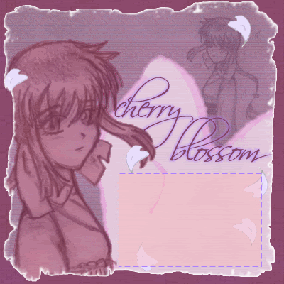
jasminech: Hmmm. This one could have been nice, but it's the colours that throw it off. The plum background you used really doesn't suit it, and the purples and pinks used inside really don't match, as well as that orangey colour inside the text area. The inner border is a neat idea, but not pulled off too well- first, either go with more white, or scrap the white and go with a darker colour; second, the edges, especially on the right, show up terribly pixelly. Your text could have a few adjustments- perhaps rasterise "blossom" and get rid of some of that overlapping between the "b" and "l". Otherwise, it's an interesting take- the falling cherry blossoms are quite neat, but could stand out more if they were more in your colour scheme.
Apricus: Very nice, but some parts are too busy. The star(s) (I can't tell if there are more than one) you added in the corner are unnecessary. The part where the flowers cover the house in the original picture seem vastly different and confusing in your blog- I'm not entirely sure what you did there. It's also really busy where "happily ever after" is- tone down the background there. However, all in all, this is excellent- I like the faint flower pattern/motif you put in places, and the text area works well and has good creative touches- the border's great (no need for those slightly crooked edges though), and I'm a fan of those different shaded rectangles.
Adoration: Neat, but too simple (again, to the point where I don't see the effort that may have gone into it). First off, the image isn't very clean- there's white around the glasses and hair, and remnants of a purple shadow on the right side. Text and text area are clean (although "let's run together" gets a little messy and could have been moved slightly lower), but only because the background's plain- it really just seems like a Clouds filter. The pattern inside the text area does make the difference, though.
Lauren: Hmm, it looks okay, but it doesn't seem like you've done much with the image other than echo it on the left. I see that you tried a 3D effect on "welcome", but it doesn't seem to work too well- there aren't enough shadows and highlights, and the "stickiness" of New Romantics really takes away from it. The text inside is distracting- if you want to include it, perhaps a different place on the picture would be more suitable. The sparkles are a nice touch, but you used too many of the same one, which makes it look redundant in places. If you had it in different sizes and shapes, it would definitely work.
DM was on fire!: Pretty decent, although it seems awfully like Adoration's in that it's too simple, with that clouds background. The saturated look is creative in that you placed the clouds over Jeremy Camp and set as some kinda overlay, but really too much, and could be toned down with a layer mask (or if PSP doesn't have that, just the eraser tool on half opacity or something like that). The text also could be more clear and standout. I do like how you placed Jeremy over the text area, though.
Fizzy: Looks clean and nice. Changing the colour scheme to pink was a good choice, and the various different grids you added in the background work and blend fairly well (there are spots in the lower left corner where it doesn't). The text area is fairly usable (could be bigger, if the picture placement was rearranged), but it really needs to be more defined, otherwise text would look out of place if placed on there.
Izzi: Because of the direct linking, I can't tell if you've done anything to the image other than make it greyscale- and that's what I'll have to assume. "Welcome" is a little too dark and sticks out of the picture, and "to my sanctuary" could have been bigger and all in lowercase. The text area is a little thin, but the real problem with it is that it varies from grey to black too much- text won't show up very clearly.
Neopets Addict: A tad too simple- it seems mostly brushwork. You could have tied in the colours of the Faerie Pteri a little more- those purples, reds, and oranges look too nice to not be included. Your magic wand seems to be a little too strong- the Pteri's being cut into and parts look fuzzy. Text area works, but the size could be adjusted- it's too close to the border and makes the outer border look as though it's awfully thick.
mazil: Very cool- you made additions to the image that really make it look better than the original, and those additions also fit fine into a blog. The streaks of "wind," you could say, are really nice. You've got a neat text area there which looks of a good size- but I think it would have been better if it was set at a lesser angle (text room would not be compromised). Another thing I might change would be to add a darker border on the outside of the one you already have- some parts of it seem a little too light.
Neko: It was definitely a good idea, in my opinion, to fade away unnecessary parts of the image rather than attempt erasing- it looks good. The various patterns and colours you added in the background are nice and complementing, although not too busy imagewise. The stars, however, seem a little out of place- you could make them gleam a little more with the Dodge tool, change the colour, or fade them. Anyway, it does get a tad too busy in the text area- I'd suggest to make that text area more opaque and more pink, as I'm not entirely sure how text would show up in what you have right now.
rachel: Heh, this one makes me laugh. You could have done a little more to the image- perhaps making it of one colour scheme would have been better than just leaving it in its original colours. The grid (squares) pattern could be smaller, and it also looks a tad awkward on the hand. Text area is usable, although I'd fade the mouse a little more. Also, I'd move "Has anybody seen my mouse?" over to the right more as it seems to be sticking to that border.
Koku: I really like how you make this one less in colour and more in white, then changing the colour of those lines to a more rainbow fashion. Greyscaling the text area is creative, but it doesn't seem to be very feasible to use- the lines really need to be toned down in there so text can go in. "Garden of Eden" could also be more standout, although I understand the style and context you're using it in.
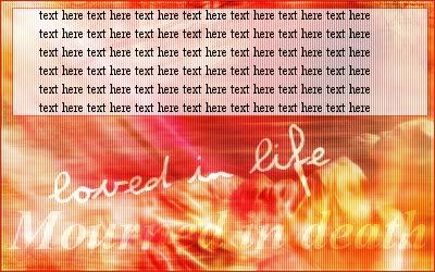
LAQ: As much as I like the colours, it seems a little awkward to me. The text area's fine and all, but it's really the text "loved in life" and "mourned in death" that throw things off. I couldn't tell there was a girl there until I saw your original image. The text should be smaller and less dominanting- "mourned in death" is also making things a little too busy with the folds in the girl's clothing. "Loved in life" could have been in another font- Violation doesn't seem to fit too well.
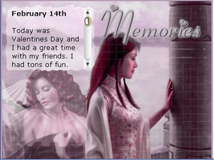
Kitten Medli: Very creative of you to keep the background of the original image and continue it on- the result looks very nice and different. It does get a little wavy at times though, but nevertheless, works in the text area. The text is very fitting. The only thing I'm not as fond of is the woman- the black stands out in a kind of weird way. A way to remedy that would be to either change the colour scheme of everything else to a darker brown, or to colourise her in the brown. Not so sure if that would work though...but it seems you did the best you could.
timkhj: A little overambitious, but nonetheless a good blog. I like how you decided to use your second image as a backdrop- however, there are parts which need a little work where it seems more obvious that two images were combined. It still took me quite awhile to figure that out though, so you did a decent job. "Race on" is at a great angle, but very pixelly- since I'm assuming that you're using PS 7 like Jasujo, did you use the Perspective function? Whenever that doesn't work out very well, you should go in there manually to do the touchups. Your text area is dark and a good size- very functional.
InsanePlushie: I like how you made the image more blue than the original. The text area is good in size and functionable (I like your text- how you made it as though there was a beginning and an end), but far too light. "Welcome to my story" and "the end" could be in a different font- the one you have is a little plain and doesn't suit it very well. But otherwise, it seems a little plain to me- you could add more than just the diagonal line pattern. Perhaps a bit of brushwork would be nice.
First, this round I'd like to commend Sunnie, Scholastic, Twisted Sanity, and Apricus for blogs that I just find awesome and outstanding.
Oh, now comes the part I hate... >_< *sigh* For the four I find not so fortunate this round- perhaps it's maybe you had an off day and you could be an excellent graphician, but hey, I can only judge based on what you have here and now, and only that. Sorry.
Dawn2, Goldfish Lover, JellyFish72, jasminech. (Slight warnings to Adam loves Hilary Duff and Lauren.)
Anyway, here goes. I'm gonna try not to be too nice. :P
Adam loves Hilary Duff: It looks decent as a whole as a graphic (contrary to moogie's opinion, I like the blue tone), but there are quite a few bits which I find could use a little fixing. First off, the corner on the top right is really annoying me. I understand that it's part of the original picture, but since you're using PS7, surely you could use at least the Clone Stamp to get rid of it. Also, the dots you placed on the picture seem more detrimental than beneficial- it makes the image look of a lower quality, to be honest. Also, the blog area needs to be more opaque- I can't think of a specific colour that would show up well in there. Good size choice though.
watericesage: As nice as the background is, and how you fixed up the violin, there's really one large thing I notice about the blog that detracts me from it. The blog area. The colour seems too light- I suspect you used an offwhite and made it translucent? Sure, text would definitely show on it, but perhaps a brown would have done the job better. Also, the text area is small and makes the blog looks disproportional as a whole.
Dawn2: Your created background is simple (to the point where I don't see much effort, contrary to what you say yourself about not using brushes), but unique. Colours suit each other, and the blog area is a good colour and size to be usable. The font for "wintery," however, doesn't really seem to fit- it's also the dominant element, which really makes this blog a lot less than it could have been. Perhaps you could have added more wintery elements and summery elements to create a "clash"- I'm sure you could do that from scratch on PSP. Forgive me if I'm being vague, but that's all I can put into words.
Sunnie: Very nice. Your colour adjustments and addition of stars onto the picture are very very fitting. My only real criticisms are that the colour of the text area is a little too bright, and the text area is also a tad on the small side.
Scholastic: Excellent work there- I'm a little curious though, are those flowers and the motif bordering the text area brushes, backgrounds, or something you made yourself? Regardless, the colours are vibrant and all elements fit your sixties theme. One thing I might have done myself though would be to carry the colours you have on the right to a small portion of the left, or just "tone up" the tan of the text area to something brighter.
_jaye_: As off-the-wall as this idea is, I'm not too fond of what you've got there... I like your crystal ball theme idea, but it's not looking like one to me. The glitter and stars work out nicely, but the ball isn't three-dimensional enough. Other than that, the text area's pretty nice, although the rectangle looks a tad awkward in there- perhaps some rounded fading would work. After all, text may only code to arrange in rectangles, but that doesn't mean your text area can't be larger and have an irregular shape.
jellyoflight: Hmm. First of all, the image looks fine- even though you only really just put a sepia tone over it. I like your 3D-ish text effect, and the colours pretty much fit altogether, but it's really the text area that seems problematic. I like your colour offsetting and the light border you added to it- but really, that kinda working belongs in anything but a blog (it'd look excellent on a set if you utilised it well). With Bono looking so dark and the rest of the background so much lighter, there's really no text colour that would show up completely, and defeats the purpose of a blog.
Amethyst: Eep, a little too bright. The "glow" (in other words, slight more contrast) you added is a good touch, but too much. The bottom's also rather busy- you could fade the grid there and perhaps the brightness of the image to allow for the text to show better (maybe a translucent rectangle with a gradient mask?). I like your text area design, it allows for customisable headers, I guess. The swirls seem to show up a bit too much though.
Jasujo: Nice and elegant! A few issues I see though- the pattern you have in your text area, especially on the top left of it, kinda runs into the image and jumbles it. If you made the edges of the text area more opaque/white (use a layer mask), it'd make things cleaner. You could also have made your name a little more clear and the border of the text area more gold- use the Dodge and Burn tools slightly to adjust that.
Goldfish Lover: Mm...as neat as those many patterns you added in the background are, there hasn't been much done. The borders could have been in shades of blue rather than just plain black, for starters- and in turn, the image should have been adjusted accordingly. This image also isn't the best to make a blog with- there aren't very many places to put a proper text area. Yours is running into the Snowbunny- text would be hard to read and the image wouldn't look so nice. The text choice for "welcome" also doesn't seem to fit very well.
Kandice: Very nice- I like how you stuck to black and white, but mostly black- I hate to go against moogie again, but I find that this works out for the better, as it'd be easier to decide on a text colour. Nice blending of images. Text area is a good size, but I think in order for the text to work better, the text area should be more contrasted than the rest of the blog.
JellyFish72: It really doesn't seem like you've done anything other than add a border, text, and a text area. I'm frankly at a loss at why you had to use three programs to achieve this. Nevertheless, it's usable as the text area can definitely make things readable. "Rub-a-dub-dub!" could be brought out more, it's getting lost in that towel, heh.
Twisted Sanity: Very nice. The scanlines and mosiac effect work very well together to portray the theme you've got, as well as all that text (illegible too, which is good for things like this) you have over the radioactive symbol. Your blog area is a good size- I like the erratic effect that came out, with the border and the scanlines, but most of all, I'm glad you went against the flow and used something that isn't just a plain rectangular shape. It's those little things that make me like this one.
jasminech: Hmmm. This one could have been nice, but it's the colours that throw it off. The plum background you used really doesn't suit it, and the purples and pinks used inside really don't match, as well as that orangey colour inside the text area. The inner border is a neat idea, but not pulled off too well- first, either go with more white, or scrap the white and go with a darker colour; second, the edges, especially on the right, show up terribly pixelly. Your text could have a few adjustments- perhaps rasterise "blossom" and get rid of some of that overlapping between the "b" and "l". Otherwise, it's an interesting take- the falling cherry blossoms are quite neat, but could stand out more if they were more in your colour scheme.
Apricus: Very nice, but some parts are too busy. The star(s) (I can't tell if there are more than one) you added in the corner are unnecessary. The part where the flowers cover the house in the original picture seem vastly different and confusing in your blog- I'm not entirely sure what you did there. It's also really busy where "happily ever after" is- tone down the background there. However, all in all, this is excellent- I like the faint flower pattern/motif you put in places, and the text area works well and has good creative touches- the border's great (no need for those slightly crooked edges though), and I'm a fan of those different shaded rectangles.
Adoration: Neat, but too simple (again, to the point where I don't see the effort that may have gone into it). First off, the image isn't very clean- there's white around the glasses and hair, and remnants of a purple shadow on the right side. Text and text area are clean (although "let's run together" gets a little messy and could have been moved slightly lower), but only because the background's plain- it really just seems like a Clouds filter. The pattern inside the text area does make the difference, though.
Lauren: Hmm, it looks okay, but it doesn't seem like you've done much with the image other than echo it on the left. I see that you tried a 3D effect on "welcome", but it doesn't seem to work too well- there aren't enough shadows and highlights, and the "stickiness" of New Romantics really takes away from it. The text inside is distracting- if you want to include it, perhaps a different place on the picture would be more suitable. The sparkles are a nice touch, but you used too many of the same one, which makes it look redundant in places. If you had it in different sizes and shapes, it would definitely work.
DM was on fire!: Pretty decent, although it seems awfully like Adoration's in that it's too simple, with that clouds background. The saturated look is creative in that you placed the clouds over Jeremy Camp and set as some kinda overlay, but really too much, and could be toned down with a layer mask (or if PSP doesn't have that, just the eraser tool on half opacity or something like that). The text also could be more clear and standout. I do like how you placed Jeremy over the text area, though.
Fizzy: Looks clean and nice. Changing the colour scheme to pink was a good choice, and the various different grids you added in the background work and blend fairly well (there are spots in the lower left corner where it doesn't). The text area is fairly usable (could be bigger, if the picture placement was rearranged), but it really needs to be more defined, otherwise text would look out of place if placed on there.
Izzi: Because of the direct linking, I can't tell if you've done anything to the image other than make it greyscale- and that's what I'll have to assume. "Welcome" is a little too dark and sticks out of the picture, and "to my sanctuary" could have been bigger and all in lowercase. The text area is a little thin, but the real problem with it is that it varies from grey to black too much- text won't show up very clearly.
Neopets Addict: A tad too simple- it seems mostly brushwork. You could have tied in the colours of the Faerie Pteri a little more- those purples, reds, and oranges look too nice to not be included. Your magic wand seems to be a little too strong- the Pteri's being cut into and parts look fuzzy. Text area works, but the size could be adjusted- it's too close to the border and makes the outer border look as though it's awfully thick.
mazil: Very cool- you made additions to the image that really make it look better than the original, and those additions also fit fine into a blog. The streaks of "wind," you could say, are really nice. You've got a neat text area there which looks of a good size- but I think it would have been better if it was set at a lesser angle (text room would not be compromised). Another thing I might change would be to add a darker border on the outside of the one you already have- some parts of it seem a little too light.
Neko: It was definitely a good idea, in my opinion, to fade away unnecessary parts of the image rather than attempt erasing- it looks good. The various patterns and colours you added in the background are nice and complementing, although not too busy imagewise. The stars, however, seem a little out of place- you could make them gleam a little more with the Dodge tool, change the colour, or fade them. Anyway, it does get a tad too busy in the text area- I'd suggest to make that text area more opaque and more pink, as I'm not entirely sure how text would show up in what you have right now.
rachel: Heh, this one makes me laugh. You could have done a little more to the image- perhaps making it of one colour scheme would have been better than just leaving it in its original colours. The grid (squares) pattern could be smaller, and it also looks a tad awkward on the hand. Text area is usable, although I'd fade the mouse a little more. Also, I'd move "Has anybody seen my mouse?" over to the right more as it seems to be sticking to that border.
Koku: I really like how you make this one less in colour and more in white, then changing the colour of those lines to a more rainbow fashion. Greyscaling the text area is creative, but it doesn't seem to be very feasible to use- the lines really need to be toned down in there so text can go in. "Garden of Eden" could also be more standout, although I understand the style and context you're using it in.
LAQ: As much as I like the colours, it seems a little awkward to me. The text area's fine and all, but it's really the text "loved in life" and "mourned in death" that throw things off. I couldn't tell there was a girl there until I saw your original image. The text should be smaller and less dominanting- "mourned in death" is also making things a little too busy with the folds in the girl's clothing. "Loved in life" could have been in another font- Violation doesn't seem to fit too well.
Kitten Medli: Very creative of you to keep the background of the original image and continue it on- the result looks very nice and different. It does get a little wavy at times though, but nevertheless, works in the text area. The text is very fitting. The only thing I'm not as fond of is the woman- the black stands out in a kind of weird way. A way to remedy that would be to either change the colour scheme of everything else to a darker brown, or to colourise her in the brown. Not so sure if that would work though...but it seems you did the best you could.
timkhj: A little overambitious, but nonetheless a good blog. I like how you decided to use your second image as a backdrop- however, there are parts which need a little work where it seems more obvious that two images were combined. It still took me quite awhile to figure that out though, so you did a decent job. "Race on" is at a great angle, but very pixelly- since I'm assuming that you're using PS 7 like Jasujo, did you use the Perspective function? Whenever that doesn't work out very well, you should go in there manually to do the touchups. Your text area is dark and a good size- very functional.
InsanePlushie: I like how you made the image more blue than the original. The text area is good in size and functionable (I like your text- how you made it as though there was a beginning and an end), but far too light. "Welcome to my story" and "the end" could be in a different font- the one you have is a little plain and doesn't suit it very well. But otherwise, it seems a little plain to me- you could add more than just the diagonal line pattern. Perhaps a bit of brushwork would be nice.
First, this round I'd like to commend Sunnie, Scholastic, Twisted Sanity, and Apricus for blogs that I just find awesome and outstanding.
Oh, now comes the part I hate... >_< *sigh* For the four I find not so fortunate this round- perhaps it's maybe you had an off day and you could be an excellent graphician, but hey, I can only judge based on what you have here and now, and only that. Sorry.
Dawn2, Goldfish Lover, JellyFish72, jasminech. (Slight warnings to Adam loves Hilary Duff and Lauren.)