Week 2
LAQ

The colors are pretty, and I like how you've warmed it up. The colors go well together. The blog area is nice as well, but the biggest problem for me in this blog is the quality of the image. The JPEGyness of the graphic really disrupts the nice, peaceful feeling of the blog. I dont know what noise removers are in GIMP, but if you can, try to enhance the quality of the images, when using low quality images like this.

-
8/10
Ansile
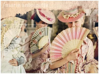
The ripped paper effect is nice. But I think the blog background isn't... opaque enough. I think text would have trouble showing up on there. Also, I can still notice the slight JPEG quality to the image. Try one of Photoshop's noise removers, I quite like Smart Blur too. -
8/10
Zilary
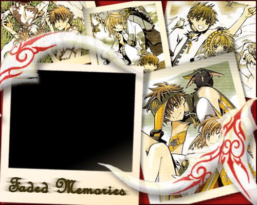
This is certainly very creative. It looks like you've put a lot of effort into it, especially in extracting those feathers out.

I like the old, nostalgia effect the photos have, but I have to complain about a few things. The red background seems kind of weird. I think it would also work if you chose a slightly lighter beige color instead of the black. However, the text is probably the biggest downfall. It looks very... weird and it doesn't seem to fit the blog at all. I think if you were to use a simple, windows default font. Something like that, on a slightly darker color than the background, would have worked much better. -
7.5/10
hakojo
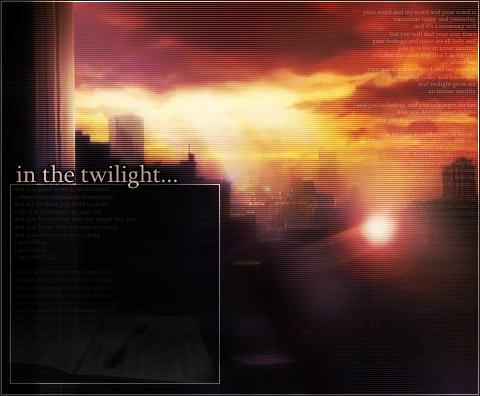
Wow. I just think this is gorgeous! I love how you manipulated the images, and the mystical feel of the whole thing. The text works well, and the faded book and the small text in the background of the blog is good also. It's barely noticable, which is good. The blog is also very functional. Excellent job!

-
9.5/10
Kugetsu
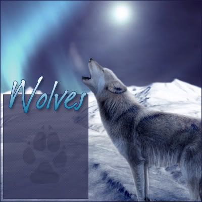
Well, I think it's nice how you blended all those images together.

It must've taken a long time. I'd like to say, I'm sooooo very glad that you edited your blog, to put new text on. However, the new one still doesn't really fit in with the blog, but it's getting better.

The pawprint in the background is nice, and adds to the blog. -
8/10
Ken
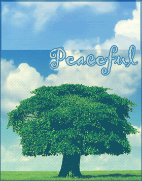
I like this one. It has a very simple, soothing feel to it. It's also very clean looking, which is a plus.

The font seems more Playful than peaceful to me, but it's still good. -
8.5/10
Rachel
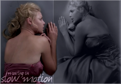
The blog on a whole is pretty good. The girl faded into the text area though, I think, could be just a little more faded. Not that text wont show there, but the fact that it can also distract your attention from the text that is going to be on there. I dont quite like the font as well, it doesn't seem to fit the mood of this blog. Again, perhaps a windows default font, like Georgia or Garamond might work better. I know you're going for a "dim" feel, but it really seems dull. -
7.5/10
DM was on fire!
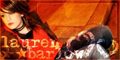
One of my biggest problems with this is the text area. Now, I'm all for the "a part of the person is in the text area" effect, it looks quite good sometimes. I think you might have overdone it a bit, because a good chunk of the text will be on her knee and her shoulder, which does look very weird. I dont quite like the pixalized effect on her also. -
7.5/10
Bangel
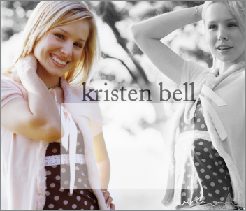
I really like this one, because it is very clean and relaxing. I think the greyscale and blending worked great here. Love the text also. I can notice just a tiny bit of blending problems around her hair, but it still looks very good. I think that you can move the text box over to the right just a bit more though, so that it covers a little bit less of the colored girl, which I assume is the main focus. -
8.5/10
jade_em
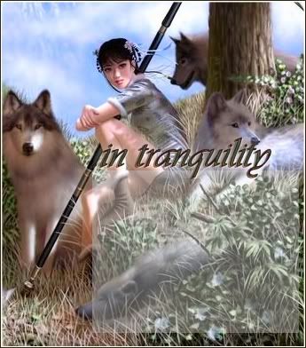
The whole feel of the graphic comes off as a little bit messy. I know that Paint shop pro has some noise removers, so you may want to run the image through a JPEG artifact remover before you start working with it. The text area seems very bland, also. -
7/10
Neko
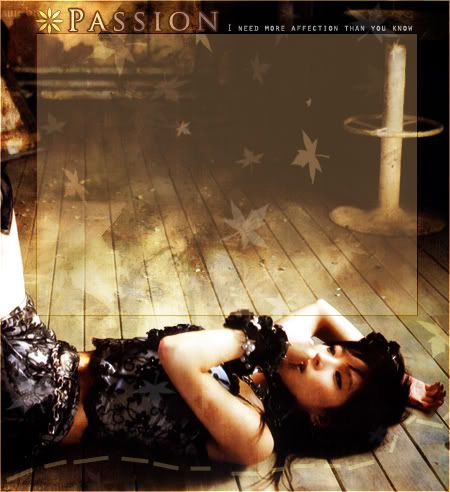
Ahh, this is very pretty. It also functions as a great blog.

I like the colors of the blog too. The text looks great. The only problem I have, and it's just a very small problem. I think the flower beside "Passion" looks kinda out of place. Perhaps you can replace it with one of the maple leaves you used in the blog? -
9/10
Kitten Medli

The colors work together very well on this one, the background is nice too. The blog area is very nice, and it looks very good. But I was just wondering why you didn't move it over to the left a bit more. There's space there, and you can move it so that there wont be a scrollbar over the fox's sceptre. Other than that though, it's a great blog.

-
8.5/10


