Fri Feb 18, 2005 6:53 am
Here's mine. Nothing too flashy:

Orignal Image: http://img.photobucket.com/albums/v55/Burinpu/Figo.jpg
Program: Paint Shop Pro
Oh, and if you were wondering. That is my dog.
Orignal Image: http://img.photobucket.com/albums/v55/Burinpu/Figo.jpg
Program: Paint Shop Pro
Oh, and if you were wondering. That is my dog.
Fri Feb 18, 2005 8:56 am
*sigh* Not what I can say my best. 
I'll see if I have time to fix it... but I don't know if I will... so...

Photo: http://img141.exs.cx/img141/6177/20040215139gd.jpg
Prog: PSP7
I'll see if I have time to fix it... but I don't know if I will... so...
Photo: http://img141.exs.cx/img141/6177/20040215139gd.jpg
Prog: PSP7
Fri Feb 18, 2005 9:23 am

Original Image: (original size was 1167 pixels wide and 795 pixels high, but I couldn't upload it like that) http://img19.exs.cx/img19/7411/harley59pb.png
Programs: Paint, Adobe Photoshop Elements
I'm really sorry about the original image. If I have time, I might try to work on another icon. :/
Sat Feb 19, 2005 9:44 pm
Sun Feb 20, 2005 7:13 am
here's my entry

original image in a second
program: PS 7
original image in a second
program: PS 7
Mon Feb 21, 2005 12:16 am
Once again, 4 are to be chosen.
Shadowfare
Original Image
Program Used: PS Elements 2
Kyra

Original Image
Program Used: PS 7
...Alex

Original Image
Program Used: PS 7
Amethyst

Original Image
Program Used: PS Elements
paola

Original Image
Program Used: PS 7
DM was on fire

Original Image
Program Used: PSP 8
meowth1982

Original Image
Program Used: PSP 9
Apricus

Original Image
Program Used: PSP 8
Koku

Original Image
Program Used: PS 7
hellyer

Original Image
Program Used: PSP 7
Neko

Original Image
Program Used: PS CS
(Note: Yes, this is red...I somehow missed this icon until it was too late to ask for an entry change. )
timkhj

Original Image
Program Used: PS 7
Optimus
Original Image
Program Used: PSP 5
ScottNak
Original Image
Program Used: PSP 7
Kitten Medli
Original Image
Programs Used: Paint, PS Elements
bluehawaii19

Original Image
Program Used: PS CS
Darklegendary

Image 1
Image 2
Program Used: PS 6
Sunnie

Original Image
Program Used: PS 7
Starchaser

Original Image
Program Used: PS 7
moogie
Original Image
Program: PS 7
Shadowfare
Original Image
Program Used: PS Elements 2
Kyra
Original Image
Program Used: PS 7
...Alex
Original Image
Program Used: PS 7
Amethyst
Original Image
Program Used: PS Elements
paola
Original Image
Program Used: PS 7
DM was on fire
Original Image
Program Used: PSP 8
meowth1982
Original Image
Program Used: PSP 9
Apricus
Original Image
Program Used: PSP 8
Koku
Original Image
Program Used: PS 7
hellyer
Original Image
Program Used: PSP 7
Neko
Original Image
Program Used: PS CS
(Note: Yes, this is red...I somehow missed this icon until it was too late to ask for an entry change. )
timkhj
Original Image
Program Used: PS 7
Optimus
Original Image
Program Used: PSP 5
ScottNak
Original Image
Program Used: PSP 7
Kitten Medli
Original Image
Programs Used: Paint, PS Elements
bluehawaii19
Original Image
Program Used: PS CS
Darklegendary
Image 1
Image 2
Program Used: PS 6
Sunnie
Original Image
Program Used: PS 7
Starchaser
Original Image
Program Used: PS 7
moogie
Original Image
Program: PS 7
Mon Feb 21, 2005 1:45 am
I'm sorry...I'll have to resign... Some things have come up and I am flooded with homework. Plus I keep on missing the deadlines. -_-. Maybe some other time.
Mon Feb 21, 2005 3:15 am
Mermaid Hil wrote:I'm sorry...I'll have to resign... Some things have come up and I am flooded with homework. Plus I keep on missing the deadlines. -_-. Maybe some other time.
You were already no longer able to participate when you didn't enter the last round...
I guess you didn't realize this, but once you miss/lose a round, you're out for good. Sorry.
Mon Feb 21, 2005 5:07 am
Flame wrote:moogie
Entry temporarily withheld until original image given.
here you go, sorry for the wait
http://raspberry-swirl.net/scans/0music ... ra-026.jpg
Mon Feb 21, 2005 9:45 pm
Murr.... I wish I'd had time to make a better entry before I left - oh well.
By the way, to judges - thanks so much for your comments on the last round. I did worry a little about the text color when making the blog, but I tested it out with black font, and it seemed to me to work reasonably well - I'll show you that version when I get back.
By the way, to judges - thanks so much for your comments on the last round. I did worry a little about the text color when making the blog, but I tested it out with black font, and it seemed to me to work reasonably well - I'll show you that version when I get back.
Wed Feb 23, 2005 3:21 pm
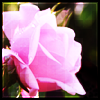
Shadowfare: This is one of the entries that I don't really understand, see, the rules for he round state "No red", then why do you choose an image with a pink rose on it? Sure, I know most colors contain traces of red, but by choosing a lighter version of the color doesn't justify it when looking at the rules. You could have just picked another image or used a blue gradient on this one or anything. Now then, on to the more graphic-sensed judging: You have used nice effects on the image and kept it simple and clean, the outer border, however, doesn't fit at all considering the light feel of the image.
Kyra: All in all I think this is a very good icon. Though it might seem like the text is more stylish when having a quite low opacity you should have made it stand out just a bit more. Also, looking at the placing of the image and text, I would have moved the image a bit lower down, so that the text wouldn't have been as close to the man's forehead as it is now. No biggy, good job.
...Alex: Eww... a spider. You have dared to be original though, and I'm not really here to judge you badly for choosing a critter I don't like in real life now am I? The words in the dark area of the blog should be more visible, for now I have to come closer to the screen and try to change my viewing position to see the words, rather irritating. I like how you have placed the image and the good word with gradients and effects.
Amethyst: I have nothing to say about this in major. Considering the image you chose and what effects you chose for the icon etc. it's not too shabby at all. I was thinking that all the green might just become too much green after a while of viewing. Often a detail with different color gives a little extra to many things.
paola: The image effects are great, but the border and text give the impression of that they were just put there without any further consideration. Mainly I started thinking about this as for me the image seems soft and nice, whereas the border is quite "hard" looking considering its style.
DM was on fire: First of all, even though the background behind the image is just a small part you should have worked on that a bit more, given it a texture, image effects, gradients, whatever. Just something. The image is cut out too roughly; the outlines of it should have been made softer. Also, I believe it would have been better if you had moved the image a bit further up (or made it a bit smaller) so that the text wouldn't be in immediate contact with the person's chin (yes, I know it's Hilary Duff, but for the sake of formality).
meowth1982: I think you are one of the few in this round that has nailed a really good style for an LJ icon. As it will probably not be followed by any other graphic really in touch with it, the icon needs to work "on its own", meaning that in a set for example the icon/avatar would be accompanied by a signature. I do not like how the text is black, try to be more experimental with that next time. Same thing goes for the dark-ish color of the border.
Apricus: My main problem with this set is the borders. For now it looks like you’ve used some kind of button effect on it, making it “stand up” a bit more. I think a simple one pixel bordernext to the darker outer border would have been a much better option.
Koku: Very elegant and good usage of fonts, colors and effects. Perhaps the inner border could have been made a bit transparent (less opacity). And that’s it.
hellyer: It doesn’t really look like you’ve done much at all to the image, resize and paste. A lot more could have been done. A calligraphic font would have been better, as at least I associate the diary in the picture as a handwritten one. You need to be more imaginative.
Neko: As stated, the icon is red, therefore you did not follow the given rules. As for the entry itself, it’s very good. The font does not fit into the combination as well as everything else though. Nevertheless, I do not know why this set wasn’t disqualified before the judging, that is up to Flame however.
timkhj: You have resized the image poorly and the proportions are all messed up. No real color improvement and the fonts aren’t placed that well. You could have done much better.
Optimus: I can’t say this is really bad, because it is actual quite nice. Still the main looks of it do not appeal me. Most probably cause it doesn’t have anything eye-catching in it. So to summarize this, sure, you did a very good job with the features and effects you chose but I feel you could have used your imagination a bit more. Rather hard to explain, but I hope you get something out of my blab.
ScottNak: And I thought curry is yellowish… oh well, sure, I’m not going to complain to about such things, don’t worry. Yet another icon that does not interest my eyes, you could have twiddled around with the text a bit more, make something special and flashy (not meaning that you should have animated it by saying ‘flashy’). Anyway, you could have for example placed the text on the edge of the bowl or something like that, mixing with brighter colors etc.
Kitten Medli: Nice start, looks like you stopped halfway through though. You could have worked more with at least the text, it doesn’t look good with the style it has now. Also, it would have been better if you had moved the picture of the parrot either a bit more upwards or a bit more down, this because of the fact that it doesn’t look nice when its head is touching the border just by a small edge.
bluehawaii19: You’ve really not done any justice to the original image, as for now I wasn’t even able to tell what the image was supposed to look like until I checked the original version. A border around the icon would have made it much better, and adding more strength to the text would not have hurt either.
Darklegendary: Next time, just forget about a thick black border around any graphic at all, in my opinion the can work in 0,5% of all tries. One pixel will do and it will look far better than you maybe can think. However you’ve done some nice blending, even though I think you could have used more colors in the icon, blue and black make it just boring. As for the text; it might not be too strong, but it is definitely the wrong color.
Sunnie: Magenta or not, looks like red to me (at least a part of it). Still don’t get why you guys insist even trying on making something pink, magenta or something like that when you know how close these come to red. Ah well, mysteries of life I suppose? All the borders on this one are quite off track. First of all the rainbow-scheme does not fit the image in any case, and by adding a black borders to that… well, it’s not exactly making it better. Just by using one pixel borders would have made this icon so much better already.
Starchaser: The icon seems to been made quite quickly, still it’s not that bad. I’m mostly bothered about the subtext, and more exactly the font you used. I think this could have been made a bit smaller, as it is now it is taking up too much space of the icon.
moogie: In some ways I do like this, and the details you put in it. exactly the things the viewer looks for with his/her eyes and that then catches their attention. Though the text and its placing is not bad, you could have thought about it a bit more and maybe changed its position (or altered the position of the image).
My votes go to, in no particular order, Sunnie, timkhj, Neko and bluehawaii19.
Wed Feb 23, 2005 4:04 pm
Silja wrote:bluehawaii19: You’ve really not done any justice to the original image, as for now I wasn’t even able to tell what the image was supposed to look like until I checked the original version. A border around the icon would have made it much better, and adding more strength to the text would not have hurt either.
I was going for a grungy feel to the icon. Since the flower was originally pinkish red, I needed to change that. Also, the icon does have a border around it...
Wed Feb 23, 2005 4:38 pm
Silja wrote:timkhj: You have resized the image poorly and the proportions are all messed up. No real color improvement and the fonts aren’t placed that well. You could have done much better.
I think he was going for the fish-eyed look, like the distorted reflection on a rounded surface.
bluehawaii19: You’ve really not done any justice to the original image, as for now I wasn’t even able to tell what the image was supposed to look like until I checked the original version. A border around the icon would have made it much better, and adding more strength to the text would not have hurt either.
No one said the icon has to look exactly like the original image.
Wed Feb 23, 2005 5:04 pm
Silja wrote:meowth1982: I think you are one of the few in this round that has nailed a really good style for an LJ icon. As it will probably not be followed by any other graphic really in touch with it, the icon needs to work "on its own", meaning that in a set for example the icon/avatar would be accompanied by a signature. I do not like how the text is black, try to be more experimental with that next time. Same thing goes for the dark-ish color of the border.
Wow, thank you *blushes* I use it a lot when I post on LJ now that I made it, it's one of my onw favorites. I realize that color is an issue for me, for some reason unbeknownst to me. It is something I'm working on though, and will probably change about this icon.
Wed Feb 23, 2005 5:18 pm
SpiraLethe wrote:Silja wrote:timkhj: You have resized the image poorly and the proportions are all messed up. No real color improvement and the fonts aren’t placed that well. You could have done much better.
I think he was going for the fish-eyed look, like the distorted reflection on a rounded surface.bluehawaii19: You’ve really not done any justice to the original image, as for now I wasn’t even able to tell what the image was supposed to look like until I checked the original version. A border around the icon would have made it much better, and adding more strength to the text would not have hurt either.
No one said the icon has to look exactly like the original image.
Regarding the second one, yes, I did word my thought badly. Still, they are my opionions and thoughts, I have not had the aim to try to add rules of my own or whatever you thought I was doing.