|
*deep breat before first PPTTG-judging* There are _quite_ many of you, but I'll sincerely try my best.
Dawn2: A very lovely set all in all, and I love the mix of all the blue colors. Also, good job with the transparency, many find that often hard but you have done a great job. The downfalls of the sets are in my opinion the main font as well as the rather plain background. I can't help thinking something more unusual font would have lightened it up a lot more. Some patterns etc. help bringing that little extra to the background. And to add it, the box on the sig ends rather abruptly, which I personally don't like.
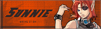
Sunnie: Nice set, really. Good color-combinations and choice of fonts. What was mainly brought to my mind was the image quality; looking at the used image it has gotten quite rough on the edges in the set, something you should work on. The stronger black dots in the background don't seem to work that well either and the subtext could use some extra effects making it stand out a bit more.
Darklegendary: This is quite an experimental set, and I don't mean anything bad when saying that. It's good to see that people dare to cross the borders and do some serious color editing etc. (I hope that was understandable...). The color of the outer border is a bit too strong, looking at the rest of the colors of the set. The border would fit better, if you had not made the background so light. Still no biggie, though. Good job.
bluehawaii19: The first thing that I thought of when seeing this set was that you definitely need to make the subtexts stronger (consideration of using pixel fonts, darker colors etc.), I could hardly see what was written until I moved closer to the screen (I might need glasses too, you know...). The placing of Dom in the sig does not look right on the quite empty background.
remybuxaplentyfan: You really haven't done that much to this set. All I see is the used image pasted onto a plain background (not ignoring you must have removed the white around the image and then the adding of white and plain text and subtext. And well, that is pretty much all I can say.
Optimus: Needless to say, this is an excellent set. Great image effects and originality. Personally I'm also fond of the mosaic-effects you have added to the original image. Good work with colors and fonts. Just watch out that you don't get stuck in the same patterns of the graphics-making.
Starchaser: Yet another gorgeous set. The border is quite out of the ordinary, I love it! A good example of creative thinking. The fonts are great, but I have to say though that the smaller text are quite hard to read (my (pea)brain had to concentrate bit harder to read them) so you'll need to be careful with that.
Kitten Medli: Very nice set you have made. I think there are some things you could have done better though; the image you used seems to have gotten a bit out of proportion, in the sig (forgive me if it hasn't, it really looks like it though) which is not too good, you need to be in "control" all the time, so to say. The choice of fonts is not the greatest in my opinion, but they're still ok. As a plus I have to say, that first I did not see the slight animation, but when I looked at it closely I went "oh... how nice", it's the small things that count eh?
moogie: Great job moogie. The choice of colors is absolutely fabulous (darling!). The rounded corners give the set that little extra; one can tell you have quite some talent with combining styles and effects. A minus with the whole thing would be that the light cursive text behind the main text (saying the same thing, yes I know) makes the set a bit too messy. Though I'm not sure of it would be better without it, maybe something else could replace it? Just ideas, really.
hellyer: Good start, but it seems like this set is half-finished. The added image effects do not work in my eyes, and same thing goes for the text. The borders are too "heavy" in colors, comparing to the image itself. That concludes my thoughts pretty well. My tip to you would be that it often helps to brainstorm some before making a set, then you'll have lots of ideas concerning effects, colors etc. to mix together.
Kyra: Lovely set, I truly mean that. You've done a great job in making an empty space in the set seem much fuller with colors, effects, brushes and God knows what. Usually I would end up complaining about that the empty space in the sig is really disturbing, but you totally blew me off that track, great job! However, I do not like the instant black and white in the border of the set that meets the blues of the image, background and fonts. Try to use some border colors matching up to these three in the future. I'm unsure if I really like the placing of the image on the av or not, you'll have to settle on a "maybe".
xerai: Though I can sense that you had a great idea for a set in the beginning, the end result got rather messy. The blends are quite nice, but the text all over the place is no good at all, you could have still had it there, but I would have rather seen you place it behind all the people in the images you used. I'm not too fond of the colors either.
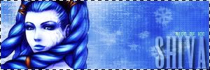
Shadowfare: I'm in a conflict here. I don't like the set, but it's great. Can you get anything out of that really? I guess too many personal likings are getting in the way of judging graphic skills. So, putting most of my personal thoughts aside, I can assure you that the set looks very good. The border around the pixel font is too square-ish though, which I dislike no matter what. The bright blue around the image gives a rather empty feel to the set, even though it's not that empty at all. I'll just stop now, before I confuse myself to death.
Koku: Nice set all in all. This is one of those times I have to complain about the emptiness of the background though. The background colors and patterns are nice, but something small above the "dawn" text would not do any harm. And now that I mentioned it, the text on the sig is a bit too big and/or out of style, you could have done some more consideration on that part. The av is great though, prefect placing of text and image there.
fzun: Well done fzun, this shows how even quite simple sets can become great pieces of art showing good graphic skills. If I were you I would have place the fonts a bit more to the left, further away from the border. I would have also blurred out the more pixel-ish parts of the image. Next time try to look carefully at the details, they can change a whole lot when it comes to the overall appearance of the set.
tymaporer: Sorry to say, but this is quite a weak entry/set. You started of with a tricky image, though the most skillful artist would manage to make so much more out of this. I can give an ok for the av, but the sig just doesn't work. The placement of text is quite... er, abstract maybe? As a reader one doesn't know where to start, what to separate from each other and where the end is. Background a colors are poor, and a stronger order would definitely be needed. You did, however, manage to blend the image into the set quite well.
Amethyst: Great colors, I must say. Structurally I can't really find any problems with this entry. Looking at the used image I can't say that you could have done a better job with that either (al though, who knows?). One thought though; the outer border could have been a bit lighter, the contrast between it and the rest of the set is quite big. Animation could have worked and made the subtext-part better.
Apricus: Good one Apricus! As I do not really find any problems in the images etc. I'll just move on quickly to the part that could use some improvement; your choice of fonts is in my opinion not the best and the same goes for the effect you used on them. It's all about testing different combinations, though getting a conflict between individual opinions is pretty much impossible when it comes to details like this.
watericecage: This set has both good sides and bad. As I complimented someone else earlier, I will compliment you on a good job regarding the transparency. You did have a black border to work with though, which makes the task a bit easier, at least that’s what I have thought during my own set-makings. Continuing along, I do not like the way you have cut of the image in the sig, the result would have been much better of you had resized the image instead (kind of like in the av). Another thing I do not like is your choice of fonts plus that all the separate sub-text words make my head spin. The colors are successful despite all what I mentioned before though.
Scholastic: You have chosen a very interesting technique to separate the different characters from the image. Original and stylish, I like it. The border colors you have used should have been a bit more stronger though, as well as the fonts, which brings me to the fact that a more unusual font would have done this set good as many other sets I have and will judge in this post. If I were you I would simply added more contrast to the set.
...Alex: In a sense of style this set is great, as well as sticking out of the crowd with a small-sized av. I can’t help feeling that it’s quite dull though. The colors are not outstanding, nor the fonts. I _think_ you have written something on the av (“Alex”?) but I really can’t be more than 5% sure, you should have fixed this without anyone pointing it out to you, unless you actually wanted to have it like that for some strange reason. And forgive me if my eyes have just created an illusion of a text on the av! Not a good thing that a small part of the font was placed above the woman in the image this time.
meowth1982: Great entry with lost of humor in it! You show a good creative sense of mind when combining such a funny image with the perfect subtext (note that I’m only judging the combination). The main text should have been made smaller, it stands out too much and fills too much of the space in the sig. The background is ok, but not anything overly well done. The placing of the text on av would have been better if it would have been put in the upper right corner instead.
ScottNak: Poor Scott, I understand you’re missing your green friend. Nevertheless, you’ve made a really good set. The only thing I feel I can complain about is the animation. Instead of splitting it into three parts, you could have combined the two last, making waiting time for the viewer shorter and more bearable.
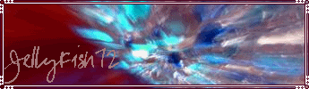
JellyFish27: Good start, though I can’t really see that you’ve done much at all with the image itself. Nice cutouts however. I dislike the font a lot though; you should have anti-aliased it, looks quite tacky the way it is right now.
paola: An adorably great set! If I can recall it correctly, you were complaining about that the computer you made the set with has no fonts (or good fonts). Personally I think that is a bunch of nonsense. The fonts match up perfectly with all the luscious colors I could stare at all day long. And yes, that’s all.
DM was on fire!: The small text you have placed all over the set really messes it all up. Just by placing it behind the used image and making it blend into the background more would have helped a whole lot. Though not entirely impossible, it’s hard to distinguish the main font and sub-text due to what I mentioned earlier. I have to say though that only these small changes would have made it a whole lot better, concentrate on the details and you’ll get far.
polarbearpop: Loving the sig, it’s the av that has most flaws in my eyes. Mainly because the placing of the image could have been a whole lot better (you could have resized it, displayed the whole dog in the image as in the sig etc.). Though I wouldn’t call this a really advanced set, you have already gotten far, keep up the good work.
Mermaid Hil: Interesting set. Al though I think the swirl-effects have gotten worn out by the years, this is nothing pointing at that you are not a good graphic artist, only what I would have changed for the sake of if myself. The main problem in this set is the huge gap between main text and subtext in the sig, leaving a terrible empty space in the middle of it all. The borders of the image part you cut out for the set are too rough, try to make lines like this smoother.
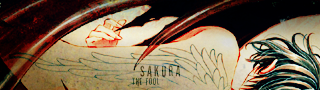
Sakura: As I don’t know what image you used for the set I am pretty much unable to do some judging regarding that, but from what I can see, you have made a good set. It is original and you have made a good combination of fonts, colors etc. No major complaints.
Alex: Before I say anything else, I’ll just tell you that we like the same song (don’t know about the rest). You have but an original idea into a well-made set, which is highly appreciated. I myself would have made the transition between the two images a bit more smooth while also keeping the frames for a bit longer, letting the viewer look at both carefully even the first time when he or she lays his or hers eyes on the set.
timkhj: You definitely need to work more on the image as well as font quality. No viewer is too fond of blurred creations when you know it probably wasn’t the artist’s direct intention to make them so. The main font of the sig should have stronger colors to stand out more and be more viewable.
Neko: wesome set to end my judging with! I think the image effects you’ve used are great. Sometimes such things can “damage” the image used, but you have only done justice for this set. A small detail that irritated me was that the main text and sub text weren’t aligned so that the subtext would be straight under the main text. I think this would have made a small detail better in the set.
Sorry if my comments started to sound a bit repeating, though I think hat is quite inevitable when there is such a large amount of sets to judge.
My votes go to JellyFish27, remybuxaplentyfan, tymaporer and hellyer.
Holy sheet, that’s over 2600 words! May I faint for just a while? *faints*
 Set by everconfused
|


