Mon Jun 13, 2005 2:24 am
Yoshi wrote:Scholastic: Excellent work there- I'm a little curious though, are those flowers and the motif bordering the text area brushes, backgrounds, or something you made yourself? Regardless, the colours are vibrant and all elements fit your sixties theme. One thing I might have done myself though would be to carry the colours you have on the right to a small portion of the left, or just "tone up" the tan of the text area to something brighter.
Yes, I made those flowers myself, because I have much spare time while making the blog. Silly me.
Mon Jun 13, 2005 3:05 am
About the 3-Dness of the crystal ball, would it be better if turned the opacity higher at the top bit where you can see the white? I actually only turned it down that low because I thought that either the text wouldn't show on the text area, or the starts would be covered. But yea, the 3-D ness.. 
Mon Jun 13, 2005 3:07 am
_jaye_ wrote:About the 3-Dness of the crystal ball, would it be better if turned the opacity higher at the top bit where you can see the white? I actually only turned it down that low because I thought that either the text wouldn't show on the text area, or the starts would be covered. But yea, the 3-D ness.. :P
I actually didn't find the top part very realistic. Perhaps a smaller gleam on the side would've helped.
Mon Jun 13, 2005 3:48 am
I completely understand if I am out this round; I made this while I was on vacation, and I had EXTREMELY little time to finish it in, so it's not my best work...
And I used 3 programs because I use Photoshop to resize things, because it has better quality, and Animation Shop for text, because I can see where I'm putting text better.
And I used 3 programs because I use Photoshop to resize things, because it has better quality, and Animation Shop for text, because I can see where I'm putting text better.
Mon Jun 13, 2005 6:31 am
<b><u>Notes</u></b>
1. If your blog has something protruding over the text box, you need to realize that when you code it, you'd have to make the table go underneath whatever is sticking into it, so the text in the blog area won't be able to go all the way to the top, which would look quite silly. Do keep that in mind for future blogs you may make.
2. Borders are meant to frame an image. Blogs need thick borders, especially if there is a lot of stuff going on or bright colors or whatever. Borders should be dark and thick, just enough to sufficiently keep things neat.
3. You should select an image out of which you can make a blog. Many people chose images and just put a text box on top of it, disregarding the fact that the things going on behind the text box are so busy that there's simply no point is placing text there.
<b>Adam loves Hilary Duff</b> -- I don't like how there's this weird dark thing in the upper right corner. I'm not sure what it is; it looks like a strip of wood or something. Either way, you should've gotten rid of it. The area underneath that random corner should've been removed as it serves no purpose. Your border is almost invisible. See note #2. The blog area isn't nearly opaque enough to possibly write anything in it. I'm not a fan of tinting an image all the same color because it's an overused effect. Perhaps the next time you tint something, try varying shades and add different blending effects or something, because as is, it's monotonous and bland. Also, see note #1.
<b>watericesage</b> -- I realize you were going for the rustic look, but the end effect is washed out. The image doesn't have enough emphasis on the violin. It should stand out more. Instead, the bland blog area catchs your audience's eye first. The blog area should be larger (width-wise). You could have accomplished this by standing the violin up more and stretching the blog area out because right now the area to the left is a little too blank.
<b>Dawn2</b> -- First off, see note #2. I think some of the stick things in the background are too jagged, making it look a little messy. The "Wintery" is too close to the top edge, and I don't like how there isn't anything between that text and the box except "all summer long" which isn't large enough for a blog. You shouldn't use a pixel font for subtext on a blog such as yours where everything else is large and prominent. The placement wasn't a very good choice either, as it throws the balance all to the right.
<b>Sunnie</b> -- The idea is really cute. I think it's great that you added more stars. The coloring looks a little off though. The characters don't look warm enough for a "starry night". I also dislike how you could've made the blog area so much bigger. The text would've looked great at the way top and you could've stretched the blog area all the way up there too. See note #2. You should have made it thicker, just like the border around your text and blog area. With a thicker border, you'd need to move the blog area away from it a little, and the extra space around the other sides of the blog area definitely provides for such adjustment. Also, see note #1.
<b>Scholastic</b> -- I must say that your work has greatly improved since the last competition. Good job. I really like this blog. It's very creative and the overall effect is fantastic. There should be more brown in the image area though, because the brown looks a bit out of place. I don't like how your text is sideways like that, because there is plenty of space for it to be horizontal. Now did you make the flowery background yourself or is it another image? If so, how did you manage it?
<b>Jaye</b> -- It would've been better to use the sphere idea for a tag. As a blog, it doesn't work. The blog area isn't centered; it's too close to the edges and it flattens the 3D look you were probably going for. It makes the rest of the thing look plain, even though you have all the stars going on and such. I don't like how your subtext is on top of the larger text, because it throws off the layered effect. I also don't like how the sparkles are yellow when your ball is blue; they don't make it look any less unrealistic.
<b>jellyoflight</b> -- I don't like your font choice for "welcome". Or perhaps it's because you added a bevel. It just doesn't match the tone of your blog. Also, the blog area is not in a prime position, as it starts at Bono's chin, rather awkward place to set a text box really. The text at the top is too small/fuzzy to read. See notes 1 and 2.
<b>Amethyst</b> -- I'm glad you were able to find/create a spot on your original image to place a blog area. Not many people have done that successfully. The dot overlay is a little strong (it makes the image <i>really</i> bright) and you should take a look at note #2, but other than that, I haven't got much else to pick over.
<b>Jasujo</b> -- This is so simple and elegant! Nicely done. I just think it would've been better if you had somehow recreated more of the background so that your blog area isn't covering the pretty sachet. If you had done that, you could've cropped the rest of the blank space out (the parts above the sachet and at the top right corner). Also, "Jasujo" shouldn't be on the inside of the text box, as your text is supposed to go over that. Although the corners of the blog area are really pretty, I think it'd be hard to place text over that. You could've put those patterns on the corners of the whole blog itself. Also, see note #2.
<b>Goldfish Lover</b> -- While the dotted/cross overlays are cute, the rest of the blog doesn't work. The text is hard to distinguish from the image because of the cyan color and the placement. You chose to put it on a rather busy part of the image, which makes it so difficult to read. Also, see note #3. You should've recreated the rest of the frozen pond and placed a blog there, because situating a text box over the main focus of the image is a definite no-no.
<b>Kandice</b> -- The collage was a cute idea, but it's so hard to see them because everything is so dark. It would've looked really neat if you had increased the contrast of the photos; then the black and white thing would've looked fantastic. I dislike the grid overlay. It's unnecessary and rather distracting. Also, you could've gotten away with leaving out the text at the bottom. It's too close to the bottom border and doesn't do much for the blog. I'd like to see a more defined blog area as well. All in all, you just need more color/contrast.
<b>JellyFish72</b> -- Wow. Bright. Actually, blinding is a more suitable word. The image is really cute, but it should've been toned down. I'll commend you on the thick border and well-sized blog area, but that is all. It doesn't look like you did much else to the image though.
<b>Twisted Sanity</b> -- Ow. My eyes hurt. The scanlines make it excruciating to look at your blog. They need to go. I don't like the font choice for the text nor do think any color text would work too well on that blog. You might as well have made the blog area a dark color so that the text could be a light one. Moving along, because it burns....
<b>jasminech</b> -- I think you could've gotten away with the raggedy/sketchy border instead of placing the whole thing inside an opaque box. I also think that you should've stuck with one family of pink/maroon instead of bouncing around to the peach and neon purple. The bright purple outer glow on the text and the color of the blog area make them both look out of place.
<b>Apricus</b> -- Fantastic work! I'll say straight off that this is my favorite entry for this round. I love the sepia tone you put over the image. The little sketchy flowers and squiggles are a cute touch, even if they're add to the already busy image. I absolutely adore the blog area. It goes against the norm with the smudged border, which is great. The only complaints I have are how the "and they lived" looks a big awkward because there are no effects to make it blend in like the "happily ever after" and how it's a bit busy in various places. This is one of your best works, Apricus. Brilliant.
<b>Adoration</b> -- I'm not a fan of the color overlay + white text look. It's been overdone here. The extraction of the guy from the original image is choppy. You should've gone over the edges with a soft eraser. The "let's run together" is poorly placed as it's the same exact color as the larger text and they really do run together, heh. See notes 1 and 2. Actually, as an amendment to note #1 for this particular case, the protruding text/image aren't so terrible that one couldn't code around it, but you should still be careful nonetheless.
<b>Lauren</b> -- My main complaint is that you have text in the text box... so what'll happen when you actually code it and put text in there? The cute little verse you have will make any text in the box illegible. I also dislike how you took the original image and reversed it to add business to the other side of the blog. You didn't need to do that; even simple brushes would've had a better final result. See notes 1 and 2.
<b>DM was on fire!</b> -- How long exactly have you been using the color overlay + white text technique? It's really not working, because the fonts you choose are too thin. The dimpled overlay makes Jeremy Camp really vivid. It needs to be toned down. See note #1. I'd really recommend that you take a different approach to image manipulation in the future, as this style is not cutting it.
<b>Fizzy</b> -- The colors in the original image are beautiful. The way you tinted it makes it look washed out. The gray text doesn't fit in very well. The blog area is much too small. If anything, I would've simply made a text box over the umbrella things after covering them up or making the text box very opaque. See note #3.
<b>Izzi</b> -- While the image you chose to work with was gorgeous, making it grayscale did nothing for it. There really isn't anything going on in this blog. Nothing stands out. The "Welcome" looks a little choppy; did you anti-alias the text? I really think you could've added a lot more contrast or something to really add the sparkle to this beautiful image. See note #2.
<b>Neopets Addict</b> -- The image extraction job is a little bit messy. It looks like you just used the lasso tool. Next time, when you select the background, experiment with feathering selections or actually go in there and run a soft edged eraser around the edges of the image. I think you should've flipped the swirl layer around so that it's busier on the left side. As it is right now, your blog is too unbalanced, because everything is going on on the right side. I dislike how the text box is so closely situated to the outside border. You could've done with more color as well. See note #2.
<b>mazil</b> -- Good tinting job! I love the color scheme, even if her shirt and the creature's fur still has too much of a green hue to it. While the shape of the blog area is really cool, I think you should've had it horizontal rather than at a slant because you cannot code tables on a slant. Other than that, no complaints.
<b>Neko</b> -- You should've cropped more of the girl out and moved her to the right. As is, any text in the blog area would run into her arm along with the stars and wing that you have there. I don't like the wing brush behind the blog area. I realize you put it on the girl, but it still looks out of place.
<b>Rachel</b> -- How cute! I dislike how you enlarged the mouse to place in the text box, as it's rather distracting. You should've just filled the box with brown and made it slightly transparent. I also don't like how you placed the "Has anybody..." at the bottom left corner of the text box. It should've gone underneath the text at the top or something, instead of starting a whole new text object there. See note #1.
<b>Koku</b> -- Oh, pretty. I love the violet tint you chose. It looks great. While the blog looks a little washed out, it also carries a dreamy feel, which I like a lot. The blog area is on the small side and not nearly opaque enough as any text will have a hard time being read over the stuff going on in the background. I think you also should've made the "garden of eden" stand out more, perhaps with an outer glow or something.
<b>Laq</b> -- That's a really vivid blog you've got there. It's hard to make out the girl at first, but then it's all right. I like the effects you used and all, but you should tone down the vibrant colors a notch. Instead of a white blog space, you should've used a pale yellow or similar color, because white looks very out of place. The scanlines are really strong as well and should've been toned down too.
<b>Kitten Medli</b> -- I see that you stretched out the image to compensate for the lack of an image to work with. It would've been better if you had smudged or distorted the stretched out area somehow because the horizontal lines are just bland. The blog area is rather small. See note #2.
<b>timkhj</b> -- Great job getting rid of the people in the original picture. About the text though... it's large, prominent, and distracting. If I didn't know better, I'd say you made it that way to hide some image editing seams =P. The dark brown blog area looks a little out of place, as you could've gotten away with something that matched the dirt color more than the reddish shade you chose.
<b>InsanePlushie</b> -- The dark, mysterious thing works really well. The scanlines across the character's face do not work well though. I would've liked to see more contrast between the character and her background because as of right now, she kind of blends into nothingness. The blog area is also awkwardly much lighter than the rest of the blog and takes away from the dark, mysterious thing. I don't think you should've put "welcome" and "the end" into the blog space itself. See note #2. I think you'd need a double colored border for this image. Perhaps black on the outside and purple or something on the inside.
My votes go to Adam loves Hilary Duff, JellyFish72, Lauren, and Izzi.
Warnings go to Dawn2, jellyoflight, Kandice, and Goldfish Lover.
Last edited by vkceankraz on Tue Jun 14, 2005 10:55 am, edited 4 times in total.
Mon Jun 13, 2005 6:49 am
Good luck to everyone else
Mon Jun 13, 2005 8:06 am
vkceankraz wrote:<b>Scholastic</b> -- I must say that your work has greatly improved since the last competition. Good job. I really like this blog. It's very creative and the overall effect is fantastic. There should be more brown in the image area though, because the brown looks a bit out of place. I don't like how your text is sideways like that, because there is plenty of space for it to be horizontal. Now did you make the flowery background yourself or is it another image? If so, how did you manage it?
Sorry, it took so long, because I must search the website once again. http://www.pegaweb.com/tutorials/foliage/foliage.htm There, I'm using that tutorial. I'm using different shapes, though.
But I didn't used the effects (texture and lightning) for those flowers. And for the curved lines, I'm using pen tools. I'm using a little bit Offset filter too. That's all.
Mon Jun 13, 2005 2:48 pm
Well hello there, guess who's back? And I promise I'll try not to be too nice...  (And holy crap there's many of you!)
General criticism:
Some of you have made incredibly small textboxes; remember that a scrollbar is supposed to fit in there with the text and the effect won't be that nice at all. This will reflect poorly on those who have made his "mistake".
Adam loves Hilary Duff - Looking at the basics I think this blog is fairly ok. Taking a more detailed look there is a lot you could have improved though. First of all the colors are terribly monotonous and the box hardly stands out at all. The dark object in the corner should have been removed.
watericesage - I like the theme and colors you chose, however I think you could have made this blog a lot more lively. To start off you could have given the violin more color, making it stand out more in vivid brown and red mixtures. The text box is too small and too light compared to the rest.
Dawn2 - Al though you've manages to fit in a text box with a good size, the rest doesn't really seem to work. The placement of the text is rather bad, and it looks like you moved it up towards the right corned just to avoid having anything come into the text box (which is good as an idea). The background looks very empty in addition.
Sunnie - I love what you have done to the image itself, it is when it comes to the text and the box the whole thing fails. First of all this is due to my personal taste, I really dislike the blue color you've used for both the text and especially the box. You would have had room to stretch the box a lot more vertically and it would have looked much better. That black border around the text is a definite no.
Scholastic - Groovy baby, very nice. Just a few pointers: the image and pattern look rather blurred, I would have like the blog better if the were more clear. Also, the black border doesn't fit in at all, something more colorful and even less thick would have been better.
_jaye_ - Well, your starting idea was very good. I don't feel like you've done all you could have done to make this blog as good as possible. My first tip is you should have used more light and shadow to make the ball look even rounder. The text box looks quite tacky as its lower corners are touching the edge of the blog.
jellyoflight - The main problem here as I see it is the awful blurriness of it all. You have no definite border around the text and the smaller text is awfully fuzzy. The 3D-effect on the "welcome" text isn't really working with the rest and if I were you I would have not made the text box go over Bono as much as it does right now, he is sort of "drowned" by it. The colors are rather dull.
Amethyst - Me likey. The only think I have an issue with is the font, which doesn't fit the blog at all according to me as it is now. If I were you I would have placed it below the box, using times new roman, book antiqua or something along those lines instead.
Jasujo - Well, the decorations of the text box are pretty, but that's pretty much it. The blog would have looked a lot better and interesting if you hadn't placed the text boxt so much over that bag-thingy (ehm..) and if the colors would have been more bright. Now it just has a very boring outlook.
Goldfish Lover - I'm not particularly fond of the jagged edges and I can't really see how such a font with graffiti-style and all fits the snowbunny image. I'm sure you could have found a more fitting combination of styles.
Kandice - Often image blends look the best when they do not melt into a common background, but into each other. Some color would not have hurt in this blog, as well as something that stands out more out of the monotonous mass. The border around the subtext makes the whole thing look too square-ish.
Jellyfish72 - Doesn't really look like you did much at all to this blog, I'm not lying if I say I could cram something like that together in a couple of minutes. The main problem is with the text that is barely visible.
Twisted Sanity - *boom* Very good. One of the few things you could have improved is the font style you have chosen, even though it's not entirely bad something else would have probably made a better choice.
jasminech - I don't like the style you have combined that jagged-edge picture with the plum colored background at all. The colors of the font are too blue-ish compared to the rest of the colors of the blog. All in all I'd like to see more contrast in the picture.
Apricus - Very good, you've matched fonts colors and the picture nicely. Mainly I think, as with many of the others' blogs, you could have spared a bit more room for the text box. And that's about it.
Adoration - The image you cut out for the background looks very sloppily done, this by looking at its borders, somewhat jagged edges and a little white here and there. You should have been more careful. Overall the blog has quite a boring look to it. Having that bit of text in the text box is not really a problem in any blog, but having the image go into the box is not that good at all.
Lauren - Doesn't really look like you've done that much to this blog, and the elements in it don't fit together very well. For example the text would have needed to be a bit softer, perhaps without the 3D-effect. I like the placement of the image, but you could have made the text box a bit bigger.
DM was on fire! - The text needs to stand out a bit more, perhaps you could have used a similar coloring to it as the image, with more black etc. I'm highly bothered by that the image you chose goes over the text box that much; imagine that there is going to be a scrollbar next to that (or on top of it, even worse), that will make the text box even smaller on top of it all.
Fizzy - The text box is way to small and its borders would need a bit more visibility. Other than that I also don't like how the text "Memories" goes on top of the girl's head, it makes it look like you just threw it in there for the sake of it. Pretty image effects, on the plus side.
Izzi - Just a gray-scaled image and typical blog elements are seldom enough. You could have done so much more to this one.
Neopets Addict - All in all I like this blog, it's colorful and spiffy, or how should I put it. I think it's a bit too empty though, the background could have used some more effects or color. The edges of the Pteri look a bit choppy which is not nice.
mazil - Very nice mazil! Mainly I think the image could have used a bit more contrast, and maybe another font style would have fitted the theme better. Other than that I just hope you keep up the good work.
Neko - Simplistic and pretty, and I think you've done a very good job considering the image you started with. What I think would be needed in this blog is something that stands out a bit more than the rest, for the moment I feel that nothing wakes my interest when I look at the blog.
rachel - Well, I just can't find any element in this blog that I really like. Mainly because I don't think the styles of the text, effects and image fit together very well. The smaller text would definitely need some more centering.
Koku - Absolutely great, no complaints (!).
LAQ - You should have centered the text box in my opinion, other than that I actually like the lively colors mixed with the effects you chose. Very good.
Kitten Medli - In general this is a nice blog with a fitting layout and so on. I'm thinking that it needs something more attention-grabbing though, as I've said to some others here. Maybe giving the woman's face more light and making her lips more red would have done the job.
timkhj - As a blog this is very good, a nice and big text box with no interference from other elements and so on. Esthetically I don't like it that much at all. The text looks like it was resized from something very small making it pixelish and blurry and the same goes for the background. Colors are at some parts not that good either against each other.
InsanePlushie - I feel that this blog as an image needs more contrast and less light, giving a more dramatic feel to it. The text box could have been a bit darker as well and more consideration should have been given to the choice of fonts etc. Other than that I do think your blog is pretty ok.
My votes go to jellyoflight, jasminech, Izzi and timkhj.
Last edited by Silja on Tue Jun 14, 2005 2:42 pm, edited 1 time in total.
*sigh*
Mon Jun 13, 2005 8:08 pm
Yeah,I know that wasnt a good blog but it wasnt a good day so I pretty much had an off day. 
Oh,well
Oh,well
Re: *sigh*
Mon Jun 13, 2005 8:18 pm
Goldfish_Lover wrote:Yeah,I know that wasnt a good blog but it wasnt a good day so I pretty much had an off day.
Oh,well
I'd appreciate it if you didn't post comments like this.
Just so everyone knows, commenting on a rating you received is fine, as well as any question on how to fix or improve something. However, making excuses or comments about having bad days or anything of the like aren't appreciated.
Thanks.
Mon Jun 13, 2005 8:25 pm
Okay okay, the text box in mine is too small. I figured you'd be able to code it so the scrollbar and the text were smaller than normal... 
I like it when the text is like that.
1. If your blog has something protruding over the text box, you need to realize that when you code it, you'd have to make the table go underneath whatever is sticking into it. Then the text in the blog area won't be able to go all the way to the top, which would look quite silly. Do keep that in mind for future blogs you may make.
I like it when the text is like that.
Mon Jun 13, 2005 8:28 pm
Sunnie wrote:1. If your blog has something protruding over the text box, you need to realize that when you code it, you'd have to make the table go underneath whatever is sticking into it. Then the text in the blog area won't be able to go all the way to the top, which would look quite silly. Do keep that in mind for future blogs you may make.
I like it when the text is like that.
I like it when text is like that too.
It seems to be quite common for text to be like that.
Silja wrote:Adam loves Hillary Duff - Looking at the basics I think this blog is fairly ok. Taking a more detailed look there is a lot you could have improved though. First of all the colors are terribly monotonous and the box hardly stands out at all. The dark object in the corner should have been removed.
....You spelt my username wrong.
I will try to make my blogs look alot better in the future, if I am here for the future part of the PPTTG.
Mon Jun 13, 2005 11:35 pm
Adam loves Hilary Duff wrote:Sunnie wrote:1. If your blog has something protruding over the text box, you need to realize that when you code it, you'd have to make the table go underneath whatever is sticking into it. Then the text in the blog area won't be able to go all the way to the top, which would look quite silly. Do keep that in mind for future blogs you may make.
I like it when the text is like that.
I like it when text is like that too.
It seems to be quite common for text to be like that.
Common doesn't necessarily mean practical.
Here is an example of a guild layout I made for Lillie.
Notice how the labels above the text boxes slightly protrude onto them. Also notice how it's <i>slightly</i>-- just enough to achieve the desired layered effect (which is what is "common"), but one could still code it properly so that the resulting effect won't have text a quarter of the way below the top edge of the text box. Understand?
Tue Jun 14, 2005 4:49 am
Adam loves Hilary Duff: It doesn't look like you've done much to this picture at all, just added a color overlay and dot texture, then the text area and words. Oh, and a border I guess. There are various imperfections in the picture itself (the cut off corner being the most obvious), and you didn't even make an effort to fix those. Not to mention that this isn't very good in the ways of function, the contrast between the light stairs and her dark jeans, and especially her striped sleeve, are very distracting from whatever text might go in the box. 5/10
Adoration: As mentioned, the extraction around the guy's hair is very sloppy. I personally think the layout of this blog is a little bit boring, it's really just a background with a guy pasted on and the blog elements added. The purple tinting on the picture is a nice touch to make it more unified looking, though. 7/10
Amethyst: It's a pretty source image, but you didn't do much to it besides play with the levels and add a dot overlay and some swirly brushes... I like how you did the text area, though, the colors still show through, but all the details are blurred out so they're not distracting. I don't like how bold the black stars look at the corners of the text area, nor the dark text at the bottom, if they were less contrasted, they would look much better. 6.5/10
Apricus: This is very cute, it has a really dreamy, nostalgic look to it. The textures and patterns you added are very nice and not distracting at all. I do have some issues with the area where it looks like you retouched the picture, just below the top left corner. It's a little muddy looking, and it's building up a bit of a repeated pattern, and that's usually a dead giveaway of hasty clone-stamping. The best way to avoid that is to continually pick new target points to clone from. 8/10
Dawn2: I think the best part of this blog is the display text. I get the feeling that you put each letter on a separate layer and arranged them individually, that sort of random look works very well here. I'm not so fond of the background, it really looks like a bunch of scatterbrushing. Also, the large gap between the text and text area is very distracting, it's okay to overlap them just a little, as long as the bulk of the text area isn't disturbed. 6/10
DM was on fire!: Hm, this blog bears a really uncanny resemblance to Adoration's. Maybe it's just a coincidence, but it still stands that I think this type of layout is a bit boring. I'll also add, I think the particular font you used (which I notice you use a lot) looks quite ungraceful and doesn't match well with very many images. 7/10
Fizzy: I like how you desaturated the background and intensified the colors on the girl, it brings a lot of attention to her and it has a very interesting look. The borders of the text area are really hazy and undefined, it would look better if the lines were more clear. Lastly, the pure gray text looks really awkward with the pink-toned picture, it would look much better if you'd chosen a muted shade of pink. 7/10
Goldfish Lover: It's a cute source image, but you haven't done much with the image at all, the patterned dots are a very easy effect, and the border looks like you traced along the border of a number of filters. The display text is set in a font that doesn't match the icy theme you were trying to go for. The text area is in an awkward position, covering a central portion of the main picture, and there's too much contrast for any potential text to be easily readable. 6/10
InsanePlushie: I don't see anything done to the picture besides the bluer tint and scanlines. I do like the contrast between the picture and text area, the lightness really draws your eye to the functional area. I don't think the font you chose matches the look of the picture too well, a nice Gothic font would have looked very good. 6/10
Izzi: I've been to Enayla's site, and I know that all you did was convert the original picture to grayscale. After that, you simply added text and a text box, and the text box is rather busy so that text will be hard to read. 5/10
jasminech: This looks very simple and pretty, but like the others said, the borders look awkward and need some more work. There's some odd looking compression artifacts in the edges of the girl's hair in front, they'd probably disappear if you extracted it a little more carefully. There's really no unifying color scheme in this blog: the girl has a maroon tint, the background is a muted lavender, the large petal in the background is pink, the text looks like a true magenta, and the text area is a peach tone. More similar colors would help this blog look a lot more "together." 7/10
Jasujo: This is a very pretty blog, even if you did hardly anything with the original image. You kept the color scheme very simple and elegant, and all the elements you added keep up with the simple and pretty look. My only recommendation would be with the corner decorations you added, they look a little busy, simpler ones would have looked just as nice and less crowded. Overall though, this is a very sweet looking set-up, it really reminds me of a wedding invitation. 7/10
_jaye_: I recognize those brushes, and they look sort of awkward spherized so much. The rectangular text area looks very strange in the circle, and the brushes around the text are very very recognizeable. I'd recommend you try a different brush, or at least alternate the size of them as you go along so that there's some variation. 7.5/10
JellyFish72: Since you only shared the thumbnail, I can't do an overlay to check if you actually did anything with the original image, but it definitely doesn't appear that you did much, if anything. It's a very cute blog though, and the text area works well, which is nice to see. The text really gets lost against the bright pink towels, try a different color, or a stroke around it. 6/10
jellyoflight: I like how you added the dramatic lighting to the background, it looks very natural. The sepia-toning has a nice oldies feel to it, but the rest of the colors are kind of questionable. The light text area really sticks out, and the contrast between the dark background and darker jacket is very distracting from any text that might go there. Your choice of fonts don't match too well, the rounded and scattering font for "it's a beautiful day" is way too cutesy looking for the image, and the "welcome" is just an awkward color. 6/10
Kandice: I'm going to disagree with moogie and Yoshi here, I think the blending is average, the feathered edges are rather noticeable. The part that really sticks out the most to me is the pixel text at the bottom, the sharp edges really stand out against the rest of the soft transitions in the blog. 7/10
Kitten Medli: I think the way you extended the background is very awkward looking, that look is typical of stretching a small strip of the original background. I see you tried to cover any pixellated distortion by blurring it. I think it would have been just as easy to erase the background and redraw it yourself. 7/10
Koku: I like the washed out look of the picture, it's very dreamy looking. To be honest, I would never have noticed that the text area was grayscale, since all the colors in this picture are very faint. The text area is rather busy with the lineart behind it, I'd definitely soften it a bit so that it's not as distracting. 8.5/10
LAQ: This blog looks so abstract that I didn't really understand it until I looked at your source image. I think "loved in life" would look nicer if if followed the contour of the girl's body, I don't know if Gimp can make text on a path, but another easy way to do it would be to separate each word onto its own layer. 7.5
Lauren.: One thing that I really dislike in graphics making is using other's graphics as a base for your own. You may not be aware, but your original image is a wallpaper that used this picture as a source. That said, you haven't done much with it, I see you darkened it a very little bit and added some sparkles and mirrored a faded copy of the image. 6/10
mazil: I like this one quite a lot, it's very fun and cute. I'd suggest you do some minor color corrections on the picture, the colors look a little drab, especially next to the vibrant colors you used in the background. 9/10
Neko: I like the hazy/dreamy look of this blog, it's very pretty. There's a lot of little distractions in the text area, I'd recommend you tone them down a bit. Other than that, thoug, very nice. 8/10
Neopets Addict: The colors are very nice, I actually like how you made everything shades of yellow to keep focus on the Pteri. I agree with the others that the text box looks awkward, but I think it's more of a consistency problem: the text box almost touches the right and left edges, and is extremely far from the bottom. If you had a more balanced width between those three edges, I think it would look much better. 7/10
rachel: It's a cute source image, but you didn't do much with it besides add some grid overlays. I'm not too fond of the font you chose, it's rather illegible, especially the small part with the poem. 6/10
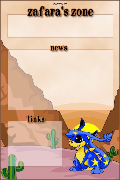
Scholastic: This is a very fun blog, the colors and theme go together extremely well, and it's always nice to see something that's more fun and quirky rather than more elegant stuff. The whole blog would look more balanced if you had some dark stuff in the top half too, rather than lumped together in one silhouette at the bottom. 8.5/10
Sunnie: The sky you reconstructed looks very fake behind the smooth CG'ed characters. The color is very awkward too, you might have kept the more muted tone of the original sky in the picture. There's a lot of empty space in the picture, it's really framed by the characters and textbox near the bottom, and the stars and galaxy textures don't do anything to fill it, really. The font you chose is very distracting, not only because of it's elaborateness, but because of its shocking color. 6/10
timkhj: The composite is a little bit sloppy, there are a lot of compression artifacts in the resized background, you could have blurred it a little bit to hide them and give a sense of distance. The text is very lively and fitting, but it's very jagged. 6.5/10
Twisted Sanity: It's a nice overall effect, even if you didn't do much with the original image. All the elements come together for a nice grungy organic look, my only suggestion would be not to capitalize the first letters in "The Revolution," the font is designed for the letters to have the appearance of all caps, and the uppercase letters have a very distracting bright white box around them. 7.5/10
watericesage: I really like the background on this blog, it's not distracting, but it's not at all boring with all the text and pictures hidden in there. The text at the bottom looks a little boring though, despite that it's slightly angled. I'd recommend mixing and matching fonts and sizes to make it more eye-catching. 7/10
I vote out Adam loves Hilary Duff, Goldfish Lover, Izzi, and Lauren..
Adoration: As mentioned, the extraction around the guy's hair is very sloppy. I personally think the layout of this blog is a little bit boring, it's really just a background with a guy pasted on and the blog elements added. The purple tinting on the picture is a nice touch to make it more unified looking, though. 7/10
Amethyst: It's a pretty source image, but you didn't do much to it besides play with the levels and add a dot overlay and some swirly brushes... I like how you did the text area, though, the colors still show through, but all the details are blurred out so they're not distracting. I don't like how bold the black stars look at the corners of the text area, nor the dark text at the bottom, if they were less contrasted, they would look much better. 6.5/10
Apricus: This is very cute, it has a really dreamy, nostalgic look to it. The textures and patterns you added are very nice and not distracting at all. I do have some issues with the area where it looks like you retouched the picture, just below the top left corner. It's a little muddy looking, and it's building up a bit of a repeated pattern, and that's usually a dead giveaway of hasty clone-stamping. The best way to avoid that is to continually pick new target points to clone from. 8/10
Dawn2: I think the best part of this blog is the display text. I get the feeling that you put each letter on a separate layer and arranged them individually, that sort of random look works very well here. I'm not so fond of the background, it really looks like a bunch of scatterbrushing. Also, the large gap between the text and text area is very distracting, it's okay to overlap them just a little, as long as the bulk of the text area isn't disturbed. 6/10
DM was on fire!: Hm, this blog bears a really uncanny resemblance to Adoration's. Maybe it's just a coincidence, but it still stands that I think this type of layout is a bit boring. I'll also add, I think the particular font you used (which I notice you use a lot) looks quite ungraceful and doesn't match well with very many images. 7/10
Fizzy: I like how you desaturated the background and intensified the colors on the girl, it brings a lot of attention to her and it has a very interesting look. The borders of the text area are really hazy and undefined, it would look better if the lines were more clear. Lastly, the pure gray text looks really awkward with the pink-toned picture, it would look much better if you'd chosen a muted shade of pink. 7/10
Goldfish Lover: It's a cute source image, but you haven't done much with the image at all, the patterned dots are a very easy effect, and the border looks like you traced along the border of a number of filters. The display text is set in a font that doesn't match the icy theme you were trying to go for. The text area is in an awkward position, covering a central portion of the main picture, and there's too much contrast for any potential text to be easily readable. 6/10
InsanePlushie: I don't see anything done to the picture besides the bluer tint and scanlines. I do like the contrast between the picture and text area, the lightness really draws your eye to the functional area. I don't think the font you chose matches the look of the picture too well, a nice Gothic font would have looked very good. 6/10
Izzi: I've been to Enayla's site, and I know that all you did was convert the original picture to grayscale. After that, you simply added text and a text box, and the text box is rather busy so that text will be hard to read. 5/10
jasminech: This looks very simple and pretty, but like the others said, the borders look awkward and need some more work. There's some odd looking compression artifacts in the edges of the girl's hair in front, they'd probably disappear if you extracted it a little more carefully. There's really no unifying color scheme in this blog: the girl has a maroon tint, the background is a muted lavender, the large petal in the background is pink, the text looks like a true magenta, and the text area is a peach tone. More similar colors would help this blog look a lot more "together." 7/10
Jasujo: This is a very pretty blog, even if you did hardly anything with the original image. You kept the color scheme very simple and elegant, and all the elements you added keep up with the simple and pretty look. My only recommendation would be with the corner decorations you added, they look a little busy, simpler ones would have looked just as nice and less crowded. Overall though, this is a very sweet looking set-up, it really reminds me of a wedding invitation. 7/10
_jaye_: I recognize those brushes, and they look sort of awkward spherized so much. The rectangular text area looks very strange in the circle, and the brushes around the text are very very recognizeable. I'd recommend you try a different brush, or at least alternate the size of them as you go along so that there's some variation. 7.5/10
JellyFish72: Since you only shared the thumbnail, I can't do an overlay to check if you actually did anything with the original image, but it definitely doesn't appear that you did much, if anything. It's a very cute blog though, and the text area works well, which is nice to see. The text really gets lost against the bright pink towels, try a different color, or a stroke around it. 6/10
jellyoflight: I like how you added the dramatic lighting to the background, it looks very natural. The sepia-toning has a nice oldies feel to it, but the rest of the colors are kind of questionable. The light text area really sticks out, and the contrast between the dark background and darker jacket is very distracting from any text that might go there. Your choice of fonts don't match too well, the rounded and scattering font for "it's a beautiful day" is way too cutesy looking for the image, and the "welcome" is just an awkward color. 6/10
Kandice: I'm going to disagree with moogie and Yoshi here, I think the blending is average, the feathered edges are rather noticeable. The part that really sticks out the most to me is the pixel text at the bottom, the sharp edges really stand out against the rest of the soft transitions in the blog. 7/10
Kitten Medli: I think the way you extended the background is very awkward looking, that look is typical of stretching a small strip of the original background. I see you tried to cover any pixellated distortion by blurring it. I think it would have been just as easy to erase the background and redraw it yourself. 7/10
Koku: I like the washed out look of the picture, it's very dreamy looking. To be honest, I would never have noticed that the text area was grayscale, since all the colors in this picture are very faint. The text area is rather busy with the lineart behind it, I'd definitely soften it a bit so that it's not as distracting. 8.5/10
LAQ: This blog looks so abstract that I didn't really understand it until I looked at your source image. I think "loved in life" would look nicer if if followed the contour of the girl's body, I don't know if Gimp can make text on a path, but another easy way to do it would be to separate each word onto its own layer. 7.5
Lauren.: One thing that I really dislike in graphics making is using other's graphics as a base for your own. You may not be aware, but your original image is a wallpaper that used this picture as a source. That said, you haven't done much with it, I see you darkened it a very little bit and added some sparkles and mirrored a faded copy of the image. 6/10
mazil: I like this one quite a lot, it's very fun and cute. I'd suggest you do some minor color corrections on the picture, the colors look a little drab, especially next to the vibrant colors you used in the background. 9/10
Neko: I like the hazy/dreamy look of this blog, it's very pretty. There's a lot of little distractions in the text area, I'd recommend you tone them down a bit. Other than that, thoug, very nice. 8/10
Neopets Addict: The colors are very nice, I actually like how you made everything shades of yellow to keep focus on the Pteri. I agree with the others that the text box looks awkward, but I think it's more of a consistency problem: the text box almost touches the right and left edges, and is extremely far from the bottom. If you had a more balanced width between those three edges, I think it would look much better. 7/10
rachel: It's a cute source image, but you didn't do much with it besides add some grid overlays. I'm not too fond of the font you chose, it's rather illegible, especially the small part with the poem. 6/10
Scholastic: This is a very fun blog, the colors and theme go together extremely well, and it's always nice to see something that's more fun and quirky rather than more elegant stuff. The whole blog would look more balanced if you had some dark stuff in the top half too, rather than lumped together in one silhouette at the bottom. 8.5/10
Sunnie: The sky you reconstructed looks very fake behind the smooth CG'ed characters. The color is very awkward too, you might have kept the more muted tone of the original sky in the picture. There's a lot of empty space in the picture, it's really framed by the characters and textbox near the bottom, and the stars and galaxy textures don't do anything to fill it, really. The font you chose is very distracting, not only because of it's elaborateness, but because of its shocking color. 6/10
timkhj: The composite is a little bit sloppy, there are a lot of compression artifacts in the resized background, you could have blurred it a little bit to hide them and give a sense of distance. The text is very lively and fitting, but it's very jagged. 6.5/10
Twisted Sanity: It's a nice overall effect, even if you didn't do much with the original image. All the elements come together for a nice grungy organic look, my only suggestion would be not to capitalize the first letters in "The Revolution," the font is designed for the letters to have the appearance of all caps, and the uppercase letters have a very distracting bright white box around them. 7.5/10
watericesage: I really like the background on this blog, it's not distracting, but it's not at all boring with all the text and pictures hidden in there. The text at the bottom looks a little boring though, despite that it's slightly angled. I'd recommend mixing and matching fonts and sizes to make it more eye-catching. 7/10
I vote out Adam loves Hilary Duff, Goldfish Lover, Izzi, and Lauren..
Tue Jun 14, 2005 7:29 am
Adam loves Hilary Duff wrote:Silja wrote:Adam loves Hillary Duff - Looking at the basics I think this blog is fairly ok. Taking a more detailed look there is a lot you could have improved though. First of all the colors are terribly monotonous and the box hardly stands out at all. The dark object in the corner should have been removed.
....You spelt my username wrong.
I will try to make my blogs look alot better in the future, if I am here for the future part of the PPTTG.
Username smooshername, I don't think those are the essentials of PPTG really
Which reminds me, I'll edit my other post with the rest of the judgings today