For those topics one could describe as the forum equivalent of a twinkie. Word games, forum contests and giveaways are all the rage here.
Topic locked

Tue Feb 28, 2006 3:02 am

Image
Image Used: http://xs70.xs.to/pics/06093/InSerenity ... omn1ac.jpg
Program Used: GIMP 2.2

I hope the text is readable enough. >_> And no, it's not supposed to be English, I felt like doing something in Italian (it's "Wild Flowers" in Italian, or at least that's what the online translator told me).

EDIT: Realized that I put the wrong picture up. :oops: The correct one is now there.
Last edited by LAQ on Wed Mar 01, 2006 8:54 pm, edited 1 time in total.

Tue Feb 28, 2006 3:57 am

Image

original image: http://rablade.com/caps/albums/sincity/sincity_0029.jpg
(first shot in animation: http://rablade.com/caps/albums/sincity/sincity_0040.jpg)
(last shot in animation: http://rablade.com/caps/albums/sincity/sincity_0045.jpg)

program: photoshop 7

Tue Feb 28, 2006 6:02 am

moogie, sorry to say I get the following error when I attempt to view the source images:

Forbidden
You don't have permission to access /caps/albums/sincity/sincity_0045.jpg on this server.

Additionally, a 404 Not Found error was encountered while trying to use an ErrorDocument to handle the request.

:oops:

Tue Feb 28, 2006 7:21 am

Bangel wrote:Image

Original Image: http://www.coniston.demon.co.uk/Pond%20 ... 201998.JPG
Program Used: Paint Shop Pro 9


Not to butt in or anything, but I found other images that look similar to your icon's flower.

http://brentonmumford.com/pictures/wors ... 20lily.jpg

http://www.cambridge2000.com/gallery/im ... 96725e.jpg

Tue Feb 28, 2006 8:59 am

timkhj wrote:moogie, sorry to say I get the following error when I attempt to view the source images:

Forbidden
You don't have permission to access /caps/albums/sincity/sincity_0045.jpg on this server.

Additionally, a 404 Not Found error was encountered while trying to use an ErrorDocument to handle the request.

:oops:


thanks for letting me know. the problem is fixed for me when i copy and paste the url into the navigation bar

Tue Feb 28, 2006 1:02 pm

Nessa wrote:
Bangel wrote:Image

Original Image: http://www.coniston.demon.co.uk/Pond%20 ... 201998.JPG
Program Used: Paint Shop Pro 9


Not to butt in or anything, but I found other images that look similar to your icon's flower.

http://brentonmumford.com/pictures/wors ... 20lily.jpg

http://www.cambridge2000.com/gallery/im ... 96725e.jpg


Neither of them are the exact, but the second one looks a lot closer than what I put up, so I'll change it to that. Thanks, Nessa!

Tue Feb 28, 2006 8:25 pm

Bangel wrote:Image

Original Image: http://www.cambridge2000.com/gallery/im ... 96725e.jpg
Program Used: Paint Shop Pro 9


I can allow that. The image is close enough. Thanks a bunch Nessa!


LAQ - It's readable. I don't actually understand it, but hey, it works. ;)

Wed Mar 01, 2006 1:35 am

Again a first for me. Don't use LJ so haven't had the need to make an icon. :)

Image

Original image:http://img.photobucket.com/albums/v292/ ... narch3.jpg
Programme used: Photoshop 7.0

Wed Mar 01, 2006 3:26 am

Icon:
Image
Original: http://img.photobucket.com/albums/v509/ ... andler.png
Program: PSP7

Wed Mar 01, 2006 7:00 am

Image

original image: http://www.sxc.hu/photo/291845
program: photoshop cs

Thu Mar 02, 2006 4:44 am

Image
Image Used: http://img.photobucket.com/albums/v199/ ... KH2_08.jpg
Program Used: PS CS2

Wee...I finally finished~! Good luck to all~!

Btw, DM, the text on the blog is Japanese, it supposely means refined elegance.

Fri Mar 03, 2006 12:17 am

Judges, rate and choose two!

Neko
Image
Image Used: http://img.photobucket.com/albums/v199/ ... KH2_08.jpg
Program Used: PS CS2

kiay
Image
Image Used: http://www.sxc.hu/photo/291845
Program Used: photoshop cs

Nikita
Image
Image Used: http://img.photobucket.com/albums/v509/ ... andler.png
Program: PSP7

Melmite
Image
Image Used: http://img.photobucket.com/albums/v292/ ... narch3.jpg
Program: Photoshop 7.0

moogie
Image
Image Used: http://rablade.com/caps/albums/sincity/sincity_0029.jpg
(first shot in animation: http://rablade.com/caps/albums/sincity/sincity_0040.jpg)
(last shot in animation: http://rablade.com/caps/albums/sincity/sincity_0045.jpg)
Program Used: photoshop 7

LAQ
Image
Image Used: http://xs70.xs.to/pics/06093/InSerenity ... omn1ac.jpg
Program Used: GIMP 2.2

Bangel
Image
Original Image: http://www.cambridge2000.com/gallery/im ... 96725e.jpg
Program Used: Paint Shop Pro 9

maniac
Image
Image: A PSP Picture Tube (the candle)
Program Used: PSP 8

stinkyllama
Image
Image: http://i21.photobucket.com/albums/b300/ ... -rikku.jpg
Program Used: PS 7

Marissa
Image
Image: http://remedy.silhouette-project.com/my_stuff/ilya.jpg
Program: CS 2

Kitten Medli
Image
Image: http://img.photobucket.com/albums/v37/Medli/1389.gif
Program: PS Elements

Ken
Image
Image: http://i12.photobucket.com/albums/a223/ ... icent1.gif
Program: PS CS2

Rachel
Image
Image: http://img.photobucket.com/albums/v390/ ... 2-orig.jpg
Program Used: PSP 9

Amethyst
Image
Background image: http://img.photobucket.com/albums/v31/l ... ps0073.jpg
Program used: Photoshop Elements
Animation: http://img.photobucket.com/albums/v31/l ... 4_0001.jpg
http://img.photobucket.com/albums/v31/l ... 4_0023.jpg

Iath-em
Image
Original: None
Program: PS CS 2

Fri Mar 03, 2006 8:52 am

as a reminder, my image links only work if you copy and paste them into the text box

Fri Mar 03, 2006 6:04 pm

I don't think I'm going to get along with my new video card well. But, atleast I have Linux again.

NOTE TO SELF - Download Screen Capture, OpenOffice Suite, Flash 7 plugin, and some sort of media player so I can listen to RadioU. *goes buggy without music*

Neko - What you've done is absolutely amazing. The border looks great, same for the scanlines (*squint* Those ARE scanlines right?), it's just amazing.

Kiay - I can see that it says "Legend", but it's pretty hard to see. I really like the effects on the picture, but I think the scanlines are maybe too wide. :\ Don't see any other problems with it.

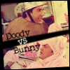
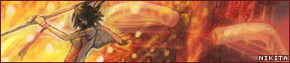
Nikita - HOW DO PEOPLE DO THAT WHOLE COLOUR DECREASE THING?! <_< The whole one on one thing seems really cool, but...why's Ross "Doody"? oO

Melmite - To be honest with you, you really didn't do too much. You did the border, which I do like, but after a while, doing a border like that may be boring to some. Trying something new is all a part of graphics making, and who knows. You could maybe have your own style. Also, the 3d text is a little bothersome. <_<

Moogie - Aside from the resize, text, border and mini movie, I don't see where you did much either, but it looks really nice. I think it may have something to do with simplicity. o_o

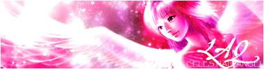
LAQ - Absolutely amazing. Your image is so beautiful, the colours blend perfectly, and the same goes for the text. I love it.

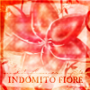
Bangel - The image that it has looks pretty close, just so you know. :) Anyway...the "x" bothers me a bit, because it's brighter than everything else. The colours are very nice, but the text still bothers me. If you had created an "X" on another layer, and then changed it's opacity to match the rest of the text, it would be perfect.

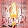
Maniac - I think it really could've lived without the "Happy Birthday" text, and you could've just kept your LJ username. Also, if you had moved the candle up, you wouldn't have the empty space on top. And maybe a few other different candles shadowed in the background. :)

stinkyllama - I really like the background, and the colours on Rikku, but the text is a little blurry...and it really doesn't make sense. :lol: Maybe if I played FFX2 it would make more sense, but for now, I just like Rikku.
As I say again...I like the background. :o

Marissa - If you don't mind, I've saved your picture for safe keeping. :lol: The border is very interesting (I've got one on my current Family Force 5 set's avatar. I going to dedicate today to learning how to do it! :lol:) But, the text bothers me just a bit. It's a little plain, and also, it looks like the stroke is, for lack of a better word, swallowing the white. Or maybe it just looks like it's white. oO

Medli - I've got a "what" question. What is it? o_o Is it a Gnorbu or what? oO It's odd...I'll say that. The background is nice, but I don't think the subtext works out too good like that. Also, maybe it's because I'm running subRed, but the top of the border looks like it's missing.

Ken - I really like it, but a few things bother me. For instance, that's not really an "evil" font that was used. Something a bit more grungy would've looked better. Also, the double border is annoying. I think a 1px border would've sufficed.

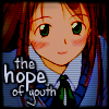
Rachel - I'm seriously jealous of your ability to colourize. I've tried, but I can't. OK...the text is very nice, but "of youth" looks a bit small. Also, the scanlines are a bit too heavy for my taste. The font's cute...what is it? :o

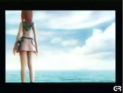
Amethyst - Full Metal Alchemist, right? oO Anyway, by trying to dodge the Japanese subtitles, her chin is cut off a bit. Nothing to worry about though. Also, I think with the colours and the grid, you can't really tell what it is. And, finally, I think the text would've been better if it was just on top of the mini movie, not above it.

Iath-em - <3 <3 <3 I have absolutely nothing to say except wow. No picture, that's amazing. But, I have ONE thing to say. "Celebration" should've been above "2006", and not below it.

Hm. Maniac and melmite. Sorry, guys.

Fri Mar 03, 2006 8:44 pm

DM wrote:Iath-em - I have absolutely nothing to say except wow. No picture, that's amazing. But, I have ONE thing to say. "Celebration" should've been above "2006", and not below it.


Casual observance would dictate that Celebration was written above 2006 and not below it.
Topic locked