Sun Jan 02, 2005 6:38 pm
Jens: I love the colour scheme, and the image. The positioning of the av text and sig subtext are great. And I like the simplicity of the borders. The grid in the background is slightly distracting, for me anyway. The colouring of the text seems to be slightly greyer than the colouring on the image, I think it might look better if it were bluer (blue-er?). I agree though that the text on the sig should be moved up and centered more.
AutumnElf:
The blend: Lower the opacity on the scan lines, they're way too distracting. The text looks good, and would probably look better with the scanlines not so dark. The positioning of the images is good, I love how on the left she's looking up at the text, and on the right she's looking at me =O. One odd thing though, the arms being cut off like that really freaks me out.
The set: I agree with the others, the black border doesn't go. Perhaps take the blue out of the details on the wings and darken it a little, then use that colour for the borders. I like the simplicity of the set. The background and the text look very watery/icy, which match the name. The text could stand to be a bit darker, but only a bit. If it stood out too much it'd ruin the simplicity of the set.
Could I get this set made for Kyra:


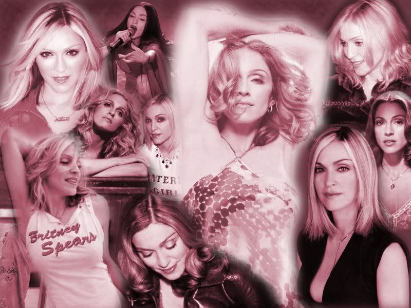
And this Madonna wallpaper:
http://img.photobucket.com/albums/v18/s ... adonna.jpg
Both rated please? =)
AutumnElf:
The blend: Lower the opacity on the scan lines, they're way too distracting. The text looks good, and would probably look better with the scanlines not so dark. The positioning of the images is good, I love how on the left she's looking up at the text, and on the right she's looking at me =O. One odd thing though, the arms being cut off like that really freaks me out.
The set: I agree with the others, the black border doesn't go. Perhaps take the blue out of the details on the wings and darken it a little, then use that colour for the borders. I like the simplicity of the set. The background and the text look very watery/icy, which match the name. The text could stand to be a bit darker, but only a bit. If it stood out too much it'd ruin the simplicity of the set.
Could I get this set made for Kyra:
And this Madonna wallpaper:
http://img.photobucket.com/albums/v18/s ... adonna.jpg
Both rated please? =)
Sun Jan 02, 2005 8:24 pm
Sapphire Faerie- The set is scary. I love the background and effects, but they don't really go with the picture. Looks like something an anime picture would go well with.
The Madonna wallpaper looks pretty cool! Though black haired Madonna sticks out alot.
http://img.photobucket.com/albums/v235/adamsworld/draiknestlayout.gif
Can anyone rate that?
The Madonna wallpaper looks pretty cool! Though black haired Madonna sticks out alot.
http://img.photobucket.com/albums/v235/adamsworld/draiknestlayout.gif
Can anyone rate that?
Sun Jan 02, 2005 8:29 pm
I so have to rate that, being a global mod of the Draiknest forums. =D
I really like how the text is bordered, it really makes it stand out. The font is awesome as well. The one thing I can see that bothers me is how the image is a bit grainy. However, the blending is nice. Just a bit plain, though. 7/10
I really like how the text is bordered, it really makes it stand out. The font is awesome as well. The one thing I can see that bothers me is how the image is a bit grainy. However, the blending is nice. Just a bit plain, though. 7/10
Mon Jan 03, 2005 3:17 am
Adam: I really like it, but I do see a few things wrong with it. First, the background behind the text is way to plain, it would look better if you had a faded image there, the gradient is not enough. The main text looks kind of weird, I think it will look much better if you made the text bigger so it wouldn't look so thin and grainy. Maybe also make the border dark blue instead of black and fade both the main text and the subtext a little. Oh and are you going to have a background where the white part is? If you wont, I think a light blue background would look great. 
I'm curretly trying to improve on my wallpapers, blogs and all that other stuff so can anyone rate a hack wallpaper I made? Constructive crisitism would be nice.

note: the background is made from scratch using only the girls image (I forgot her name)
I'm curretly trying to improve on my wallpapers, blogs and all that other stuff so can anyone rate a hack wallpaper I made? Constructive crisitism would be nice.

note: the background is made from scratch using only the girls image (I forgot her name)
Tue Jan 04, 2005 9:46 pm
Darklegendary: That is really busy and bright! It actually hurts my eyes a bit to look at. It also looks like there are spots on the outline of the girl where something went wrong, or too much was taken out with a magic wand (not saying that you did, that's just how it looks when I do that by accident ^^;) I do really like the blend of the girl in the middle, and actually had to double take. And I do like the text, but icons would get in the way of it I would think. My best advice would be to maybe dim the brightness of it a bit, move the text to the right and try to fix some of the pixaliation on the outline of the girl. And that's as constructive as I can get Honestly, if it wasn't for the brightness I would see myself using it
Can you guys rate a set I made for another forum by chance? Thank you!


Can you guys rate a set I made for another forum by chance?
Tue Jan 04, 2005 11:11 pm
darklegendary: very nice image manipulation. you left space for the icons, which is good. i dont think the colour scheme is right for the image though, i would have tried something a bit more red. also, there seems to be alot of open space, perhaps add some abstract linework? the overall is quite good though.
7/10
7/10
Wed Jan 05, 2005 10:09 pm
Meowth1982: Cute! My only problem is the text over the av...It kinda obscures the girl's face. 9/10.
Darklegendary: This is very good. I love the background! The text on the left is kind of distracting, though...maybe if you made it bigger and moved it down by the girl's feet it would look better. 9.5/10.
Any ratings for my current set?
Darklegendary: This is very good. I love the background! The text on the left is kind of distracting, though...maybe if you made it bigger and moved it down by the girl's feet it would look better. 9.5/10.
Any ratings for my current set?
Fri Jan 07, 2005 5:35 pm
Amethyst- The colour works so well! I love tiny sets! It looks awesome!
Meowth- The text over the girl is a bit strange, but I love the sig! Where did you get that heart brush? So cool!
I was messing around with brushes and I made this avatar:

Rating?
Meowth- The text over the girl is a bit strange, but I love the sig! Where did you get that heart brush? So cool!
I was messing around with brushes and I made this avatar:
Rating?
Sat Jan 08, 2005 7:33 pm
Adam: Hey, I finally see the gradient! You're right, it IS hard to see. You did a REALLY good job of erasing the BG. However, if you could see the gradient a little more...only thing that bothers me.
Ammy: I think you should've bordered the text on the av. It looks like two different sets. It's REALLY good though, but that's the only problem.
Meowth: At first, I typed MEDLI. Bad me, bad me. XD But I LOVE Venus. I think a dark border would look better, however. I LOVE the heart, but where there's two different "types", to say, of text it's distracting.
-----------------------------------
This set was SUPPOSED to be for PPTTG, until I finished. It just doesn't look right for some reason. Ratings, please?


It looks SO bad. >__<
Ammy: I think you should've bordered the text on the av. It looks like two different sets. It's REALLY good though, but that's the only problem.
Meowth: At first, I typed MEDLI. Bad me, bad me. XD But I LOVE Venus.
-----------------------------------
This set was SUPPOSED to be for PPTTG, until I finished. It just doesn't look right for some reason. Ratings, please?
It looks SO bad. >__<
Sun Jan 09, 2005 4:40 am
DM: I like the av, it doesn't seem empty, and the grid effect goes relatively well with the image. Although, I never really liked the colorization effect. Try using a pink gradient on overlay/softlight/multiply on it next time and see what happens.  It always works for me, as it doesn't completely colorize certain parts of an image where all the colors are either a light or darker shade of a certain color. The sig is extremely empty. Try making the size a bit smaller next time, even though that may be hard because of your long name. xD Also, try some brushes or gaussion/motion blurs on the background to get some neat effects. Same could be said about the image.
Adam: I like it. Although, the brushes look a bit blurred with the background and you cant really tell what they are. Also if you add an outer glow to the main image it might enhance/make it stick out, a little more. I also don't like the position of the text, although that may just not be my preference where the text goes. Try corners next time or underneath the main image for a more centered feeling. The blue goes suprisingly well with the black, white, and orange though.
So, rate my current set?
Sun Jan 09, 2005 5:50 am
Oooooh, that is such a cool set Knives, I love shoes! Err, yeah, anyway, I thinks it looks great, only the shoe in the sig is a bit to bright, it doesn't look right when everything else is pale and dark shades. But maybe its just me being picky, so who knows.
Can someone rate?


Can someone rate?
Sun Jan 09, 2005 5:23 pm
Hehe!! I love that set Dark!! It is so cute! I love the colours - the way you've blended the pink into the purple! The pictures are placed perfectly and are sooo cute!! The only thing I'm not so keen on is the way the y and g in cut off at the bottom of the sig. Maybe you could shift all the text up a bit? Its up to you of course if you're fine with it. 
Can you rate this set I made please? Its based (by request) on my current pink set.

Can you rate this set I made please? Its based (by request) on my current pink set.
Sun Jan 09, 2005 7:04 pm
Darklegendary - I see you have finally loosened the thick black border Still I believe you could work on the current border, try mixing with lighter shades matching the image instead of always making a black edge. The purple shades of the image are lovely though and the fonts well chosen as the image effects, maybe you should try moving the texts up to the middle though?
I made this set recently for a request on my board, but I'd love to hear opinions from you others about it as well.


I made this set recently for a request on my board, but I'd love to hear opinions from you others about it as well.
Mon Jan 10, 2005 7:45 pm
DM was on fire! wrote:Adam: Hey, I finally see the gradient! You're right, it IS hard to see. You did a REALLY good job of erasing the BG. However, if you could see the gradient a little more...only thing that bothers me.
Ammy: I think you should've bordered the text on the av. It looks like two different sets. It's REALLY good though, but that's the only problem.
Meowth: At first, I typed MEDLI. Bad me, bad me. XD But I LOVE Venus.
-----------------------------------
This set was SUPPOSED to be for PPTTG, until I finished. It just doesn't look right for some reason. Ratings, please?
It looks SO bad. >__<
Um, DM.....
There was no background to begin with.
Your set doesn't look bad at all!
It is great.
Though I'm not sure if I would have chosen pink.
Light blue seems like something I'd use if I were you.
Wed Jan 12, 2005 1:25 pm
rate this set for Bridgette pretty pweaz?

