Pteri Of Lurve in works
Thu Feb 10, 2005 3:41 pm
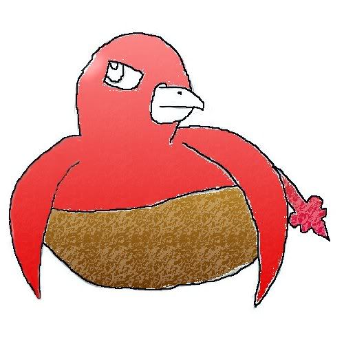
I'm still working on him and know he needs a lot of work, but I was wondering what people thought so far. He's sititng in a nest. I'm maybe 1/4 the way done.[/url]
...
Thu Feb 10, 2005 4:55 pm
Did you do that on the comp? or with a graphics pad? or what, bcause, to b honest...I don't really like it...sorry  It looks a bit unprofesional, and stuff...sorry, but it's much better than most peeps could ever do on the computer:)
Thu Feb 10, 2005 8:25 pm
I'm just learning to draw with a art program in my school's computer lab. I'm no where near finished with the drawing, yet. I know it could be alot better, but I am still learning.
Thu Feb 10, 2005 9:07 pm
The main thing that jumps out at me is it needs it's little feathers on top of his or her head, but since you're a Pteri expert I'm sure you knew that.  His (or her) body could be a little smaller. Maybe tucking in the wings might be a good idea, as well.
I like the coloring of the body and how it has slight texture to it. The way you drew the beak is nice, and since I always have issues with eyes I like yours. It'll look pretty good with some coloring.
With some tweaking I think you could maybe get in the art gallery.
By the way, if I sounded harsh or mean anywhere, I'm sorry because certainly never intended to. I always worry I'll offend or hurt people when I suggest things to them.
Thu Feb 10, 2005 9:14 pm
Thanks Kitten
Well here his my second hour of working on it.
I have to stop to go to class again so that will be it for a while.
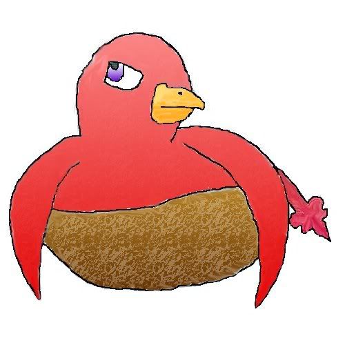
Yes I'm still working on it. I'm maybe 1/2 way done.
Well here his my second hour of working on it.
I have to stop to go to class again so that will be it for a while.
Yes I'm still working on it. I'm maybe 1/2 way done.
Thu Feb 10, 2005 9:47 pm
ooh! like the eyes, though the colouring on the skin is really cool, there still are some white borders that you may want to get away
well, it depends on what program you're using... if it's photoshop you could put the outlines on another layer so you can colour more easily
well, it depends on what program you're using... if it's photoshop you could put the outlines on another layer so you can colour more easily
Fri Feb 11, 2005 12:15 am
Pretty fair so far, but perhaps you should give the Pteri a different colouring on the chest area? You may also want to add a tinge of the same colour on the edge of the wings (because of the angle you drew them at), if you know what I mean.

Also, if you want to get really detailed, perhaps give it a more feathery/"furry" look, and give the nest a bit more stick detail (eg. protruding sticks, not in the round shape). You may also want to lighten up on the cloning texture- I can see that you've been using the same pattern over and over again there. It looks pretty good, but would look better if it was varied. Give it a few smudges. :)
Also, if you want to get really detailed, perhaps give it a more feathery/"furry" look, and give the nest a bit more stick detail (eg. protruding sticks, not in the round shape). You may also want to lighten up on the cloning texture- I can see that you've been using the same pattern over and over again there. It looks pretty good, but would look better if it was varied. Give it a few smudges. :)
Fri Feb 11, 2005 2:08 am
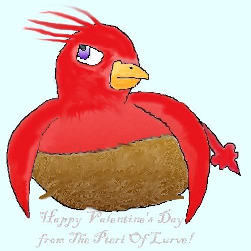
I think this might be finished. What do you all think? I had plans for the lighter coat Yoshi as that was what everyone saw(my base coat). So now I need some C&C. Should I try for the art gallery??
Fri Feb 11, 2005 2:29 am
Hm, I like it! I can't help thinking that its falling, and is trying to hold the nest to keep it from falling as well. Heh. It could just be the background color, it looks alot like the sky to me.
I love it, though! The eyes are nice, and so is the texture of the Pteri and nest.
I love it, though! The eyes are nice, and so is the texture of the Pteri and nest.
Fri Feb 11, 2005 2:34 am
XD
Yeah....the fluff on its head in combo with the b/g color does make it look like it;s falling.
Not bad at all, though! The shading turned out quite well, particularly where the darker feathers meet the lighter ones.
Yeah....the fluff on its head in combo with the b/g color does make it look like it;s falling.
Not bad at all, though! The shading turned out quite well, particularly where the darker feathers meet the lighter ones.
Fri Feb 11, 2005 2:43 am
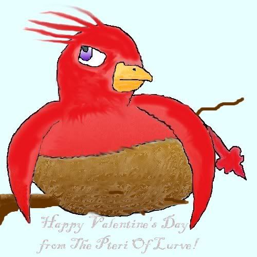
I seen that falling for you theme right after posting it. I had him branch out a little. See:
Fri Feb 11, 2005 2:47 am
Lovely. It's now a fat Pteri on a thin branch. XDD
Just kidding..
Just kidding..
Fri Feb 11, 2005 2:59 am
Hah, Requiem.
It looks alot better. I don't feel dizzy when I look at anymore, because its not falling!
It looks alot better. I don't feel dizzy when I look at anymore, because its not falling!
Fri Feb 11, 2005 3:01 am
Well fine the Req. *Kidnaps Illusen and makes her use her power to age the tree a bit!* There! Happier?
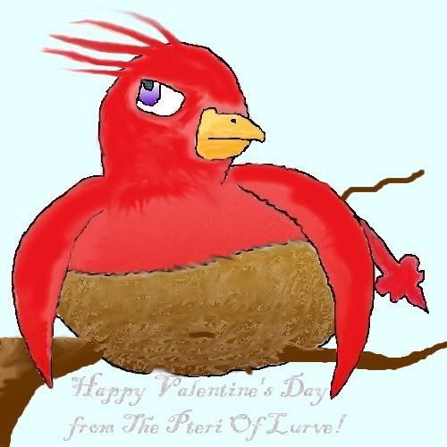
*holds up Illusen's staff threateningly* Now how's the tree?
*holds up Illusen's staff threateningly* Now how's the tree?
Fri Feb 11, 2005 3:14 am
It looks nice, I like it, but you can still improve it. I can see that you used the bucket/fill tool, you should never use that tool to color pictures, it looks very grainy and it leaves a bunch of white spots around the lines, smudging the white areas does not make it look better, only worse. Instead, create the lineart in a different layer, it will look so much better that way and the coloring wouldn't overlap the lineart. Your picture needs more shading. Don't be afraid to color it some more, use darker colors, experiment with things, just be sure to put every color in a different layer so you can easily fix mistakes.
Oh and I'm also very very sorry for my poor grammar, just ask if you don't get somethings, I promise to explain it better.
Oh and I'm also very very sorry for my poor grammar, just ask if you don't get somethings, I promise to explain it better.