Ratings
Thu Oct 28, 2004 11:02 pm
Any ratings on graphics goes here and only here, no stray topics. ;P
Ratings Board Rules:
1. Keep your criticism constructive.
2. You must give/get ratings at a ratio of at least 1:1, that means for every graphic you ask for ratings on, you must rate at least one other. And I mean a meaningful, well-thought out rating, not just a number or "that's good."
New Addition: These numbers do not stack up. If you rated two sets and asked for one rating, you cannot make a post later asking for one free rating because you rated earlier.
And be good about your ratings, if I see continue to see many ratings that simply say "that's good" in many words, I will raise the ratio to 3:1.
3. You may not ask for ratings on work that you did not make.
<hr>
To get you all started again, try the end of the last split, or you can go ahead and rate my new set.
Last edited by Yoshi on Sat Jan 15, 2005 6:10 pm, edited 1 time in total.
Thu Oct 28, 2004 11:15 pm
Yoshi.... I like your current set. The colours and images used are perfect for Autumn and Halloween. The set is simple, yet stands out. I give it an 8/10.
Can someone rate this blend for me, please and thanks?
http://img.photobucket.com/albums/v168/tropikalprincess18/Kellyblend.jpg
Yoshi edit: Maaaajor page stretch, image changed into link.
Can someone rate this blend for me, please and thanks?
http://img.photobucket.com/albums/v168/tropikalprincess18/Kellyblend.jpg
Yoshi edit: Maaaajor page stretch, image changed into link.
Fri Oct 29, 2004 3:24 am
Mary : Beautiful.  The colors are nice and I like the text. It is hard to read, but we wouldn't want it to stick way out, either.
  Nice job, though. 9/10.
Sat Oct 30, 2004 6:13 pm
Mary, the colours, like Medli said, are awesome. It's extremely nicely done, shame about the text. But ah, it's really nice. Only thing I can pick, though, is that the last image is cut off.

(I took the photo too. Signature to come later.))
(I took the photo too. Signature to come later.))
Sat Oct 30, 2004 6:53 pm
Bluehawaii19: The color and actual blending of the images is very good. My only problem is the text, because it's rather hard to read.
Xerai: I like it so far! The 'r' seems a bit blurry, though, and the squares aren't even. Can't wait to see the sig^^
----------
Ratings on my current sig? The original picture is here.
Xerai: I like it so far! The 'r' seems a bit blurry, though, and the squares aren't even. Can't wait to see the sig^^
----------
Ratings on my current sig? The original picture is here.
Sat Oct 30, 2004 7:10 pm
xerai wrote:Mary, the colours, like Medli said, are awesome. It's extremely nicely done, shame about the text. But ah, it's really nice. Only thing I can pick, though, is that the last image is cut off.
(I took the photo too. Signature to come later.))
Actually, you need to scroll a bit for the rest of the image.
Sat Oct 30, 2004 7:26 pm
bluehawaii19 wrote:xerai wrote:Mary, the colours, like Medli said, are awesome. It's extremely nicely done, shame about the text. But ah, it's really nice. Only thing I can pick, though, is that the last image is cut off.
(I took the photo too. Signature to come later.))
Actually, you need to scroll a bit for the rest of the image.
Oh...
Amethyst wrote:Xerai: I like it so far! The 'r' seems a bit blurry, though, and the squares aren't even. Can't wait to see the sig^^
Must be your eyesight...the r is just like every other letter. And the squares...thats the idea..Really ._.
Sat Oct 30, 2004 8:09 pm
Ooh, Amethyst, your sig is wonderful! Great job making the image look like night.. the blue tones are very nice. 
Anyone even want to comment on my sig?
Anyone even want to comment on my sig?
Sun Oct 31, 2004 4:43 pm
Amethyst : I love the night sky you created. It makes the image a lot more interesting. The star is a nice touch as well. The fading font is perfect for that signature. The main text has an interesting font. I'm bit a torn on if I like it or not, though. I like the glow around it, though. It makes it seem as if it's made of stars. 9/10
Riddikulus : I'm not a big fan of cut-outs although the one you chose works well with the otherall image. I really like the font that you used for the main text. I think that the stars in the background are a bit overused, but again, they work well with the signature. The image you used is very.. different. ;P The orange tones compliment the brown, though. 7/10
Please rate this set :
Tue Nov 02, 2004 12:46 am
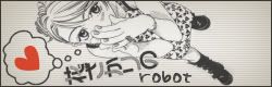
Robot - The set has a rather endearing simplicity to it, which makes it look really cool. I like the angle the girl is at, and the heart. I have a problem with the background, though. I don't like the greyness fading to white. It feels like the background should be the same color.. I dunno. 9/10
Tue Nov 02, 2004 12:51 am
Xerai - As Amethyst said, looks good so far! *tilts head at it* What's it a photo of? I guess we'll be able to see that better, when you've made the sig.
Riddikulus - Hehe, that's a cool photo! Very unique. I like the cutouts too, you don't see angled cutouts like that very often The main font you've chosen is very cool, though a bit hard to read on the av. Maybe a 1px outline around it might help? The only other thing I noticed was that the sig looks quite "tall". If you made it a bit shorter, it would be more in proportion to the av, as well as helping fill a bit of the empty-ish space above (and to the left of) the main text .
robot - Very neat and simple, yet effective... you seem to be very good at that I like the way you positioned the picture, and the heart stands out really well, adding interest to the set
Riddikulus - Hehe, that's a cool photo! Very unique. I like the cutouts too, you don't see angled cutouts like that very often
robot - Very neat and simple, yet effective... you seem to be very good at that
Thu Nov 04, 2004 10:06 pm
mazil wrote:Xerai - As Amethyst said, looks good so far! *tilts head at it* What's it a photo of? I guess we'll be able to see that better, when you've made the sig.
It's a pony,

Sun Nov 07, 2004 4:03 am
Robot: Aww, what can I say? Your sets are great, and this is no exception. I love the set, the composition, and the way the heart adds a splash of color. The fonts are nice too. In the sig, I might move the girl over a bit to the right to get rid of some of the empty space and prevent the overlap with the text. Also, for some reason, I think the thought bubble might look better without the scanlines in it... but that's me being weird and nitpicky.
Ridduklus: I like it! The cutouts are cute, the background is nice (although the little bit of green next to 'got' is sort of distracting), the text and image are nicely blended in. In the av, I'd move the text a little to the left, away from the border - just about a pixel or so. Tnhe sig is a little too tall for my taste, and you end up with empty space at the top. Since the sig subtext overlaps with the guy anyhow, I'd just move the main text down a bit and put the subtext at the top.
Amethyst: Well, I still think the butterfly sig was fabulous, but this is nice too. You did a really impressive job of changing the whole feel of the image from day to night, and it looks quite natural. The main text is a little too bright, and dominates the image. I love the subtext quote, by the way.
xerai: I could tell it was a horse, but it took me a little work. It might work better if you lightened the scanlines a bit. I'd also move the text about one pixel to the left. I like the squares and the fading line at the bottom.
Mary: Nicely done - I like the feel of the whole iamge, and it looks quite smooth. For some reason, the text over the third person from the left looks a little odd. Also, since there's a lot more writing on the left than the right, the image looks somewhat unbalanced. Maybe you could have done the main text as only two lines, spread it out more, and put her name across the bottom?
Yoshi: I love it. It's quite inspiring - I actually can sort of feel the autumn air and the warmth of the tea when I look at it. I might take away the characters at the left, though, as without it the set is more simple and...literal, I guess, but it looks fine that way too.
Ratings?


Ridduklus: I like it! The cutouts are cute, the background is nice (although the little bit of green next to 'got' is sort of distracting), the text and image are nicely blended in. In the av, I'd move the text a little to the left, away from the border - just about a pixel or so. Tnhe sig is a little too tall for my taste, and you end up with empty space at the top. Since the sig subtext overlaps with the guy anyhow, I'd just move the main text down a bit and put the subtext at the top.
Amethyst: Well, I still think the butterfly sig was fabulous, but this is nice too. You did a really impressive job of changing the whole feel of the image from day to night, and it looks quite natural. The main text is a little too bright, and dominates the image. I love the subtext quote, by the way.
xerai: I could tell it was a horse, but it took me a little work.
Mary: Nicely done - I like the feel of the whole iamge, and it looks quite smooth. For some reason, the text over the third person from the left looks a little odd. Also, since there's a lot more writing on the left than the right, the image looks somewhat unbalanced. Maybe you could have done the main text as only two lines, spread it out more, and put her name across the bottom?
Yoshi: I love it. It's quite inspiring - I actually can sort of feel the autumn air and the warmth of the tea when I look at it. I might take away the characters at the left, though, as without it the set is more simple and...literal, I guess, but it looks fine that way too.
Ratings?
Sun Nov 07, 2004 6:03 am
Starchaser : I love that set. It's so.. calming, perhaps. The old painting look that it has makes it really appealing. You chose the perfect font for the signature's main test. I like the faded letters in the avatar as well. 10/10
By the way, the overlapping text in my set is actually from the original image, but I loved the font and the way it looked so much that I couldn't bring myself to erase all of it. I'll have to mess about with it and see how it looks with the girl and the text moved around a bit.
By the way, the overlapping text in my set is actually from the original image, but I loved the font and the way it looked so much that I couldn't bring myself to erase all of it. I'll have to mess about with it and see how it looks with the girl and the text moved around a bit.
Sun Nov 07, 2004 4:36 pm
bluehawaii19: Nice job on the blending but the text is a bit hard to read 8/10
xerai: Aww its a pony Hehe, I like ponies so 9/10
Riddikulus: That was the best movie ever xD. He has mad moves and I wanna learn that dance like mad crazy xD.
Robot: Ooooh so purdy 9/10 for sure. Like the Japanese (or is it Chinese?)
Starchaser: Ooooooh so blue. Like how the sub-text on th esig doesn't stand out too much. 9/10 ^_^
xerai: Aww its a pony
Riddikulus: That was the best movie ever xD. He has mad moves and I wanna learn that dance like mad crazy xD.
Robot: Ooooh so purdy 9/10 for sure. Like the Japanese (or is it Chinese?)
Starchaser: Ooooooh so blue. Like how the sub-text on th esig doesn't stand out too much. 9/10 ^_^