Sun Nov 07, 2004 5:55 pm
Starchaser wrote:Ratings?

Starchaser, I really like it. i know people say you should be careful when putting in text if it's not horizontal, but the diatonal text looks just perfect. The only suggestion i would have is about the subtext, i'd make it very slightly paler to make it easier to read, and maybe move it to the left very slightly, as it's soo much closer to what he's throwing than the left hand edge of the sig, it looks very slightly wonky. other than that it's fantastic!
I'm not asking for this set to be rated per-say, i just can't decide which av i prefer. which av number 1 or 2?
1.

2.

(and here's the sig)

Thanks in advance!!
Sun Nov 07, 2004 6:03 pm
Rachel: spiff set ^_^ Hmm..I think I like the first av best. Umm only suggestions I would make is about outlining the text, i dunno, it seems a bit...awkard? (the pixel text I mean)
Ratings on the new set?


Ratings on the new set?
Sun Nov 07, 2004 6:37 pm
Fzun: I love it!  The sig is a bit empty, however, the color matching is absolutely wonderful!! Definate good work.
Can someone rate this set I made for Naniwai for me please?


Can someone rate this set I made for Naniwai for me please?
Sun Nov 07, 2004 8:55 pm
fzun wrote:Ratings on the new set?
i like it. it's simple and effective. sometimes sets can be a bit cluttered. the only comment i have is that the smoke coming off the soup (or whatever it is) doesnt match anywhere in the set, if i were making the set i'd consider having the paler inner border match one of the greys you can find in the smoke, to tie it in a little bit.
meowth1982 wrote:Can someone rate this set I made for Naniwai for me please?
it seems a bit busy. i like the background image, but maybe you need a thicker, or second border on the name, as it's a little hard to read with everything going on behind it... other than that it looks very good. it's not one of the best sets i've seen from you tho meowth.
Sun Nov 07, 2004 10:30 pm
fzun wrote:
I really like the colours that you used and the image is really cute.
It is a plain set, but really stands out. The text blends in, but also is noticable. I give it an 9/10.
Can someone rate this colourization that I did, please and thanks?
http://img1.exs.cx/img1/7702/fwmb-Mary-ch35.jpg
Last edited by bluehawaii19 on Mon Nov 08, 2004 3:52 am, edited 1 time in total.
Mon Nov 08, 2004 3:17 am
r4che1 wrote:it seems a bit busy. i like the background image, but maybe you need a thicker, or second border on the name, as it's a little hard to read with everything going on behind it... other than that it looks very good. it's not one of the best sets i've seen from you tho meowth.
I took your advice and went ahead and made the boarder around the text bigger. I think it looks much better now.
Mon Nov 08, 2004 4:20 pm
bluehawaii19 wrote:Can someone rate this colourization that I did, please and thanks?
http://img1.exs.cx/img1/7702/fwmb-Mary-ch35.jpg
wow mary, that's really good. you're soo good at colourisations and blends. if you hadnt said it was a colourisation i wouldnt have known. the colours look really natural, and the piercing blue colour of the eyes is just amazing, it stands out without looking over the top. well done!
Fri Nov 12, 2004 4:54 am
fzun wrote:Rachel: spiff set ^_^ Hmm..I think I like the first av best. Umm only suggestions I would make is about outlining the text, i dunno, it seems a bit...awkard? (the pixel text I mean)
Ratings on the new set?
Wow, this set it awsome... The colors are matching the picture
And can anyone rate this set I made for myself:


Btw, I know the set is kinda wierd...
Fri Nov 12, 2004 6:54 am
Slorg.... The avatar is really cute. I like how it is cut out in the shape. Anyways, the colours go well together and the set is nice and simple. I give it a 7.5/10.
Can someone rate this blend I just made, please and thanks?

Can someone rate this blend I just made, please and thanks?

Fri Nov 12, 2004 9:33 pm
Slorg: I agree with Mary that the av is really cool. Good job on the cut outs! I don't really like the sig though, it feels too empty overall. 7/10
Mary: I don't know what you started with but it looks like you put a lot of work into this. The only thing is the woman in the upper right hand corner kinda got her head cut off. It makes her look kinda weird. 9.5/10
Can someone rate this set (there are two avs because the quality on the one with animation had to be reduced for filesize)?
Sat Nov 13, 2004 4:22 am
Ack. All the sets in quotes are confuzzling me!
Starchaser- The diagonal text in the av looks slightly off. The sig subtext needs to be more opaque, and I'd maybe make the border on the av and sig just a little bit darker. Blagh. Beautiful, as always.
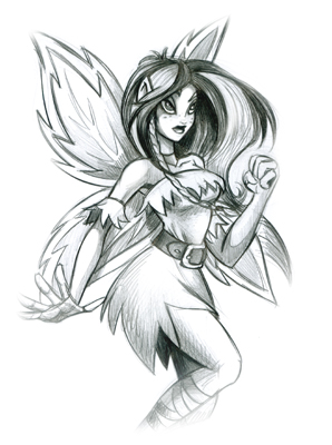
Rachel- I don't like the placement of the faerie's head in the first av, and I'm not overly fond of the second one either. ^^;; The sig is a bit too empty. And the border on the av text needs to be a different color.
Fzun- *glomp* (I owed you that.) Anyways, it's simple and very smooth looking. My main problem is that there isn't enough detail in the background. But because that makes it smooth looking, I'd maybe do something different with the main font.
meowth1982- The av is fine. Maybe just give it a dark blue border. The sig is too busy. I'd get rid of the first section of circles(the ones behind 'Nani')
slorg- The cutouts just aren't working for me. They don't look all that great. The sig is also far too empty, and it's jagged around the, erm, whatever the image is of.
hyperflutterby- Okay, if you have to have the unanimated av, use the green or yellow text. The sig and av don't really match, and I don't like the placement of the text in the sig. It's just all way too busy in some parts with not enough detail in others.
Starchaser- The diagonal text in the av looks slightly off. The sig subtext needs to be more opaque, and I'd maybe make the border on the av and sig just a little bit darker. Blagh. Beautiful, as always.
Rachel- I don't like the placement of the faerie's head in the first av, and I'm not overly fond of the second one either. ^^;; The sig is a bit too empty. And the border on the av text needs to be a different color.
Fzun- *glomp* (I owed you that.) Anyways, it's simple and very smooth looking. My main problem is that there isn't enough detail in the background. But because that makes it smooth looking, I'd maybe do something different with the main font.
meowth1982- The av is fine. Maybe just give it a dark blue border. The sig is too busy. I'd get rid of the first section of circles(the ones behind 'Nani')
slorg- The cutouts just aren't working for me. They don't look all that great. The sig is also far too empty, and it's jagged around the, erm, whatever the image is of.
hyperflutterby- Okay, if you have to have the unanimated av, use the green or yellow text. The sig and av don't really match, and I don't like the placement of the text in the sig. It's just all way too busy in some parts with not enough detail in others.
Sat Nov 13, 2004 7:36 pm
Slorg: I like the av more than the sig. the sig is a bit plain, if you add something in the background it might look a bit better. the first thing i'd try if i was doing that would be a large (possibly out of focus), faded image of the broken toy. other than that its really good. 6/10
Hyperflutterby: That set is really good!! But on the unanimated av i would make the colour of the text one of the paler colours so it stands out more. And in the sig i would make the bar behind the text stand out less, it seems a bit harsh to me at the moment. other than that tho, it's really really good. 8/10
Could someone please rate these re-colours i've done? i'm thinking of making them into a couple of sets, but i wanted an opinion on the colours etc first.
Fyora Recolour
Illusen Recolour
Thanks!
Sun Nov 14, 2004 2:43 am
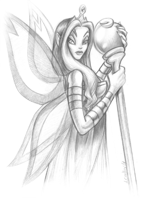
Fzun: It is time when simplicity looks dead cool. I love the font you used, may I ask what it is? I also like the colour theme, it goes very well with the green pot on the left
Hyperflutterby: I like the sig more than the av. What I think is that the av should go with the sig, meaning it might look better if you cut some of the sig and place it in the av. I do see a faerie on the av, but somehow it doesn't REALLY match that much since it's blue and the sig is black. Other than that, it's absolutely fab!! I really like the image you used. May I suggest the smaller faerie or the large faerie blowing can be part of the av? 7/10
Dizziness
Jealousy
These are wallpapers purely made in photoshop from scratch ^^ I understand it may be messy so yea.... Abstractism XD Just 2 for the time being...
Sun Nov 14, 2004 3:01 am
Rachel: Wow  They are amazing! I LOVE the Fyora one, the shading on it...just, wow. But! Fyora is really kinda more on the pink side rather than purple
  The Illusen one is nicely done too, except did you put those freckly things on her face on purpose? Because they look out of place and...does Illusen have freckles? 9/10
_jaye: Oooh. I'm getting dizzy just looking at them =P I really like "Dizziness" and the whirlwind and lines and everything. The "Jealousy" one, I find a little plain for some reason o.0 8/10


It's ok, I suppose...what I really want to know is on the av, should I leave the light green that looks like its highlighted over "AutumnElf", or remove it?
_jaye: Oooh. I'm getting dizzy just looking at them =P I really like "Dizziness" and the whirlwind and lines and everything. The "Jealousy" one, I find a little plain for some reason o.0 8/10
It's ok, I suppose...what I really want to know is on the av, should I leave the light green that looks like its highlighted over "AutumnElf", or remove it?
Sun Nov 14, 2004 12:51 pm
thanks jaye and autumnelf for your ratings, but i dont think i was clear enough with what i'd done, i only recoloured the images. I got the original images from the gallery of heroes:
Neopet's fyora ; My Fyora
Neopets illusen ; My Illusen
Anyway, Jaye - Dizziness looks really good, wow, so does jealousy! i prefer jealousy out of the two, but they're both fab! 8/10
autumnelf - that set is amazing!! But i couldnt comment on whether you should keep the glow on the av text without seeing it both ways, sorry. it really is amazing tho. 9/10