Quick-Ref Page Redesigned
Fri Apr 18, 2008 12:44 am
Re: Quick-Ref Page Redesigned
Fri Apr 18, 2008 12:51 am
Oh I don't like it, right now, at ALL.
I like seeing ALL my pets on one page - and being able to switch between them by clicking on their picture. I don't WANT to read a drop down menu next to a tiny picture of them. Aggh.
I like seeing ALL my pets on one page - and being able to switch between them by clicking on their picture. I don't WANT to read a drop down menu next to a tiny picture of them. Aggh.
Re: Quick-Ref Page Redesigned
Fri Apr 18, 2008 1:03 am
I'm really not liking this. Why does TNT have to change stuff just for the sake of changing?? Now there's no way to see who's hungry without cycling through, setting each pet to active in turn. Kind of defeats the idea of Quick-Ref. *grump*
Re: Quick-Ref Page Redesigned
Fri Apr 18, 2008 1:10 am
I guess it looks kind of snazzy, but I don't like it for functionality. My ugliest pet is always my active pet (Boochie etc) so now I'll almost never see my other guys 
Oh, "great"
"[pet] must be converted in order to be fully customisable. Click here to learn more."
Bah humbug, I thought they'd get rid of that stupid yellow notice. Now it's worse, with an image of my sad pet next to it. Yeah right, like she'd actually want to turn into this ugly thing:

instead of her prettyful self:

...and don't even get me started on my Plushie Chomby. I'd quit neo before I converted him.
Heh, sorry for the slightly unrelated rant.
Oh, "great"
"[pet] must be converted in order to be fully customisable. Click here to learn more."
Bah humbug, I thought they'd get rid of that stupid yellow notice. Now it's worse, with an image of my sad pet next to it. Yeah right, like she'd actually want to turn into this ugly thing:

instead of her prettyful self:

...and don't even get me started on my Plushie Chomby. I'd quit neo before I converted him.
Heh, sorry for the slightly unrelated rant.
Re: Quick-Ref Page Redesigned
Fri Apr 18, 2008 1:12 am
So... we get notices now?
The old quickref worked fine and the new one only has this notices thing different. And it loads a bit slower.
I only have my one pet, so the one-pet thing doesn't bother me much, but it's still a fairly unnecessary change.
The old quickref worked fine and the new one only has this notices thing different. And it loads a bit slower.
I only have my one pet, so the one-pet thing doesn't bother me much, but it's still a fairly unnecessary change.
Re: Quick-Ref Page Redesigned
Fri Apr 18, 2008 1:31 am
I thought I was going to hate it.... but actually doesnt bother me that much.... if you click the pictures of all your other pets they show up on the same page without making them your active pet and show you there info... takes a few for the pet pictures to load but no huge deal.... Was this something that needed to be done right now? No not really I could have lived quick ref for me is only used when i wonder if my pets have high or low hit points and that's it....
I don't see any flaw with it but I think the time that was used to work on this could have been spent better in other area's of the site without question.
edit: looking at it more i think i do like how it is set up a bit more... only because it makes finding the link for things like customize and your pets page easier. Again tho I still think the time could have been spent elsewear.
Last edited by Rubywinged on Fri Apr 18, 2008 1:36 am, edited 1 time in total.
Re: Quick-Ref Page Redesigned
Fri Apr 18, 2008 1:35 am
I thought the point was to see all your pets without having to do anything else. Drat. I only use quick ref to switch my active pet, but this makes it more annoying. I bet it works like crap on the old computer... The drop down menus for navigation hardly work as it is because they don't work until the ads fully load and they hardly ever do that.
Re: Quick-Ref Page Redesigned
Fri Apr 18, 2008 1:38 am
butterflygirl wrote:I thought the point was to see all your pets without having to do anything else. Drat. I only use quick ref to switch my active pet, but this makes it more annoying. I bet it works like crap on the old computer... The drop down menus for navigation hardly work as it is because they don't work until the ads fully load and they hardly ever do that.
My best advice for you on the old computer is switch to firefox and get adblock if you can. I have dial up and trust me it makes a HUGE difference when you dont have to wait for all those ads to load!
Re: Quick-Ref Page Redesigned
Fri Apr 18, 2008 1:41 am
metalmario wrote:I guess it looks kind of snazzy, but I don't like it for functionality. My ugliest pet is always my active pet (Boochie etc) so now I'll almost never see my other guys
I agree this is totally the fail.
Since active pets arn't safe my lab pet is always my active pet. So it irritates me that they're automatically introducing your active pet as an overriding visual theme (on the side bar, on the chat boards, here etc.) instead of giving us a choice of pets.
And again they're using poor UI principals. They've made the interface harder to use, less intuitive, more difficult to see and use on lower resolution monitor settings, while at the same time drastically reducing the amount of information provided, and making it much more difficult to get that information (inactive pet's, health, stats, neolodge status, disease status, petpet age) and making it more difficult to catch potential problems (see disease status, neolodge, and health above)
It would be slightly better if they would save your setting for having the pet windows expanded or contracted but they don't. And even in that case it's harder to use and takes up more space.
I've said it before. Do they not employ any HCI designers? I could do better than this and I've only taken a few classes in the subject.
Re: Quick-Ref Page Redesigned
Fri Apr 18, 2008 2:06 am
I just noticed the quick ref change. Who wants to bet that this change was implemented in order to make room for more advertisement space?
Re: Quick-Ref Page Redesigned
Fri Apr 18, 2008 2:11 am
smudgeoffudge wrote:I just noticed the quick ref change. Who wants to bet that this change was implemented in order to make room for more advertisement space?
Probably I took ad block off one day on neo and the ads that are all there now shocked me. I've only had firefox for 2 or 3 years and now I look and its just swarming with ads it makes me sad..... and makes me realize i will never get rid of firefox screw those ads. People are not going to buy something because you flash some ad at them they are going to buy it because they want it and already had it in there head to buy bleh!
Re: Quick-Ref Page Redesigned
Fri Apr 18, 2008 2:13 am
I dislike this change. I want to see at a glance which of my pets is hungry or needs attention. Is there a way to do that now?
Re: Quick-Ref Page Redesigned
Fri Apr 18, 2008 2:14 am
smudgeoffudge wrote:I just noticed the quick ref change. Who wants to bet that this change was implemented in order to make room for more advertisement space?
What room? The pet stuff takes up too much space
Seriously though, of course. That's the only reason they seem to do layout messing up...
Rubywinged wrote:My best advice for you on the old computer is switch to firefox and get adblock if you can. I have dial up and trust me it makes a HUGE difference when you dont have to wait for all those ads to load!
Maybe... Do they have 98 compatable versions? I'm not the fondest of ff, but maybe getting rid of the ads would be worth it.
Re: Quick-Ref Page Redesigned
Fri Apr 18, 2008 3:09 am
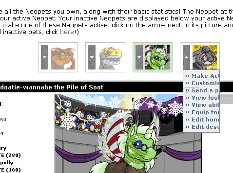
It's amazing how they can make the same amount of information take up more and more space.
Also:

That's one fantastically helpful menu.
Also:

That's one fantastically helpful menu.
Re: Quick-Ref Page Redesigned
Fri Apr 18, 2008 3:12 am
Moongewl wrote:It's amazing how they can make the same amount of information take up more and more space.
Also:
That's one fantastically helpful menu.
lol, that cut off bites. I only have three pets so it's not an issue for me.