Mon Dec 06, 2004 11:28 pm
Finally. Whew.

Original Image: http://img84.exs.cx/img84/8996/f6eyunaarmedcross.jpg
Programs Used: GIMP 2.0
My first wallpaper ever!

Original Image: http://img84.exs.cx/img84/8996/f6eyunaarmedcross.jpg
Programs Used: GIMP 2.0
My first wallpaper ever!
Wed Dec 08, 2004 11:06 am
Wed Dec 08, 2004 7:58 pm
Mazil, have you accidently linked to the same image twice? For original image, I see your wallpaper.
Wed Dec 08, 2004 8:39 pm
Mazil, you're lucky I was too busy to post this last night.  Or you would've been late.
And I must say, all of these wallpapers are gorgeous. ^_^
Judges are to choose...2 entries.
Apricus
Wallpaper
Original Image
Program Used: PSP 8
Sapphire Faerie
Wallpaper
Original Image
Program Used: PSP 7
Neko
Wallpaper
Original Image 1
Original Image 2
Program Used: Photoshop CS
Knives
Wallpaper
Original Image 1
Original Image 2
Program Used: Photoshop 7
Marissa
Wallpaper
Original Image 1
Original Image 2
Program Used: Photoshop CS
laq
Wallpaper
Original Image
Program Used: GIMP 2.0
mazil
Wallpaper
Original Image
Wed Dec 08, 2004 10:59 pm
Hehe... thanks heaps for being busy, Flame 
Oh, and thanks kim, that was a bit silly of me!
Here's the original image: http://www.allrpg.com/games/ff10/wallpaper/11_2.jpg
Oh, and thanks kim, that was a bit silly of me!
Here's the original image: http://www.allrpg.com/games/ff10/wallpaper/11_2.jpg
Fri Dec 10, 2004 4:20 am
<b>Apricus</b> -- Ohhh cool! I'll assume that the icons go in the upper right hand corner. I just think the grids are a bit too big, and so is the pixel effect that you used. Smaller next time, eh? Overall, it looks very nice.
<b>Sapphire Faerie</b> -- Blue! My favorite color! However, the text placement could use work. You should have put it at the bottom, so that desktop icons could be placed above it. Also, Copperplate isn't that great of a font. It's kind of tacky looking, but that's just me. I can always pick out stuff that you make. Very distinct style. But this time, the abstract background is just a bit too overpowering. Perhaps fade it a bit? You need to play up the main image a bit more. A note for the future: I've noticed that you use the abstract background effect a lot, and it's the main point of your style. The problem is that it doesn't always work. You have to look at the image you're working with. For instance, if it's drawn, you need to use a cartoonish background.
<b>Neko</b> -- It looks fantastic! I love it. Kind of on the bright side, that blinding thing in the middle. Great blending job. You just need to have moved the text to the bottom so that the upper left corner is free for icons.
<b>Knives</b> -- Effin' awesome. Really. But then again, you do wallpapers a lot. So mleh! The scanlines are too far apart.... It kind of draws my eyes in weird directions. And the pixellated effect is too much. Lower that layer's opacity a bit more. Other than that, it's amazing.
<b>Marissa</b> -- Lovely! Good job fixing up the original image, although I imagine it's a lot smoother when you shrink it so much. Anyhow, even though it's rather simple, the end effect is beautiful. Not too blinding or anything. Very easy on the eyes. I must say, I liked your original entry a lot too. It was very original.
<b>Laq</b> -- Doesn't look like you did much. I don't like the text placement. The colors/lighting kind of make me uneasy. The background effect is pretty cool, nevertheless.
<b>Mazil</b> -- Nice job extracting the image, but it shouldn't be in the center of the wallpaper. You left enough space for icons, but it just would look silly to split icons up and place them on either side of the image. I like what you did to the background; it looks really cool. I just think you could have done something other than use the original background as a base.... Maybe do some stuff from scratch.
Votes go to Sapphire Faerie and Laq.
<b>Sapphire Faerie</b> -- Blue! My favorite color!
<b>Neko</b> -- It looks fantastic! I love it. Kind of on the bright side, that blinding thing in the middle. Great blending job. You just need to have moved the text to the bottom so that the upper left corner is free for icons.
<b>Knives</b> -- Effin' awesome. Really. But then again, you do wallpapers a lot. So mleh! The scanlines are too far apart.... It kind of draws my eyes in weird directions. And the pixellated effect is too much. Lower that layer's opacity a bit more. Other than that, it's amazing.
<b>Marissa</b> -- Lovely! Good job fixing up the original image, although I imagine it's a lot smoother when you shrink it so much. Anyhow, even though it's rather simple, the end effect is beautiful. Not too blinding or anything. Very easy on the eyes. I must say, I liked your original entry a lot too. It was very original.
<b>Laq</b> -- Doesn't look like you did much. I don't like the text placement. The colors/lighting kind of make me uneasy. The background effect is pretty cool, nevertheless.
<b>Mazil</b> -- Nice job extracting the image, but it shouldn't be in the center of the wallpaper. You left enough space for icons, but it just would look silly to split icons up and place them on either side of the image. I like what you did to the background; it looks really cool. I just think you could have done something other than use the original background as a base.... Maybe do some stuff from scratch.
Votes go to Sapphire Faerie and Laq.
Last edited by vkceankraz on Fri Dec 10, 2004 9:12 pm, edited 1 time in total.
Fri Dec 10, 2004 8:49 pm
Apricus-Very nice use of red, but maybe do a brighter glow on the text to make it more seeable. Like vkceankraz said, use a smaller grid in the background.
Sapphire Faerie-I like how you tried to continue the glows onto the wallpaper. Try to blend the image more into the wallpaper around the edges. I don't really like the quality of how it saved, so I suggest maybe using .gif or .png.
Neko-I love the use of pink! I also really like how you blew up the larger image of Yuna, but the corners on some parts are a bit pixellated.
Knives-I love the swirls and sparkles and wings. The second image you used is sort of hard to see. I also really like the text. Though agreeing with vkceankraz again, the pixellation effect is a bit too much.
Marissa-Nice and clean, and I like the touch of musical notes in the background along with the sparkles. I also like the design Yuna's stepping on.
Laq-I like the effect used on the image, and the background. The text looks sort of odd on it, white or faded.
Mazil-I really don't like the color choice here. The mocha color doesn't really look all that good next to Rikku, but the shadow and ribbons behind her look nice.
I'll have to vote out Sapphire Faerie and Mazil. Sorry.
Sapphire Faerie-I like how you tried to continue the glows onto the wallpaper. Try to blend the image more into the wallpaper around the edges. I don't really like the quality of how it saved, so I suggest maybe using .gif or .png.
Neko-I love the use of pink! I also really like how you blew up the larger image of Yuna, but the corners on some parts are a bit pixellated.
Knives-I love the swirls and sparkles and wings. The second image you used is sort of hard to see. I also really like the text. Though agreeing with vkceankraz again, the pixellation effect is a bit too much.
Marissa-Nice and clean, and I like the touch of musical notes in the background along with the sparkles. I also like the design Yuna's stepping on.
Laq-I like the effect used on the image, and the background. The text looks sort of odd on it, white or faded.
Mazil-I really don't like the color choice here. The mocha color doesn't really look all that good next to Rikku, but the shadow and ribbons behind her look nice.
I'll have to vote out Sapphire Faerie and Mazil.
Sat Dec 11, 2004 2:49 am
Apricus - I'm glad I suggested this image to you, because you did an amazing job with it. I love how you've brightened all the colors. The bright swirls in the background are very cool, thought I'd make the grid a little smaller. I'd also have made the text stand out a little more.
Sapphire Faerie - A giant...swirly...background. I can't say I like it at all. It's way too busy. The main text is nice, but if icons were placed on the left side, they would overlap it. And the smaller text is too blocky for how smooth the rest of the set for of is. The image of Lenne is also overwhelmed by the background...So, my suggestion would be to not use that type of background for wallpapers. Or just maybe use touches of that background in places along with something more solid.
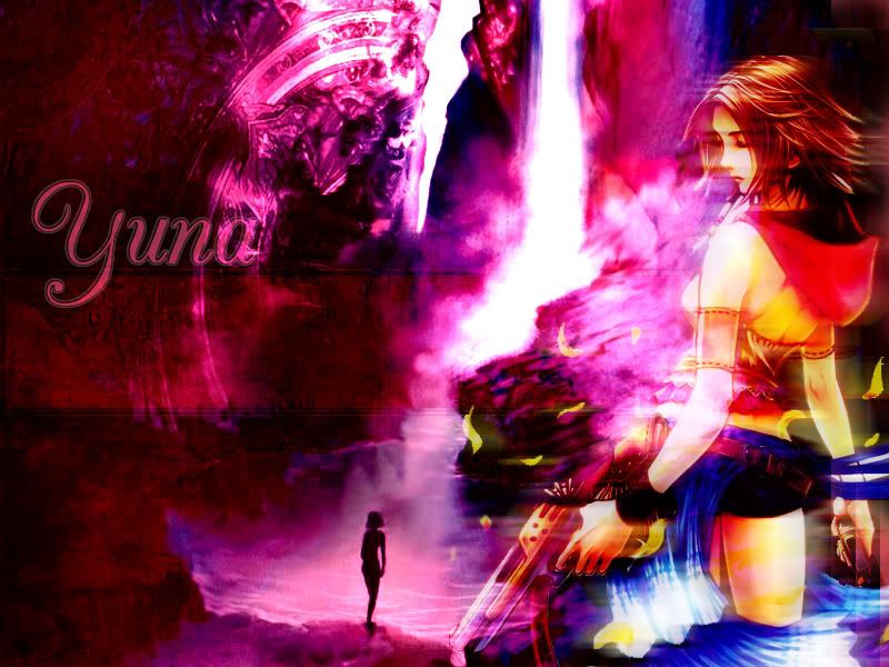
Neko - Stunning colors. I've also never seen that image of Yuna before. Anyway, it has a very nice dreamy effect, especially with the colors and smoothness. What adds to this is the image in the background, with the large white crack and the small figure by the water. My only suggestion would be to move the text so icons can go on the left side.
Knives- The scanlines are a little too far apart, and the pixelated effect is a little too strong. Rinoa's fact looks really weird because of it. I think I can see where you maybe used the image of Shuyin, but, erm...yeah. The wings are a nice touch, as are the swirls. The small text is a little too small I think, but it's no big deal.
Marissa - Very nice. It's simply, clean cut, with just enough detail. The love the background, and the glow around Yuna is a nice effect. I also like the design Yuna's stepping on. Gives it even more of a FFX touch.
laq - Not bad for a first try. I like how you've altered the coloring in the image of Yuna just slightly. Her pink hood and blue skirt stand out a little more. I'm not overly fond of the text. You shouldn't have used white, and the text is also unreadable. The background also needs slightly more detail, as the writing just isn't enough.
mazil - Bad color choice. I'm not really sure where you pulled it from. It's simple, and I like the shadow and background...but the bland colors just really ruin this. You also should've moved the image a bit more to the left.
My choices are Sapphire Faerie and mazil.
Sapphire Faerie - A giant...swirly...background. I can't say I like it at all. It's way too busy. The main text is nice, but if icons were placed on the left side, they would overlap it. And the smaller text is too blocky for how smooth the rest of the set for of is. The image of Lenne is also overwhelmed by the background...So, my suggestion would be to not use that type of background for wallpapers. Or just maybe use touches of that background in places along with something more solid.
Neko - Stunning colors. I've also never seen that image of Yuna before. Anyway, it has a very nice dreamy effect, especially with the colors and smoothness. What adds to this is the image in the background, with the large white crack and the small figure by the water. My only suggestion would be to move the text so icons can go on the left side.
Knives- The scanlines are a little too far apart, and the pixelated effect is a little too strong. Rinoa's fact looks really weird because of it. I think I can see where you maybe used the image of Shuyin, but, erm...yeah. The wings are a nice touch, as are the swirls. The small text is a little too small I think, but it's no big deal.
Marissa - Very nice. It's simply, clean cut, with just enough detail. The love the background, and the glow around Yuna is a nice effect. I also like the design Yuna's stepping on. Gives it even more of a FFX touch.
laq - Not bad for a first try. I like how you've altered the coloring in the image of Yuna just slightly. Her pink hood and blue skirt stand out a little more. I'm not overly fond of the text. You shouldn't have used white, and the text is also unreadable. The background also needs slightly more detail, as the writing just isn't enough.
mazil - Bad color choice. I'm not really sure where you pulled it from. It's simple, and I like the shadow and background...but the bland colors just really ruin this. You also should've moved the image a bit more to the left.
My choices are Sapphire Faerie and mazil.
Sun Dec 12, 2004 5:39 am
*Thwacks Flameh for choosing wallpapers as this round's thing* My dial-up is crying. =P
Apricus: Great job! I don't really like the swirls, though, for some reason. The grid would probably look better if smaller, as well.
Sapphire Faerie: The 'Lenne' text is a bit pixelly. The background is far too busy and overwhelms the picture of Lenne.
Neko: Wonderful piece of work. =) My only crit is that the text or it's outline should be a bit bigger, so it stands out more.
Knives: Your use of the Mosaic filter was a bit over-the-top. It's far too strong, and distorted the picture instead of adding to it. Also, the diagonal scan lines should be closer together, as they look awkward, being so far apart. Lastly, the left side of the background is far too empty. Even if that's where Windows users' icons would go, you shouldn't have just left it so plain, while the right side's so detailed.
Marissa: Excellent background. Simplistic elegance. Very nicely done. =)
laq: Terrific! Wonderful colourising work. The background's a bit empty, even with the text. Also, the main text on the right would probably look better if it were a greyish-pink, to match the white of Yuna's shirt. The plain white doesn't match anything, and stands out like a sore thumb.
mazil: Though a very nice background, the, uh, colour scheme of the background of the background (heh) doesn't match the picture's colours. The picture should either be moved more to the left or right, as it's too centered.
Sapphire Faerie and Knives. Sorry! =(
Sun Dec 12, 2004 9:47 pm
...Alex wrote:*Thwacks Flameh for choosing wallpapers as this round's thing* My dial-up is crying. =P
Don't hit Flamey!
...and Flamey has dial-up too, Alex. And it wasn't crying. So maybe you have crappy dial-up?
Sapphire Faerie and mazil cannot participate in this round.
Requirements
-Do not attempt to abuse Flamey because you don't like the requirements. (This rule also applies to my oh-so-lovely judges...)
-Make a lj icon
-No images from Neopets
The round after this one will be the last. Work extra hard, all of you.
Mon Dec 13, 2004 1:07 am
I'm not out?
...
Another round where I have never done a graphic of it's type before. Oh fun!
...
Another round where I have never done a graphic of it's type before.
Mon Dec 13, 2004 4:43 am
Ah, I had a feeling I might be gone this round. Serves me right for rushing my entry so much. My apologies go to everyone for that pink/purple/brown colour
Anyways ... Flame, thanks heaps for organising all of this, it's been great fun. BIG thankyous to the judges for their helpful comments, too
Anyways ... Flame, thanks heaps for organising all of this, it's been great fun. BIG thankyous to the judges for their helpful comments, too
Tue Dec 14, 2004 4:30 am
Woah. Okay, I'm so totally not making another icon for like, another three days. *all iconed out*
Icony:

Original Piccie: Here
Program: PSP 8
Guess who killed their image, guess who killed their image... *hums*
Icony:
Original Piccie: Here
Program: PSP 8
Guess who killed their image, guess who killed their image... *hums*
Fri Dec 17, 2004 10:11 pm
w00t

Program: Photoshop CS/ImageReady CS
Source Images: http://img25.exs.cx/img25/8852/drawsword6ik.jpg , http://img25.exs.cx/img25/8097/sakurapetals9vn.jpg
Program: Photoshop CS/ImageReady CS
Source Images: http://img25.exs.cx/img25/8852/drawsword6ik.jpg , http://img25.exs.cx/img25/8097/sakurapetals9vn.jpg