*puffs* Oh, I got back just in time, I think! Wow, there's so many of you! Best get cracking...
Dawn2 - Ooh, pretty! I like this set a lot, especially the av. The pale blue of the gradient draws the eye wonderfully (though unfortunately, it does draw the eye away from your name at the bottom!). Nice job with the butterfly cutout. For the sig, I'd suggest making the main text colour contrast a more with the background. The gradient is nice, but the light blue disappears into the background a lot, making it hard to read.
Sunnie - (Zero, you changed your name?! This is gonna take me ages to get used to!) Ooh, I really like that bright orange and the pixelly-grainy background to the sig. It's a pity the girl's outline looks pixelly, though. The jagged black looks a bit too obvious around her shoulder. The choice of font is great, by the way. It really suits the set.
Darklegendary - Very nice, lovely shades of purple. You did a great job colourising. I really like the sig's background and the broken up reflection of the puppy petpet (I've forgotten it's name!) in the top right. I like the placement of the subtext a lot, though it does make it hard to find a place for the main text.
bluehawaii19 - Heeee, what a great photo! I like the colourising work you did on it. It might have been nice to add something to the background, though, as the sig looks a bit plain in parts (though simple is always nice). The font for the main text is very nice, but, as the others have said, the subtext is very hard to read. It also looks a bit mismatched next to the main text, since they are both curvy fonts, but different!
remybuxaplentyfan - Hmm, I must say, the background does look very plain. Plain (or plainish) colour backgrounds can look nice next to a more complicated picture, but since the mouse is drawn quite simply and has a pixelled outline, it looks a bit unfinished, overall. Unfinished, but much potential, of course! Experimenting with brushes and photoshop layering effects would be great here, just to add interest to that blueness =)
Optimus - Ooh, textured pixelness, very cool! I especially like those darker dots above your name on the sig. Fonts are very nice, as is the text placement. The av text is a liiittle hard to read, but the sideways effect is worth it. As Marissa says, it's a pity the eyes aren't golden! I think the texturedness and contrast has made them even darker than the original image, unfortunately. Some colourising would've looked great there!
Starchaser - Wow! I love it! The blue/grey/teal background is gorgeous, the text looks lovely on it. The border is very nice too, it stands out as something different... in a very good way. One slight thing I noticed, though, is that the girl is on a slightly different angle on the av than in the sig... it's not something you'd notice unless they were next to each other, though. Oh, and the av text is a bit hard to read... though I really like the way it's angled, and the use of the two fonts =)
Kitten Medli - Pretty pink! The background is nice, I like the grid... it can be a bit too bold sometimes, but I think you've worked it in very nicely! Font is cool *nods* ... Shania seems to have gained a bit of weight on the sig though? Hehe!
moogie - Hmm, since the girl is so pale and her eyes are dark, to me (at first glance) it looked like only her eyes are pixellated on the av... which looked a bit strange! The main font (and different fonts behind it) on the sig is nice, though I tend to find text crossing a character's face a bit distracting.
hellyer - Cool set. I really like how you focussed on the guitar and hands... and the different angles from the av and sig give the set a lot of "movement", which is perfect for the rock theme! I'm a bit undecided on the font, though. The dirty-grungy look of it is perfect, but maybe something wider and larger would have matched the boldness of the picture a bit better.
Kyra - That's an awesome picture, I really like the way you matched the background to it, too... the texture makes it look like an old painting on cloth, but the bright blue is very modern! The font is nice too, as is the placement. The only thing I don't like quite so much is the border... the black dashes are a bit jarring, after all that nice blue. Something a bit softer (maybe textured/brush looking?) would have been nice... but great overall.
xerai - Very interesting! It has some very nice elements... that darker area above the girl looks great. Overall, though, it seems a little bit cluttered/confused. The first maybe because of the balance... the boy's head is rather close to the other guy's foot. The second, due to the writing (though in general I really like it, the font was well chosen!). Generally, though, it comes across as fun and eye-catching =)
Shadowfare - Hehe... confusing as it is, I'm kinda with Silja on this one! It's a very nice looking set, but I feel that there is something that is needed... though I can't quite put a finger on it! I think it might be the girl's dress merges into the background. Something to break up the blue might have been good, or even a lighter blue, to add contrast? I like how you used some of the planet in the background on the left there.
Koku - Cute pic! I really like this ... the soft oranges and pinks of that background are lovely, and really compliment the picture. I like the little "dawn" text in the middle of the av... and I actually really like the space above the main text in the sig. The upper swirls from the "d" and the "w" curve nicely into that space, and I think they would have clashed with anything more busy in the background. I'm a bit biased towards empty space though!
fzun - Ooh, you really brought out some lovely colours in that picture. Nice choice of font, for both the main text and the subtext. I would have
maaybe moved the main text on the sig to the right a little, but... really it looks fine as it is! Good work!
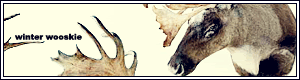
tymaporer - This might sound really weird, but when I first saw the set, I thought the picture was a cow's head!

Um. I think it might be the way that part of the pic is cut off to the left and... oh dear! Anyway. As the others have all said... it was a bit of a tough image to work with, I think. Since it's so small, it's hard to see what's going on, and doesn't quite have the effect I imagine it would if it were bigger (which is a pity). In general I think yellow-ish writing on grey looks rather cool ... though unfortunately I don't think they match the blue-grey of the picture that well. The faded edges make it quite hard to read, too, since it's quite a "thin" font. I quite like that square though! A couple more of them would be good, though, since it looks a bit lonely at the moment!
Amethyst - Hmm... I quite like the scanlines and grungy feel to this set (the writing in the sig background is cool!), but I'm not sure if I like what's happened to some of the colours of the pic - mainly the greenish-yellow on the face, I think. Generally, though, the placement of text and picture is great, as is the font.
Apricus - That's a great photo! I love the colours in it. The background is very nice, as are the scanlines, the colours, the font, and everything! Hehe. I'm afraid I don't have anything else to suggest =D
watericecage - I like av, and the way you changed the colours of the picture to blues... it makes them look a
lot better! I don't heaps like the shape of the sig though. Combined with the gradient, it looks a bit abrupt, somehow. A lighter blue colour for the border might have lessened that a bit. The font you've chosen for the main text is hard to read and slightly messy looking... I think a blocky font would have given a better "icy" effect.
Scholastic - Wow, this looks really great. The four-part av is very unique. The various faces are a little bit hard to make out, but I think you did well considering the size constraints! The shiny metal look of the sig border is very cool, and the four faces look great =)
Alex - Hmm, looks nice! For the sig, though, I feel that it would have been more balanced if there was a bit more space on the right of the lady (Claire, I guess? hehe), to counteract that on the left of the guy. Also, I think the text looks a bit cramped near the lady's head at the moment. It might've looked good centered, with a word per line.
meowth1982 - Yay, Angry Beavers!! The av is great, no suggestions except maybe moving the subtext so that it isn't covering Norbert's teeth. Sig is nicely balanced, the background contrasts nicely, and that subtext fits perfectly!
ScottNak - Hehehee, poor little kacheek. Good job with the shades of grey... monochrome can be a bit boring sometimes, but I think you have a good amount of contrast going there! Animation timing and font choice seem orright to me... but whatever is that thing in the background? A black (red, yellow) hole? =D
JellyFish27 - That's a cool image you've used... it might've been good to add a little bit more of your own touch to it, though. Maybe some colourising, or some sort of overlay. The curvy font is a good idea, but it antialiasing it to get rid of the jagged edges would make it look a lot nicer. Part of the "J" is also cut off, so the text would probably look good moved to the right a little... with an added glow behind it, to make it stand out from the light, uh, thingamyjig!
paola - Oh, gorgeous... those blues really bring out the picture a lot better than the green in the original image did! Lovely choice of fonts, and I like the smaller-than-usual size of the av and sig =)
DM - I find the pixelly effect over the picture rather overpowering, I'm afraid. That effect combined with the text in the background and the high contrast makes the image look rather choppy and not very good quality, especially in the av. The main text on the sig looks cool over the background text, though.
polarbearpop - Lovely, you did a nice job removing the background from the dog, and the purple looks really nice. The different shades of purple in the background, combined with the text, make it very pretty and interesting, besides =)
Mermaid Hil - Very nice purples... I like how you added a light grid over the background to change the "swirl" look a bit! The edge of the wing is a bit a jagged there... maybe a white glow behind her would have looked nice? It would have helped the wings (and her in general) stand out from the background a bit more.
Sakura - Ooh, very dark... lovely shades of red-pink grunginess there =) I very much like the positions and colours of the subtext (the way the second line is lighter) and the main text too. The gray stands out nicely, though it does contrast with the rest of the set quite a bit.
Alex - Wow, great animation! You did a great job matching up the orange colours, the beach photo looks really nice like that. I love the subtext on the av too... that's something you don't see too often!
timkhj - Oh, it's a pity the pictures are so blurry! Better to use a small picture than a blurry one, sometimes. The background is very cool, and the subtext is cute. As vkceankraz said though, it's better to turn anti-aliasing off with pixel fonts, they are a lot clearer that way. It might have been nice to use the same pixel font that you used in the av in your sig as well, to match =)
Neko - Very nice! I like the scanlines and the dots you've added to the left and right of the sig. The way the picture is rotate on the sig is great, too! I'm often not a fan of sideways sig pictures... but this one works really well =) Nothing else to suggest!
Okay, the part I don't like quite so much. My votes go to:
JellyFish27, watericecage, DM and remybuxaplentyfan.
Instead of warnings, I thought maybe I'd congratulate some entries that impressed me a lot. Commendations go to:
Starchaser, Scholastic and paola


