School was hard this week. Too much work to do, not enough time to rate, but here I go.
Dawn: it looks weird. The weird gradient effect in the background gives it an ethereal look, and detracts from the main image. I think its nice that you made the butterfly stick out in the sig, but it looks enclosed in the av. Although, I do like the color choices.
Sunnie: the main image looks slightly pixelated, and I think it would have looked better if you would have left it softer, rather than sharper. The av is nice and complete, but the sig looks empty, and I think an outer glow with the main image may help it stick out more. I like the “flares” on the left corner, and the background choice. I don’t like the subtext font though, even if you want alternatives to the mainstream pixel font, then a size 10 times new roman sharp font might be a better alternative.
Darklegendary: I like the “windyness” of the set, it goes very well with the subtext. I like the colors and the random swirls and text around the image. I think the opacity of the secondary image in the sig would have looked better with a lower opacity though. In the sig, the image is standing straight, while the av image is tilted. I think it would have been better if you had tilted the one on the sig. I also think that the stroke of the subtext would have been better in a slightier darker color.
bluehawaii19: like the bg, and I like the color overlay. I think the stroke looks weird because you have it alternating with some weird effect. I think an outer glow would have helped the main image stand out. I don’t like the text though, solid colors would have worked better, and you can barely see the subtext. Again if your opposed to the pixel fonts, refer to the last sentence in my review of sunnies.
Remybuxaplentyfan: with photoshop CS, I think you could do better. If this is your first time using the program, I could understand, but I would not have entered this competition if it was. It looks like something that you can adequately do with your regular ol’ paint program. It is empty, and it looks extremely basic.
Optimus: I like the border, as it really does match with the bg. Especially the halftone effect. The colors match nicely with the main image, and overall it is naturally good. I don’t think that mosaic effect does your set any good though. An overlay, soft light, or brightness/contrast effect would have been better. Also the main text to me looks a bit thick, maybe lower the opacity a bit.
Starchaser: I like how you did the border; it makes it look so much more realistic. I like the bg a lot, esp. the glowing lights and the faded text. The main text looks almost the same opacity as the faded text, and I think a stroke would make it look better, along with 10-20% more opaque. Also I think an outerglow would look nice with the main image. Overall good set though.
Medli: I like the effect you did with this set. The whiteness around the image on the right is weird though. Also the 2px-3px stroke around the subtext is awkward, 1px would have been good. I like how you faded the main text though, makes it look more dreamy, but the grid in the bg clashes with it. Try just not to make the text overlap over something like that next time.
Moogie: not one of your best sets im afraid to say. I like the soft mosaic effect used in the set, and the av looks pretty good. The sig disturbs me though. The eyes wide shut in the bg makes the eyes wide shut main text look cluttered. I think a stroke would have made the difference, and the opacity of the faded text would have to be lower. Also the stroke on the subtext (or glow) would have been more noticeable. Although I like the inversed part, large subtext, small main text.
Hellyer: im not sure what your trying to do with this set, but it looks ok at first glance. I don’t like the pastel look you gave it, as it makes everything look splotchy, but I do like the darker colors. I also do like your font choice and color with the outer glow. I don’t think the double border works with this set though, just a simple 1px would have done. Otherwise its great, even though the main picture is at different angles in the av and sig.
Kyra: very nice. I like the background, it makes it so much more chilling. The main image could have an outer glow (notice I say that a lot), the border doesn’t look right dotted and black, and the fill pattern could not have been overlayed onto the main text, but the rest of its great. I esp. liked the 3D thing you did with the text, mind showing me how to do that sometime?
Xerai: ooh. I like the collage of pictures in the sig, but I don’t see how they relate. Very simple, yet so complex. I don’t like however, the faded text all over the images. I think it would have been better to use leave off an empty section to put that in. also the text on the av looks weird. I can’t put my finger on it, but something isn’t right there.
Shadowfare: I loved this set since I first laid eyes on it. I adore the sig, because you managed to get in the earth in their because of the subtext. I also like the motion blur you used on the main words, and the slight fade you did on the subtext. The subtle, but nice, double border works well with this set. The only problem I have is the empty space behind the main image. I think it would have been better if you would have added some form of faded space or something, but that may just be my opinion of it. Great job. (Oh yeah, an outer glow would look nice with the main image too xD)
Koku: I like the idea of the set, and the bg. The bg flows with the set with flowers and a smooth transition to and from the image. I also like how you did the color overlay on it. The scanlines work nicely too, although letting them on the main image kinda blends it in with the bg, which could be what you wanted, or could not have been. Also the font choice for the main text makes the D look like a T. Just my preference, I think the av font color could have been the same as the sig one, or vice versa.
Fzun: I like how you made the image lighter than the original one. Not sure if you did this but..I liked how you enlarged the image too, to showcase the moonsize and clouds. I also liked how the text is faded into it, very nice. The only thing I don’t like is the stroke colore used on the main text, Wind. It looks like a generic blue, when a lighter blue would have been better. I also like the tiltedness of the text, it gives it that dreamy feeling. I can’t see much else than what you did with the main image, so my advice may be brief.
Tyamporer: I think there can be more done with the image. I personally don’t like the image you chose because of its minuteness. I also don’t like how you tried to fade it into the weird gray bg. It clashes horribly, I’m sorry to say. Also the gold text does not go with any of the colors you have chosen. I don’t understand why there are some parts faded, and some not. I also don’t understand why there is a box in that corner. There is no border, and that makes it look unnatural.
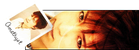
Amethyst: I like how you made the screencap so lively. I also like how you made the background blend with it, very nice. The scanlines over the image work with it, instead of against it, which is always a good thing. I like how you did your subtext, but I don’t like the font choice and what you did with it. I think a “happier” font would have made a difference, cursive works well. I also don’t like the graininess of the sig, it just looks grimy. Double border looks nice though.
Apricus: the av looks REALLY nice. The sig doesn’t, unfortunately. I think it is just too empty, a smaller width would really make a difference. I like the font and color choices you used, they really match. I also like the bg. Just the width of the sig makes the picture look tiny and far away.
Watericesage: the av looks fine, but doesn’t match with the sig. The background matches nicely in the sig, but the font choice is ALL wrong. Sorry if this hurts, but they are horrible. Get better ones, and im sure your sets will improve. The weird fade thing you did is also awkward. They just look like you changed colors instead of lowered opacities. The weird square-like cutoff thing you did is also very strange.
Scholastic: I love the concept. I like the av a lot, the text matches very well. I like the sig aswell, because you have the same concept and the same font coloring theme. The only thing I don’t like is the font coloring theme with the main text, because it looks like they were transparentized. Solid colors would work better.
…Alex: Nice av, trying to make it small so we can’t see it eh?

Very nice, esp. the brown coloring. I don’t like that pattern though, makes it look weird. The sig is good, I like the position of the text, and the colors. I think a stroke would have helped though, and again, the pattern irritates me.
Meowth: An outerglow would help the main image stick out more. The bg is funky and it amazingly works with your image (LOVED angry beavers btw). Only problem I see is the main text. It looks huge, and so opaque. Try lowering the opacity or making it smaller so that it can fit in a smaller portion of the image. Also if you do that, then the sig length would be smaller and might make it looks less empty, because it is on the brink of it.
Jellyfish: I see you used a premade template. (Correct me if im wrong) Although they are fine with some people, I do not like them. No creativity whatsoever in doing so, and the one you chose does not match your image. It just looks like you just added a template and text. Try checking off the antialias button on your program to make it look less pixelated. Also the position and color look weird. The image is also weird. To me it looks like vomit.
 Paola
Paola: Amazing. I like how you did the border and text for the avatar, along with the color scheme. Not many people can pull off turquoise. Everything is perfect, esp. the subtext banner thing in the bg of the subtext. The only beef I have with it is an outer glow on the images might make it more noticeable.
DM: the text looks pixelated (atleast the stroke does), and the stroke color blends in too much w/ the bg. The sig looks empty aswell, it might looks better if it was less wide, and you shrunk your name down a few sizes. I don’t like the weird overlay effect you used with the fading words, they don’t work out well.
Polar: I love the bg. The little subtext bar is also very nice. Although I think it would look nicer if you lowered the opacity on the subtext stroke. The main text is ok as well. The fault I see is the faded text in the bg. It detracts from the image too much, mainly because it is too opaque. Lower the opacity on those and your good to go.
Mermaid: An outer glow would be nice..
The bg is swirly and distracting, although it does work with this particular set. I like the border on the avatar, but not on the sig. It just looks too bulky. Again with the premade templates thing. (if infact, you did use one). I also think you could have done better with your animation, as it is choppy. And there is also this huge empty space between the main, and subtext. Try positioning the text at different angles, or lower the height of the image.
Sakura: I can’t really tell what the image is, but it looks nice. The sig looks excellent, but the av disturbs me. Using the big text on the av makes it look bad. Using your pixel font would have worked way better imo. Everything else is great, esp. the inner framing.
Alex: I like the fading thing, its very nice. I can’t really see what else you’ve actually done with the image, but the text and everything is great. I esp. love the double border and the faded paved paradise next to the opaque words in the av. No real faults here.
Tim: I think the picture distortion really messed up your images. :/ I like what you were trying to do, but I think that the pictures the way they are distorted, really decrease the quality of this set. Everything looks nice, esp. the happy face in the bg of the sig. Although font seems to be your main problem. The main text looks pixelated, and the subtext is blurry and bulky. It also doesn’t match the main text color. The avatar is also weird. The text and image is all blurry, I don’t like that. Also there seems to be a pixel of yellow or something running alongside the top left border. I think that should be cleaned up a bit.
Neko: I like the image you chose, aswell as the bg. It makes it look really nice. What I don’t like is the border stuff around it. They seem to be transparent when they shouldn’t be. I also like the subtext bar, as it goes along with the set. The main text is different from everything in the set, but is very nice and flows with the right side of the sig. The scanline thing also would look better if not on her face, but just behind her. I love the subtle pixel effect.
*Watches everyone come back next round with 10% opacity texts and outer glow images*
I choose Jellyfish, DM, tyamporer, remabuxaplentyfan to oust. Sorry guys.
Warnings to: bluehawaii, xerai, watericesage, and tim
Round winners: Paola, shadowfare, optimus
dont worry, round winners are just something I liked to add to congratulate the people who stood out the most in each round.