Yay, I love this round!
For all you interested in anime walling, I'd recommend
Minitokyo.net, it's full of talented wallers and a great source for high quality images for walling.
[/shamelessplug]
Apricus: It's a very pretty source image, but you haven't done much with it. All I can really see is that you rotated the image, tinted it reddish, blurred the right half, and added a gif pattern overlay. The only real suggestion I can make on this piece is that you spread out the blur a little more, the edge is very obvious and it looks awkward.
6/10
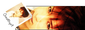
Amethyst: This is a little simple, but it's very nice. I like the way you incorporated the larger image into the background, it looks very good with the abstract waves you made. The smaller figure is a little rough, and I can tell you tried to smooth out the lines, but the best way to avoid jagged edges is to start off with a high quality image, particularly when making wallpapers, as they're so big that you can't depend on downsizing to smooth out the picture.
9/10
Darklegendary: I really like this wall, it's very classic and nostalgic, yet dirty and grungy, suits Vicious perfectly. The edges of the image are a little rough, it's especially noticable on the bird's wings and crest. The text in the left portion is distinguished enough that I'd guess it's meant to be read, but it's just so small and the font is so curly that it's very hard to read, particularly the second line ("All the ??? been? forgotten by me").
8.5/10
Koku: The first thing I noticed is that your source image looks like a crop of
this wallpaper. Would you mind telling me where you got it from? The source image of THAT wall is
this picture from an official wallpaper. [/moreshamelessplugging] I don't see much that you've done with this picture, besides boost the saturation of the pictures and add diagonal scanlines. I'm not too fond of the tilted text, it doesn't fit with anything, and it kind of gives me a headache.
6.5/10
moogie: Heh, it looks like you went out of your way to clear up the left side to make it look functional, but there's another problem here. By default, the Windows taskbar covers the bottom 30 pixels of the desktop, including the wallpaper. Most wallers take this into account (along with the fact that not a whole lot of people change the default) by putting their signature there. In this wall, the text on the bottom would be cut off by the taskbar. Generally, if such a thing happens, someone would be more inclined to change their wallpaper than their taskbar. Function issues aside, this wall doesn't look like much was done with it either. You simply stretched the canvas to 600 px tall, added lines and text to the blank space, and added pattern overlays on the picture.
6/10
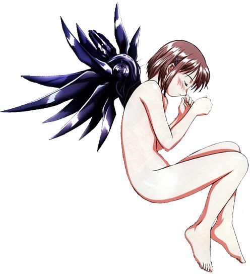
Neko: Wow, this is my favorite wall this round. The silhouette is very dramatic and pretty against the abstract background. I especially like how you made another abstract layer to echo her wings, very pretty. Excellent job.
10/10
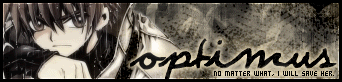
Optimus: Interesting effects, but other than those and the text, it doesn't look like you did much to the original picture after extracting it.
6.5/10
paola: I really like the background you made on this one, it reminds me of an abstract oil painting. I don't know how the quality was on the original image, but it looks resized on the wall. The text near the bottom is a little too dark for me to read on this monitor, remember that LCD monitors are very bright and often show details that won't be visible on other monitors.
9.5/10
First I have something to say. Nearly all of you made wallpapers for icons on the left, and that's not really necessary. It's very easy to drag and drop icons elsewhere, and there are plenty of beautiful wallpapers designed for icons to be on the right, top, or bottom edge.
Anyway, this round I vote out Apricus and moogie.


