Pink Poogle Toy Forum

The official community of Pink Poogle Toy
Main Site
NeoDex
It is currently Thu Feb 13, 2025 8:15 am

All times are UTC


Post new topic This topic is locked, you cannot edit posts or make further replies.  [ 137 posts ]  Go to page Previous  1 ... 5, 6, 7, 8, 9, 10  Next
Author Message
 Post subject:
PostPosted: Tue Apr 19, 2005 6:44 pm 
Honorary Member
Honorary Member
User avatar

Posts: 401
Joined: Mon May 31, 2004 6:29 am
Amethyst: I like how this set looks, the grunge and sepia tone reminds me of an old silent movie. The heavy contrast between the girl and the background looks rather awkward on the sig, especially since it's not as pronounced in the av. Lastly, the animation in the sig is a little ungraceful, adding more transition frames would make it much smoother. I'm not sure how you got such a large filesize with such a close color range and only a few frames, I wouldn't expect it to be too high. 7.5/10

Darklegendary: This set is very interesting, the colors and abstract shapes really give an icy look. I don't think the spiky shapes in the corners look quite right, they're a lot more bold, and they really suggest action, which looks like it's totally the opposite of what you're trying to portray. Additionally, the lavender shape across the bottom left side of the sig has a very rough edge, it looks out of place with all other subtle edges. 8.5/10

Koku: You started with a very fun picture, and you've preserved and enhanced the random crazy look of it very nicely. The outline of the larger bird in the sig looks a little out of place since its head is cut off, it really just looks like a weird random shape between the owl and the little bird. I really like the contrast between the girl and the colorful background, it kind of reminds me of a Picasso painting. 8/10

paola: You started with a very nice image (Yuuko! ^_^). The oblique positioning of the set is very creative and fitting of the picture. I like what you did with the border, it's also very unusual, but *.png transparency doesn't work in IE, which is still the most commonly used browser. The subtext is in an unusual place as well, but I doubt it looks very good on a dark background, it looks a little awkward even against the light gray background I'm looking at it on. 8.5/10


Image


Top
 Profile  
 
 Post subject:
PostPosted: Wed Apr 20, 2005 12:28 am 
PPT God
PPT God

Posts: 1195
Joined: Mon May 31, 2004 6:35 am
<b>Amethyst</b> -- The border is too thin, especially on the left side with the dark image. The adjustments you made to the image don't do much for it. It's too dark to tell what it's a picture of straight off. And the focus on the avatar doesn't make a lot of sense. I also think that the signature is entirely too empty. The way you set it up, you could've easily put some main text in the blank area along with the subtext. In addition, the animation is too slow, which makes it really choppy. <i>6/10</i>

<b>Koku</b> -- While the whole effect is a little on the vivid side, it does look stunning. I really like the contract and the strength that you put into the image. The girl's neckline along the collar of the shirt looks weird because it isn't bordered, but that's okay. The blurry text is also a nice touch to such an abstract image. <i>8/10</i>

<b>Darklegendary</b> -- The color scheme is nice, as is the background. I just don't like the extremely jagged edges. I do get the effect you were going for though; the character does sort of look "trapped within the ice". I think you should have stuck with either a dashed border or an opaque one, or moved them apart (with the dashed border on the inside or something) because when they're right next to each other, it looks cramped and a little chunky. <i>8/10</i>

<b>paola</b> -- Fantastic work! I think the hue of the image could be a bit more pink, but it's not a big deal. I always admired your abstract, but fitting, backgrounds. The tilt is definitely unique, but it makes the text underneath the avatar and signature slightly uneven. I'm using IE and I still see the gray box around the PNG. I don't know if that's my fault or yours though. I figure it's transparent on your monitor. <i>9/10</i>


Top
 Profile  
 
 Post subject:
PostPosted: Wed Apr 20, 2005 1:12 am 
PPT Trainee
PPT Trainee
User avatar

Posts: 657
Joined: Tue Jun 01, 2004 4:35 am
Location: Australia
Gender: Female
First off, I'd like to say congratulations to all of you. I've seen each one of you make wonderful entries for this competition, it's been very inspiring to see :)
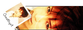
Amethyst - Nice feel to this set, the texture you've added is wonderfully grungy. The way you centered on the guitar in the sig is very effective, too. The av is a nice size, but I find the image a bit hard to make out at first. Since the area of the girl's face is so small, and it's also placed in the corner, it's not a natural focus point. Instead, the eyes are drawn to the lightest and darkest parts of the image - her shoulder and her scarf. I imagine she might've stood out a bit more if she was to the right and down a little... or maybe if you could've lightened the overlays that are over her face, so her features (eyes, nose) are more apparent. (7/10)

Koku - What an awesome picture! The way you've created your own background has really enhanced the image, and given a unique feel to this set. The rainbow colours are lovely, and certainly suit the name "siren". Two minor considerations... the girl looks perfect in the av, but in the sig, the thicker outline on her face (which I guess was left from removing the background?) means her mouth and nose have lost some definition, which was a nice element in the original picture and in the av. Also, the raven's head being chopped off is a little bit of a pity! Selecting and resizing that area a little so it would fit might've been good. (8/10)

Darklegendary - Cool effects, you've really taken this image and used it for your own theme/ideas... which is a very good talent! The jagged and diagonal lines (along with the "wind" effect?) certainly make it look very icy. I like the av too, the darkness of his hair is quite striking. I'm not sure if I like the dashed border to the set, however (even though I'm usually a fan of it). It seems somewhat at odds with the rest of the set, which has clean, solid lines. (7/10)

paola - Ooh, I love the diagonal positioning! The angled subtext is a very creative idea, too. The background is beautifully textured, I really like the way your style has evolved in that respect. I find the blackness of the girl's hair a bit stark and "sharp" against the soft background, especially in the sig (her hair is a bit less defined in the av), but it does provide a good contrast. (Also, personally, I find her eyes a bit scary looking! But that's besides the point ^_~) (8.5/10)


Top
 Profile  
 
 Post subject:
PostPosted: Wed Apr 20, 2005 1:27 am 
PPT God
PPT God
User avatar

Posts: 1271
Joined: Tue Jun 22, 2004 2:43 pm
Gender: Female
Amethyst
Oh yay! A different looking image from your usual. I love the grungy and old feel this has to it. Has a sort of sad look to it. The biggest problem with it is that the sig is rather plain. I realize this is because of the animated text, but because there is usually only one line appearing at a time. So yeah, something needs to fill the background. Also, the av is a little...odd looking at first glance. I didn't realize it was her head and shoulder at first. 7.5/10

Koku
More bright colors. Okay. The text is sort of blurry. I think it's supposed to me, but that just makes it look like you did a bad job. Also, the image choice is very unique. However, I couldn't tell that that was her foot in the sig because it's sort of odd looking... The small bird on the girls foot is also sort of weird looking. 8/10

Darklegendary
I like the alternating border around it, but I don't like how it's uneven. On the av, I think the text should probably be dark purple, to make it stand out and tie in the dark purple main text in the sig. I'm not all that fond of where you cut off his head in the av....But nothing major. 9.5/10

paola
Okay, there's a big grey blob around this on my monitor...but anyway. I like the unique angle it's on. Main problem with this is the text. It's hard to read, even when I put this on a light grey background. It's supposed to follow the diagonal, I realize, but it's really too hard to read. Also, the top of the sig looks a tad empty. 8.5/10


Image
Gone.


Top
 Profile  
 
 Post subject:
PostPosted: Wed Apr 20, 2005 1:34 am 
PPT God
PPT God
User avatar

Posts: 1271
Joined: Tue Jun 22, 2004 2:43 pm
Gender: Female
=======================================
1st: Paola - 8.0 / 8.5 / 8.5 / 9.0 / 8.5 = 42.5
2nd: Darklegendary 7.5 / 8.5 / 7.0 / 8.0 / 9.5 = 40.5
3rd: Koku- 5.5 / 8.0 / 8.0 / 8.0 / 8.0 = 37.5
4th: Amethyst- 6.0 / 7.5 / 7.0 / 6.0 / 7.5 = 34.0

(Silja / Marissa / Mazil / Vkceankraz / Flame)
=======================================


Funky little chart courtesy of ScottNak. And so we have our winner.

CONGRATS TO PAOLA!!!!!!

:)


Image
Gone.


Top
 Profile  
 
 Post subject:
PostPosted: Wed Apr 20, 2005 1:46 am 
PPT Student
PPT Student
User avatar

Posts: 366
Joined: Mon May 31, 2004 8:35 pm
Location: Lalaland
YAY! Congrats to paola for earning the rank of PPTTG! And good job to everyone who participated! *throws confetti* Fuuuuffuuu...XD


Image
"The path I've chosen had no effort, unless I took that chance, at the decision I've made, for all I've done and suffered." - Mi-Ku, © Mi-ku All Rights Reserved.


Top
 Profile  
 
 Post subject:
PostPosted: Wed Apr 20, 2005 2:23 am 
PPT Warrior
PPT Warrior
User avatar

Posts: 900
Joined: Tue Jun 01, 2004 5:03 am
Location: on a chair
Congrats Paola! :D

W00t! I'm in second place! xD


Top
 Profile  
 
 Post subject:
PostPosted: Wed Apr 20, 2005 2:29 am 
Honorary Member
Honorary Member

Posts: 3197
Joined: Mon May 31, 2004 6:09 am
Location: SoCal
Congratulations Paoooola!
Clearly had a great product at the end (4/5 top marks by judges) as well as having a great run in the game! *parrrteh*

Great work to Dark Koku and Amethyst. Tis a great feat to live til the end... I mean survive. =P

*wooha*


Top
 Profile  
 
 Post subject:
PostPosted: Wed Apr 20, 2005 2:34 am 
Beyond Godly
Beyond Godly
User avatar

Posts: 2713
Joined: Wed Jun 02, 2004 2:48 am
Location: Probably; a bunny.
*claps wildly*

On behalf of The Pink Ink, I'd like to give Paola a big "CONGRATULATIONS!" which echos wildly.

Big, gooey, slimey congrats to Koku(*sparkles*), Dark, and Amethyst as well!

We appreciate everyones effort! Good job to all. It turned out to being a great season of PPTTG!

*cough* http://www.pinkpt.com/


Image
generally unimpressed. Koku.


Top
 Profile  
 
 Post subject:
PostPosted: Wed Apr 20, 2005 3:15 am 
PPT God
PPT God
User avatar

Posts: 1417
Joined: Tue Jun 01, 2004 12:03 am
Location: In a place called vertigo! :D
Congrats to Paola, and to everyone else also! :D You all did great jobs, and I really enjoyed following the contest. :D

Congrats again!


Image
Click here, click here! Don't be a c-c-c-combo breaker! :D
THANK YOU ZILARY. <3


Top
 Profile  
 
 Post subject:
PostPosted: Wed Apr 20, 2005 5:42 am 
PPT Trainee
PPT Trainee
User avatar

Posts: 657
Joined: Tue Jun 01, 2004 4:35 am
Location: Australia
Gender: Female
*grins* Congrats paola, and very well done to Amethyst, Koku and Darklegendary... it's certainly not a mean feat to get into the top 4 of all graphicians on this forum :)

Big thanks also to Flame for organising this supa-doopa event!! Image


Top
 Profile  
 
 Post subject:
PostPosted: Wed Apr 20, 2005 6:29 am 
PPT God
PPT God
User avatar

Posts: 1503
Joined: Thu Jul 29, 2004 2:06 am
Location: Finland
Congratulations paola :)


Image
Set by everconfused


Top
 Profile  
 
 Post subject:
PostPosted: Wed Apr 20, 2005 10:17 am 
PPT Warrior
PPT Warrior
User avatar

Posts: 838
Joined: Mon May 31, 2004 6:40 am
Location: Cybertron, Australia
Congratulations Paola

And congratulations to Koku, Darklegendary and Amethyst for making it to the final round!


Image


Top
 Profile  
 
 Post subject:
PostPosted: Wed Apr 20, 2005 11:44 am 
PPT God
PPT God
User avatar

Posts: 1046
Joined: Mon May 31, 2004 3:35 pm
Location: Nantes
Gender: Female
Yay Lorena! :D *gives you a big lolly* You did a spectacular job this game. I had a feeling you would win. ;)

And of course, congratulations to Darklegendary, Koku and Amethyst for making it so far. All of you, keep up the good graphics!


Image


Top
 Profile  
 
 Post subject:
PostPosted: Wed Apr 20, 2005 1:07 pm 
Beyond Godly
Beyond Godly
User avatar

Posts: 4673
Joined: Mon May 31, 2004 5:14 pm
Location: Inside a box
Congrats to Paola! -cheers-

Major props to everyone else who participated^^ It's been an honor competing against you, and keep up the good work!


Image


Top
 Profile  
 
Display posts from previous:  Sort by  
Post new topic This topic is locked, you cannot edit posts or make further replies.  [ 137 posts ]  Go to page Previous  1 ... 5, 6, 7, 8, 9, 10  Next

All times are UTC


Who is online

Users browsing this forum: No registered users and 35 guests


You cannot post new topics in this forum
You cannot reply to topics in this forum
You cannot edit your posts in this forum
You cannot delete your posts in this forum
You cannot post attachments in this forum

Search for:
Jump to:  
Powered by phpBB® Forum Software © phpBB Group