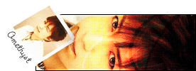
paola :: I like the colors you used so far. For the font, you can try using a grungy-ish font or a font that's easy to read. Super curly fonts are a no-no. x] Are you going to add a border? The color burn edges is a neat idea. *looks at the original picture* Wow, you made things look a lot clearer. The white thing located in the top left corner bother me for some reason. x_x It looks like a blank spot in the siggie. But it can't be helped, since it's part of the original picture.
fzun :: The glow's color on the siggie seems kinda off. But I really like the colors you used for this set. They seem so relaxing... :] I like the shining effect also. And as mentioned by Amethyst, the text on the avatar isn't very noticable. I think you should broaden the border for the av's text and lower the opacity of the text on the siggie. Oh and I really like the gradient border on your set. ^_^
Can someone please rate my current set? I haven't changed my set since Valentine's Day so that means I haven't made any graphics since then. XD Criticize all you want!!
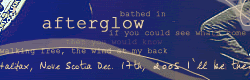
magikwishez ~> I really love your set. The blue colors are nice and soft and light. And then it's not boring or one solid color. I like how there's bits of darker blue shade on your set, too.
I like how the main text/title is "sitting" on your subtext and kind of interwoven there a bit..... n_n;;
Paola Wow. Nothing to complain about this one. Except it seams... cramped. But that's just the size of the image. I wouldn't add anything else to the sig. It looks great the way it is. Colours, texture, great blending. 9.7/10
magikwishez Wow. I really like the texture that you've created in the background. Kinda plain and simple. But I like it. 9.2/10
-----
My turn to get yelled at. It's only second go on PS7. So I know it stinks.
Noelle: I like it! My only complaint is that the image looks a little overexposed....Maybe you could tone that down a bit? Also, the text is a little hard to read against the background. It's very good for only your second try, though^^
magikwishez: I love the blue color scheme a lot. I also like how the main text is sitting on the subtext. Also a great choice of brushes. My only complaint is the subtext is a little hard to read for me, but that's probably me.
Noelle: Wow, pink. That's awesome for your second try, but the main text is a little hard to read since it's all pink.
Amethyst: Nice and simple; I like it. Although, the space where the northern lights are seems to be a little empty, but I guess that's supposed to be like that.
Ratings for this set? This was my first set in Photoshop CS. I used a tutorial too. xD
Last edited by Dragonfire on Wed Jun 29, 2005 10:17 pm, edited 1 time in total.
Dragonfire ~> I like the color scheme and the modern/sci fi or something feel of it. n_n
I don't like how the 'Digital Guardian' text is right under the border if you know what I mean. Because the left side has a space between the border and the text and the top of the text doesn't. Just not even-looking to me. :3
However, I like the Dragonfire text. Modern looking font and it fits nicely.
I like the brightness in the middle of the banner, but I would like it more if it was balanced on the sides with the same kind of brightness in some way. Not brightness all over though.
Sweet Pea wrote:Dragonfire ~> I like the color scheme and the modern/sci fi or something feel of it. n_n
I don't like how the 'Digital Guardian' text is right under the border if you know what I mean. Because the left side has a space between the border and the text and the top of the text doesn't. Just not even-looking to me. :3
However, I like the Dragonfire text. Modern looking font and it fits nicely.
I like the brightness in the middle of the banner, but I would like it more if it was balanced on the sides with the same kind of brightness in some way. Not brightness all over though.
I like the blending effect...flowing it seems.
7/10.
I didn't notice that the subtext was uneven until I posted it on here, as in PS it looked even. It also only took me like 15 minutes for the sig since I was just testing PS out. I'm probably going to remake it though and use more colors from the middle image.
EDIT: I redid, and made alot of changes, and I reuploaded it. I think it looks alot better now
Dragonfire wrote:I didn't notice that the subtext was uneven until I posted it on here, as in PS it looked even. It also only took me like 15 minutes for the sig since I was just testing PS out. I'm probably going to remake it though and use more colors from the middle image.
EDIT: I redid, and made alot of changes, and I reuploaded it. I think it looks alot better now
Great! It looks much better now. n_n
I like how the small text is under the title.
I noticed the improvement in your set while I was browsing the forum, too. ^^
Dragonfire - Pretty image. The way the subtext is under the main text is awesome, the only thing I could think of is...uh...nothing. XD
Anyone care to rate my current set? I'm planning on redoing it, so any screamings, I mean ratings (*pokes Noelle*), are welcomed. (I will be changing to subtext to Hanging by a Moment by Lifehouse.)
Dm: It's a little plain, the coloring on Chii seems a little, bad. the colorizing made the image look bad quality, and the background is plain. All your sets look the same, and the positioning is always the same, try to randomize it a bit 7/10
Moofy: Very original. I like the way the colors stand out from the white. Maybe you could move the text up a little more, though....Where it is now, it's a little hard to read.
Ammy: Very awesome! I like the way "Amethyst" on the avatar and "Heaven is Lost" on the signature look exactly the same amount of pixels away from the edge - it makes it look symmetrical. The lack of main text on the signature adds to the effect. 9/10.
Amethyst ~> I like the technique you used in your set...the motion/blur-NESS. n_n;; I like how the simple, small bright points of your set is the main features.
You don't have a big title so that helps highlight the background.
7/10 ... Personally, I would have like things more...I dunno...more textured and stuff...more UMPH. :3 But your set is a nice change to see. ^^
. . .
Anubis ~> Aww, the bird's kute. n_n I like the colors. But I would have like something done more with the title and text. The title seems cramped in the banner and the subtext does too, a bit. A little plain for my taste, but kute still. ^^


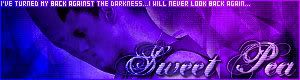

 9.7/10