Pink Poogle Toy Forum

The official community of Pink Poogle Toy
Main Site
NeoDex
It is currently Wed Feb 12, 2025 9:53 am

All times are UTC


Post new topic This topic is locked, you cannot edit posts or make further replies.  [ 200 posts ]  Go to page Previous  1, 2, 3, 4, 5, 6 ... 14  Next
Author Message
 Post subject:
PostPosted: Tue Nov 16, 2004 2:33 am 
PPT God
PPT God
User avatar

Posts: 1271
Joined: Tue Jun 22, 2004 2:43 pm
Gender: Female
I'm too lazy to see if everyone entered who was supposed to. If you're late, tough luck.

Oh, and judges are to choose 3 people to be ousted. This is going to be a really hard one to judge...

laq
Image
Original Image
Program Used: GIMP 2.0

Neopets Addict
Image
Original Image
Program Used: Photoshop CS

Darklegendary
Image
Original Image
Program Used: Photoshop 6

Zero
Image
Original Image
Program Used: Photoshop 7

Knives
Image
Original Image 1
Original Image 2
Original Image 3
Program Used: Photoshop 7

Sapphire Faerie
Image
Original Image

Marissa
Image
Original Image
Image for making the moon

mazil
Image
Original Image

Charka
Image
Original Image

Neko
Image
Original Image
Original Image
Program Used: Photoshop CS

r4che1
Image
Original Image
Program Used: PSP 9

DM was on fire!
Image
Original Image 1
Original Image 2
Programs Used: PSP 8 and Paint

Apricus (who now has an official mention in the rules. =P )
Image
Original Image
Program Used: PSP 8

meowth1982
Image
Original Image
Program Used: PSP 9


Image
Gone.


Top
 Profile  
 
 Post subject:
PostPosted: Tue Nov 16, 2004 3:03 am 
Honorary Member
Honorary Member
User avatar

Posts: 886
Joined: Mon May 31, 2004 7:03 am
Location: Los Angeles, CA
Aack - I totally forgot about this.

I'll try to get mine in today or tomorrow, if that's not too late, but I don't think I'll be able to. I have way too much work.


Image


Top
 Profile  
 
 Post subject:
PostPosted: Tue Nov 16, 2004 9:23 pm 
PPT God
PPT God
User avatar

Posts: 1271
Joined: Tue Jun 22, 2004 2:43 pm
Gender: Female
Starchaser wrote:
Aack - I totally forgot about this.

I'll try to get mine in today or tomorrow, if that's not too late, but I don't think I'll be able to. I have way too much work.


Sorry, but it's too late.


Image
Gone.


Top
 Profile  
 
 Post subject:
PostPosted: Wed Nov 17, 2004 5:07 am 
PPT God
PPT God

Posts: 1195
Joined: Mon May 31, 2004 6:35 am
<b>Laq</b> -- Ohhh! Dreamy. I think the orange of her hair throws things off though, because your main colors are pink, purple, and blue... all very pastely until you hit that bright orange. You should have muted it a bit more. What color would you use for the font, without making it look overdone though? Overall, it's still very nice.

<b>Neopets Addict</b> -- You've improved a lot. Good job. I like this one a lot, because of the simplicity. I think you should have make the yellowish parts more vibrant though, because the overall effect is very toned-down, ho-hum. Oh, and nice job with the placement of everything. It's all balanced. Good.

<b>Darklegendary</b> -- The border of the blog area is too thick, making it stand out too much. It's also very close to the edge of the whole image. I think the cyan is a bit much; my eyes go straight to those bright blue spots. The white overlay doesn't fit. Perhaps you should have tried a shade of blue or purple, to offset the bright cyan.

<b>Zero</b> -- Hehehe! So cute! Love the picture and the abstract background, but the blog area, again, is too close to the edge. You need a sufficient amount of space between the blog area and the edge of the border. Also, perhaps the main text should be blue, so that it's not uniform with the background. The extra Zero layer in the background is slightly redundant. If you do that, rotate the image in some manner so that it doesn't look repetitive.

<b>Knives</b> -- So pretty! The statues in the back are a good touch. I just think you could have moved them around a bit so that the blog area could be bigger. The top looks especially empty. Other than that, it's lovely. Good job, Knives.

<b>Sapphire Faerie</b> -- Oh... vivid! It's very you. I could pick it out and be able to tell that you made it. Your style is very distinct. Two things though: first, the main text blends in with the background. It's hard to read and should stand out more. Second, the blog area will be hard to have text on. Only black text would match, and even then, it'd be hard to read.

<b>Marissa</b> -- For some strange reason, despite the blood dripping from her fingers, it's very sexy. I love that you changed the color of the background. It makes her stand out a lot more. The only thing that I dislike is how high the blog area goes; perhaps you should have faded it out at the top of her upper arm so that the eye isn't drawn straight to the upper left corner of the blog area.

<b>Mazil</b> -- I'm afraid to admit that I don't get it. But I suppose I'd have to know the joke it's alluding to. Sigh. The joys of being uncultured in today's youth. Anyway, it's good. Simple, and very well done. I could have sworn you used something else for the floor tiles, and I was very impressed with it. It's awesome. I like it a lot, especially the random lines that center in on the character. Fantastic job.

<b>Charka</b> -- It's kind of bland. With all the empty background space, you should have made the box bigger by stretching it upward and rightward. Also, what color are you going to make the text? I'd advise on a darker background and then a light blog area so future text will work. The simple outline was a good idea; it matches the drawing lines.


<b>Neko</b> -- It's so pretty! I love the color scheme. I think the stars should have been blurred or the opacity of that layer lowered. They look really pixelly and slightly out of place. As with Charka, what color are you going to use for the text that'll go in the blog area? I suggest a lighter overlay color. Nothing else; it's lovely.

<b>Rachel</b> -- Good work! I like how the blog area is behind the main image. However, the border around the box area is too thick. Keep it at 1 or 2 pixels so that it's not distracting. The quality is a bit shoddy, but I can tell it looked nice before you saved it. Try upping the quality to 60 or 80 next time.

<b>DM was on fire!</b> -- Er... not bad, but not great. I don't like the pixellate effect that you used. There is plenty of space for a bigger blog area; I'm a fan of large writing spaces. Also, how are you going to write anything in the blog with such a dark image behind it? If anything, you should have flipped the smaller image and placed it on the right, so that both images aren't on the left, making the blog unbalanced.

<b>Apricus</b> -- Ohhh!! Good tinting job. Only two things: the blog area looks out of place. It doesn't match with the rest of the image. Maybe you should have used a light blue or something. Second, "up at" is hard to read.

<b>Meowth</b> -- Good work with extracting the image. The background is too bright and too blue. You can hardly tell where the image ends. Lower the opacity next time. Where does the orange come from? Perhaps you should have stuck with all red or something, because the yellow/orange looks out of place. I think you could have also stretched the blog area a bit more left and right.

<i>Three</i> people, Flame? Grrrr. *glares at Flame*
Ummm... hm. This time around, I vote out Darklegendary, Charka, and DM was on fire!.


Last edited by vkceankraz on Sat Nov 20, 2004 12:48 am, edited 2 times in total.

Top
 Profile  
 
 Post subject:
PostPosted: Fri Nov 19, 2004 1:46 am 
Way Beyond Godly
Way Beyond Godly

Posts: 8715
Joined: Sat Jun 05, 2004 9:10 pm
Location: Cleveland, Georgia
Gender: Female
vkceanraz wrote:
Mazil --I'm afraid to admit that I don't get it. But I suppose I'd have to know the joke it's alluding to. Sigh. The joys of being uncultured in today's youth.


It's a Homestarrunner thing.


Image


Top
 Profile  
 
 Post subject:
PostPosted: Fri Nov 19, 2004 2:33 am 
PPT God
PPT God
User avatar

Posts: 1271
Joined: Tue Jun 22, 2004 2:43 pm
Gender: Female
As Flame's computer monitor is extremely...weird...she can't see a lot of these blogs in very good quality. Neopets Addicts is very blurry, while Sapphire Faerie's is perfectly clear. ^^;; Flame thinks her computer has something against every color except red...

Anyway, sometime in the next 3 days Flame should be able to get her ratings up, provided she can successfully steal her cousin's laptop. If not, you'll just have to do without Flamey's ratings this time.


Image
Gone.


Top
 Profile  
 
 Post subject:
PostPosted: Fri Nov 19, 2004 4:40 am 
Honorary Member
Honorary Member
User avatar

Posts: 2456
Joined: Mon May 31, 2004 5:54 am
Location: THE HEART OF DARKNESS. *ominous drums* Haha, just kidding, I'm stalking you. :D
Gender: Female
I finished my ratings and was about to post them, when *poof*, the browser 'unexpectedly quit'. Grr. *Goes to type up ratings again, this time in a saved Word document*

I'll have at least a few of the ratings up by tomorrow morning. (7-9 hours)

Edit:

laq: The orange is a bit bright, and it clashes with the blue. Your use of glow is well-done.

Neopets Addict: The text box border's colour is so similar to the background colour that it's hard to see. The blog itself is elegantly simplistic, which is nice, as most things, when made to be simple, look plain.

Darklegendary: The blog is grainy in some parts. The text box border is a bit too thick. The use of the Mosaic filter was a nice touch. =)

Zero: The text box's colour is a bit too pale- it's rather pinkish, which doesn't match the reds in the blog. The dot pattern in the background of the blog is a bit too opaque in some parts- lower the opacity a bit. I love that you used the Blackjack font for the text, though. It matches perfectly. (I have the hardest time finding fonts that match things I make)

Knives: Overall, wonderful job. The top of the blog is really empty, though, so would probably be better if cropped a bit.

Sapphire Faerie: The picture of Amy Lee is slightly pixelish in parts. The text box's background is one that most text wouldn't look good on- maybe if it was simply a lighter colour, instead of light-coloured lines covering it? =)

Marissa: VERY nice work on this. However, the text box is a bit too tall, in my opinion: it would have looked better if shorter. The fade at the top of it [the text box] is wonderful, though. =D

Mazil: =O hasdkljaghfdsjkTHE CHEAT SQUEE. =D The Cheat love aside, excellent blog. The 'a' in 'say' blends slightly with the yellow light/line, though, and so the 'Can you say...' text should probably be moved a little lower.

Charka: 'Tis a bit empty- perhaps a background pattern or some brushes would help? The font used for the text doesn't really match the picture, by the way. Nice fading for the background, though. ^_^

Neko The text is REALLY pixelly in between the outline and the text itself. You used a bit too many white-pixel-stars in some places- it doesn't blend well with the far right side of the blog. Even so, excellent fading work, and the pink, low opacity text box is well done. =D

r4che1: In some places, the picture used is a bit pixelly, as is the text. The two outlines of the text is a nice touch, however, as is the text box's going behind the picture.

DM was on fire!: I'm not really fond of things that are only one colour, and this isn't an exception. A bit of colour could really spice it up, however much I hate that phrase. =P Also, the text box could be better if the picture in it was simply part of the blog, blended with the other picture, and the text box be right next to, or slightly going underneath of her it [the picture in the text box]. The patterns used for the blog/background match well, and makes it look nicely done. Also, the colourising job was excellent, and I like the text for 'Pure Magic' being like a warped shadow of the other text. =D

Apricus: Rissa-in-a-boxy-bean's work is not sucky! *Thwacks her for saying her graphics are bad* Now, for your rating. ;P My only two crits are: one, the blog is a bit empty on the right side (without the text in the text box, that is. It'll probably look fine with it in. =)), and two, the text box overlapping the lower ornament looks rather awkward- perhaps the box could be a bit shorter (by cutting off part of it's bottom, not the top, I mean.)? Overall, very, very nice work. It's beautiful. =D

Meowth1982: The background is really distracting. Other than that, though, great job. Clean picture extraction, fonts that match the graphic... =)

Okay. As for who to kick off... Hard choice, so I'm not picking. =)

Fine. Charka, Darklegendary and Sapphire Faerie. >_< *Hides from them*


can't find the sig from this set, so instead, you get a <3 .


Last edited by Xandra on Fri Nov 19, 2004 7:21 am, edited 1 time in total.

Top
 Profile  
 
 Post subject:
PostPosted: Sat Nov 20, 2004 3:42 am 
PPT God
PPT God
User avatar

Posts: 1143
Joined: Wed Jun 02, 2004 8:14 am
Location: In a cage...
Yes I noticed the top was extremely empty, and therefore i attempted to add "realistic" clouds. :P Shank you for the ratings ^^.


Image


Top
 Profile  
 
 Post subject:
PostPosted: Sat Nov 20, 2004 3:50 am 
PPT God
PPT God
User avatar

Posts: 1851
Joined: Tue Sep 21, 2004 5:58 pm
Location: In Ohio. Catch me if you can :P
vkceankraz wrote:
<b>Meowth</b> -- Good work with extracting the image. The background is too bright and too blue. You can hardly tell where the image ends. Lower the opacity next time. Where does the orange come from? Perhaps you should have stuck with all red or something, because the yellow/orange looks out of place. I think you could have also stretched the blog area a bit more left and right.


Believe it or not in the flash animation that this was pulled from, the actual words "A website" is in Orange and Yellow. I chose that to look close to the original flash animation, although a person that hasn't seen it would not know that. :) I guess I chose the hawaiian type background since he's dressed in a sailor's uniform. But looking at it again, I do agree that I could have made it a bit darker. :)


Image

<STOWA|Sleep> my sister questioned the title. "Half Blooded Prince? Does that mean he's a Moogle"


Top
 Profile  
 
 Post subject:
PostPosted: Sat Nov 20, 2004 3:57 am 
Honorary Member
Honorary Member

Posts: 3197
Joined: Mon May 31, 2004 6:09 am
Location: SoCal
Heh. Silly Kim. Not knowing the goodness that is Homestarrunner.
*looks around* Great job guys :P


Top
 Profile  
 
 Post subject:
PostPosted: Sat Nov 20, 2004 4:11 am 
PPT Warrior
PPT Warrior
User avatar

Posts: 900
Joined: Tue Jun 01, 2004 5:03 am
Location: on a chair
Well, guess I'm out, I knew I should have tried more even with those tests coming, oh well. Thank you for your ratings judges, I can't say they helped me improve alot this round but they did get me to see what was wrong with the blog I made.

See you all in PPTTG 5 (if theres ever going to be one)


-used to be darklegend-
currently: lurking ^-^


Top
 Profile  
 
 Post subject:
PostPosted: Sat Nov 20, 2004 5:03 am 
PPT God
PPT God
User avatar

Posts: 1271
Joined: Tue Jun 22, 2004 2:43 pm
Gender: Female
ScottNak wrote:
Heh. Silly Kim. Not knowing the goodness that is Homestarrunner.
*looks around* Great job guys :P


I suggest you twirl off this thread and go bother Koku with that pitchfork.

Anyways, my monitor has fixed itself temporarily. So here's a few ratings.
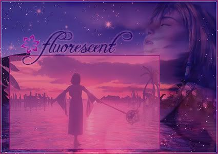
laq
Very nice. My major problem is with the orange coloring. You either need to get rid of it or add more touches of it elsewhere.

Neopets Addict
You've always impressed me with the simplicity of your blogs. This one is unfortunately the blurriest for me, however I can see enough to tell that it is very good.

Darklegendary
I don't think you've ever done too well with blogs...Hm. I think you're trying to style your blogs the same way you've done your sets. Large black border, complicated base image, etc. However, I'll tell you why that dark black double border does not work. This set is far too bright and contrasts with the bright blue too much. If you colorized this to a darker color the black would work. Also, it doesn't look like you've really done much to the image. The text doesn't stand out enough either...

Zero
It's bright, it all matches, it has Zero. Nice job having a faded image of him in the bg. The only thing that bothers me a lot is the white border around the text.

Knives
It's a little empty, but has a very serene look to it. There's some faded details in it I can't see, however what I can see looks very nice. It all goes together very well, especially the text and textbox.

Sapphire Faerie
Nice job colorizing the image and cuting it out. I love the vibrance of this blog. I'd maybe give this a double border, as the one you have it a little hard to see. I'd also make the text box more opaque, or actually change it to a more black hue so you could use white text.

Marissa
It has a very sexy look to it. I love the top of the faded textbox, and the colorization you've done.

mazil
I can honestly say I've never seen/heard of that before. -_-;; I'm pathetic. Anyways, it's very bright and simple. The font you've used is gived it the perfect sort of cartoonish feel. The random lines are also a very creative touch.

Charka
Too plain. There needs to be more design in the background, and I'm really not all the fond of the font and color used for the text.

Neko Gorgeous. You do some of the best work with FF images that I've ever seen. My main problem is that the white pixels sorta make it looks scratchy, and I dunno how well text would work in the text box.

rachel I think you said this was your first one, right? Impressive. I love how you've place the imahe of Yuna over the text box and then also faded a image of her in the text box. I'm not overly fond of your font choice though, and I'd get rid of the double border.

DM I like this one. Hm...It's a little boring though because it's greyscale. Maybe add more details into the background? Also, because of the image of DMG in the text box, there actually isn't all that much room for text. =P

Apricus
Oh yes my dear, this is the most hideous blog I've ever seen. *snorts* You've done an amazing job making the ornaments shine. My main problem with this is the text box overlapping the one ornament, and the color of the text box. I'd maybe have used a more reddish or blueish hue.

meowth1982
It's nice, but it's waaaaay overdone. Get rid of the yellow in the text 'a website.' Also tone down the background. You can use the same one, just fade it out a bit so it isn't so overpowering.

Hmmm.... Charka, Darklegendary, meowth1982.


Image
Gone.


Last edited by Flame on Sat Nov 20, 2004 7:04 pm, edited 2 times in total.

Top
 Profile  
 
 Post subject:
PostPosted: Sat Nov 20, 2004 6:03 am 
PPT God
PPT God
User avatar

Posts: 1851
Joined: Tue Sep 21, 2004 5:58 pm
Location: In Ohio. Catch me if you can :P
Flame...www.homestarrunner.com Greatest site ever :D when you get into the menu screen click "First Time Here" and it'll introduce you to the site :)


Image

<STOWA|Sleep> my sister questioned the title. "Half Blooded Prince? Does that mean he's a Moogle"


Top
 Profile  
 
 Post subject:
PostPosted: Sat Nov 20, 2004 8:10 am 
PPT God
PPT God

Posts: 1195
Joined: Mon May 31, 2004 6:35 am
meowth1982 wrote:
vkceankraz wrote:
<b>Meowth</b> -- Good work with extracting the image. The background is too bright and too blue. You can hardly tell where the image ends. Lower the opacity next time. Where does the orange come from? Perhaps you should have stuck with all red or something, because the yellow/orange looks out of place. I think you could have also stretched the blog area a bit more left and right.

Believe it or not in the flash animation that this was pulled from, the actual words "A website" is in Orange and Yellow. I chose that to look close to the original flash animation, although a person that hasn't seen it would not know that. :) I guess I chose the hawaiian type background since he's dressed in a sailor's uniform. But looking at it again, I do agree that I could have made it a bit darker. :)

By lowering the opacity, I meant making it lighter, so that he stands out more. Because the guy sort of blends in with the background. If it were a lot darker, so that the character still stood out, that would be fine too.
And Scott, I knew it was Homestarrunner, but I'm a Weebl & Bob fan myself. Homestarrunner isn't as funny.


Top
 Profile  
 
 Post subject:
PostPosted: Sat Nov 20, 2004 1:24 pm 
PPT Student
PPT Student
User avatar

Posts: 375
Joined: Mon May 31, 2004 4:19 am
Location: The Soul Society
;_; *doesn't want to be poked with a pitchfork*

laq-The image is pretty bright, which can get a bit annoying. I like the use of blurring and text.

Neopets Addict-I like the use of blue and yellow, and the placement of the stars and stoke on the image. Maybe use a dark blue instead of a black for text.

Darklegendary-I love the mosaic effect on the dragons. The use of blue is good, but I suggest making the outline a dark blue rather than black.

Zero-Looks nice, but I agree with vkceankraz that you should add a bit more color in the background and text other than red.

Knives-The blogs looks very peaceful, and I love the faded images. Only problem is the graininess. Maybe try saving it as a jpg next time?

Sapphire Faerie-Looks nice as usual, but not such a good job on cutting out the image. I see some of the background still.

Marissa-Oooh, I love the moon and how you changed the color of her eyes and the background. It looks just like the original picture. It's just a bit pixellish under her red hair.

Mazil-I love the background. It's nice and bright. I can't really see any problems with it.

Charka-Like the others said, it's bland and empty. I don't really see what you've done other than just add a faded copy in the background. The main font doesn't match the image, being a muddy orange, and being energetic compared to the simplicity of the rest of the blog.

Neko-Very pretty, I love the images, text, and flower. The white pixels distract from the image.

r4che1-Very nice for your first blog. I like the positioning of the picture, but you see come of the old background still on the edges of it, so I suggest spending more time cleaning up the image.

DM was on fire!-I like the blur and the images. What are those bars slightly covering her face in the blog for?

Apricus-I like the ornaments and the text. But maybe don't use white for the blog, because it stands out too much.

meowth1982-The background stands out quite a bit, and the text just pops out at you. I suggest trying to blend everything together, though, and maybe make the background a bit lighter.

I vote out Charka, Darklegendary, and meowth1982.

<_<


Image
Time stops for no one.


Top
 Profile  
 
Display posts from previous:  Sort by  
Post new topic This topic is locked, you cannot edit posts or make further replies.  [ 200 posts ]  Go to page Previous  1, 2, 3, 4, 5, 6 ... 14  Next

All times are UTC


Who is online

Users browsing this forum: No registered users and 8 guests


You cannot post new topics in this forum
You cannot reply to topics in this forum
You cannot edit your posts in this forum
You cannot delete your posts in this forum
You cannot post attachments in this forum

Search for:
Jump to:  
Powered by phpBB® Forum Software © phpBB Group