Pink Poogle Toy Forum

The official community of Pink Poogle Toy
Main Site
NeoDex
It is currently Sat Feb 08, 2025 3:39 pm

All times are UTC


Post new topic This topic is locked, you cannot edit posts or make further replies.  [ 140 posts ]  Go to page Previous  1, 2, 3, 4, 5, 6, 7 ... 10  Next
Author Message
 Post subject:
PostPosted: Thu Feb 10, 2005 3:08 pm 
PPT God
PPT God
User avatar

Posts: 1503
Joined: Thu Jul 29, 2004 2:06 am
Location: Finland
Yet another judging, with some small pointers before I start.

As you all know, this round the contestants had to make blogs. And accordingly, I believe a good graphician thinks of what he or she is making when he or she makes it. Therefore, I will also make small pointers of the function of the blogs; sets are used as sets and they should be usable for that cause, blogs are used as blogs and they should be suited for that use. Still with me? Good.

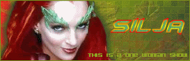
bluehawaii19: Amazing blending I must say *applause*. The colors are dreamy and soft, can't complain on anything there either. Not to the minus part. First of all, you need to work on your borders. This particular one jumps right at me, destroying a lot of the feeling in the blog. It is way too strong and thick, and doesn't match the rest of the serenity one bit (kind of like placing a white fluffy rabbit inside a solid concrete box.. okay okay, I think you get it.). Definitely an improvement regarding the fonts, though you should have placed the "Welcome" above the box.

Darklegendary: Groovy purple, though using only colors like that fail to give the blog features that would make it interesting to the eye. By this I'm not saying you should have mixed in some orange, green and a bunch of other colors, but you could have put more contrast to the image and made some parts darker etc. I'm not too keen on how you turned the image, gives the set a messy feel. Borders still a bit too strong; don't be afraid to use lighter colors for them.

Starchaser: Interesting, and also daring putting the box straight onto the image borders themselves. It works though. Good blending and great color effects, they really make the blog stand out of the crowd. If I were you I would have added a lighter border as a contrast to the main border, like it is now the border falls too much into the image.

watericecage: I don’t really get the feeling you have done that much to this particular blog. The image quality is not very good, and the “welcome” text seems a bit rugged (it could have used more anti-alias, unless the image quality made it “worse”). Your border is too thick and plain as well, one pixel with some gradient colors would have improved it a whole lot. The image placing itself is fairly good though. Good blog for a beginner, however, to be the PPTTG you need you train your skills more, add image effects etc.

moogie: VERY original moogie, this is a great blog. I love how you placed the “be cool” text on the wall, making it look like graffiti. Also nice that you did not make the text area for the blog lighter, but instead gray scale. A problem as I would see is the border, although there’s nothing incredibly wrong with black and white, colors matching the colored parts of the blog would have been better in my opinion.

Scholastic: Sorry to say but I really don’t like this blog. It is way too blurry and nothing at all stands really out from it. I can hardly work out the image, and after a while I got rather tired of trying to figure out what the images were all about. I can’t say justice has been done to the original image. The borders don’t really work either a long with the text. Good idea at the beginning, bad result.

Shadowfare: Nicely done, I adore the colors, they give a calm and dreamy look to the blog. If I were you I would have made the text box a bit smaller, so that the welcome text could have been placed above it without touching the box-border. Also, you should have made the color inside the box a bit more darker, thinking about if the blog would come to practical use. As it is now, it would be hard to find a suitable color for the font inside to make it clearly visible

Dawn2: Small yet sassy, I like it. Though there are some things you should have worked on a bit more. First of all, I see that you have some trouble removing the white around the image, as there is still some “leftovers” of that visible around the girl. You need to be careful with things like that. The image itself could have used a bit more contrast, as I see it now it is a tinsy winsy bit too blurred out (sometimes resizing can cause this). Chosen font is very good, but the borders are too rough. Last but not least, the box for the text is way to small, the girl should definitely been placed more to the right, making the box more wider. As a conclusion, you made a very good start but got only halfway there.

Amethyst: First problem I saw was that things in this blog blend way too much into each other. Box should have been made lighter as well as the font. As it is now it just seems like one big mess. Not all bad though, trust me. You placed the image well on the blog as well as the rest of the parts. Good work with gradients and image effects, though you could try to be a bit more eccentric.

Kyra: Neat one! I have a thing for rainbow color-combinations, and this one hits the spot. Great job with mosaic effects on the image as well as other effects. What I would like to point out is the text you have in the upper part of the blog, next time, watch out to it doesn’t tough the blog border, and make it a bit stronger with perhaps a border of its own etc.

Koku: Interesting choice of style, with a wonderful result. You seem to have an eye for the image effect parts, because as I see it now you have chosen the perfect combination for this blog. They all fit together nicely. I don’t like the placing of the pixel font though, it seems like it has floated on its own adventure, a better placing for it would have been perhaps straight above the “spiral” text. Nevertheless, keep up the good work.

Sunnie: Reminds me very much of the blogs I used to make when I was just starting out with my graphic making with more advanced programs such as photoshop. Nothing bad with it really, just the basics, which sadly makes it lack personality in form of graphics. It falls into the crowd, if you know what I mean? Many small improvements can be made, but I know it is about experimenting your way to the top. What I can point out though is that the text could have been placed a bit lower, making it rest on the box-border. You also used a non-suiting image effect with the larger pixels (2x2), try testing other styles next time.

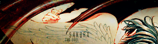
Sakura: OMG I can’t believe you made something that awesome from the original image! Whoah… ahem, alrighty, back to the more serious judging. I can’t really find any flaws with this one, except yet again the practical part. Next time try not to narrow down the lighter area that much, so that the text-area will be easier to place nicely onto the blog.

polarbearpop: First of all I want to point out the obvious problems. The text does not work at all with this blog. You’ve chosen a bad font and put bad colors on it, what more can I say really? The text area is quite a mess as well, it need to stand out more with a lighter background and clearer and better border. This blog simply doesn’t appeal to me, I’m sure you could have done better giving it a bit more time, effort and thought.

hellyer: Refreshing was the first word brought to my mind. Nice job done. Simple theme, which I appreciate you kept simple without any extra fuss around. You’ve managed to make the image quality better as well with well-working light image effects. The main flaw is the welcome-text, you should have made it a bit smaller placing it closer to the box.

Optimus: I can’t say I have that much to point out about this particular blog. Mainly I would just like you to be more careful with the cut-outs next time, there is still some white left here and there, a good graphician considers the blog being but on a light as well as a dark background. If text would be placed in the box meant for it the main text would definitely be a problem, try to take that in consideration next time.

Kitten Medli: I think my main thoughts for this blog are the same as for Sunnie’s blog. To repeat myself: it reminds me very much of the blogs I used to make when I was starting out with more advanced graphic programs. You do not seem to have any obvious problems with image, text and box placing though. The next step for you should definitely be that you experiment a bit more with colors and effects, I’m sure that will bring good results.

ScottNak: Good start, though there are many details that bring down the quality of this blog. First of all, you should not have placed the sub-text where it is now. Its colors are way too strong, to be honest it just looks awful the way it is now. Moving on, you should have been more careful when cutting out the wolf (looking mainly it its legs). However, the rest seems to work fine, and I really like the fog-effects you have added.

DM was on fire!: Yet again, another example of what I call beginner blogs. Not too shabby, but lacking personality with details that could have been made better. The image you cut out got quite rough around the edges in the process, plus that the placing of it alongside the text and box is a bit off track. Summa sumarum, if I were you I would have placed the image a bit behind the box taking it further away from the blog-border and concentrated the text above the box. Colors are very nice though, and I’m not saying that just to be nice.

meowth1982: Great work with the text box as well as the borders, they fit together nicely (with the image too, of course). I feel that the image effect considering the darker stripes is not as good though, mainly because an effect like that seldomly works with any image. The font is most off-track though, you should definitely gone for something softer with more suiting brown-ish colors.

xerai: Good job with the chosen image, though I must say you could have chosen something more interesting. I’m just getting the feeling that you could have worked a bit more with the one you picked, as it is now I see an image pattern pasted onto it and that’s all… it’s just… grass. Considering it is grass, something more elegant would have been better when talking about the font, colors are very good though. Text box would have been better if it was a bit lighter.

...Alex: First of all, just by looking at the blog quickly I had a hard time catching where the text box was. It should definitely had a more lighter color as well as more visible borders. For the moment all I see is a bit more reddish tones and a weak border. Good image placing, same goes for text, but I believe the Harry Potter font would have made it even better (downloadable at for example dafont.com).

Apricus: Yet again quite amazed by the result, looking at the original image. Well done! Original idea as well, I appreciate such things. Next time try using thinner border, thick ones don’t really work in that many occasions (regarding both blog and its textbox). No, nothing else to yap about.

fzun: Gah, makes me really want to be wherever that picture is taken. This blog has a fun and crazy summery feel to it, good job, considering it’s hard to capture feelings in images. The only think I really feel I need to point out is the font: it really needs more strength and perhaps some color of its own instead of just the transparency. The text box looks good, but I’m wondering if it would have needed to be a bit lighter… ah well, I’ll just leave this one now.

Neko: Geez, how do you people manage to make these great creations out of all those small original images? Anyway… The background area to the right would have needed some texture; it does not look good with the plain green color. I myself would have probably also placed the font behind the box and made it a bit bigger, I think this would have been more suitable for the blog.

timkhj: First of all, good cutouts, it looks like the two images you used have always been “together” like that. Nice placing of image as well. Now to the less-fun part. You really should not have put the text on the bottom of the box there in the first place, it ruins a lot of the blog’s looks even though it’s such a small detail The clear red border is a bit too clear, it would have been better given a darker red color. The image quality itself is lacking, the blog needs more contrast and darker shades.

paola: Amazing work, and as you used to image to start with that’s even better. The only thing I want to point out is that you went a little overboard with the borders. In my opinion the darker area in the middle of the two other border-like creations could have been left out. And to end this, I must compliment you on how you managed to make the image look so glittery, just by skillful color (and perhaps brush?) use.

My votes go to Scholastic, polarbearpop, timkhj and watericecage.

Edit: No, I can't spell :P


Image
Set by everconfused


Last edited by Silja on Sat Feb 12, 2005 10:54 pm, edited 2 times in total.

Top
 Profile  
 
 Post subject:
PostPosted: Thu Feb 10, 2005 7:26 pm 
Way Beyond Godly
Way Beyond Godly

Posts: 8715
Joined: Sat Jun 05, 2004 9:10 pm
Location: Cleveland, Georgia
Gender: Female
Silja wrote:
DM was on fire!: Yet again, another example of what I call beginner blogs. Not too shabby, but lacking personality with details that could have been made better. The image you cut out got quite rough around the edges in the process, plus that the placing of it alongside the text and box is a bit off track. Summa sumarum, if I were you I would have placed the image a bit behind the box taking it further away from the blog-border and concentrated the text above the box. Colors are very nice though, and I’m not saying that just to be nice.


It's only my fourth blog, so technically, it IS a beginner blog. :P But I know what you mean by rough aruond the edges. I had problems erasing the background, so I ended up having to use the defringe, remove white matte and remove black matte tools a lot making it look pixelly. I should've remember white pixels don't show on burn. Wait, that's hard light, never mind.


Image


Top
 Profile  
 
 Post subject:
PostPosted: Thu Feb 10, 2005 8:27 pm 
PPT God
PPT God
User avatar

Posts: 1503
Joined: Thu Jul 29, 2004 2:06 am
Location: Finland
DM was on fire! wrote:
Silja wrote:
DM was on fire!: Yet again, another example of what I call beginner blogs. Not too shabby, but lacking personality with details that could have been made better. The image you cut out got quite rough around the edges in the process, plus that the placing of it alongside the text and box is a bit off track. Summa sumarum, if I were you I would have placed the image a bit behind the box taking it further away from the blog-border and concentrated the text above the box. Colors are very nice though, and I’m not saying that just to be nice.


It's only my fourth blog, so technically, it IS a beginner blog. :P But I know what you mean by rough aruond the edges. I had problems erasing the background, so I ended up having to use the defringe, remove white matte and remove black matte tools a lot making it look pixelly. I should've remember white pixels don't show on burn. Wait, that's hard light, never mind.


See? An expert knows a beginner blog when she sees one :P lol. Okay, enough about the bragging (and I surely didn't say that to be mean, just in case if it sounded nasty). Too bad I've never used PSP programs, other than animation shop, I would have loved to give you tips on how to go about things like that. But, good news for you photoshop users because that's a program I use pretty much on a daily basis. Don't be afraid to ask for help if you need assistance with the program itself, using different features etc. :)


Image
Set by everconfused


Top
 Profile  
 
 Post subject:
PostPosted: Thu Feb 10, 2005 8:34 pm 
Honorary Member
Honorary Member
User avatar

Posts: 401
Joined: Mon May 31, 2004 6:29 am
...Alex: I like how you boosted the saturation on Harry and the snitch, and lowered it in the background. You also did a very nice job covering up the uneven color of the original scan, but it's still kind of apparent in the trees just behind his head. Other than the color adjustments, though, you did not do much at all with the image. A lot of the halftone grain from the scan is still visible, and it would have looked nicer if you'd smoothed it out. What I really don't like is the text area. There's actually not a lot to differentiate it from the rest of the picture, the red border is a little weak, and the sepia toning still shows some color through. Remember that even though this contest focuses heavily on design, an important part of design is to visually enhance function. A blog is for writing in, I don't think there's any one color that would be readable on a varied background like that. 6/10

Amethyst: The source image you chose is very pretty. However, it doesn't look like you did much work on this, just made a few standard-ish enhancements. I have never, ever liked grid overlays, particularly not when they interfere with the main picture. Your text area is really too busy for text to be readable. 6/10

Apricus: Hm. Sorry if I'm jumping to incorrect conclusions, but I wish you'd supply the ACTUAL image you used, rather than a thumbnail. The upscaling is really too detailed for me to believe you did it with a program. I like the new background you made for the graduates, but I think the swirls are a little overused and they don't really fit the lighthearted celebratory look of the picture. Once again, the text area of a blog has to be uniform and un-distracting enough for text to be legible on it. The feathered edge around the outside borders is also a nice touch. 8/10

bluehawaii19: A very nice job compositing the images, it looks very convincing. The background on the text area needs to be fairly even and uncluttered or else text won't be readable on it. My only other suggestion is that the text that says 'Welcome' looks awkward when you can see the border of the text area through it. 8/10

Darklegendary: Hey, I recognize that picture! I like how you tinted the whole image purple, but kept her skin tones. The grungy background you made looks very nice and fits well with the sparkly effects around her hands. I would change the font for 'welcome,' Monika has a rather uneven baseline and unless you know how to adjust it, it looks very unbalanced and somehow ALWAYS looks like it's tilting down to the right. It's good to finally see a blog with a perfectly functional text area. 10/10

Dawn2: I like that it's small, it really stands out. The problem, though, is that you could probably only fit perhaps two sentences into the text area, so it should probably be a bit wider. I think the splatter-pattern background looks very nice with the vector-ish art. 8.5/10

DM was on fire!: I like your source image, it's very cute and simple. I don't particularly like the grungy scanline overlay over it though, it detracts from a lot of the detail in their uniforms. I also don't especially like how much you saturated the colors, it's VERY bright and distracting. The background you made is very nice though, interesting, but not too busy. 8/10

fzun: Hm, once again it looks like you simply took the source image and did very minimal work on it. Firstly, I would have chosen a better source image, the one you're working with is quite grainy, especially in the green areas of the trees. And just like a whole lot of people in this round, the backdrop for your text area is too contrasted and colorful for any text to be easily readable. 4/10

hellyer: It's very nice and simple. I think the motion blur looks a little bit awkward around the player, it looks very nice in the background. I think the text box would have looked better if you'd placed it a bit lower on the grass, and if you'd chosen a different color for 'Welcome,' the bright white doesn't match with anything in the picture. 7/10

Kitten Medli: When you re-tinted the image blue, it seems to have deepened a lot of shadows in his face, and it makes him look rather old. The background you made is very simple and not too interesting, it would have looked nicer if you'd added some texture to the dark blue backdrop, besides the stars. 6/10

Koku: Hm, I can sort of tell that the source image you used was enlarged, but the blurring around the edges isn't too obvious. I think the colors on this one are very nice and work together well, and I like how you slightly blurred the background to put more focus on the characters. However, the blog area is too busy for text to be readable. 8/10

Kyra: Ooh, very nice use of color. I can only guess at how you did the border, but it's very clever and subtle. All the mosaic and grunge overlays look very nice without being distracting. Very nice work, it's very hard to make a rainbowy graphic look elegant. 10/10

meowth1982: The border around the text area is very nice. Other than that, though, it doesn't look like you did a lot of work. Removing the logo from the sky is actually fairly simple, and so are scanlines. Remember not to make the backdrop of the text area too distracting or else it will be hard to read. 6/10

moogie: Very creative way of setting off the text area. However, even if you were to use white text in that area, the plus-sign overlay is very distracting. Something about the 'graffiti' on the wall looks off, I think it may be that the font is very smooth and uniform. 10/10

Neko: A very cute source image. The 'Rhapsody' is a bit hard to read when it's overlaid on the girl's shoulder. Overall though, there's nothing really wrong with this blog, but nothing at all outstanding about it. 8/10

Optimus: The first thing I notice is the text that says 'to the west,' because the thick black stroke around it is VERY bold. I like how the text underneath it is on a light gray to black gradient, it's a nice subtle effect. 7.5/10

paola: Did you learn those effects from Greg Martin's tutorials? Of course, excellent job rendering the planet and the starfield, and the magenta works with it very well. I think the only problem is that the stars are still very bright behind the text area, and they would be distracting. 10/10

polarbearpop: Well, it's a nice and cute concept, but it didn't work out very well. The pictures you used are really too different from each other to look good together. I also find it very odd that you chose such a clumsy looking font to go with a more romantic theme. 5/10

Sakura: The extra contrast really makes this image look very nice and bold. I don't have much to say about this blog, it's very nice. The text area might be a problem, but I suppose it's possible for someone to make a text area that's an unusual shape. 10/10

Scholastic: Interesting. Overall, the text area is way too busy for any text to be legible on it. I like the borders though, they remind me of a film director's sign, and the font you chose for "midnight oil" matches the image very well. 6/10

ScottNak: For some reason, that moon looks really awkward against a dark blue sky. Also, something about mirroring the image of the wolf makes it look a little like a deer. The whole creepy theme is very good though, the font and the red eyes on the wolf go well with the slash marks in the corner. And just an unrelated note, the verse in the corner sounds a little awkward. 7.5/10

Shadowfare: I like what you did with the image, the vibrant colors and the slight blur make it very nice and dreamy. The only real problem I have with this is the text area, the background is, once again, too varied for any one color to look good and be readable on it. 10/10

Starchaser: Nice work compositing the two images, it makes it look very busy and lively. Nice choice of fonts for the text on the left, the variation works very well. The only problem is the text area. The background of cars and lights is too busy for text to be legible. 9/10

Sunnie: I can't see much of what you've done to alter the image, other than change the sky from blue to pink, and add scanlines. I like the font you used, it's very cute and simple, and the stars for the dots is a nice touch. 7/10

timkhj: This doesn't look very different at all from the original image. Remember that the text area can't have too much variation of color or else it will be hard to read. 6/10

watericecage: Other than enhancing the reddish tones of the image, I can't see much work on this blog. The firey texture on the 'Welcome' is a nice touch, though. 6/10

xerai: You didn't do much to the original image, scanlines are very easy. Also, I think a thinner font would look better with the grass. 6.5/10

I vote out fzun, polarbearpop, Scholastic and watericesage.


Image


Top
 Profile  
 
 Post subject:
PostPosted: Thu Feb 10, 2005 9:41 pm 
PPT Trainee
PPT Trainee
User avatar

Posts: 540
Joined: Mon May 31, 2004 4:18 am
Location: Hotlanta :P
mazil wrote:
Sakura - The angled area kinda makes me wonder where the text area will go, though? Would it be a thin strip, going upwards from that narrowest point at the bottom, or a thicker one, from that widest point at the top? Each would create a bit of a problem with the readablity of the text, against the various background colours. Nevertheless, I love the idea... ^_^


As in reply to all of your helpful suggestions:

I had that problem too, after I made the blog itself. Maybe it would work with a small, squarish text space where the height is slightly larger than the base, and it is centered. [/quote]


Image

(He who fights with monsters should see to it that he himself does not become a monster). And when you gaze long into an abyss, the abyss also gazes into you.


Top
 Profile  
 
 Post subject:
PostPosted: Thu Feb 10, 2005 9:49 pm 
PPT God
PPT God
User avatar

Posts: 1046
Joined: Mon May 31, 2004 3:35 pm
Location: Nantes
Gender: Female
Marissa wrote:
Apricus: I wish you'd supply the ACTUAL image you used, rather than a thumbnail. The upscaling is really too detailed for me to believe you did it with a program.


Oopsie! I didn't mean for it to be a thumbnail, that's Photobucket's doing. It likes to resize images that are too big. I didn't check and see if it had gotten resized after I uploaded it, sorry about that. I'll make sure next time.


Image


Last edited by Rissa on Thu Feb 10, 2005 10:07 pm, edited 1 time in total.

Top
 Profile  
 
 Post subject:
PostPosted: Thu Feb 10, 2005 10:01 pm 
PPT Baby
PPT Baby
User avatar

Posts: 60
Joined: Thu Jun 03, 2004 4:23 pm
Oh well. I was going for a paint splat artsy feel. Not romance. Next PPTTG I'll just do something plain.


My 3 favorite books
Harry Potter
Lemony Snicket
Elektra


Top
 Profile  
 
 Post subject:
PostPosted: Fri Feb 11, 2005 12:54 am 
PPT Student
PPT Student
User avatar

Posts: 484
Joined: Mon May 31, 2004 5:25 am
Location: Massachusetts
Gender: Female
Scholastic, thanks ^_^

Silja wrote:
paola: Amazing work, and as you used to image to start with that’s even better. The only thing I want to point out is that you went a little overboard with the borders. In my opinion the darker area in the middle of the two other border-like creations could have been left out. And to end this, I must compliment you on how you managed to make the mage looks so glittery, just by skillful color (and perhaps brush?) use.


I think I went overboard too, except it looked too plain if I took the border out and I was in a rush, so I didn't bother fixin it. Plus, I <3 triple borders XD

Marissa wrote:
paola: Did you learn those effects from Greg Martin's tutorials? Of course, excellent job rendering the planet and the starfield, and the magenta works with it very well. I think the only problem is that the stars are still very bright behind the text area, and they would be distracting. 10/10


Yes, Greg Martin ^.^ It's probably bright because I put a layer of grid burshes in overlay. The brightness probably would kill though.


Image


Top
 Profile  
 
 Post subject:
PostPosted: Fri Feb 11, 2005 12:58 am 
Beyond Godly
Beyond Godly
User avatar

Posts: 3007
Joined: Tue Jun 01, 2004 5:08 pm
Location: You're FACE.
Beginner blog, eh? I guess you could call it that. It's like what the... fourth or so blog I've made? And as for like, not doin' much with the image, I liked it as is. XP
Nyeh, I'll do something more fancy-shmancy next round (if it's something I can be fancy with). :3


Image
Zero set 13 of 26


Top
 Profile  
 
 Post subject:
PostPosted: Sat Feb 12, 2005 10:32 pm 
PPT God
PPT God

Posts: 1195
Joined: Mon May 31, 2004 6:35 am
Note to all of this round's entrants:
Please remember that a blog's purpose is to have some area big enough to hold legible text. Also keep in mind the limits of HTML-- rectangular areas. I'm disappointed that many of you forgot this, and it will reflect in your ratings.


<b>bluehawaii19</b> -- Although you did a decent job of blending the pictures together to create a nice scene, I'd like to ask, how would you code it? If you used the entire box for text, it would run over the "welcome" and look ridiculous, provided you could read it at all, because I don't know what color text would be legible. White, perhaps? But even that would look too out of place.

<b>Darklengendary</b> -- Nicely done! I love what you do to your images. It looks very powerful and whimsical. I also especially like the border. It's unique and not boring at all. Plus you can put text into the box. Good job.

<b>Starchaser</b> -- The images and color scheme are gorgeous, but how would you fit text into that box? It'd be hard to have text of any color show up. The text box needs to be more opaque for anything to be legible. Also, text would run over the words "city lights".

<b>watericesage</b> -- I sort of like the color changes. It looks relatively simple; you could have added something to spice it up a bit. I dislike how the block area goes over her shadow, as it would be difficult to have a dark text be legible there. The "welcome" also looks out of place over her jacket. An outer glow would have helped negate the choppiness.

<b>moogie</b> -- Interesting method of covering up the crease lines in the original image. I think the overlay is too strong because it would interfere with the text. The white text around the blog area would also make any text placed there difficult to distinguish from the border. You get some points for creativity, I suppose.

<b>Scholastic</b> -- The diamonds in the border are too pixelly/opaque for the blog. They don't fit at all, and I dislike how they run over the dotted border, which is the one that actually works. I also don't understand how the text is supposed to go in the two right frames. You need to define a blog area, or when a scroll bar shows up, it's just going to look silly. Text shouldn't go over detailed images such as yours, because that would just interfere too much.

<b>Shadowfare</b> -- Ohh, pretty. I like how you made the original image more vivid, but with something so powerful, you need a stronger border to hold it all together, if you understand what I'm trying to say. I don't like how "welcome" sits so close to the top edge, but you get props for making the blog area as large as it could be (could've been a few pixels wider, but oh well). One would just have to be very careful selecting a color for the text to go in the blog area, as anything too bright would just blind your readers.

<b>Dawn2</b> -- Ack. First off, how in the world would you be able to write any text in that tiny space? I'm betting you could only fit 5-letter words in there, less, when the scrollbar pops up. Second, what is that white blob above her right shoulder? It looks like a huge blob that you cut in half. This piece wouldn't have been so poor if you had made it bigger.
<b>Amethyst</b> -- How do you plan on putting text in that area? What color could it possibly be? If the area were more opaque, it might've worked. Even then, the image would look incomplete because half her body is cut off. This image just isn't right for a small blog such as this. The uniform gridlines are irritating because the mood of the image isn't rigid; it's supposed to be dreamy and wavy. If you had perhaps used a smaller grid overlay and erased parts of it, it might've worked.

<b>Kyra</b> -- Although what you did to the image looks very cool, I don't know how you would be able to write in that area. I suppose if you used black text it might work, but it'll still run into the thing's sleeve. The blog needs to be more opaque and not have something already written in it, or the text you add will run over it. Or you could've made the thing smaller and moved it out of the blog space. Also, the pixel effect is too large and especially distracting above the thing's right eye.

<b>Koku</b> -- I can't think of a color for text that would work in this area. A light text will be illegible against the guy's bright hair, but a dark color would be illegible against the black spots. If you had made the area more opaque (a lot more opaque) something might've been able to go there. The thin pixel border isn't strong enough to hold such a vibrant
piece together.

<b>Sunnie</b> -- Although your space for text is a bit on the small side, I can put text in it! Props! I like the color scheme and I like how you made the sky purply. The main problem is the grid overlay; it's too monotonous and too strong. Less opacity and more transparent areas so that it doesn't look bland.

<b>Sakura</b> -- Wow. That was a pretty creepy image, but you totally messed around with it and the end result is pretty cool. The only problem with the blog is that it's not really a blog.... You can't code diagonal lines in HTML and it'd be really hard to pick a text color that'll show up in the less opaque areas.

<b>polarbearpop</b> -- When you combine a drawn image and a photograph, you need to try and make them look like they were both drawn or they were both photos. I think it looks really neat, but you can't write anything in it. Also, because that's the center of focus, would you really want text over it? The font you chose also doesn't fit. It's not very romantic; perhaps try something curlier next time.

<b>Hellyer</b> -- Cool. I love soccer images =) Either way, the blur thing looks all right, but then the "welcome" is too strong for the windy effect. You need to apply the same theme to the majority of the objects in a work. You also cut the guy's head too close to the top border, making it looked cramped. You get lots of points for being one of the few with a real blog. The blog area is on the small side; it could be stretched out a lot more, to cover even all of the lower left corner.

<b>Optimus</b> -- As nice as it looks, it wouldn't work. Where would you put the text? You cannot code text so that it goes behind the "to the west" unless you make it a whole different image on a different div layer. Also, what happens when the text rolls over the image? It'd be incredibly hard to read. There are a few spots you didn't erase completely above the guy with the fuschia hair. The way the side borders end is too abrupt. They should be faded out (black at the bottom, fading to gray at the top).

<b>Kitten Medli</b> -- The starburst brush is too generic, especially when you do it by hand. You should try changing the scattering/sizes so that it looks more natural. Otherwise, download some real star brushes to make it look more realistic. I don't like how the "starry starry night" runs off the side of the blog. It makes it look unbalanced. It also is too opaque and distracting. I'm glad that text will be legible in your blog area though. Light text on a dark border is risky, but you could pull it off.

<b>ScottNak</b> -- Nice font choice! ;) The scratches don't look very real. Maybe because they're not wide enough and the middle one's all slanted. The combination of the images looks really awesome; good job! The poem is kind of out of place. The red is a bit too bright; perhaps lower the opacity a bit so that it blends in more. Also, the first and third
lines are too close to the left border. It looks too cramped/busy. If anything, you should have focused on "werewolf" rather than the poem. The blog space is nicely done though. Glad you kept it clear, but it could be a bit more opaque because of the scratches behind it. Lastly, your border needs to be inverted: black on the outside and red on the inside. Always try to frame an image with the darker border on the outside.

<b>DM was on fire!</b> -- The blog space is too close to the right border. If you were going to stretch it all the way to the border, you should've stretched it downward to the bottom border and upward to the text as well. It's decent work, though.

<b>Meowth1982</b> -- What color text would you use to make anything legible in that area? Again, you shouldn't place the blog space over a part that's critical to the image for lots of reasons. 1. it's going to be hard to read your text, 2. you've just covered up an important part of the image. I also don't think that it's really all that hard to cover up the black box in the original image. It's pleasing to the eye though, if you weren't to use it for a blog.

<b>xerai</b> -- The image you chose to work with is beautiful, but not the best for a blog because it doesn't really have an unnecessary area that you could put a place for text over without making it look covered up. If you were to do a blog area like the one you chose, it needs to be wider and placed elsewhere. I would've shrank the image and stretched it downward, where you could place a blog space and have the grass at the top, kind of like a header. The gridlines are way too strong and monotonous. Try setting it on overlay or screen, just to get some variety. The font you chose isn't seemly for grass. It's too round and retro, while it should be spiky or sharper. The border also needs to be darker than the image, or it doesn't frame it properly.

<b>...Alex</b> -- This image probably wasn't the best one to use for a blog because you had to cram in a space for text. I would've made it wider, to cover the minor character's face as well, since you don't really need him anyway. Also, what color text would you use to make it legible? The space needs to be more opaque for anything placed there to work. I like that you made the image more vivid, though.

<b>Apricus</b> -- Ohh! Nice. I love the fuzzy glow around the border. The person's green shirt looks really out of place, since the rest of the image is browns and such. If the blog space were more opaque, I'd have no more complaints.

<b>fzun</b> -- Eh. It's a nice picture and all that, but what did you really do to it? The blog area isn't opaque enough to write anything on. I can't say much else since it doesn't look like you did much else.

<b>neko</b> -- Nice work! You did a good job of taking an image like that and blowing it up while making it look classy. Lovely. I have only a few complaints. First, the blog border around the blog area looks out of place. Second, the blog isn't placed between the borders evenly. You have enough space to make it higher so that there is an even space around each side of the blog area. Sorry. I have a thing for balance. =)

<b>timkhj</b> -- Initial D! Hahahaha. I've never watched it/played it, but my guy friends were obsessed with it awhile back. Anyway... It's not bad. I just think it's sad that the other cars will be covered when you put text on it. I would've placed the blog space on the left, covering the huge empty space at the bottom left corner, so that the front of the main car and the other cars would still be visible. I also would've moved your text, "drive-drift-dream", above the blog space if it was where it is now for cleaner coding purposes. Plus words will roll over it if you code the blog that way. I think the red border is a bit too bright though. It sort of draws one's attention away from the center of the blog, where it should be, to the border.

<b>paola</b> -- Gorgeous. Although I don't like the unused space at the top, it's not a terrible thing. I like it a lot. No huge complaints.

My votes go to scholastic, Dawn2, amethyst, and polarbearpop.
The rest of you are lucky that Flame didn't say I could vote out all the people who didn't make real blogs, even if your artistic ability is amazing. Practicality has its uses.


Last edited by vkceankraz on Mon Feb 14, 2005 12:18 am, edited 4 times in total.

Top
 Profile  
 
 Post subject:
PostPosted: Sat Feb 12, 2005 10:50 pm 
PPT Warrior
PPT Warrior
User avatar

Posts: 910
Joined: Sat Jan 08, 2005 2:16 am
Location: Indonesia
vkceankraz wrote:
<b>Scholastic</b> -- The diamonds in the border are too pixelly/opaque for the blog. They don't fit at all, and I dislike how they run over the dotted border, which is the one that actually works. I also don't understand how the text is supposed to go in the two right frames. You need to define a blog area, or when a scroll bar shows up, it's just going to look silly. Text shouldn't go over detailed images such as yours, because that would just interfere too much.


I dunno, I just feel when I solarize the picture and resize it, it looks great, but when I set the brightness TOO high, it looks silly. :P

vkceankraz, you're my favourite judge so far.

// humbles

No, silly, seriously, you're my favourite. :)


Image
// set by paola


Top
 Profile  
 
 Post subject:
PostPosted: Sat Feb 12, 2005 11:48 pm 
PPT God
PPT God
User avatar

Posts: 2092
Joined: Mon May 31, 2004 4:30 am
Location: Northern California
Gender: Female
fzun wrote:
Hold on a sec. I counted 26 entries, but there's still 32 participants. Do the 6 that didn't enter get booted, and not anyone that entered?

Sorry if this is a stupid question, it's my first PPTTG :p


I haven't been on PPT for a few days...I made a blog though. :oops:

So it's too late now?


"I'm not superstitious, but I'm a little stitious."
Image


Top
 Profile  
 
 Post subject:
PostPosted: Sun Feb 13, 2005 7:59 pm 
PPT Baby
PPT Baby
User avatar

Posts: 60
Joined: Thu Jun 03, 2004 4:23 pm
Quote:
polarbearpop -- When you combine a drawn image and a photograph, you need to try and make them look like they were both drawn or they were both photos. I think it looks really neat, but you can't write anything in it. Also, because that's the center of focus, would you really want text over it? The font you chose also doesn't fit. It's not very romantic; perhaps try something curlier next time.


Well thankyou for your rating. I thought it looked really neat too, but I guess that's the difference between blogs and signatures. It's only my second blog, so next time I'll remember your pointers. Thanks!


My 3 favorite books
Harry Potter
Lemony Snicket
Elektra


Top
 Profile  
 
 Post subject:
PostPosted: Mon Feb 14, 2005 12:20 am 
PPT God
PPT God
User avatar

Posts: 1271
Joined: Tue Jun 22, 2004 2:43 pm
Gender: Female
Mermaid Hil wrote:
fzun wrote:
Hold on a sec. I counted 26 entries, but there's still 32 participants. Do the 6 that didn't enter get booted, and not anyone that entered?

Sorry if this is a stupid question, it's my first PPTTG :p


I haven't been on PPT for a few days...I made a blog though. :oops:

So it's too late now?


You're a few days past deadline. So yes, it's too late.


Image
Gone.


Top
 Profile  
 
 Post subject:
PostPosted: Mon Feb 14, 2005 1:02 am 
PPT God
PPT God
User avatar

Posts: 1271
Joined: Tue Jun 22, 2004 2:43 pm
Gender: Female
bluehawaii
It's very nice looking. Good job blending the images. I'm not overly fond of the thick black border though, and you wouldn't be able to easily put text in the text box. I like the script writing in the top.

Darklegendary
I'm not overly fond of the color you chose to colorize it. I think I just like the original colors better. I'm glad to see you've gotten away from the solid black borders. The text box is good. The faded image in the background gives it some details.

Starchaser
This blod really jumps out at me. I don't like the where the font changed in the text though. I think 'never sleeps' would have been better put together. Also, the text box needs to be more opaque so you could actually see text in it.

watericesage
Sort of boring looking with the coloring ov it. The text box needs to be a little more opaque, and the text doesn't look all that great either. I really think the coloring in this is what ruins it.

moogie
I think text would still be a little hard to see in the grey area...it might work a little better with a slightly darker grey. Other than that, I really like this blog. The 'be cool' in the background is a nice touch.

Scholastic
This...is weird looking. The images are extremely blurry, and the gradient in the background isn't all that great. The main text doesn't stand out enough...so...Yeah.

Shadowfare
Very nice job. I love your image choice, and the sunset. The red textbox is also a very interesting choice. One thing I would change with this is the font for 'welcome.'

Dawn
It's far too small. You could barely put any text in the text box, the image is sort of blurry, and the background really isn't anything detailed or interesting to look at.

Amethyst
Make the text box more opaque. I think there's a grid over the image, but it's hard to tell...Yeah. The colorizing makes this blog a little uninteresting to look at.

Kyra
I love the rainbow background. My suggestion for the border would have been to make it a solid dark blue or purple. Also, a border might have looked a little better around the text box itself.

Koku
I like the colorizing you've done within the text box, except you leaving the characters there makes it pretty much impossible to add text. The small font 'his desting is on the' is a little difficult to read.

Zero
Hm, this is sort of plain looking. The background maybe beeds a bit more detail, and I think you should've chosen a different font/font color. Also, the border should have maybe been a dark purple instead of black.

Sakura
I really don't like this all that much. I'm not fond of your border choice, and your text area would be pretty much impossible to code. The grungy feel is kinda cool though.

polarbearpop
You've done a nice job colorizing the different areas. Adding the eiffel tower was sorta cool...but you couldn't put text in the text book. I don't like your font choices all that much either. You actually might've been better off just using the eiffel tower image without the dogs...

hellyer
Sorta plain. You blurred the image a bit. You could've made the text box a little bigger maybe, and the font choice is sort of plain...but not bad.

Optimus
The text area will be a little thin. You probably should've made the text box a little bigger when it comes to height. You've done a good job with the cutouts, and the dots over everying are a nice touch.

Medli
Not bad. Okay, I like the color you chose for colorizng. But the other shades of blue you use don't really go. 'Starry starry night' is too purple, and the text box area is too bright of a blue.

Scott
Spiffy. I think my favorite part is the moon. The wolf image is sort of odd, and I think it might've looked better without the red eye. Nice text choice, and the claw marks are a nice touch. However, the text box might've looked better a dark grey, so then you could have used white text. (Or atleast white text would stand out more.)

DM
Okay. The font could have been put in a more interesting position, maybe have 'Daioh' slightly lower. The text box runs too close to the ede of the blog. The background isn't very detailed, and the text box looks sort of boring. It's just sort of...floating there.

meowth
The text box needs to be more opaque. I like the border you've chosen, and the verticle scanlines. I don't really like your font choice. The edges are too hard for the somewhat softer look of the blog.

xerai
The text is a little too bright with the white around it, and the border is a little hard to see. The grid over everything is a little too solid, and I think the text area would have looked better with a border.

...Alex
It really sort of seems like you took the image and stuck on text...Er...The text box needs some sort of color filled into it so text could be added. There needs to be some sort of overlay or design to the blog too, as it's sort of dull looking with just the image.

Apricus
The text box needs to be more opaque. I like the text in the background, and the diagonal 'on our way' looks very nice.
fzub
You couldn't put text in the text box. The border makes this look sort of plain because of the shade of green you used.

Neko
Cute, simple. I love the checkers in the text box. I'm not so fond of the black dashed border around it though.

timkhj
I think you might've lightened the image a bit. (?) But anyway, there isn't much you've done to this I think. The rounds edges on the blog and text box look nice, as well as your text choice with the red. Althought the 'drive-drift-dream' might've looked better if it wasn't exactly on the bottom of the text box.

paola
Impressive for having stared with no image. I don't like the white in 'gravity', it just looks off to make. I think the text box might need to be a little more opaque for text too, though I can't be sure, and don't feel like checking.


Dawn 2, Scholastic, Fzun, polarbearpop

Warnings to everyone who had a blog that wouldn't work with text/couldn't be coded.


Image
Gone.


Top
 Profile  
 
Display posts from previous:  Sort by  
Post new topic This topic is locked, you cannot edit posts or make further replies.  [ 140 posts ]  Go to page Previous  1, 2, 3, 4, 5, 6, 7 ... 10  Next

All times are UTC


Who is online

Users browsing this forum: No registered users and 66 guests


You cannot post new topics in this forum
You cannot reply to topics in this forum
You cannot edit your posts in this forum
You cannot delete your posts in this forum
You cannot post attachments in this forum

Search for:
Jump to:  
Powered by phpBB® Forum Software © phpBB Group