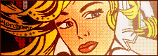
the second set is better in some ways, like for the placing of the border, but i think the colour of text and border might be a little bit less 'glow-in-the-dark'-ish
(any ratings for my set are always accepted
 )
)Moderator: Moderators
)
Ratings Board Rules:
1. Keep your criticism constructive.
2. You must give/get ratings at a ratio of at least 1:1, that means for every graphic you ask for ratings on, you must rate at least one other. And I mean a meaningful, well-thought out rating, not just a number or "that's good."
New Addition: These numbers do not stack up. If you rated two sets and asked for one rating, you cannot make a post later asking for one free rating because you rated earlier.
And be good about your ratings, if I see continue to see many ratings that simply say "that's good" in many words, I will raise the ratio to 3:1.
3. You may not ask for ratings on work that you did not make.

dlfreak wrote:I think this is the right place but anyway I would appreciate some feedback on my newly "redesgined" userlookup...
http://www.neopets.com/randomfriend.phtml?user=dlfreak


 I think the font you've used for the main text is good and goes with the overall look of the set. One thing you could have done better is come up with a better sub-text... maybe a quote from the film/books? But thats the only thing I think ... and I actually like the text you've used as it is!


Ratings Board Rules:
1. Keep your criticism constructive.
2. You must give/get ratings at a ratio of at least 1:1, that means for every graphic you ask for ratings on, you must rate at least one other. And I mean a meaningful, well-thought out rating, not just a number or "that's good."
New Addition: These numbers do not stack up. If you rated two sets and asked for one rating, you cannot make a post later asking for one free rating because you rated earlier.
And be good about your ratings, if I see continue to see many ratings that simply say "that's good" in many words, I will raise the ratio to 3:1.
3. You may not ask for ratings on work that you did not make.
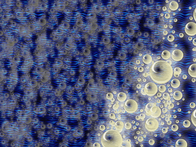
 However, maybe the colour selection isn't my type but I don't think the bright yellow goes with the dark blue. Personally I would use either a lighter blue or purple. This is only for the wallpaper because the set you used this image in blends in very well even though it's yellow on blue. I haven't quite made out why though
Could anyone rate my current set, pretty please?
However, maybe the colour selection isn't my type but I don't think the bright yellow goes with the dark blue. Personally I would use either a lighter blue or purple. This is only for the wallpaper because the set you used this image in blends in very well even though it's yellow on blue. I haven't quite made out why though
Could anyone rate my current set, pretty please? 

















DM was on fire! wrote:Adam, set one: Your set is overbordered. I used my image preview and you could've erased the middle in the Os, then you wouldn't have had as much as a problem. Another thing: black borders are REALLY boring, and trust me, you aren't boring. I love the font...what is it?
Adam, set two: I think there's 2 Gs in Dogglefox, but I'm not sure. I really like it, but how did you do the pixel dots? If you did them by hand, I feel sorry for you. Really good set, but again, the black border. There's some empty space too, however, but nothing you can do about it.
ZH: The subtext blends in too well, I can't read it too good. But, I'm needing glasses so that could be a problem too. I also don't like the way the face is cut off. And the contrast between the av and the sig is annoying.
-----------------------------------------------------------------
I made a Ichigo set the other day that I would like rated, please?