Final round already eh? Suddenly I get the feeling that it was just some weeks ago I sat here and thought I'd never finish with all those set-ratings for the first round. Oh the memories...
And then the part about my overall thoughts about this PPTG-round in particular. I must say I have seen quite some talent while judging all your graphics. I have most definitely been everything from nice and vague to nasty and strict in my ratings, that balance has been hard to reach, I must admit. Nevertheless they have all been my honest opinions from an objective point of view. And now, ladies and gentlemen, the final ratings (a long side some philosophical-gibberish).
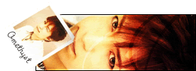
Amethyst - You have surely been very devoted to this competition. One thing is for sure though, which I mustn’t forget to mention to you here: Have more faith in yourself, you getting to the final round shows quite already doesn't it? You're not here because of pure luck or bribed judges, you're here because of talent! Elegant and kind of antique, big words for something so small, yet I think they describe your creation very well. The colors are my particular favorite in this one. But (there's always a but, isn't there?) there are some things that I'm not fond of at all. Instead of going for the animation I would have filled that space, which appears to be too empty, with standard non-animated text. It would have suited the set so much better enhancing both "elegant" and "antique". Second of all I had quite some problems with the avatar. Before I looked at the original image I couldn't even figure out what kind of image was put on it, after looking at the original image it still took me some seconds to figure it out.
6/10
Koku - You've had a blast with that "add contrast" feature haven't you? That's the particular feature that has struck me in many of your entries. Your work has a lot of personality and attitude in it, something many seek for but never find in their own style. Looking at what I just wrote, this set in particular is no different. Al though the components themselves work together quite nicely I don't simply like this set that much, The rainbow colors are too bright and it all seems mostly like an inferno of colors, effects and a picture thrown into it all. I do not like how the subtext is partly placed on the small bird on the girls foot. Also, the text effect forks for the main text, but it makes the subtext too blurry, in particular on the avatar. The set is, however, compatible with most color settings on different sites and forums, which is very good.
5.5/10
Darklegendary - I believe you in particular have evolved quite a bit during this contest, regarding graphic-making of course. Your style has caught more personality and you seem to dare to explore more with different techniques. This set in particular is very nice. You've used colors well in it and the effects match the image well. Even the image is placed neatly. The things I would like to point out in particular due to some weaknesses are the border and space for the subtext. The border doesn't seem to match the rest at all, it is very edgy and chopped, I would imagine something smoother for this set in particular. The subtext box should either be lighter or it should match the darker part of the image it is attached to. Right now it looks like you lowered its opacity which resulted in a even darker area on the image, which does not look nice.
7.5/10
paola - With a whole bundle of talent you have worked your way to the last round with four other talented artists. Maybe I wouldn't use the word unique for you, I'd say you just have a very good eye for graphics, meaning you seem to find a kind of a harmony in all of your work. The set is very original and one can see that you have used your imagination to make this one. You need to remember that the set should be visible in most color settings tough, which s right now a problem with this set in particular as the white around the text below the image box is surrounded by a white and messy border making it completely fuzzy in for example PPTs own subBlack. The space above the main text looks awfully empty, too.
8/10
Congratulations to all four of you for getting this far, and I promise this won't be the last you see of me


