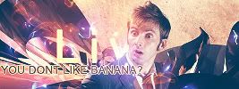
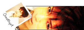
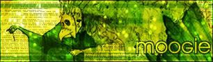
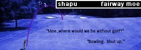
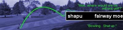
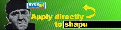
Any opinions on my new set. My first attempt in ages, so please, be nice
Ratings
Moderator: Moderators
-
Matt
- Honorary Member

- Posts: 1869
- Joined: Mon May 31, 2004 11:04 am
- Location: Dundee, Scotland
- Contact:
Bluehawaii, I'm really sorry, but I don't really know how to rate colourisations. Overall, they're great, but the one problem is that if you look at the first image, the fingers end very abruptly. If you curve your fingers like that, then you'll see a slight... light variation. The second image looks highly artificial, looking at the face it's too perfect. I think the eyes accentuate it, especially the reflection, almost as if too much light is coming. Overall, brilliant, it's just one or two little inconsistencies, but... wow! 9.5/10
Any opinions on my new set. My first attempt in ages, so please, be nice

-
bluehawaii19
- PPT Student

- Posts: 302
- Joined: Fri Jul 23, 2004 2:48 am
- Location: Ontario, Canada
Matt wrote:Bluehawaii, I'm really sorry, but I don't really know how to rate colourisations. Overall, they're great, but the one problem is that if you look at the first image, the fingers end very abruptly. If you curve your fingers like that, then you'll see a slight... light variation. The second image looks highly artificial, looking at the face it's too perfect. I think the eyes accentuate it, especially the reflection, almost as if too much light is coming. Overall, brilliant, it's just one or two little inconsistencies, but... wow! 9.5/10
Any opinions on my new set. My first attempt in ages, so please, be nice
What do you mean about the fingers in the first one?
The original (coloured) version has the same look to it...

------------------
Thanks to the wonderful Neko for the amazing set.
-
Matt
- Honorary Member

- Posts: 1869
- Joined: Mon May 31, 2004 11:04 am
- Location: Dundee, Scotland
- Contact:
bluehawaii19 wrote:Matt wrote:Bluehawaii, I'm really sorry, but I don't really know how to rate colourisations. Overall, they're great, but the one problem is that if you look at the first image, the fingers end very abruptly. If you curve your fingers like that, then you'll see a slight... light variation. The second image looks highly artificial, looking at the face it's too perfect. I think the eyes accentuate it, especially the reflection, almost as if too much light is coming. Overall, brilliant, it's just one or two little inconsistencies, but... wow! 9.5/10
Any opinions on my new set. My first attempt in ages, so please, be nice
What do you mean about the fingers in the first one?
The original (coloured) version has the same look to it...
Okay. It just seems to be as though the fingers just... stop, there's no light to suggest a continuation, or shadows. My room is near pitch black at the momet, so I guess it isn't the best 'evidence', but if I curve my fingers, there's a little shadow on the end of my finger, and a whiter patch when the skin tautens that the mind will automatically configure as a continuation. But if I'm wrong, it's because I'm new to this. I'm definitely not saying it's bad, it's just if I didn't pick out these tiny errors, then I'd just be going it's perfect to everyone around here

-
bluehawaii19
- PPT Student

- Posts: 302
- Joined: Fri Jul 23, 2004 2:48 am
- Location: Ontario, Canada
Matt wrote:bluehawaii19 wrote:Matt wrote:Bluehawaii, I'm really sorry, but I don't really know how to rate colourisations. Overall, they're great, but the one problem is that if you look at the first image, the fingers end very abruptly. If you curve your fingers like that, then you'll see a slight... light variation. The second image looks highly artificial, looking at the face it's too perfect. I think the eyes accentuate it, especially the reflection, almost as if too much light is coming. Overall, brilliant, it's just one or two little inconsistencies, but... wow! 9.5/10
Any opinions on my new set. My first attempt in ages, so please, be nice
What do you mean about the fingers in the first one?
The original (coloured) version has the same look to it...
Okay. It just seems to be as though the fingers just... stop, there's no light to suggest a continuation, or shadows. My room is near pitch black at the momet, so I guess it isn't the best 'evidence', but if I curve my fingers, there's a little shadow on the end of my finger, and a whiter patch when the skin tautens that the mind will automatically configure as a continuation. But if I'm wrong, it's because I'm new to this. I'm definitely not saying it's bad, it's just if I didn't pick out these tiny errors, then I'd just be going it's perfect to everyone around here
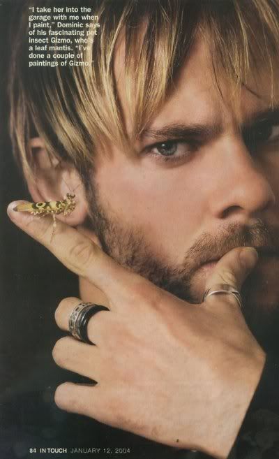
Here is the original image....


------------------
Thanks to the wonderful Neko for the amazing set.
bluehawaii19: I think I see what Matt's talking about- your colourisation added a bit of an outline to everything, and it makes it as though all the fingers are cut off. The original picture doesn't have that. As per the rest of the Dominic colouring, it's pretty nice although the eyes and hair are awfully saturated in an unrealistic way. Skin tone is great, and so is the little critter on his finger. :)
For the second colouring, Matt's also right about that- it's also rather unrealistic, especially the face (bring out the eyes a little more, perhaps?) and upper body. Perhaps you could give a little colour variation in skin colour or choose a slightly darker shade. There's also the same outline problem seen in the first one- parts of the dress have a strange white pixelly border that stands out, as does her right arm (on the left side). This one's not as good as your first one, but nevertheless it's quite well done, especially the surroundings.
<hr>
Matt: Good stuff considering you haven't been making graphics for awhile (I remember your old sets!). Several issues though- the colours don't seem to match, for one thing. Perhaps if you change the background to a brighter hue- if you want to keep at green, perhaps a leafy one; or try a summery orange- it'll come out a little better. This way your name will match, the theme will be more prominent, and the border will come out more, as it's only faintly visible at the moment. Also, the subtext font looks a little awkward. I know it's Redensek, but it looks a little classier in all caps.
For the second colouring, Matt's also right about that- it's also rather unrealistic, especially the face (bring out the eyes a little more, perhaps?) and upper body. Perhaps you could give a little colour variation in skin colour or choose a slightly darker shade. There's also the same outline problem seen in the first one- parts of the dress have a strange white pixelly border that stands out, as does her right arm (on the left side). This one's not as good as your first one, but nevertheless it's quite well done, especially the surroundings.
<hr>
Matt: Good stuff considering you haven't been making graphics for awhile (I remember your old sets!). Several issues though- the colours don't seem to match, for one thing. Perhaps if you change the background to a brighter hue- if you want to keep at green, perhaps a leafy one; or try a summery orange- it'll come out a little better. This way your name will match, the theme will be more prominent, and the border will come out more, as it's only faintly visible at the moment. Also, the subtext font looks a little awkward. I know it's Redensek, but it looks a little classier in all caps.

-
Anubis
- Beyond Godly

- Posts: 3780
- Joined: Mon May 31, 2004 4:56 pm
- Location: Right here, I think.
- Contact:
Michelle: I really like that set. I love the way, on the signature, that it's red on the left and fades into pink. The words running across the back of the signature really add to the set, and don't make the background look plain. I like the placement of "Tori Amos" on the signature right in the middle. Overall, great job!
9/10.
Yoshi: I know this was a while ago, but let me just take the time to say... I LOVE that set. I want to steal it. Can I steal it, Yoshi? It's a pretty and multicoloured. XD I actually can't find anything wrong with it, except that the left of the signature, the light, is rather blinding. 9.5/10.
---
Can someone please rate this set?
The original image was a real cat (.:Chronically Depressed:.'s), and I colourised it in Gimp, and made it a set. Commmmments? It's kinda plain.
Yoshi: I know this was a while ago, but let me just take the time to say... I LOVE that set. I want to steal it. Can I steal it, Yoshi? It's a pretty and multicoloured. XD I actually can't find anything wrong with it, except that the left of the signature, the light, is rather blinding. 9.5/10.
---
Can someone please rate this set?
The original image was a real cat (.:Chronically Depressed:.'s), and I colourised it in Gimp, and made it a set. Commmmments? It's kinda plain.

|| Set // WIS < 33 ||
Anubis: It's nice, yet i think that the colourisation is really basic, it's just one colour
the cat is cute though and i like the CD font, but i do believe that the font for the subtext and text in ava is a little too small, and the CD is a little too stuffed away in the corner, i think you could've made the contrast of the picture a little bigger, or spread the text more over the ava and sig and use some filters or such
anyone rate my new set made from a picture with general grievous on it?

anyone rate my new set made from a picture with general grievous on it?


-
Adam loves Hilary Duff
- Beyond Godly

- Posts: 2811
- Joined: Mon May 31, 2004 5:44 am
- Location: Canada
- Contact:
Anubis - It was hard for me to see the cat at first.
It is a little on the bright side.
It also is very basic.
7/10
Jens - For some reason the sub-text doesn't look too good on there.
And the L is getting covered up a bit.
Other than that, I like it.
9/10
I just made 2 new avatars.
Care to rate?
It is a little on the bright side.
It also is very basic.
7/10
Jens - For some reason the sub-text doesn't look too good on there.
And the L is getting covered up a bit.
Other than that, I like it.
9/10
I just made 2 new avatars.
Care to rate?
Set=Kitten Medli
Adam+Liz=<3
Liz: Well. That proves how good everyone's memories are.
Me: Well I have no memor........What did you just say?
-
DM was on fire!
- Way Beyond Godly

- Posts: 8715
- Joined: Sat Jun 05, 2004 9:10 pm
- Location: Cleveland, Georgia
- Contact:
Jens: The subtext doesn't belong there. If it was a bit lower, it'd look better. But it's a good set!
moogie: I don't like the way the text is. If it was off to the left, it'd look better to me.
------------------
http://www.deviantart.com/view/18203944/
This is one of those random banners I make to boost my PSP 8 skills, not to mention Adoration's begging. Please, be easy on me.
moogie: I don't like the way the text is. If it was off to the left, it'd look better to me.
------------------
http://www.deviantart.com/view/18203944/
This is one of those random banners I make to boost my PSP 8 skills, not to mention Adoration's begging. Please, be easy on me.

-
loser
- PPT Trainee

- Posts: 599
- Joined: Sat Mar 05, 2005 12:49 pm
- Location: Where ever they hide the sugar...
Anubis- Its cute! The orange adds a nice effect! But it lacking something but I cant tell what it is... 7/10
Jens- Thats cool... the subtext probably should have been placed somewhere else, like someone said the L is beign cover up... and its a bit akward high 6.8/10
Adam- First one is a bit bland. Between the dots and the red, she look a bit boring - 6/10, The second one is cool, it really stands out! 8/10
moogie- Thats really cool! I just dont like the extra black space on the left.... 9.6/10
DM- That cool! I just have one problem with it--the scratch effect takes away from the image. Other than that, its awsome! 8/10
Anyways, I have a new set. Rate it please? Just keep in mind that I know 'loser' is in a bad place, but I like it that way.
Jens- Thats cool... the subtext probably should have been placed somewhere else, like someone said the L is beign cover up... and its a bit akward high 6.8/10
Adam- First one is a bit bland. Between the dots and the red, she look a bit boring - 6/10, The second one is cool, it really stands out! 8/10
moogie- Thats really cool! I just dont like the extra black space on the left.... 9.6/10
DM- That cool! I just have one problem with it--the scratch effect takes away from the image. Other than that, its awsome! 8/10
Anyways, I have a new set. Rate it please? Just keep in mind that I know 'loser' is in a bad place, but I like it that way.

StealthStealthStealth
loser1921: Hrm...The colorization sort of flattens the image, and the sig seems a bit plain. Maybe you could put some textures or something in the background to liven it up? I love the image, though^^
For my computer science class, we have to start making about forms for our programs, creating our own design companies and such. Can I get a few ratings for my logo?

For my computer science class, we have to start making about forms for our programs, creating our own design companies and such. Can I get a few ratings for my logo?


Amethyst- it's pretty, and the purple's eyecatching, but the overlay makes the Scriptina very hard to read. With brand identity and all, you really want your users to know the name, not have to guess at what it is. Also, the font you've used for the characters is slightly boxy and doen't go so well with the script font.
Opinions on my userlookup?
http://www.neopets.com/randomfriend.pht ... ssexweirdo
Opinions on my userlookup?
http://www.neopets.com/randomfriend.pht ... ssexweirdo