Pink Poogle Toy Forum

The official community of Pink Poogle Toy
Main Site
NeoDex
It is currently Sat Feb 08, 2025 11:40 pm

All times are UTC


Post new topic This topic is locked, you cannot edit posts or make further replies.  [ 164 posts ]  Go to page 1, 2, 3, 4, 5 ... 11  Next
Author Message
 Post subject: PPT Top Graphician 6
PostPosted: Fri Jun 17, 2005 2:13 am 
PPT God
PPT God
User avatar

Posts: 1271
Joined: Tue Jun 22, 2004 2:43 pm
Gender: Female
Welcome to the 6th PPT Top Graphician! (PPTTG for short.)

PPTTG is set up in rounds in which the contestants make sets/blogs/whatever I decide you are to make. I will sometimes give very specific requirements, or barely any at all. But all requirements must be followed. This contest is to test your graphics skills and knowledge of a graphic's function.


An example of how rounds work is below.
-I give you the round requirements.
-When finished with the graphic, you post it, as well as the original image(s) used to make the set as well as what program(s) you have used.
-Once all sets have been entered by contestants, I put them all into one post.
-The judges rate the sets. (Contestants are NOT permitted to change their sets once I have put them all into this post. )
-At the end of their ratings, the judges will pick a set number of contestants for that round they think do not qualify for the next round. The contestants with the most votes will not be permitted to participate in the next round.


How your graphics will be rated:
-They will be rated on the creativity, use of color, use off effects, and their overall appearance.
-They will still be judged on their overall quality in comparison to the other entries.
- The judges will give you a thought out rating with opinions and suggestions on how to improve. The rules for rating graphics are the same as those used on the Ratings Board in PPT Art Tech.
-To put it simply: The 'best' graphics will stay, the 'worst' will go.

Additional RULES
-Graphic must be entered within the time limit.
-All requirements for your entry that are given each round much be followed.
-You are not permitted to ask for ratings in the PPT Art Tech Ratings Board or on any other forum, for any graphic you are entering in this contest.
-You will not be notified if you seemingly forget about this contest. You don't submit anything = disqualification.
- Do not say you are going to lose/statement along the lines of you not winning. You'll find out eventually if you win or lose...but there is no use in stating it before it may or may not actually happen.
-Have fun with this, everyone. :)
- If for some reason you are going away for an extended period of time, then please PM me with how long you will be gone. If you PM me soon enough, I can give you the requirements for up to two future rounds.
-If you are unsure that your graphics meet requirements, ASK. However, make sure you ask this well ahead of time. If it takes you longer than the original time limit to fix the graphic, you will be disqualified.
-If you have a problem with a judge or me, PM me and explain your problem.

Note to previous top graphicians-
You can only win this contest once. You also will only be permitted to participate up until a certain round.

Feel free to PM me or post here with any questions you may have.

Previous Top Graphicians
Starchaser - PPTTG 2
Optimus - PPTTG 3
Marissa - PPTTG 4
Paola - PPTTG 5

Judges
Marissa
vkceankraz
Silja
moogie
Yoshi


Participants:
Amethyst
DM was on fire!
Adoration
JellyFish72
Neko
Neopets Addict
Scholastic
Apricus
Koku
Fizzy
Dawn2
LAQ
magical fae
Lauren
InsanePlushie
Izzi
watericesage
Sunnie
lothwe
mazil
Kandice
Alex
rachel
goldfishLover
jellyoflight
KittenMedli
jasminech
jaye
Twisted Sanity
timkhj
Jasujo
IF YOU ARE NOT ON THIS LIST, THEN YOU CANNOT PARTICIPATE. Sorry. So please, don't bother asking. :) [/b]


Image
Gone.


Last edited by Flame on Thu Jun 30, 2005 5:49 pm, edited 2 times in total.

Top
 Profile  
 
 Post subject:
PostPosted: Sun Jun 19, 2005 6:34 pm 
PPT God
PPT God
User avatar

Posts: 1271
Joined: Tue Jun 22, 2004 2:43 pm
Gender: Female
Judges...Choose 4.

LAQ
Image
Image
Images: http://img.photobucket.com/albums/v42/b ... b0d214.jpg
http://img.photobucket.com/albums/v42/b ... thYou_.jpg
Program Used: GIMP 2.0

Neopets Addict
Image
Image
Image: http://members.cox.net/thaiboi87/Blossoms.jpg
Program Used: Photoshop CS

Jasujo
Image
Image
Images: http://e.1asphost.com/jasujo/butterflyplace090.jpg
http://e.1asphost.com/jasujo/monarch31jg1514.jpg
Program Used: PS 7

Kandice
Image
Image
Image: http://img.photobucket.com/albums/v209/ ... d_teen.jpg
Program Used: PSP 7

Dawn2
Image
Image
Image: http://maxpages.com/files/angelandbuffy/angbuff006.jpg
Programs: PSP 9, Paint

Amethyst
Image
Image
Images: http://img.photobucket.com/albums/v31/l ... 141702.jpg
http://img.photobucket.com/albums/v31/l ... a10112.jpg
Program Used: PS Elements

Adoration
Image
Image
Image: http://andyhunter.com/images/uploads/ga ... closeu.jpg
Programs Used: PSP 8, PS 7

InsanePlushie
Image
Image
Image: http://home.kabelfoon.nl/~paternot/pptt ... uotebg.jpg
Programs Used: PS 7 and Image Ready


watericesage
Image
Image
Image: http://www.advantage-designs.biz/Photo_ ... ers-01.jpg
Program Used: PSP 9

mazil
Image
Image
Image: http://pantransit.reptiles.org/images/1 ... -panda.jpg

Scholastic
Image
Image
Image: http://www.littletownmart.com/activecre ... /grntr.jpg
Programs Used: PS 7, Adobe Illustrator 8

DM was on fire!
Image
Image
Image: http://img.photobucket.com/albums/v112/ ... rigpic.jpg
Program Used: PSP 8

jaye
Image
Image
Image: http://img.photobucket.com/albums/v336/ ... /ocean.jpg
Program Used: PS 7

Fizzy
Image
Image
Images: http://www.edmunds.com/media/roadtests/ ... 34.500.jpg
http://www.hobbycenter.by/images/Mini-Z ... %20Red.jpg
Program Used: GIMP 2.0

Neko
Image
Image
Image: http://img.photobucket.com/albums/v199/ ... e_girl.jpg
Program Used: PS CS2

Lauren.
Image
Image
Images: http://www.1976.com.tw/download/chanel_chance01_800.jpg
http://wallpapers-wallpaper.berbiqui.or ... 1024-3.jpg
Programs Used: PSP 8, PSP 9

Koku
Image
Image
Image: http://img.photobucket.com/albums/v35/e ... /getty.jpg
Program Used: PS 7

Sunnie
Image
Image
Image: http://img.photobucket.com/albums/v37/M ... Thomas.gif
Program Used: PS 7

rachel
Image
Image
Image: http://img.photobucket.com/albums/v390/ ... 040570.jpg
Program Used: PSP 9

Kitten Medli
Image
Image
Image: http://img.photobucket.com/albums/v37/M ... lampa3.jpg
Programs Used: PS Elements, Paint

Twisted Sanity
Image
Image
Images: (there's a lot...not even seeing them all in the set, unless my monitor is screwy...but I'll post them.)
Images used:
http://www.50-plussers.nl/download/skier.jpg
http://ski-zermatt.com/mattnet/pics/apr ... rvinia.jpg
http://w3.ouhsc.edu/phar5442/Images/Ima ... dedown.jpg
http://www.hartnesshouse.com/Media/Imag ... 20blur.jpg
http://www.bayareaskibus.com/webart/ima ... OSS-UP.jpg
http://www.syrsan.com/pictures/mode_pic ... i_jump.jpg
http://gladstone.uoregon.edu/~jolsen1/s ... 0skier.jpg
http://www.cariboo.bc.ca/tourism/advpgm ... 0skier.jpg
Program Used: Macromedia Fireworks

jellyoflight
Image
Image
Image: http://tblogs.bootsnall.com/theglobaltr ... /puppy.jpg
Programs Used: PSP 9, Paint, Serif Photo Plus

Apricus
Image
Image
Image: http://img.photobucket.com/albums/v385/ ... gepic1.jpg
Program Used: PSP 8

timkhj
Image
Image
Image: http://tim.arlott.com/puck/waterfall.jpg
Programs Used: PS 7, Image Ready 7


Image
Gone.


Last edited by Flame on Tue Jun 21, 2005 11:50 pm, edited 1 time in total.

Top
 Profile  
 
 Post subject:
PostPosted: Sun Jun 19, 2005 8:34 pm 
Honorary Member
Honorary Member
User avatar

Posts: 6220
Joined: Tue Jun 01, 2004 3:02 am
Location: sakura makes dreams come true.
Four?!

*pouts*


Image
the greatest love story never told.


Top
 Profile  
 
 Post subject:
PostPosted: Sun Jun 19, 2005 9:38 pm 
Beyond Godly
Beyond Godly
User avatar

Posts: 4874
Joined: Thu Jul 22, 2004 3:20 pm
Location: Vancouver!
Bangel wrote:
Four?!

*pouts*


I know... *ish scared*


Top
 Profile  
 
 Post subject:
PostPosted: Sun Jun 19, 2005 10:44 pm 
PPT God
PPT God

Posts: 1195
Joined: Mon May 31, 2004 6:35 am
Bangel wrote:
Four?!
*pouts*

Well, considering the number of contestants, I highly doubt that you'd like to go back to eliminating two at a time the 12th round of PPTTG.


Top
 Profile  
 
 Post subject:
PostPosted: Mon Jun 20, 2005 1:28 am 
PPT God
PPT God
User avatar

Posts: 1271
Joined: Tue Jun 22, 2004 2:43 pm
Gender: Female
vkceankraz wrote:
Bangel wrote:
Four?!
*pouts*

Well, considering the number of contestants, I highly doubt that you'd like to go back to eliminating two at a time the 12th round of PPTTG.


Exactly as vkceankraz said. Yes, 4. And pouting won't make me change that number. Was it neccessary to make that post? I do believe I made a comment about this on the other thread...

Flame wrote:
Just so everyone knows, commenting on a rating you received is fine, as well as any question on how to fix or improve something. However, making excuses or comments about having bad days or anything of the like aren't appreciated.


I'll be extending that. Pointless posts aren't appreciated. I don't want them here. I suppose I should have specifically mentioned that as well, but I assumed it'd be understood.

You can comment on ratings. You can ask good questions that have a purpose in this competition about something you don't understand or would like to know. Simple as that. Please pout about whatever you don't like someplace other than my thread.

Thank you.


Image
Gone.


Top
 Profile  
 
 Post subject:
PostPosted: Mon Jun 20, 2005 11:14 pm 
Honorary Member
Honorary Member
User avatar

Posts: 3805
Joined: Mon May 31, 2004 4:03 am
Location: Waterloo, Canada
I'm rather pressed for time at the moment- my ratings will come as soon as possible. Sorry!


Image Image


Top
 Profile  
 
 Post subject:
PostPosted: Tue Jun 21, 2005 5:48 am 
PPT God
PPT God
User avatar

Posts: 1993
Joined: Fri Oct 08, 2004 4:40 am
Oohhh, no. I just realised that my image was resized for some reason 0_o

Anyway, just thought I should say that to explain why my subtext is so fuzzy :oops:


Image
Randomness- Werewolf and Other Stuff


Top
 Profile  
 
 Post subject:
PostPosted: Tue Jun 21, 2005 2:05 pm 
PPT Student
PPT Student
User avatar

Posts: 428
Joined: Sun Oct 10, 2004 5:45 pm
EEK, I totally forgot all about this contest. I've already missed 2 rounds(?) so I guess that means I'm out :P Thanks for the oppurtunity anyways, and perhaps I'll enter the next contest and make sure to not forget...-grumbles about a bad short-term memory-


Image
Set by Pixa!


Top
 Profile  
 
 Post subject:
PostPosted: Tue Jun 21, 2005 5:53 pm 
PPT Student
PPT Student
User avatar

Posts: 481
Joined: Wed Aug 11, 2004 3:51 pm
LAQ: i like this piece very much, you did a good job. the colors look very nice, not too bright, bringing a perfect feeling to the piece. the main text on the siganture is a little pixely, but that's the only real problem i have with it.

Adam loves Hilary Duff: i like the placing of the image on the avatar, in fact, aside from the thickness of the outline, i like the avatar just fine. i think that you could have done better with the signature though. the whole thing is sort of boring, there's a lot of open space that could be done without, i would make the main text larger and also see if there is a better font you could use. the image in the signature could also be bigger.

Neopets Addict: the only thing i can find wrong with this is the that the subtext is slightly hard to read. the image placing is very good and the colors match very well, this is a great set.

Jasujo: the colors are too overwhelming for my taste, perhaps tone down the white areas?. the background doesn't seem to match the image you chose. i like the way you did the border, and i also like your text.

Kandice: i like the avatar a lot, the whole thing is very cohesive with itself. i don't think you needed so many of the faces on the signature though, perhaps you could have just had the one face in the back and made the signature smaller?

Dawn2: i like this set, the only problems i have with it are the white text and the semi transparent backgreound for the subtext. both of these, i think, are too bright for the piece.

Amethyst: very good. the orange and the blue work very well together, not a combination i would have thought of. the overlays are nice. the maintext on the signature seems a little out of place though.

Adoration: i dont like this set, for some reason. it's by no means a bad set, it's quite good actually. the only artistic problem i cans ee is the background being a little to plain, making the rest of the signature sort of empty. it's a good set, just not my cup of tea.

InsanePlushie: the text on the signature is kind of sloppy. the stroke is too big for my tastes and it doesn't look very 3-D, the subtext is also a little too bright for my taste. i do like the cutout on the avatar though.

watericesage: good set. the only thing i dont like is the stroke on the subtext, it's sort of clunky. other than that, i like it. the colors mesh well together and you chsoe a good image.

mazil:


Image
v: Lifebreather ----- c: Neko


Last edited by moogie on Fri Jun 24, 2005 4:09 am, edited 1 time in total.

Top
 Profile  
 
 Post subject:
PostPosted: Tue Jun 21, 2005 10:39 pm 
Honorary Member
Honorary Member
User avatar

Posts: 3805
Joined: Mon May 31, 2004 4:03 am
Location: Waterloo, Canada
Major apologies- I don't have nearly as much time this round than the last to rate, so I'll keep it short. Kinda difficult for me, seeing as I have the tendency to often ramble...(like I am now) and not explain myself clearly when I don't. :P

LAQ: Interesting, to say the last, but I think the border could have been thicker. The picture on the right side of your sig isn't showing up very well. Sig subtext is a tad unclear- if you want to use that border colour, you should place it in a darker area of the sig. The av also seems like a simple crop of the sig- the swirl being on the same position on the boy gives that away, as well as the size.

Adam loves Hilary Duff: It looks decent asthetically, but cutting out the dog wasn't a good idea- it looks as if it's an awkward position since the ground is gone. The background's pretty neat though.

Neopets Addict: The elements are there, but it looks a little weird- perhaps because Jacklyn stands out too much in the sig/is too big, and the subtext is really small and hard to read. The blossoms look a little discoloured on the left edge- it's the remnants of the blue. Perhaps you could've incorporated that sky in there and put a pink colour layer on top.

Jasujo: Neat colours, but the background's really busy. If you had kept that dark blue/purple motif instead of incorporating green and swirls in there, I think it would really bring out the butterfly a lot more.

Kandice: Despite the theme, it's too dark- I had to turn my monitor brightness way up to see it better. I'm also not really sure of the fact you duplicated the person and reflected them on both sides. Seems a little redundant, although the symmetry is interesting. Nice animation there.

Bangel: Hmm...it's really plain. The background seems like a clouds/difference clouds filter and the image seems untouched. I think that sig could have either been shorter or just longer. Same goes for the subtext box.

Amethyst: Very nice and bright. Interesting use of the second picture- the blue contrasts well with the orange. Grid could be a little less visible, and the wing in the av could be better positioned and smaller.

Adoration: A tad on the plain side again. You've done some good lighting changes to the person. However, the background really could be busier- I see crosshatch strokes or something like that, but if there was more contrast, it'd definitely turn out better. Your name could span a little less and the sig size could be smaller; the animation could be a little slower.

Insane Plushie: I like how "Jessica" sticks out from the rest of the sig, but it's a little too much. The grungy bits you added on seem a little weird (on the guy's face, especially)- you could have used more of a variety of brushes, or just tone down the grunge. Interesting animation placements, good use of cutouts in the av.

watericesage: The picture choice is a little iffy- the flower's a tad pixelly. Nonetheless, you did a decent job cutting it out. Nice background colour choice, although the flower could stand out a little. Same goes for the text. Subtext isn't showing up very well, and Redensek looks kinda weird- try using it in all caps.

mazil: I really like what you did to the red panda- looks awesome in the av. The touchups look a tad strange in the sig though- I think you augmented the points of the ears a little too far. I think you also could have stuck to a different colour for the subtext- I'm not too fond of the double colouring.

Scholastic: Very nice! The circles, rectangles, and scanlines work very uniquely. I think you could have faded them a little better into the tree, though. Cool colour scheme too, to add that orange tinge in.

DM was on fire!: I think the image type shift made the quality of the Joss pic to go down a little... Anyway, you've used up enough space to allow for the simpleness that you have in the background, although I still think it'd be a little better if it wasn't so simple. Subtext could be moved down a bit; placement and size of Joss could be moved inward and enlarged/shrunken depending on what you want (it looks "in between" a closeup and a portrait, which is a little weird).

_jaye_: Ah, one of those few instances where I think less is better. Very nice picture, the pattern you added in there suits it just fine. Jaye is a little too slanted for my tastes though, and both texts in the sig could be moved lower.

Fizzy: Hmm, this is a PNG? You could have made better use of the "transparency" (which I can't see), as you cut off the car on the right and bottom of the sig. The "f" in "fizzy" also seems a little too jagged to be right. The background could be more complex too, perhaps more sleek.

Neko: For some reason that girl's face scares me. Anyway, pretty nice, just a few inconsistencies. The subtext box is masked on one side but not the other, and the av is coloured differently than the sig. Av text could be moved more towards the right. Leaves are a nice touch, good colour scheme and adjustments.

Lauren: I think there are too many things to this, which results in a bit of a mess. The swirls and your name are really interfering in the sig, and are also cut off weirdly since they're too big. You also added stars, which I think were unnecessary. Text could be smaller and more "gentle"- rather than using a border on the text, use a glow. The av looks like an exact crop of the sig, I think you could have used a little variation there. I can't see how you used the second picture.

Koku: Ooh, the white border's pulled off well. Good colour adjustments. I think the butterflies could be toned down/shrunken a little. Scanlines are a nice and subtle touch.

Sunnie: Hmm, I think the blue wasn't pulled off very well. The swirl in the background of the sig runs right over Rob's face and looks kinda like a strange tattoo...that could have been toned down. The colourising could have been done better- Rob looks too light to fit in with the rest of the set, while your texts are too camouflaging.

rachel: Very nice- I really like the bright blue and how you made the text all wavy. The sandal recolouring was eclectic, but I guess effective- perhaps you could have made the sandal itself more white though, as well as the towel and floor. The subtle rectangles look good in the sig, but look a little cut in your av- you need a bit more on the right and less at the bottom.

Kitten Medli: I think you could have used that wall in the background to your advantage- it looks too simple now. Some of your recolouring is cutting into Rach's hair- it's evident on the left side of the sig. "Medli" can be more visible and darker.

Twisted Sanity: Hrm yeah, the subtext is awfully blurry. I think you could have introduced a few more colours in here- the mosiac would look a little better if you dyed, say, the right side a different colour. Maybe orange. The grid doesn't look so good in the av and neither does the text faded into the background. It was cool to use all those extra pictures as little "distractions" in the background, though.

jellyoflight: You've got many elements here, but they don't seem to fit together. You've got the smooth side on the right from the original picture, which is fine, but making the tiny mosiac on the left, especially on the flower, is definitely very strange. The roundness of the text as well. I see that you're trying to pull of an "investigative" theme, but that could have been done better if the entire thing was more green, the subtext was in a different, more suitable font, the picture either not as tampered or fully tampered, and the text not so round. Ambitious, but it falls short.

Apricus: Interesting grungy look, although it doesn't suit my tastes. The washed-up look is interesting...kinda weird with the green, though. The stars would work better if everything was more of a unified colour scheme. Hmm.

timkhj: The first thing that really stands out here is the text. The way that you made it in that 3D kinda look...makes the P look like something else, and thus the entire word...I won't go into too much detail about that, haha. Anyway, the running waterfall is a good idea, but it's very lost since you had to reduce so many frames. It would actually look better without it. Otherwise, it's a tad plain, more could have been done to it, but I think you focussed too much on the animation.

My votes go to Bangel (Dawn2), Lauren, jellyoflight, and timkhj.


Image Image


Top
 Profile  
 
 Post subject:
PostPosted: Tue Jun 21, 2005 11:56 pm 
PPT God
PPT God
User avatar

Posts: 1271
Joined: Tue Jun 22, 2004 2:43 pm
Gender: Female
Adam Loves Hilary Duff has been removed from this competition. As such, it won't be neccessary for any more judges to rate his entry.


Image
Gone.


Top
 Profile  
 
 Post subject:
PostPosted: Wed Jun 22, 2005 1:14 am 
PPT God
PPT God

Posts: 1195
Joined: Mon May 31, 2004 6:35 am
<b>Laq</b> -- Cute. I like the golden glow that you added; it makes for the dreamy look. The weird black shadow on the far right of the sig has to go, however. I also dislike how the main text looks really thin and jagged. Perhaps you should've selected a different font or added a 2-pixel stroke. The subtext is also hard to make out because it blends in with the background a little too well.

<b>Neopets Addict</b> -- One can still see the blue tinge on the left side of the flower petals, which detracts from the rather nicely done extraction job. The border is not very strong and at some parts, you can't even tell that there is a border at all. The main text is a little too close to the almost-border (especially at the top of the "k"). Even though the subtext you chose is a little too long to be in one frame (I personally would've animated it), you get props because I remember that line from <i>Mulan</i>, which is the coolest animated Disney movie ever.

<b>Jasujo</b> -- While I commend the abstract approach, I can't say that it all comes together very well at the end. I don't think the green things in the background match with anything else in the main image. Rather, it clashes with the butterfly. I also dislike your font choice (Curls is hard to read and not nearly thick enough for a presence) and the effects you did to it. You should try rotating your images to fit the sig properly, as the butterfly's original position is rather awkward.

<b>Kandice</b> -- It's incredibly hard to see anything because of the super-dark color scheme. Everything just seems... black. Because there's nothing but duplicated faces in the background, you can't tell if there's a border or not. I very much dislike how the subtext has a dark gray stroke, as it pretty much nullifies the point of the subtext altogether. Might I suggest a broader range of colors for your future creations? I can tell that this color scheme is your style, so perhaps a wider selection from the white-black spectrum. Light gray shows up nicely on black.

<b>Bangle/Dawn2</b> -- The original image had that bluish tint, which you should've gotten rid of, as it washes out the image in the set. The extraction job you did is also very poor; I can see the clunky line next to Buffy's hair where it meets the subtext bar. You could've gotten away with shrinking the image a lot more, because signatures that are very high with little width can be rather unattractive and clumsy; they leave too much blank space, as yours does. There is definitely way too much space where the subtext is placed. In addition, the subtext bar isn't nearly opaque enough to set apart the subtext from the background. It's hard to read and poorly placed. Why is there space between the end of the bar and the border? The end result is hasty and messy. On the avatar, I think, again, that you should've shrunken the image more so that you'd have more space for text. As is, the text is too close to the image and too light, making it look awkward. I also dislike how there is hardly a border. For dark images, you should use a two-pixel border or something that'll frame the image better.

<b>Amethyst</b> -- The contrast between blue and orange is fantastic. I'm not a fan of large grids, but it's not a huge problem in this set. I really like how you focused on parts of the butterfly rather than using the whole thing; it worked out nicely. I would've used a double pixel border for this particle set, as the one-pixel border doesn't feel strong enough to hold the set together.

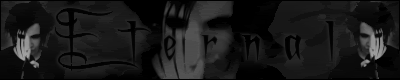
<b>Adoration</b> -- Once again, you have decided to use the "tint image + monotonous background + thin white text" style. Because it's your own technique, I've decided to stop hinting at a change, but rather examining the aspects that must be modified. Namely, the thin white text. While in this image it stands out (because nothing else is white, which I usually disapprove of), it's not advisable to use such thin fonts with this technique. You've also placed it entirely too close to the border and the guy's glasses.

<b>InsanePlushie</b> -- The overall look is pretty neat. I just think that the text is too strong to be contained in such a weak border. You should've made the main text a little smaller so that you could increase your border width properly. I'm also a fan of matching cutouts, so if you did cutouts on the avatar, I'd like to see the same on the sig.

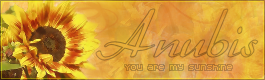
<b>watericesage</b> -- While I really like the focus on the flower, I think the set is missing something. Perhaps it's simply the text. I think for such a vibrant image, you'd also need something similar for the text. I don't like how it fades into the background. You could've gotten away with a paler yellow color. I also dislike how the subtext is so transparent, because it just looks awkward. All of the text objects simply look washed out.

<b>mazil</b> -- I very much like the take you had with this set. My only complaints are awkward text placements. On the signature, the main text should've been more centered in the blank area. On the avatar, everything seems to be concentrated on the left side, which throws off its balance and makes the right side look strangely empty. If you had put the text in the bottom right corner, I think that would've alleviated the imbalance easily.

<b>Scholastic</b> -- Eh. Nice approach but in the end I think the harsh scanlines and odd extraction makes for an awkward-looking set. I can't pinpoint anything else, but all in all I think it's just a little too vibrant for my tastes, as the set is rather dizzying.

<b>DM was on fire!</b> -- You know, I think your sets would turn out a lot better if you selected a color scheme that didn't wash out your image. I don't know what else I can say. At least the outer glow around your text is a nice touch.

<b>Jaye</b> -- I really need to comment on your layering method. To me, adding the drop shadow to your main text means that you want it to be on top of the rest of the set. Then you go and place the subtext (without a drop shadow) on top of the main text. The end result just looks awkward because, logically speaking, it doesn't register with your audience's eyes. If you're to add a drop shadow to anything, it should be the topmost layer unless the thing on top of that also has a shadow... but of course, too much drop shadow and you've got a rather awkward and redundant looking image. Now about the image itself: you've selected a pretty image to work with, but it doesn't look like you've done much work, other than adjusting the levels and adding an overlay.

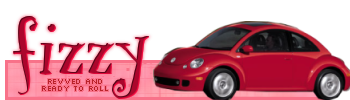
<b>Fizzy</b> -- While the idea itself is creative and cute, you should have included the whole car instead of having the little corner cut off there. I also don't recommend using object-cutouts when you have to extract an image from a busy background, because then you're left with bits of the background which makes it look a little messy.

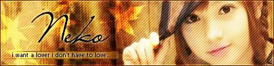
<b>Neko</b> -- I've only got a few complaints. Your main text looks a little chunky where the "N" overlaps the leaf overlay. I dislike how the subtext bar is abruptly cut off on the right side. Lastly, the avatar seems to be more yellow than the signature. Perhaps you used a different section of the overlay? It just looks odd, but it's not a huge deal.

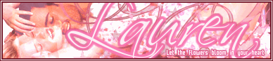
<b>Lauren</b> -- I actually really like the advert that was your original image. The signature just looks really busy where you attempt to cover up her body. I suppose that was the objective though, right? I don't quite know what you could've done to achieve the same goal without making everything collide in that area, maybe used less brushes? I also dislike your choice of subtext font, as it doesn't seem soft/romantic enough for the tone of the set.

<b>Koku</b> -- While I'm not a fan of cyan/blinding light blue, I don't think it detracts from the overall quality of your set too much. I think the cloudy-looking butterflies are a nice touch. The glow around your main text is pretty neat; it really adds to the whimsical feel. I suppose I just don't like how the border isn't symmetrical; not the outer border itself, but how you faded the right corners more than the left. It looks a little awkward. Other than those minor complaints, I think it looks fantastic.

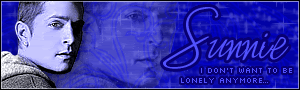
<b>Sunnie</b> -- I'm glad that you realize where your weakness lies: in using photos. I see that you made a rather nice attempt at your usual style, but it didn't quite work out. The image looks kind of grainy with the blue tint, or perhaps it was a side-effect of choosing a poor quality image to work with in the first place. Also, when you duplicated Rob's photo and placed it in the background, it is now a part of the background. You don't have to place text around it. I don't think you should've duplicated it at all, rather you could've gotten away with simply placing text normally.

<b>Rachel</b> -- I kind of like what you did with the original image, even if it doesn't look very realistic. I never would've noticed that it was a photo had I not checked the original. The end result looks plasticky and lacks realistic lighting. I think the blue water is just a bit exaggerate and should be toned down. The funky text is a nice touch though.

<b>Kitten Medli</b> -- As I've probably said before, your work has improved. The background is a little too simple, but I'm glad it's not incredibly busy either. I don't like the text placement. Is there any reason you chose to have your main text all the way on the right? It makes the rest of the set seem unfortunately empty. The main text is not very prominent either. It should usually stand out more than the subtext.

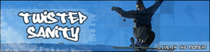
<b>Twisted Sanity</b> -- I think I see where you used all the rest of the pictures, in the background of the sig? For some reason they look more concentrated on the left of the guy while the space above the blurry subtext is nearly empty. In the avatar, the "Twisted Sanity" in the background is distracting and doesn't look very good. It also looks like the grid doesn't continue all the way to the border. What pixel font did you use for the avatar (I hope it's the same as the font you used in the signature, as matching fonts always work better)? I'd advise against using it again, because the letters are unevenly formed. Unless you didn't set it at size 8 or you wrote it up yourself. Aim for even letters in the future, as they look more professional.

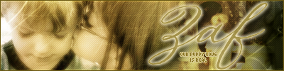
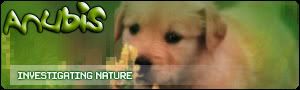
<b>jellyoflight</b> -- While the puppy is really cute, you didn't really do much to enhance the image. I dislike the random green tint around the edges of the image because it blocks out a lot of the dog and looks kind of messy. The pixellated effect was not a good choice for this, as it looks out of place in something that should've been soft and cute. Also, you should've had the subtext bar start all the way from the border instead of randomly a couple pixels away. When you have the subtext bar, you should make sure it doesn't interfere with the image; in this case, it does run into the puppy's muzzle. The bevel/emboss on the main text is very out of place. Such an effect works better for an image that is supposed to resemble slime or something (it's effective when working with slorgs, jelly, slime, that kind of thing). It looks like you have some pattern at the corner of your signature's border; in the future, you should try to make the border on the signature and avatar match. I realize that you were experimenting with lots of popular effects in this set. This is the perfect example of why we run this graphics competition-- to help people realize what works and what doesn't.

<b>Apricus</b> -- Even though the grungy effect works out nicely, I'm not a big fan of green and purple, especially for grungy tones. I'm not quite sure what else to say about that, as many of the aspects of a good set are there, but it just doesn't fly with me. Personal preferences though, and nothing to do with your talent.

<b>timkhj</b> -- Awesome animation! You're going to have to show me how you did that. My only complaints lie with the text. The main text doesn't stand out enough in the signature because of the color. You need to put an outer glow around it or something, so that it doesn't blend it with the flowing water. Also, the subtext is placed too close to the right edge. You need to leave more space between the text and the border. In addition, the fonts don't really suggest "beauty" of any sort. Perhaps just be more selective with the fonts you choose, knowing that fonts add to or detract from the tone of a graphic.

My votes go to Kandice, Bangle, Sunnie, and jellyoflight.
Warnings go to Jasujo and Fizzy.


Last edited by vkceankraz on Thu Jun 23, 2005 8:53 am, edited 5 times in total.

Top
 Profile  
 
 Post subject:
PostPosted: Wed Jun 22, 2005 4:11 pm 
Way Beyond Godly
Way Beyond Godly

Posts: 8715
Joined: Sat Jun 05, 2004 9:10 pm
Location: Cleveland, Georgia
Gender: Female
Guys, I just wanted to let you know that depending on when the new round will begin, Adoration may not be participating. She is currently in OH with no computer whatsoever.

No offence guys...BUT I DON'T CARE FOR PPTTG THAT MUCH! I WANT TO GO TO ALIVE!!! :cry:

Sorry. *smoothes shirt*


Image


Top
 Profile  
 
 Post subject:
PostPosted: Wed Jun 22, 2005 8:17 pm 
PPT Warrior
PPT Warrior
User avatar

Posts: 910
Joined: Sat Jan 08, 2005 2:16 am
Location: Indonesia
vkceankraz wrote:
<b>Scholastic</b> -- Eh. Nice approach but in the end I think the harsh scanlines and odd extraction makes for an awkward-looking set. I can't pinpoint anything else, but all in all I think it's just a little too vibrant for my tastes, as the set is rather dizzying.


What's "Eh." means there? :P I'll take that as critique. Well, yeah, when Flame put my entry, I was like "uh-oh, that scanlines is distracting, I should've put the opacity down to 25%, not 40%." And in my opinion, I should've put 2 pixel border instead of 1 pixel border, but too bad I totally forgot about that. :( By the way vkceankraz, any suggestions for my future set? If you can't write down here, mind PMing me, please? I would love to hear your suggestions. :P


Image
// set by paola


Top
 Profile  
 
Display posts from previous:  Sort by  
Post new topic This topic is locked, you cannot edit posts or make further replies.  [ 164 posts ]  Go to page 1, 2, 3, 4, 5 ... 11  Next

All times are UTC


Who is online

Users browsing this forum: No registered users and 22 guests


You cannot post new topics in this forum
You cannot reply to topics in this forum
You cannot edit your posts in this forum
You cannot delete your posts in this forum
You cannot post attachments in this forum

Search for:
Jump to:  
Powered by phpBB® Forum Software © phpBB Group