Ratings

An artistic oracle. Meet fellow creators and swap advice. Every skill you can imagine is on show.

Moderator: Moderators

Locked
Message
Author
Dragonfire
PPT God
PPT God
Posts: 2364
Joined: Mon May 31, 2004 4:19 pm
Location: Austin, Texas
Contact:

#106 Post by Dragonfire »

Anubis: I like the smallness of it, but the main text and subtext are a little plain, plus the main text looks a little choppy on the outline.

Rate this set please? (That's what happens when you're bored and have PS. xD)

Image Image
Image

Speculation Central - Thinking about the future... Today!
Twisted
PPT Toddler
PPT Toddler
Posts: 126
Joined: Tue Jun 01, 2004 11:38 am
Location: Over there.
Contact:

#107 Post by Twisted »

Dragonfire: The Dragonfire on the right of the signature is lovely, but the rest is a bit lackluster. Is the picture simply like that-try colourisation, gradients, brightness/contrast. Brushes maybe (if you're using Photoshop there are literally millions around)
Also the test has contrasting colours. Perhaps a gradient fill in the av (blue to orange) would have worked just as well in my opinion. 6/10
moogie
PPT Student
PPT Student
Posts: 481
Joined: Wed Aug 11, 2004 3:51 pm
Contact:

#108 Post by moogie »

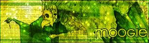
twisted: i like this set set for it's simplicity, the colorswork well without doing too much. but i dont like your font choices. 8/10

rate my new set?

EDIT: i just realized there's a spelling mistake in the subtext, i unfortunately cant find the psd so i cnat fix it for now.
Image
v: Lifebreather ----- c: Neko
Sweet Pea
PPT Trainee
PPT Trainee
Posts: 571
Joined: Tue Jun 21, 2005 12:11 pm

#109 Post by Sweet Pea »

moogie ~> I really like your set. Seems magical and mystical with all that glitter and sparkle. n_n

I like the main title, how it's thin and not bulky/stiff.

I would have like to have seen more of your signature banner though, but that's just me. ^^;

The girl has a lil pink color in her face so it matches your background nicely. But her outfit seems dark against the light pink background.

oOo, I just noticed how the girl is kinda of 'holding' your title. Nice touch. ^-^

8/10.
Image
set by me | 12.17.o5
moogie
PPT Student
PPT Student
Posts: 481
Joined: Wed Aug 11, 2004 3:51 pm
Contact:

#110 Post by moogie »

Sweet Pea wrote: moogie ~> I really like your set. Seems magical and mystical with all that glitter and sparkle. n_n

I like the main title, how it's thin and not bulky/stiff.

I would have like to have seen more of your signature banner though, but that's just me. ^^;

The girl has a lil pink color in her face so it matches your background nicely. But her outfit seems dark against the light pink background.

oOo, I just noticed how the girl is kinda of 'holding' your title. Nice touch. ^-^

8/10.


the sig is as big as i could make it without losing alot of the face in the signature

the background is the same one that was on the piece.
Image
v: Lifebreather ----- c: Neko
WIS
Beyond Godly
Beyond Godly
Posts: 4874
Joined: Thu Jul 22, 2004 3:20 pm
Location: Vancouver!

#111 Post by WIS »

Moogie -

Its really pretty. ^_^ You'd think opaque white would look ugly on all the sparkles and stuff, but it doesnt. And I like the tall sig image, it makes it look... err... cuter. Although the quality is a bit poor because of the fact that you made it a transparent gif. 9/10

Rate mine? =D
Amethyst
Beyond Godly
Beyond Godly
Posts: 4673
Joined: Mon May 31, 2004 5:14 pm
Location: Inside a box
Contact:

#112 Post by Amethyst »

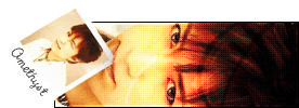
WIS - Hmm....I like the concept, but the text is REALLY hard to read. Black on a dark background generally doesn't work well. Try putting a light gray or white border around it :)

Rate my set?
Image
Noelle
PPT Student
PPT Student
Posts: 402
Joined: Mon May 31, 2004 8:39 pm
Location: Soup
Contact:

#113 Post by Noelle »

Amethyst: I like the set, the scan lines seam a bit off though. But That's just me, I try to stay away from scan lines, they drive me nuts. I love the colors. But the text doesn't seam to flow with the image, not really sure what will help that though. 8/10


Rate my vector

This is my second vector, spent 7 hours on it. (Alot better than my first, 11 hours on my first)
It is Xtina, but isn't intended to look like her. I listened to rock music all day so, I came up with the bad name.
Vector

Link to original image here

Edit fixed image link.
Last edited by Noelle on Wed Aug 17, 2005 11:33 am, edited 1 time in total.
Image
quick set by me//
Mimi
PPT Student
PPT Student
Posts: 390
Joined: Wed Aug 17, 2005 5:03 pm
Location: Des Moines, Iowa

#114 Post by Mimi »

Noelle - Out of curiosity, is your vexel supposed to be that small??? It shows as 54 x 108 pixels on my monitor, and that's really tiny... I'm sorry, there's not much to compliment or criticise because it's so hard to see! :-(
Chiririn
PPT Toddler
PPT Toddler
Posts: 172
Joined: Thu Oct 21, 2004 8:03 pm
Location: The Federation of Windurst
Contact:

#115 Post by Chiririn »

um...rate my set plz?

Details: well i worked on my sig pic and make a little changes. well i put in my name in and the name of the character and the name of the anime. as for the avatar, it was simple enough for me to make. i just cropped it and/or resize it or either way. the text size of my sig pic is around below 18 (limit) i guess.

*feels a little nervous*
AIM s/n: KirbyCalumon (contact me anytime you want if you get bored)
FFXI Server: Asura
FFXI Character: Chiririn (see name. type /sea all Chiririn. send a /tell if you wanna talk)
Image
Noelle
PPT Student
PPT Student
Posts: 402
Joined: Mon May 31, 2004 8:39 pm
Location: Soup
Contact:

#116 Post by Noelle »

soymimi wrote:Noelle - Out of curiosity, is your vexel supposed to be that small??? It shows as 54 x 108 pixels on my monitor, and that's really tiny... I'm sorry, there's not much to compliment or criticise because it's so hard to see! :-(

Someone shrunk the image. I'll fix it.
Image
quick set by me//
Jens
PPT God
PPT God
Posts: 1765
Joined: Tue Jun 01, 2004 1:41 pm
Location: Belgium
Contact:

#117 Post by Jens »

Noelle: That is AWESOME! I love the detail in the hair, and the background is really original! Even though I think the words on her ring/dunno-what aren't really appropiate for this forum ;) The eyes look realistic too! Good work!

---

Anyone wanna rate this mario set? This is the longest I've ever worked on a set... Though I think it looks nice :)

Image Image
Image
Sweet Pea
PPT Trainee
PPT Trainee
Posts: 571
Joined: Tue Jun 21, 2005 12:11 pm

#118 Post by Sweet Pea »

Jens ~ OMG, your set is so funkeh. xD Aww, I remember playing Mario in the old days... o.o;;; I like the animation. It's fun to look at. 8/10. n_____n

Chiririn ~ I like how you overlapped pictures of that anime girl and I like how the bar is not just a plain solid color or something. The grid is okay on the bar, but looks dark on the girl's face... You know? Maybe too contrasting. X3

And the text at the top is too high and the one on the right is too far to the border/edge. Your banner looks better than your avatar.

I like the whole body pose of the girl. -^^- 6/10.
Image
set by me | 12.17.o5
Amethyst
Beyond Godly
Beyond Godly
Posts: 4673
Joined: Mon May 31, 2004 5:14 pm
Location: Inside a box
Contact:

#119 Post by Amethyst »

Jens: Wow! The animation is very smooth, and the sig itself is quite pleasing visually, well done! It's actually quite mesmerising if you look at it too long.... 10/10.


Rate my new set, anyone?
Image
Anubis
Beyond Godly
Beyond Godly
Posts: 3780
Joined: Mon May 31, 2004 4:56 pm
Location: Right here, I think.
Contact:

#120 Post by Anubis »

Jens: Wow, that animation is awesomely done. I can't really tear my eyes away from that set. I love the avatar especially, very clever. =] 10/10.

---

Rate this random set?

Image Image
Image
|| Set // WIS < 33 ||
Locked