Week 1 Grading:
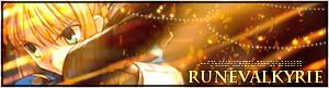
DM was on fire!

First of all, I like how the background is subdued and draws attention to the main image. The extraction was also pretty well done. The color gradient in the background works well too. I'm not too quite fond of the "no fill" text, however, but I think it doesn't look bad either. Just a few suggestions though, some experimentation with the placement, size, and font of your username. For example, DM in big, cursive font, and "was on fire" under it in smaller, regular font, or DM in big, blocky font, and was on fire beside it in smaller font. Just a few examples I'm throwing out, so your name doesn't consume as much space as it does. -
8.25/10
Dyl


First of all, I'm sure ArcSoft Photo Studio isn't the best of programs for graphics making. The image you chose isn't the best to work with, either. For instance, it is very unattractively sharpened, bad JPEG compression and just very messy in general. I see you've changed the colors of the image a little. While it doesn't detract anything, it doesn't add anything to the graphic either, since it's not closer to matching anything else you have in the signature. I see you've tried to do something creative with the border, but personally I don't think it was executed very well. Good effort, though. -
5/10
Ethics

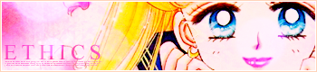
Pretty. You chose a nice image, although the original image is down at the moment, but I saw the original image before, and I like how you enhanced the colors a little. You chose a good color for text, and it works very nicely. I like the repeated images in the avatar. The border is very subtle, and works nicely with the image too. However, be careful not to rely on your source image too much. -
8.75/10
JellyFish72

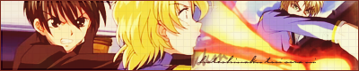
I like how you "Warmed-up" the images, and the transition is almost unnoticeable at first glance. I wish you had found a more creative way, to blend the two images together, though, but I can't think of any right now.

I'm not too fond of the grid over the image, perhaps scanlines in the direction of the fireball would have worked better for some kind of over-top texture. I like how you did the text though, even if it's illegible.

-
7.25/10
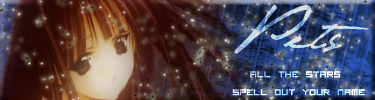
kentieness

The image, brightened up a bit, is very pretty.
The noise isn't as apparent in this signature as it was in the original image, so good job on that. If you didn't already, try a noise removing filter if you ever with to use a heavily JPEG compressed image again. I wish you didn't tint the image some-what blue, and kept it's original browns and greens. However, with the image manipulated in such a way, your outer gradient border matches perfectly. I think your inner white border is much too thick though, 1-2 pixels is definitely enough. I like the text, and the path it is on on the avatar, I'm not too sure that a curve is best for the text on the signature, though. -
7.5/10
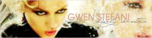
Kidwaiy


Very good for your first set! The background images are faded nicely. You've changed the color of the background from blue to a nice bronze, which suits the color scheme of the set nicely. However, a few complaints and suggestions: Firstly, the "The Sweet Escape" text seems awkward and unnecessary. I think that you should never try to put more text than necessary on a signature. Secondly, I'm not sure if you did it on purpose or not, but the "boxes" amongst the faded background images of Gwen do not really work in this situation. Lastly, I'm not too fond of your font choice for the main text, but it's not all that bad either.
-
7.5/10
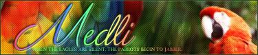
Kitten Medli


First of all, I really like the background on this set. The brushes and colors you used combine to make a very interesting background with lots of "depth". However, I'm not too fond of the red that you have used for your main text. I rather like the font choice, and placement however. Also, I'm assuming that the original image you used was a pre-extracted, transparent PNG. You can still see some rough edges, and I think the graphic would have looked better if you had taken a little time to erase those. Lastly, as a suggestion, the transition from the main image to the background is slightly awkward and sudden. I would recommend you ease the transition somehow. Such as duplicating Link in that signature, and use one of the brushes you used for the background to smudge the bottom layer toward the background. -
8/10
LAQ

Very pretty! I love how you blended the image upon itself. The colors are very lovely and I'm very glad you kept the original colors. I think, personally, that the rainbow text and subtext work wonderfully with the image and the background. Excellent job on the text and borders.
Scanlines work great in this situation. However, there seems to be a lot of empty space just to the right of the main text. -
9/10
moogie


A very nice, simple graphic. You've dulled the colors of the graphic, and gave it a more aged look. Scanlines and the simple sparkles work great. The text is nice as well, however, I dislike how some of the characters in the signature text got cut off. Also, as I stated to Ethics, you don't want to rely on the source image -too- much. Image choice, however, is an important part of this competition. -
8.75/10
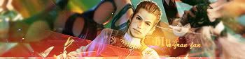
Neko

Very pretty. The colors of the original image was enhanced beautifully. And the streaks of orange that you added gave the signature a feeling of motion. You picked a good image to work with. I think the text was fairly well done, and the sparkles you added looks nice. However, I kind of wish you did more sparkles in the image's original format, instead of using rough "splatters" in the background. Otherwise, excellent job.
-
9.25/10
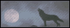
Penguin


I'm not very fond of this one. =\ Inverted colors may look cool, but they don't work very well in graphics as they're not that appealing. I see some distortion of the lines, and an attempt to make a rippled moon. I think I would like this graphic much better if it's colors were not inverted. The avatar is also poorly resized, as if it was resized in paint. Good effort, though. -
5.25/10
Pixa


I think the text was the big downfall of this set. I think the text actually looked better before you edited the set. Anywho, I think smaller text, and a better choice of fonts would have benefited this set very much. Other than that though, I like the manipulation of colors and the brushes you used in the background. I'm not too fond of the border, and I think a double stroke (purple and then white) for border would have worked much better. -
7.75/10
PK

A lot of elements and potential in this signature, however, my biggest problem is that this set is very, very, very messy. Personally, I have no idea why you chose blue to make your background, seeing as how using the original image's orange color would have made for a much, much better signature. The background itself, however, isn't half bad. However, because of the contrast of colors and the effects you did, (including the black and white sparkles), the signature gives off a very messy and dirty effect. Also, the image you chose isn't very good either. It is heavily compressed and resized oddly. However, none of that seems to show on the signature, so good job for cleaning the image up (I assume). The text doesn't seem to work very well, especially the subtext. You used a pixel font, but it is anti-aliased and not used in the size it is supposed to be used in. So now the pixel text gives off a blocky, distorted feel. When using pixel text, Always, ALWAYS turn anti-alias off. Also, experiment with the sizes, it should be from 8 - 12, depending on the font, until you get pixel text that "looks right". Believe me, you'll know it when you see it. Lastly, the bevel border you did is very tacky.
-
6/10
sigh_driven


The more I look at this graphic, the more I like it. The image itself wasn't easy to work with, and you did a nice job of putting that on a simple background. I would have preferred that it was cut out without a glow, but that would have been much more difficult, I think. I can still see a little bit of noise of JPEG compression in the image, I recommend you run the "Remove Noise" filter in Photoshop to smooth it out a bit. The background is very simple, but effective, and I like how you put text on the signature. Perhaps, just as a suggestion, a one pixel black stroke would have benefited the entire signature just a tiny bit more. -
7.5/10
spiral_star


This could have been a very nice set, but I think it was ruined by that horrible yellow color you used. I'm not quite sure where that color came from, because it doesn't match the signature at all. I would have much rather you used a light blue or a color from the ocean. I don't mind the pixel texture over the image, it adds a nice touch, but it wouldn't hurt to tone it down a little bit more. Also, there are some placement issues that could have made this signature much more appealing. For example, instead of using an awkward diagonal brush thing to take up space, you could have moved the main text (sailing) over to where the subtext is now. The subtext could have gone under the main text, and the little bit to the right where the main text would have been could just be cropped off. Lots of potential, but unfortunately this idea wasn't executed as well as it could have been. -
6.5/10
whhattisthiss

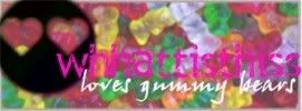
Well, I'm not sure how good of a program Microsoft Photo It is, so I can't really give you tips or pointers. The image you chose is very hard to work with, because there is no apparent focal point, so it is hard to put on a signature and have one area be the "foreground" and one area to be the "background", where text can be displayed. It probably wasn't a good idea to dim the colors of the gummy bears, instead, I would actually enhance them. Right now they look rather bland and blurry. I see you have drew your own "Foreground", which is a face with hearts as eyes. While it is rather neat and cute, it's not very good graphically.

There's no contrast between the text and the background, which makes it fade into the background itself. Lastly, the image wasn't saved very well, or at least it appears so. -
5/10
YesItIsh


The majority of this signature is actually quite nice. The only thing that bothers me is the white streak is very out of place. Other than that, everything else is fine, but can be improved on a little bit. Firstly, I really love the color scheme. It's very nice, matches nicely, and compliments the chocolate. The text is very well done too, it looks very delicate. I think that if you had simply cropped the signature so that it was a bit shorter, removed the odd white streak, it would have been even better. The brush you used is nice, but it looks odd because it is going in the opposite direction as the rest of the signature (the motion blur in the background). Also, I think a solid border, with a little bit of transparency, like it was done in the avatar, would have worked nicely as well. -
8/10
Zilary

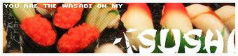
Again, like I stated in whhattisthiss's rating, it is very hard to work with an image like this. As there is no obvious focal point. There wasn't much done to the image, because of so. However, the text placement and colors, and the scanlines are nice enough to make the set appealing instead of just boring.
-
7/10


