Disclaimer: Okay, I'm going to give this my best shot. These are just my opinions of course and I apologize if I begin to get a little long winded. You'll notice that I am not good at using a 10 point scale so all scores will be on the higher end because really everyone deserves points for effort, right? And 10 different numbers are just too many to choose from. Also, please refrain from throwing silverware. Thanks
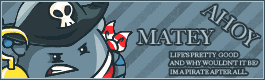
 DM was on fire!
 -
8/10 - Upon first looking at your set I really like the style. You picked a gorgeous picture to work with and while it seems like you really didn't do a whole lot to alter it, I don't find that to be a problem at all. The text 'love' is a bit chaotic with the in and out from black to white (off-white, cream, whichever) but I think that gives it a lot of character and adds to the style of the image. In fact it may be my favorite part of this set. That being said, I think that the other text really gets in the way. It's very tiny, which wouldn't be such a bad thing except that it is also rather blurry. It took me several minutes of intense focus to make out what it said. I'm not sure if that was your intention or not, but it really pulls me away which is a shame because I was liking it otherwise. Another thing I noticed was that, in the lower left corner, there is a sharp line. I realize that was part of the basket in the picture, but the way it strongly divides the picture there bothers me. It's like the signature is trying to end with that angle and her shoulder is just floating outside. It might benefit just from softening that up so it's not so strict. With the avatar specifically it doesn't grab me like the signature did. I like that their faces are conveying the happy love message, but in such a small area they look a little crammed. And you don't have the same balance of light and dark in that area either. I think the text on the avatar could have really been omitted completely. The only part I can really read is 'fire' so I assume it's your name, but I honestly cannot tell. The the lack of focus is more irritating each time I look at it. Still overall it has a good look and style, I just think you missed on the details.
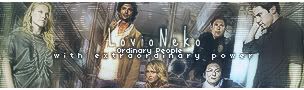
blueZ -
8/10 - I enjoy this set. One of the first things I noticed is how, because of the setup of the picture, it's almost like nikki and peter are bookends and then everyone else in contained in the middle. I don't think-- though I could easily be wrong-- that you especially planned it like that, but I still really enjoy that that is happening anyway. I like the more subdued coloring that you went with compared with the original. I even like the distortion with the beat up scanlines and everything. The only thing I would watch with that though, because you are working with a picture of actual people and at a small scale is that the faces tend to get overly distorted. It's not bad enough that I couldn't recognize them, but a few of them look like they just got punched in the face a little. The 'lovio neko' part of the text doesn't really do anything for me. It's not bad, but the more and more I look at this set the more it starts to fade into the background for me. I do, however, love the subtext. I might have put more space in between each line myself, but since it's like that on both signature and avatar I can see that you were going for that look at it doesn't bother me so much. What I love about it is how you spaced out the second line. It's a great touch because when I read the text in me head I read it just like I see it with the top line normal and the bottom line slow and dramatic. The avatar doesn't do much for me visually. I understand that it's the Heroes logo and so it's not that it wouldn't work, but the dark colorlessness of it doesn't mesh as well with the signature as it could.
sigh_driven -
6/10 - After I went back and read that it was based off the italian job I understood better why you had the yellow stripes there. The gold really pops against the solid black background, but overall it seems pretty plain and while I'm actually a fan of simple things I feel that it could have benefited from more going on here. The left and the right sides don't really feel like they belong together. I understand the stripes in context, but other than the bit of overlapping text they really have no relationship with the gold on the right. I actually really like the text for 'deadlypker' it's simple and looks really nice. I think maybe something could have been done to draw the white away from the background more there, but it's nothing much. I like that the subtext is readable, but it's still a bit out of focus which my eyes do not like much. I actually like the avatar a lot more than the signature. There isn't much going on, but there is enough there to draw my eye in and move it through. At first glance the 'dp' sort of seemed like it was just set in there and I almost suggested going without it, but the more I look at it the more I realize it'd be a bit too simple without it. It almost reminds me of a stamp. I like that there isn't a border. It wasn't necessary. I think the think border on the signature actually works against it since there is so much black going on already. I just wish there was something to tie it all together.
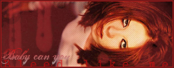
Laryxle -
7/10 - I'm going to start with the avatar here. It's a very simple and possibly common concept, a face in a box (well sure it sounds unusual when I phrase it like that) but I am really enjoying it. Shirley has such a bold face that it really works well even on a small scale. Looking back at the original I'm liking the red tones. It's not very much of a change but I prefer it. The lines a so soft I didn't notice them at first but they add enough interest. What I'm not liking is the 'L' (I think that's an L anyway) The font is very confusing for something so small and the color is very distracting. You have an image that is fairly symmetrical and throwing that in the corner just makes it seem off balance. I mean her face is the brightest and most interesting part of the avatar, but my eyes keep sinking to that lower right corner. Also, the inner border in nice, but I think a different color would have been a better choice. I'm all for subtlety, but that red is so similar it blends in on most of the image and so when I do notice it here and there it looks like it shouldn't be there. That's the same for the signature. I actually love the 'bleed like me' text at the bottom like that and sinking into the border, but with the color it's in I honestly didn't notice it was ever there until I had looked over it several times. The 'baby can you' text makes me sad. The font confuses my brain and the gradient works out so oddly because the work 'baby' is almost distracting too much away from the focus of the image while the word 'you' is almost lost completely. I don't mind images on their sides, but given the odd pose she's in everything falls heavily to the right side. I like that you added the... drips, streaks?... to the left to keep the image from being too side heavy, but with all the red going on already it doesn't do too much. Monochrome is fine with me, but since you already have such bold yellows in the face so it's not all reds anyway I think this would have benefited from some more contrast and color. Still there are some cool ideas in there.
Zilary -
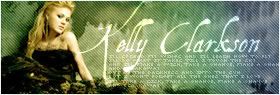
9/10 - Just at first glance this is a beautiful set. There isn't anything in here that I fell like I haven't seen many times before, but that does not bother me at all and I mean nothing bad by it. The soft color gradient goes a long way to brighten everything up as well as guide your eye across the signature. Because there was already such bold patterns on the wall behind her in the picture I don't fell like the scanlines are too much. If anything they help break up the space where the texture repeats some. There is a spot though, above the y in kelly that almost looks like it's a straight stop in the texture. Looking at the source image that it's from where the picture originally cut off so I'm not sure how it ended up like that-- and it doesn't help that the K hits the border right in that spot too-- but it splits the background. Just a little blending there would make a world of difference. I love the font for her name, all except for the K. That is probably only because I don't like were it hits the border and how it runs into her arm. Normally I guess that might help tie everything together with overlapping and all, but the spot where in hits her has a shadow on the inside of her arm there that makes it look like the K is tugging on here and no one likes a bossy K (Okay, that really might me a nitpick specific to me I fully realize that.) Your subtext is tiny and unreadable, ut it is not blurry and visually it looks great. I'm sure you meant for it to be like that and that is great (sidenote: after staring at it figuring it was solely for decoration I discovered there actually were real worlds there but I can only make out a few of them which makes me full of rage however that has no bearing whatsoever on the grading I'm just saying [squints]) I have to say though, I love how you added the dark bits at the bottom. It doesn't actually look like he dress extends all the way across when you look at it, but because the dark contrasts so much with the light colors you assume it does anyway. Also it adds a nice weight to the bottom of the signature. The avatar has me split. I think the color is a little dark. I'm not saying you should have just reused the same yellow green in that sport from the signature, but since it's such a small area the dark really stands out. Now the I love love love and then not so much. What I mean is I love how the beginning of the A starts in the corner there right into the border. I looks like the white text is flowing in from the background (and I realize that totally does not work on someone with a dark background, but pfft) and then working its way up the side. 'Amm' is wonderful. I'm not sure what is up with 'er' though. Because of the color change there, I'm not sure if you intended that or not, I fell like it breaks a good flow. I's like I start reading up, but when I get past the second m I don't see the rest of the word I just see a smudge I want to wipe away with my thumb. Still the entire thing is gorgeous.
Apex -
7/10 -I enjoy how abstract this ended up looking. I never would have figured out what the picture was if I had not looked, but I think that is perfectly fine so long as what we end up with is visually appealing. I even really like the monochrome you have going on simply because there are such deep blues along with the lighter and the stark white. Looking at the avatar I really like how it's almost divided into three distinct sections with the out of focus light blue pattern, then the white streak and finally the dark blue berry things. It's simple and very pleasing to look at. The 'blue' on there though really interrupts all of that. I think maybe it might have worked out better, if you felt you needed the text at all, to have put something in the upper left corner. It often difficult to find a a good balance when a word spans over multiple colors. So while the blue pops against the white it's fighting to fade into the blue background on the left. The first thing I notice on the signature is the border. I wonder if it wouldn't look better if it were just a bit thinner, more like the avatar. Also I would have like to see more of a grey (like the avatar) or even blue as opposed to solid black. It's probably not as big of a detail as I'm making it out to be though. I'm very drawn to the contrast of the right side, so it's good that the text on the left is so bold, but I still feel like that left side feels empty. Aside from that bit of bold contrast between the bark blue and white there is nothing pulling me into or moving me around the image. Maybe it's the lightness of the 'blue' text fading in? I don't particularly mind the font, but I think you could have found something that could have flowed better with the image. It's not bad though, I actually like that the lettering is so big and bold I just wish it didn't fade in so much. The subtext is too hard to read and it starts to take away from the image as I have to stare at it to figure out what it says. I think what you were trying to do with the overlapping was cool but it just didn't quite get there.
WIS -
9/10 - You have some amazing skills, let's get that out of the way. This set isn't my favorite, but there is still a lot to like. The way you cut out and compounded the images is beautiful. They all look as if they've always been part of one picture like that. I love the idea of coming off the fading grey into the punch of color also. I like the simplicity of having the butterfly for an avatar. It obviously connects to the signature but it doesn't look like you just took the same setup you had going on there and mushed it into a smaller space. I'm curious to see how it might have looked if it was actually more than one of the images compounded together like in the signature, but it looks great as it is really. The text on the signature is great how it slides in to the images leading you right to the boldest part. It bothers me a little bit though, that the e in explore is being dissected my the white arch from the mouse in the background picture. It's actually still readable now that I know what it says, but at first I admit that messed me up just a little. I feel like the signature might be to heavy on the right side. I know-- well I assume-- that was the goal, especially with the fading on the left, but it's maybe a little to much. Every time I look at it I tilt my head like it's going to fall over. I think that if it had a little more weight at the bottom there it might help. But then again, I actually like how everything it spreading outward and upward. Along with the bright colors that adds a very positive feel. Also, the very right end of the signature seems abrupt to me. Maybe it's just because nothing else has too much of a defined edge, but it feel like... it starts off slowly fading in then you follow it to an explosion of color and brightness in all directions then wall. Stop. Over. Anyway, it's absolutely gorgeous.
Kitten Medli -
7/10 - I love the angle at which the picture is sitting in your signature. It would have been so easy to tip it so she's completely horizontal. I love it because, with the pose she's in, she looks like she's just resting and sort of hanging on at the same time. The background has a lot going on. I was going to say that it's too chaotic, but honestly, if I look at just that, without the image or text on top of it, it really doesn't bother me too much. If you add in the text however, well then if becomes a battle. They are both fighting so hard to get my attention that my eyes end up bouncing everywhich way and well, it hurts. Okay, setting the over dramatic aside, I do think the text and the background clash. It's very difficult for me to read what it says without being distracted. I like how the picture is highlighted with the white along her cheek and arm, but when you get to the back side of her hair the color becomes a very contrasting orange. In fact, when I first looks at your set, the first thing I noticed, even against the background, was that orange streak behind her head. I really like that you made the highlight of the avatar her eyes. The only thing though, is that because you did that by fading out the rest of the picture it has a softer more subdued feel. That's fine, but it contrast the boldness of the signature so much that, even though they're the same image they feel like parts of two different sets. Between the two I prefer how you worked with the brightness, even though I think it's a bit too much.
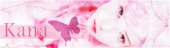
Neko -
9/10 - You did this amazing where to took something and made it very soft and yet very bold at the same time. I must say, your avatar is my absolute favorite of the bunch. At first glance it looks very simple and that is pleasing to my eye, but the more I look at it the more I see all the little things in it that make it interesting. The text is simple, crisp, and easy to read. It compliments the space. It's great. I love how the butterfly look like it is resting in her hair, almost like a barrette. The signature is pretty, but I have found more things with it than the avatar. First of all (and I'm almost certain this is a nitpick specific to me) she looks like she's sucking the soul out of the butterfly. The image is very pretty and again, like the avatar very soft and strong at the same time. I like the dotted lines that guide you around the image, especially as they try to balance out the emptier space as opposed to her face which is the focus. I feel like the length of the signature could have been shortened some. There is a lot of space, especially on the left, that feels a little too empty. I think some of it could have been trimmed down. The text on the signature isn't my favorite. It's not bad, and I like that you added the color behind it to make it easier to read. Of course, saying that, I'm not actually sure if the background part was needed. You might have just added it for the look of it and that's okay, but the strict rectangular shape of it stands out a little too much for me. I don't know if the butterfly was necessary in the signature. I like that it's something that ties them together, but maybe it would have been better if it was not so large. It's such a simple shape that I think it looks better at a smaller scale. Still, overall the set is soft and beautiful.
I apologize for what I assume are many typing errors, but I didn't have time to reread this before I headed off to work and I assumed you'd appreciate getting your ratings sooner rather than later.


 - Set by Sapphire Faerie


