<b>Apricus</b> -- Ohhh cool! I'll assume that the icons go in the upper right hand corner. I just think the grids are a bit too big, and so is the pixel effect that you used. Smaller next time, eh? Overall, it looks very nice.
<b>Sapphire Faerie</b> -- Blue! My favorite color!

However, the text placement could use work. You should have put it at the bottom, so that desktop icons could be placed above it. Also, Copperplate isn't that great of a font. It's kind of tacky looking, but that's just me. I can always pick out stuff that you make. Very distinct style. But this time, the abstract background is just a bit too overpowering. Perhaps fade it a bit? You need to play up the main image a bit more. A note for the future: I've noticed that you use the abstract background effect a lot, and it's the main point of your style. The problem is that it doesn't always work. You have to look at the image you're working with. For instance, if it's drawn, you need to use a cartoonish background.
<b>Neko</b> -- It looks fantastic! I love it. Kind of on the bright side, that blinding thing in the middle. Great blending job. You just need to have moved the text to the bottom so that the upper left corner is free for icons.
<b>Knives</b> -- Effin' awesome. Really. But then again, you do wallpapers a lot. So mleh! The scanlines are too far apart.... It kind of draws my eyes in weird directions. And the pixellated effect is too much. Lower that layer's opacity a bit more. Other than that, it's amazing.
<b>Marissa</b> -- Lovely! Good job fixing up the original image, although I imagine it's a lot smoother when you shrink it so much. Anyhow, even though it's rather simple, the end effect is beautiful. Not too blinding or anything. Very easy on the eyes. I must say, I liked your original entry a lot too. It was very original.
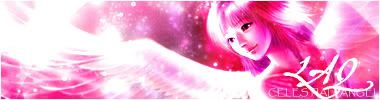
<b>Laq</b> -- Doesn't look like you did much. I don't like the text placement. The colors/lighting kind of make me uneasy. The background effect is pretty cool, nevertheless.
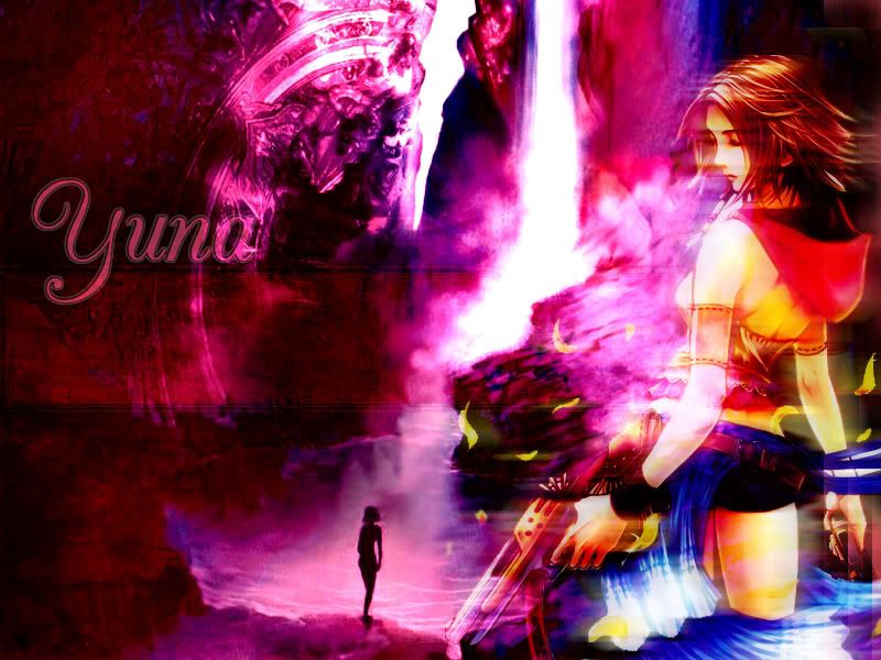
<b>Mazil</b> -- Nice job extracting the image, but it shouldn't be in the center of the wallpaper. You left enough space for icons, but it just would look silly to split icons up and place them on either side of the image. I like what you did to the background; it looks really cool. I just think you could have done something other than use the original background as a base.... Maybe do some stuff from scratch.
Votes go to Sapphire Faerie and Laq.


