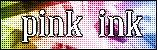
Kyra
I like the rainbowy background and the dots and whatnot. But I'm still trying to figure out what's going on with the text. It's unsmooth around the edges...It might've looked better if it was transparent or something. (Or is that why you were maybe trying to do?) Also, I'm not overly fond of the black border.
meowth1982
The different texts running across the background are the best feature of this, and I like that you've use different shades of pink and purple. The text is an okay choice because it looks like typewriter print, and the word black really stands out. My suggestion would be to maybe get rid of the hearts. They're cute, but don't have much to do with PI. Also the text 'Pink Ink' hurts my eyes.
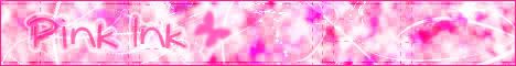
paola
It's pretty. I like the pink color you've chosed. However, the curved edges of this look a little rough. Also, the text 'Pink Ink' is very hard to read, which isn't good for a button that might be used on the PPT homepage. People need to know what they're clicking on.
 hellyer
The shape reminds me of a neopets top banner. Hm... I like the main font. Definitely looks like handwriting. However, there maybe should have been more to the background. The swirls are nice, but this is overall sort of plain looking. Some sort of black pen design or something might've looked nice in the empty space.
Neko
It's pretty. Not much to do with Pink Ink itself...I'd suggest adding some sort of text or pen/pencil image. The background is a bit busy with all different color shades. The font sort of blends in too much as well, so that needs to stand out.
Darklegendary
It's hard to actually see the background text, at least on my computer. I love the text Pink Ink on this. The checkers around the border are a nice touch. I'm not overly fond of the swirls though.
Apricus
I like your font choices, as well as the placement. The background is cool looking, however I think the text should have stood out more. That'd make it more obvious as to what PI is. The fact that text is actually in there is really hidden by other details in the background.
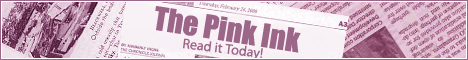
moogie
It's purple. =P But that's okay. This one is really nice, and definitely shows what Pink Ink is and obviously advertises for you to read it. I guess my one problem with it this the purple, and the shade of purple is a little dull looking to me. (Though it could be from looking at all the much 'pinker' entries)
Koku
Don't hurt me for criticizing your drawing, but the pencil is very kiddish. So is the main font. I like the text running around the background, seeing as it's actually stuff from PI I think. However, the background is still a little plain. But actually, this entry still is sort of cute looking.
Amethst
Very nice. Pink Ink definitely stands out, it's a good font choice, and I like the hot pink color scheme. The large ink splatter really makes this look good, and the horizontal blend of the hot pink and white...Very nice.
 Optimus
Another purple entry...Okay. My suggestion would be to make this pinker. The background is cutting it close, but the ink platter is most definitely purple. So immediately when the text Pink Ink becomes bold, you see purple ink...which is sort of...odd.
Kyra, Paola, Neko


