For once I think everyone finally got the hang of this and I have nothing to point out here, in the beginning of my post, that would go for more than one person
 Scholastic
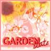
 - Your entry had quite a messy feeling to it. Whereas the colors are well combined I just think you've gone too far when it comes to the brushes/self-made images. Also, the sunflowers are too weak in the avatar, personally I think it would have been better if they would have been whole and more visible, that would have also taken some attention from the text.
mazil - Very nice, I like this avatar very much. The placement of the elements is particularly good. Umm... yeah, that's it.
Jasujo - The image itself is ok, I think. However, I don't like the borders at all, particularly the fact that the corners look chopped off (seems like you have cropped the image from a size 102x102 to 100x100). Even though the image is good, maybe you should have had something more strong in the background behind that figure, for example having just a couple of hearts there with a stronger violet color. In a way this would also have given more dimension to the picture.
Koku - You always have a lot contrast and strong colors in your work, but I feel that this has gone a bit too far. The placement and visibility of the text is very weak, i think you could have come up with something better for it, even though this might have done that you would have needed to move the image itself a bit more to the left or right etc.
Apricus - Looks like tango to me, but that’s not really what I should judge really, hehe. Whereas Koku had too much of it I think you need more contrast in this avatar, not much, but a bit. Other than that I think you’ve done a good job this round.
InsanePlushie - Mainly I just think you've really crammed too much into one icon. The individual parts just as they are seem to be fine, such as the image, the border etc., but when put together you've got too much in there and literally no real "breathing space for the eyes" anywhere.
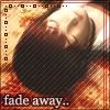
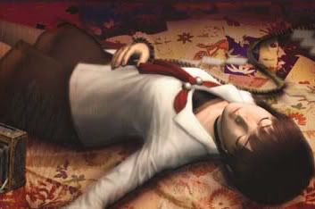
Laq - When talking about the image I'm pretty okay with it and you've done a good job. The two things I do want to point out, however, are first of all the main text and then the small text you put in the background as an effect. The main text is a bit too blurry in my opinion, and comes too close to the man's head. And as for the decorative text-effect on the background, at least I feel like you could have left it out completely.
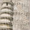
NeopetsAddict - This icon is far too plain, let alone the very plain text. Although the idea of the having the text lean against the tower is very good, and I like the placement of the text and image too, I still don't like it as a whole. The colors are dull and lifeless; for example keeping the green trees there and making them more vivid would already been a very good addition. A different and more special font would have made it even better as well as actually making the text and image stand out of the background.
watericesage - I'm not so sure you did that much with this icon. I like the colors and image effect in any case, but the writings on there are a bit lacking of strength and visibility.
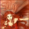
_jaye_ - Pretty good, but I feel like there's still something missing. Maybe you could have made the red colors more vivid just to have some really eye-catching element in there. Also, I would have like to seen a bit more visibility of the text.
rachel - This was certainly out of the ordinary, I'm not sure I like it though. In some aspects I could agre with you on the style you have chosen for the image, but I don't really understand how you have gotten the original image into something like that (probably possible, but I'm just not seeing it). The font is not that good in any case, I don't like how some of the letter go into each other and how vertically stretched they look.
Neko - Well, first of all the colors of the girl are a bit dull in the sense that maybe a bit more contrast would have been good. The text does not fit in at all in my eyes, I think you should have gone for something totally different regarding that.
timkhj - Really I just don't think that the different parts match each other at all in this image. This meaning that the background would have been good in some other combination, but not with the border, text and photo you used with it, the border would have been good in some other combination but not with the... etc.
My votes go to NeopetsAddict, rachel and timkhj.


